CASE STUDY

PENN Entertainment

Transforming a legacy casino brand into an omnichannel entertainment and gaming leader

Challenge

In 2021, the North American casino industry was at an exciting inflection point, with advancements in technology and the expansion of online gaming. Penn National Gaming was best known as a regional casino operator—but its leaders had the ambition to be at the forefront of the industry’s transformation.   

With the rapid growth in their online gaming business, the recent acquisition of theScore, and an upcoming acquisition of Barstool Sports, they were redefining their business and its frame of reference in the industry.   

Penn National Gaming’s brand was not poised for these shifts. The legacy corporate identity was rooted in a gaming- and US-focused name and traditional casino visuals. More broadly, the brand lacked meaningful relevance with consumers and prospective employees, inhibiting growth with younger generations and struggling to connect with the innovative talent it needed to support its transformation.  

Penn National Gaming turned to Prophet to help re-introduce the organization to the world and transform the brand to better communicate and connect with its employees, investors, regulators, partners and consumers.  

Solutions

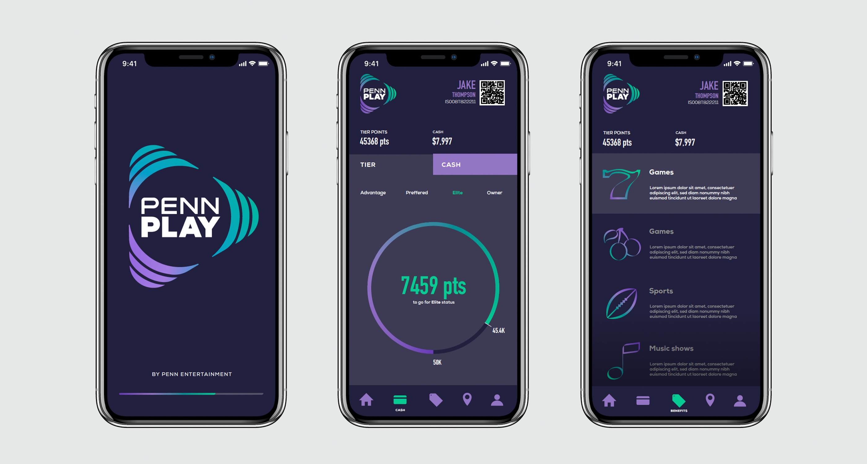
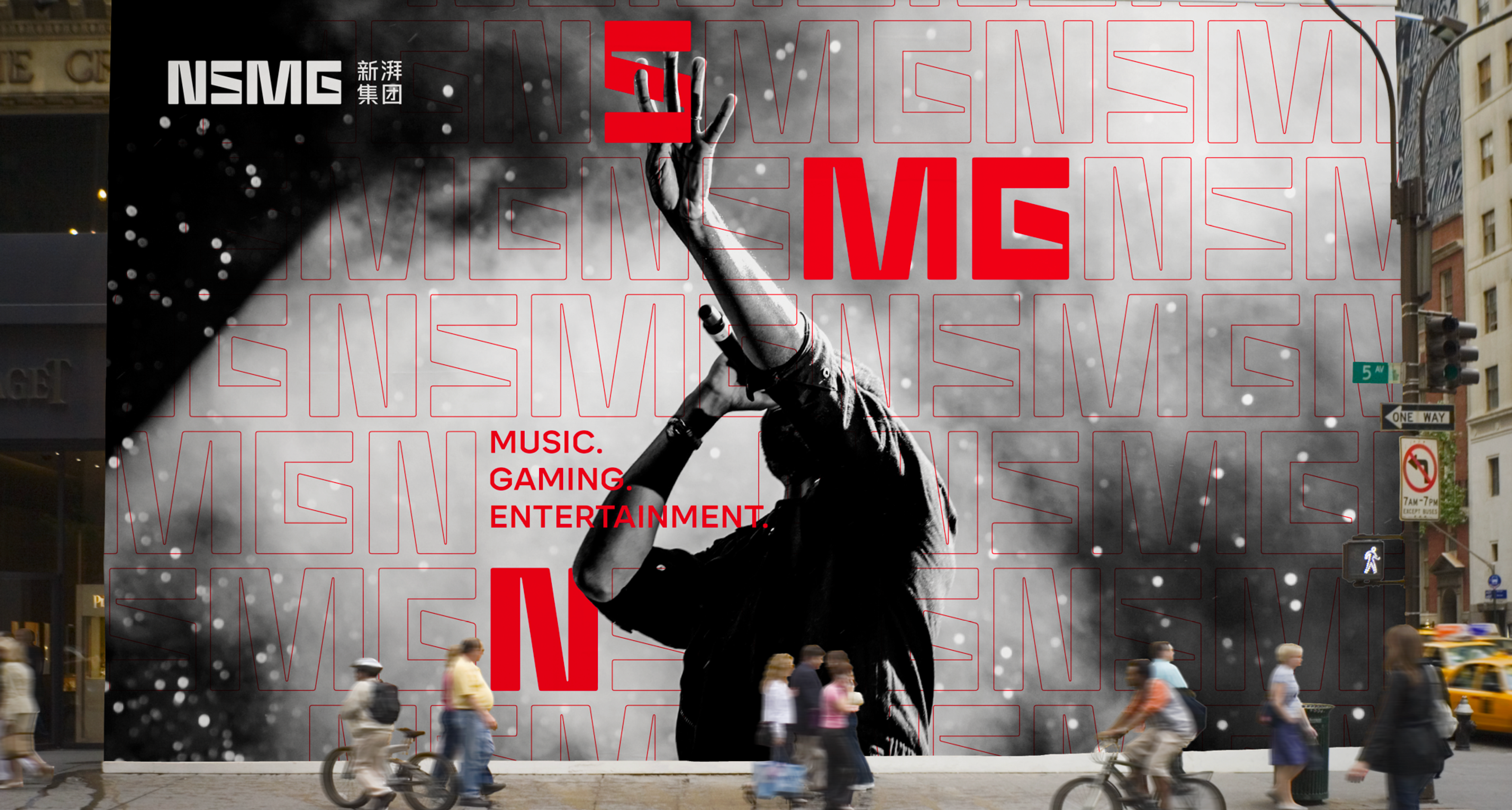
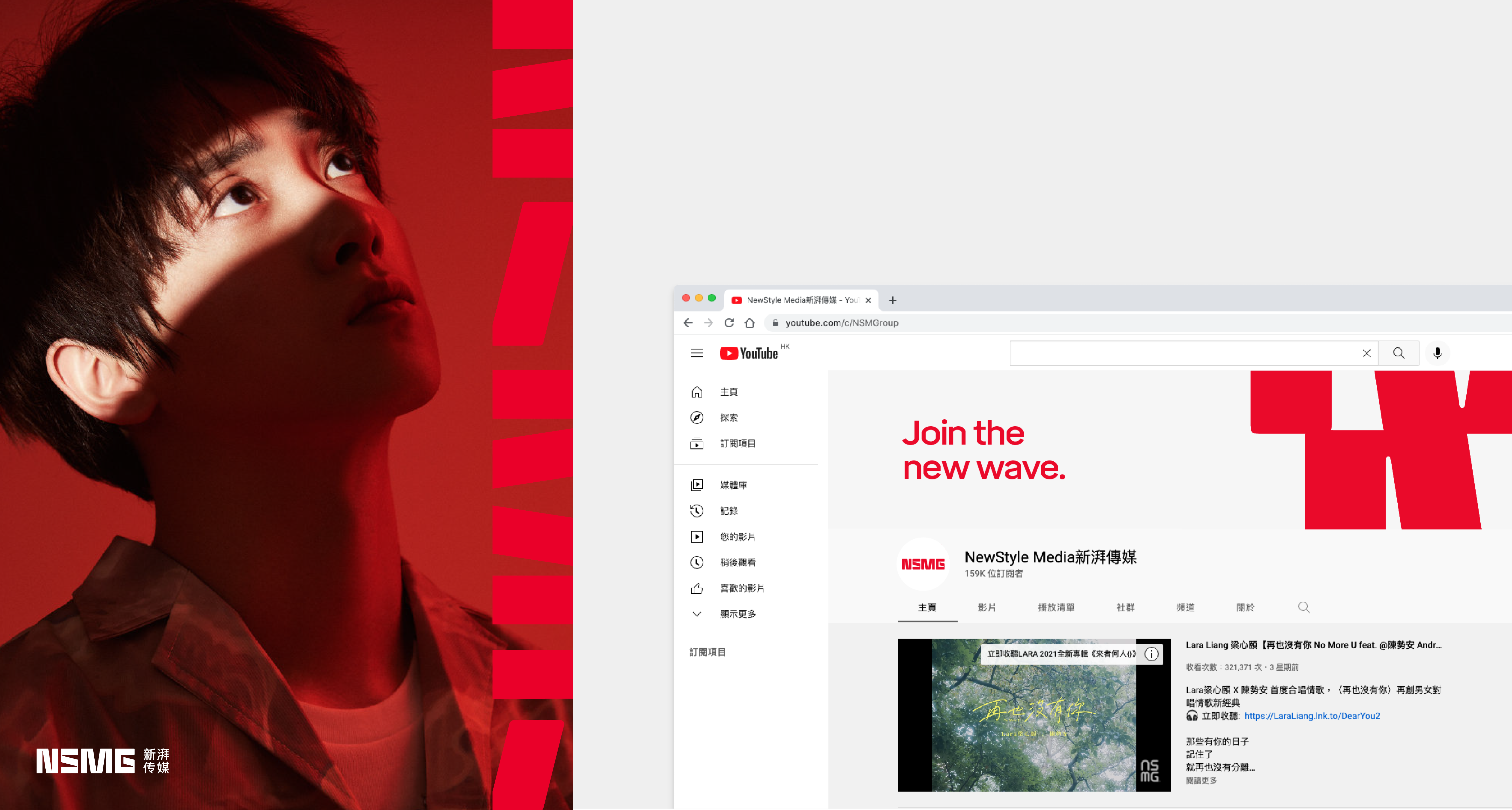
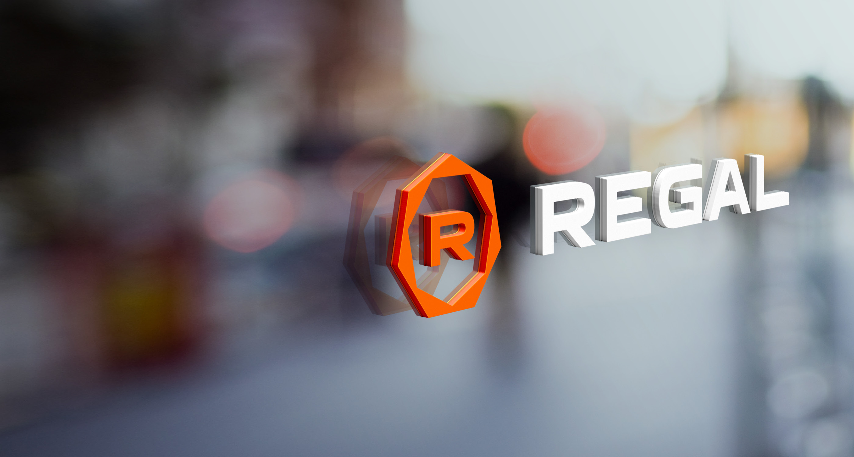
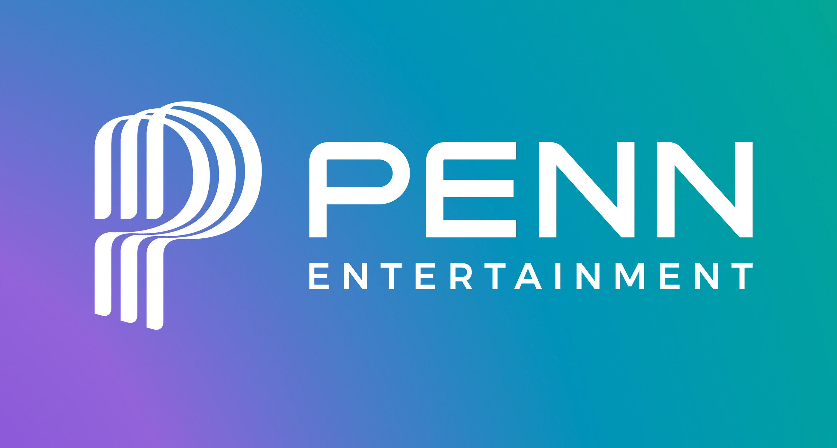
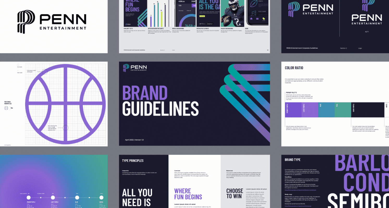
We guided the organization’s c-suite leaders through a series of interactions and data-driven assessments, which helped us determine that the corporate brand should evoke the company’s ambition, resonate with employees and build trusted category leadership. This led us to a new name for the organization: PENN Entertainment. 

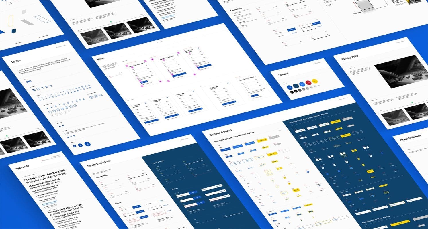
We then developed a new, simplified brand architecture model that enables PENN to organize complicated entities and offerings. We delineated clear roles and audiences for each level of the brand structure, which helped simplify and streamline the brand-building efforts and provide more equity across the organization’s ecosystem.    

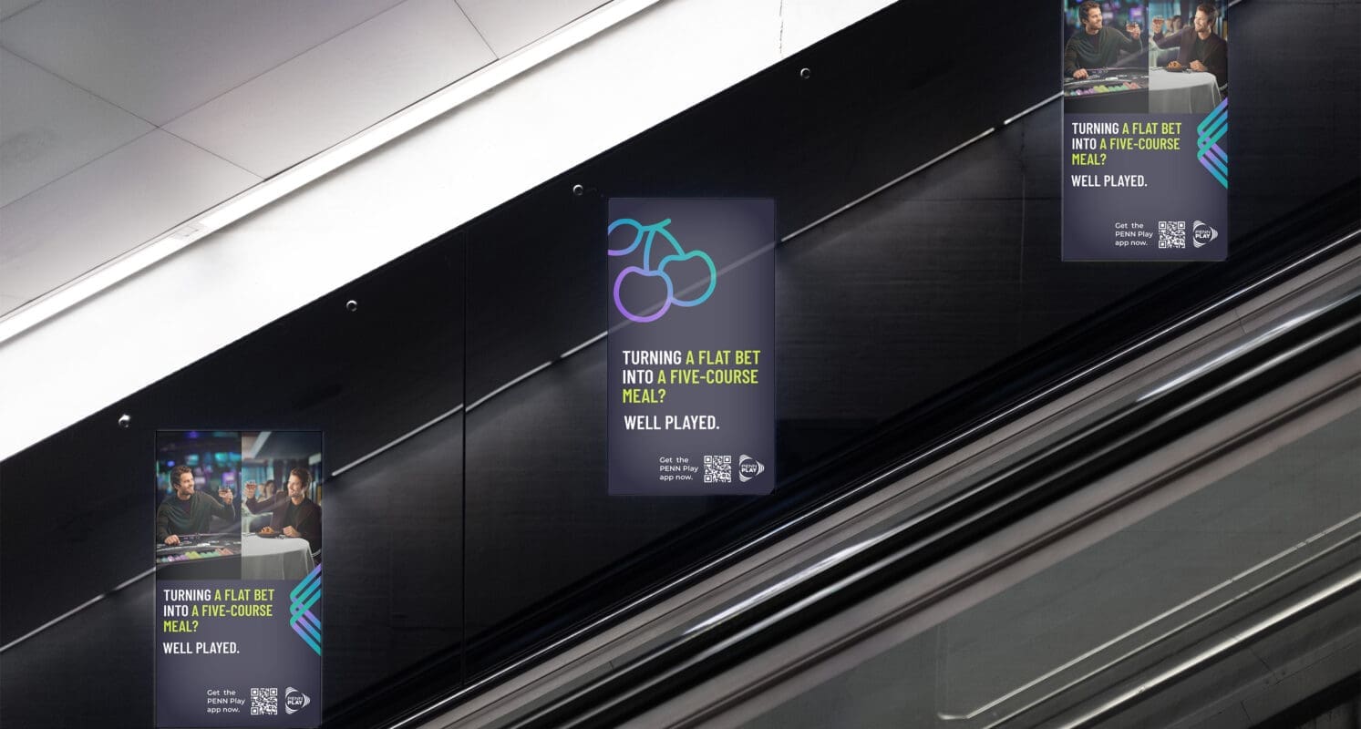
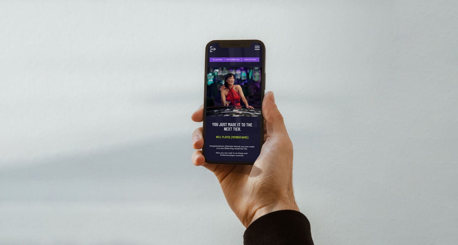
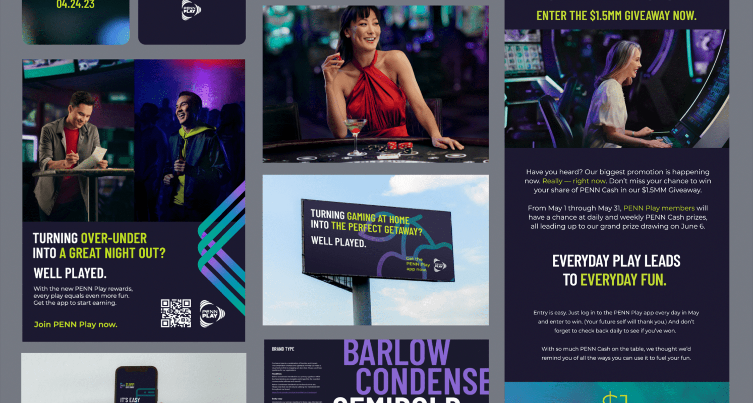
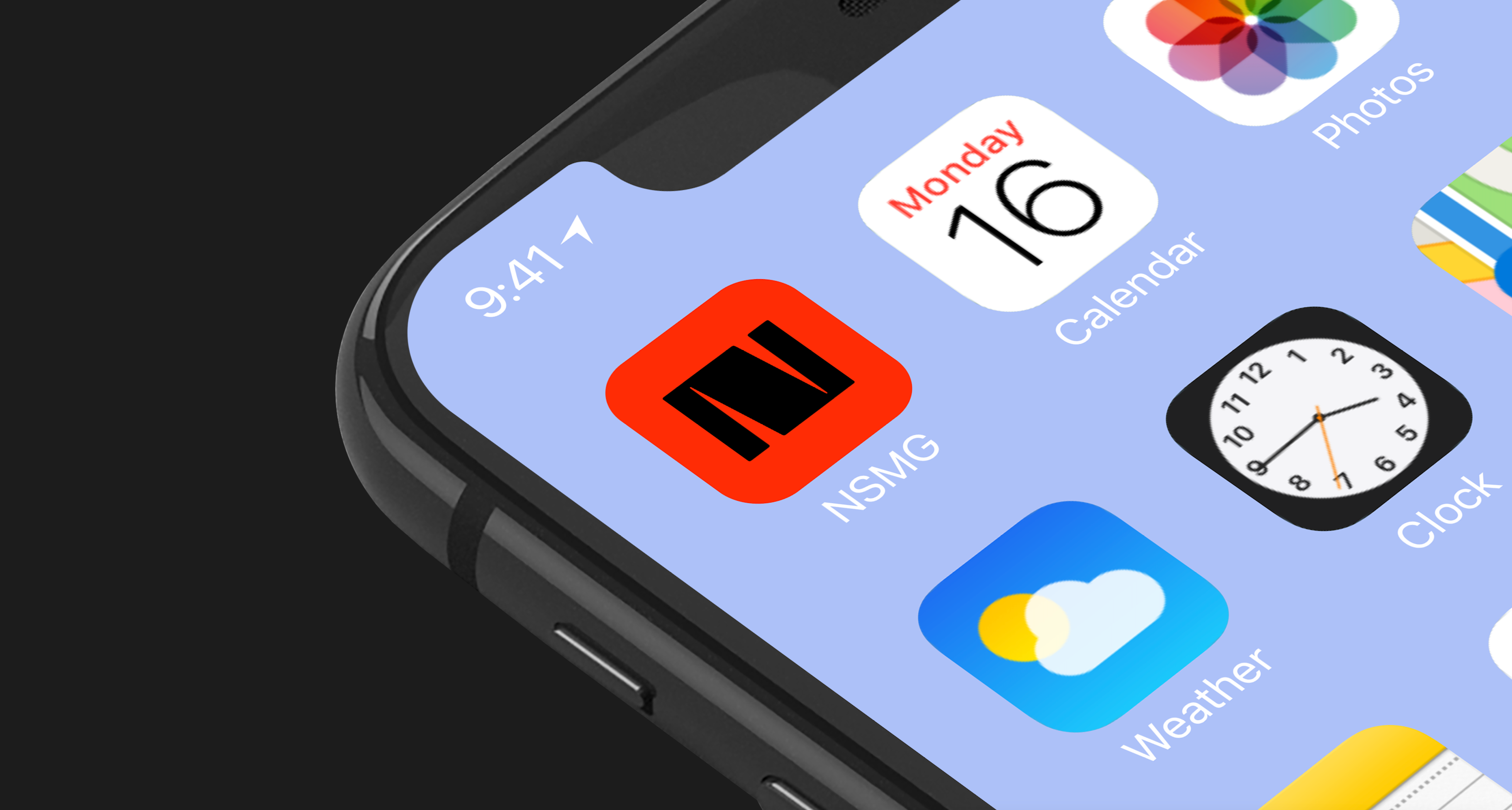
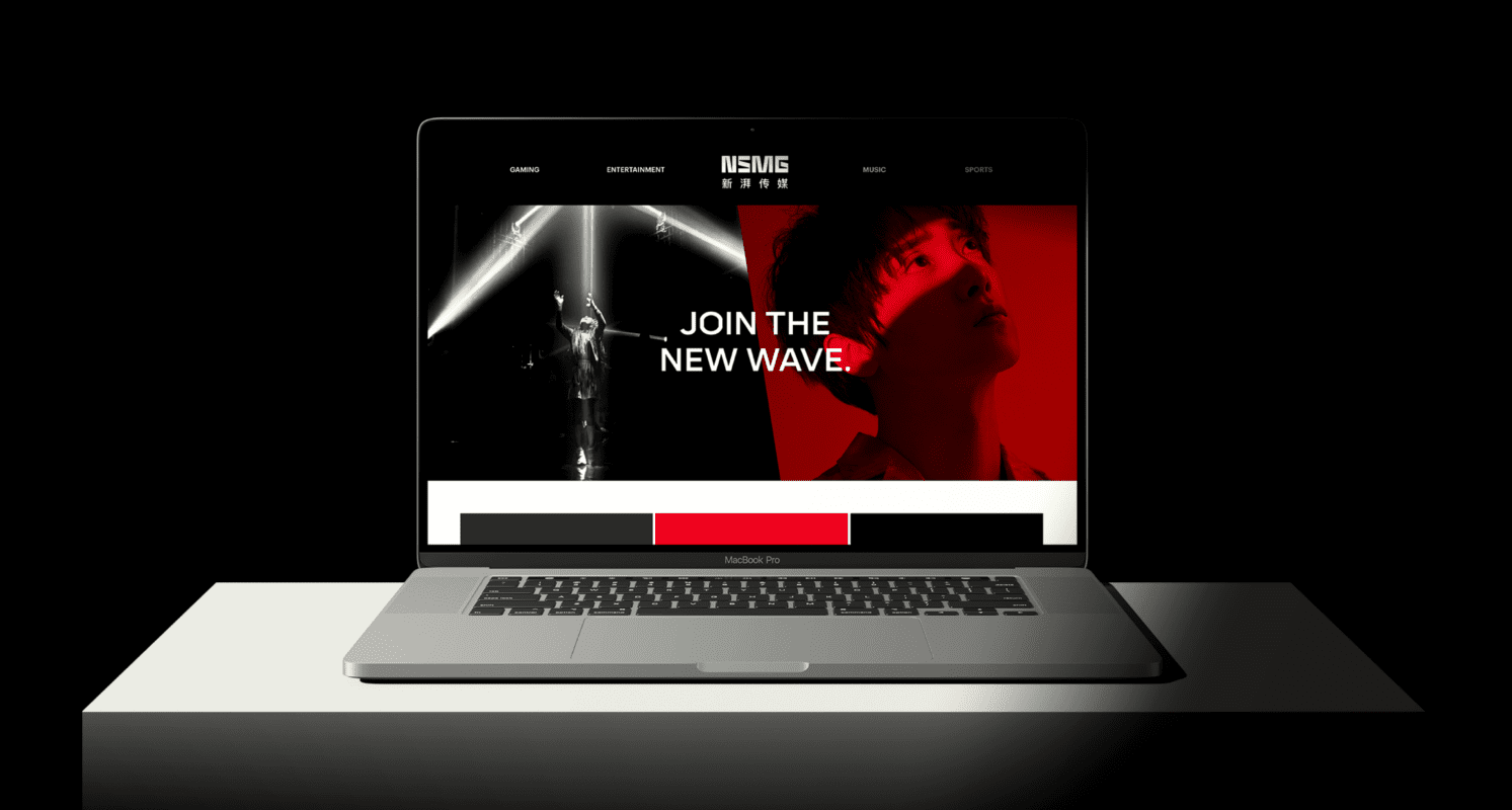
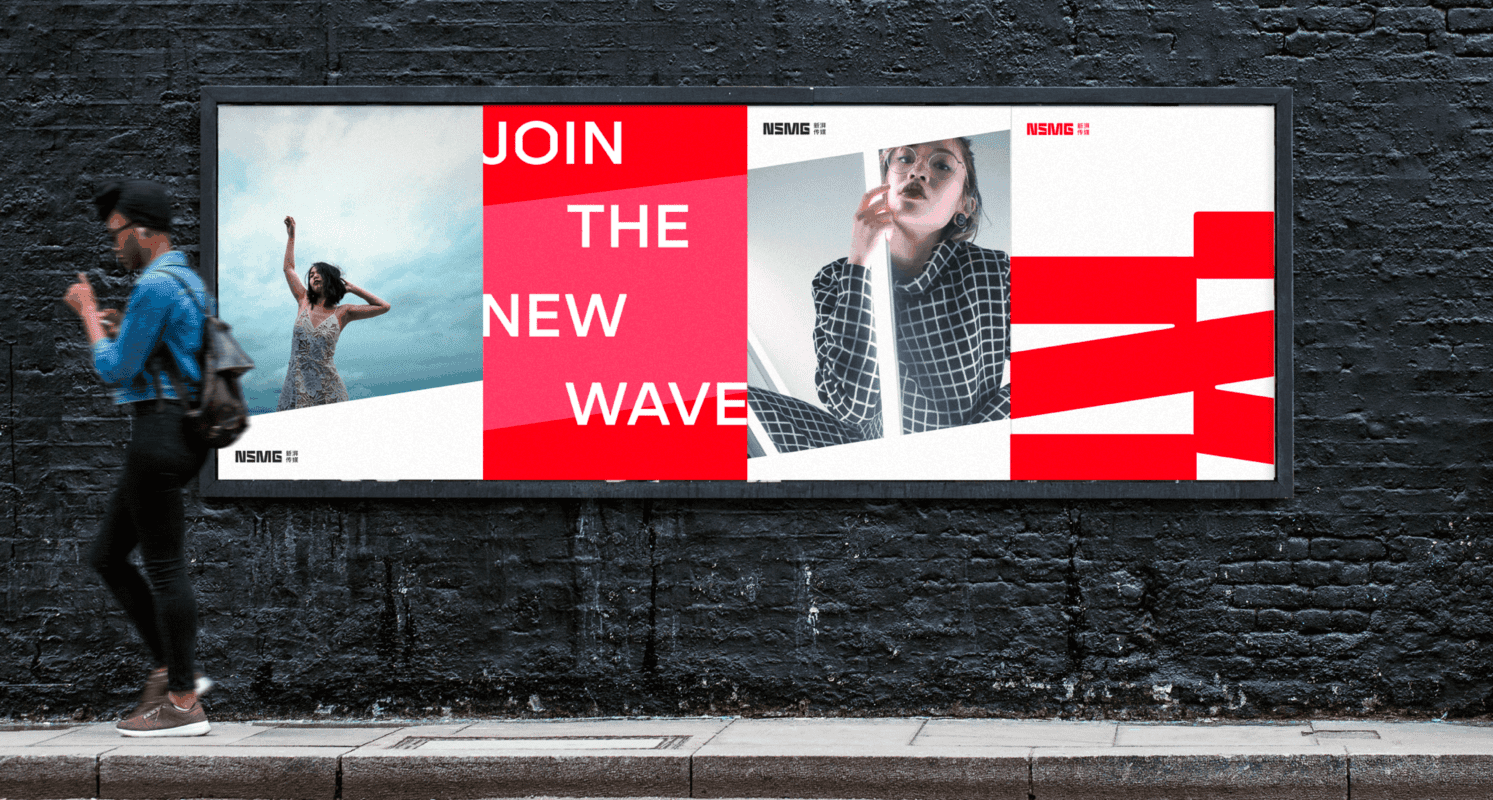
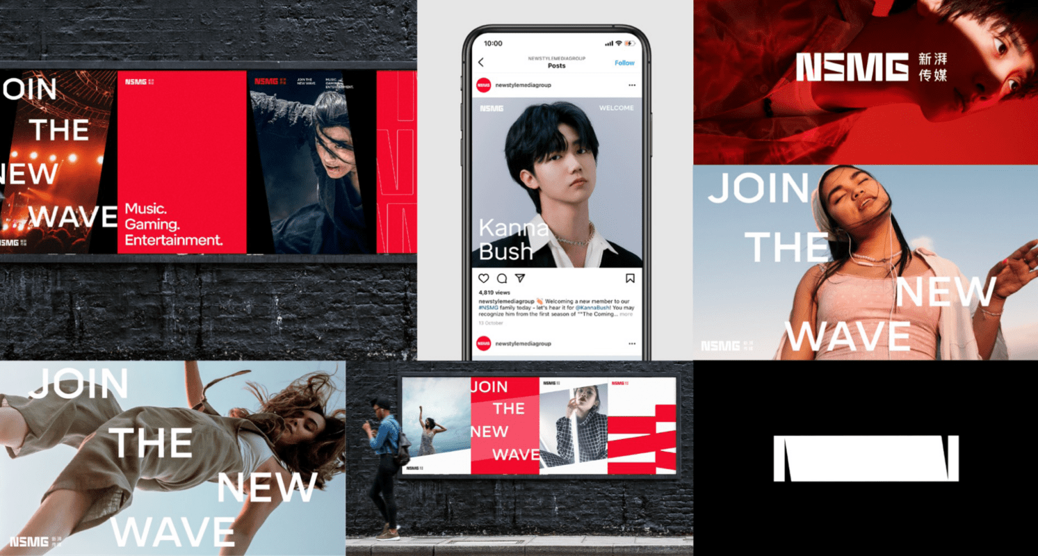
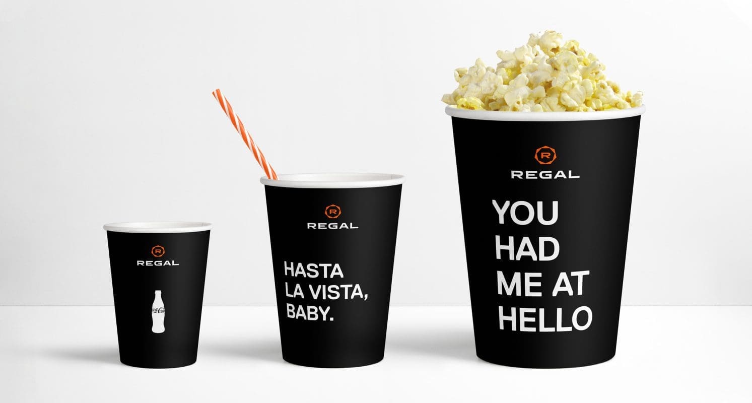
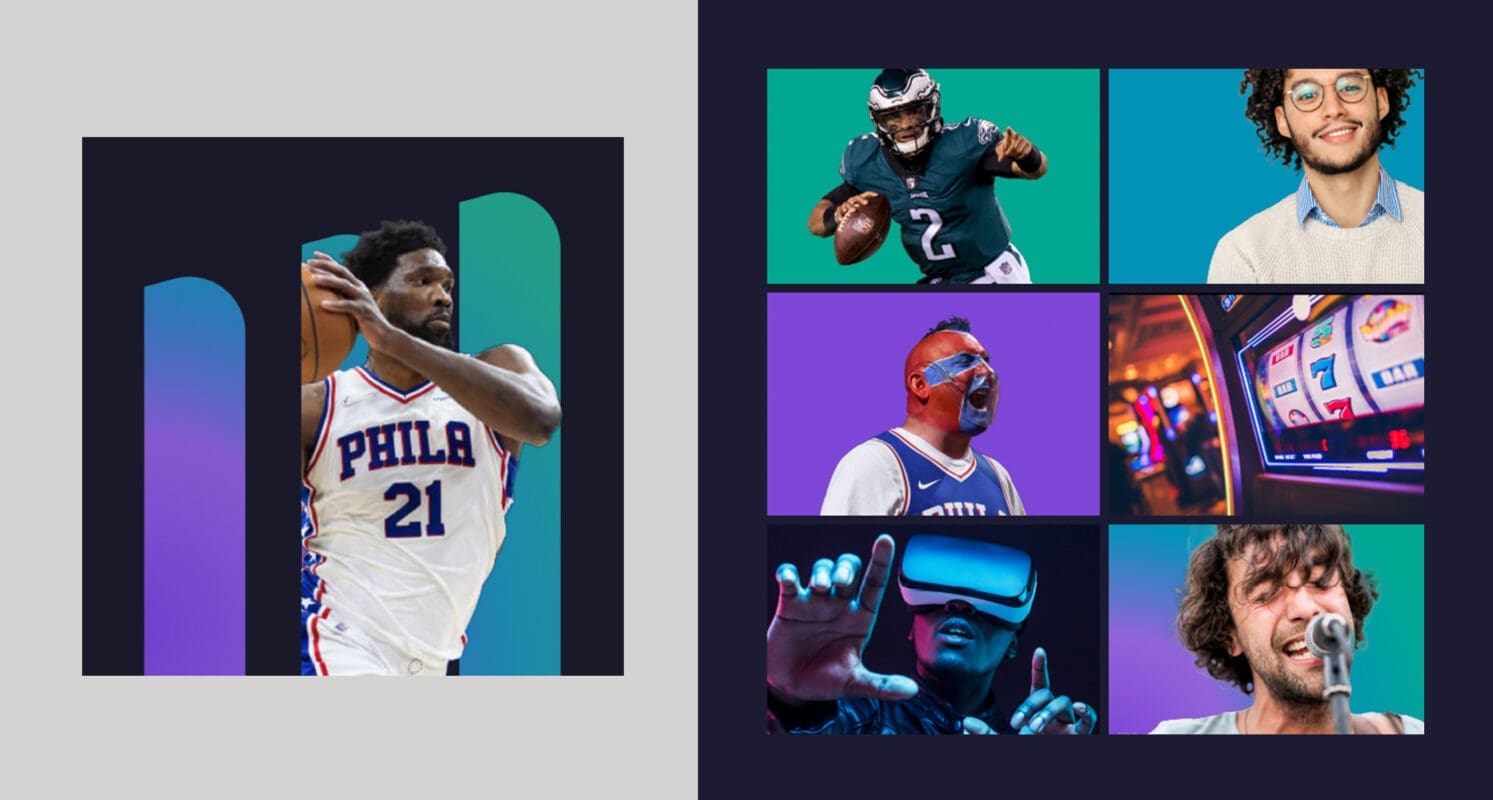
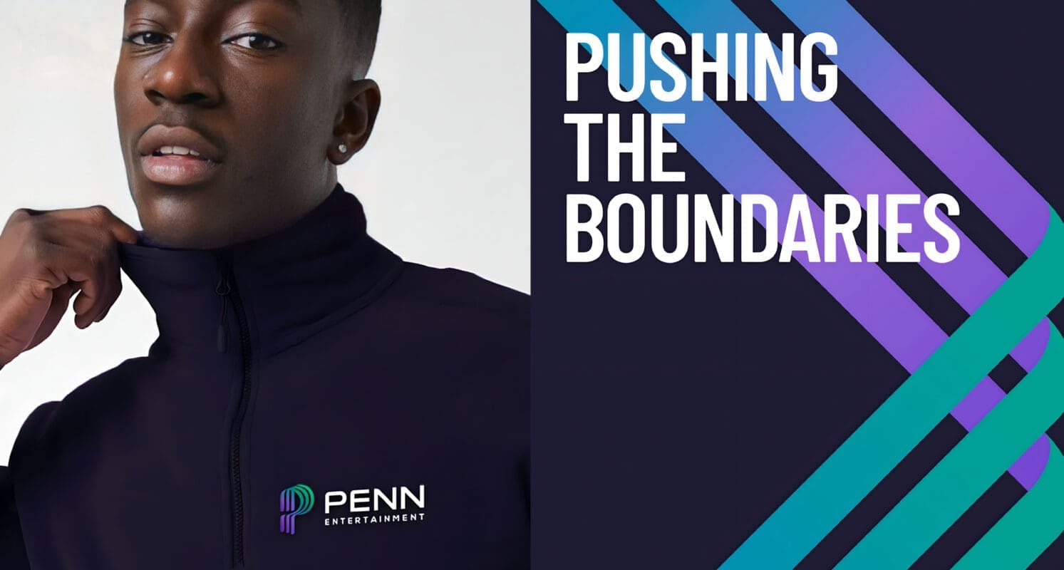
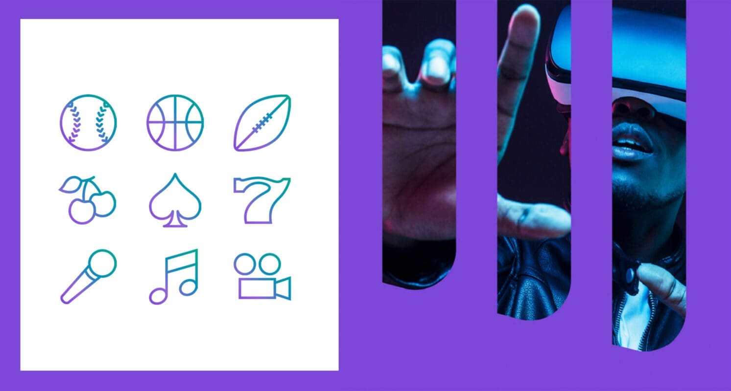
Finally, we helped communicate the new brand with a comprehensive launch, developing a concise narrative and high-impact visuals that introduce PENN’s unique identity, ambitions and strategies.  

Results

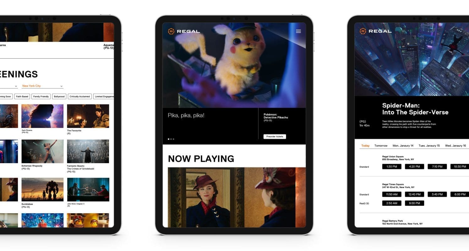
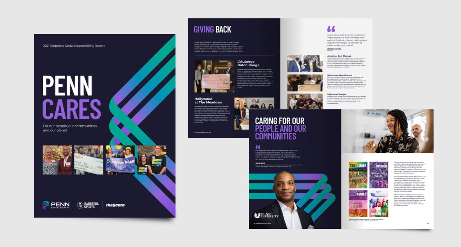
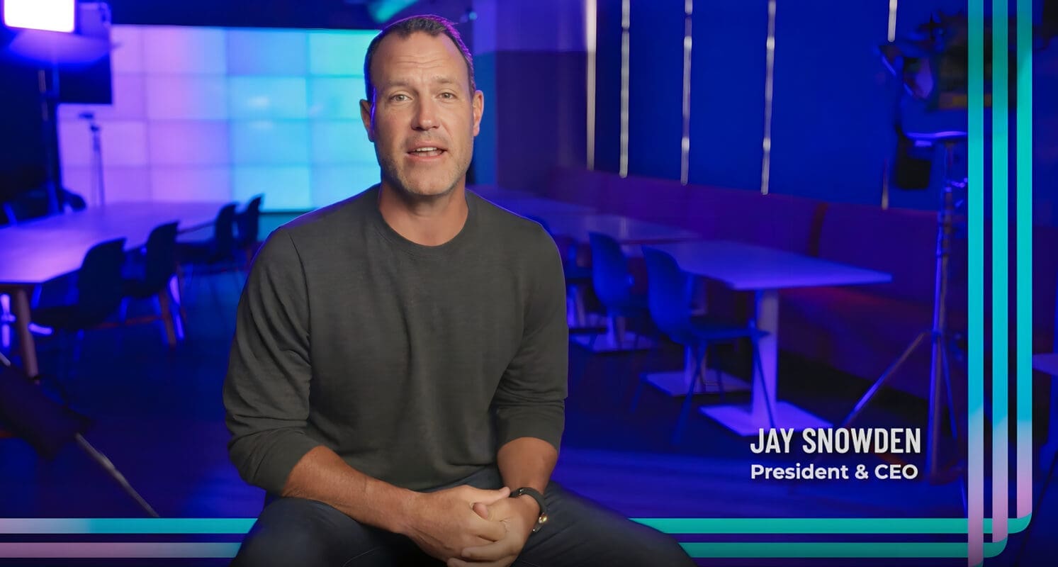
Thanks to this broad approach, Prophet helped bring PENN Entertainment’s new story to life with internal employee videos, workforce engagement, corporate development materials, a refreshed corporate website and investor presentations.   

The new corporate brand enables PENN to demonstrate its unique positioning and assets for employees, investors, partners and regulators as it moves forward in today’s fast-changing gaming and entertainment industry.  

“I’m so proud of the work… It feels like we’re finally telling our story in the right way.”

Jennifer Weissman
CMO

CASE STUDY

PENN Entertainment

Reimagining PENN Entertainment’s Loyalty Program

Challenge

PENN Entertainment had transformed itself from a regional casino operator into a modern omnichannel entertainment and gaming company. As part of that transformation, Prophet worked with PENN’s leadership team to redefine its corporate brand so that the organization could better communicate and connect with its employees, investors, regulators, partners and consumers.  

As a next step in the brand’s transformation, PENN partnered with Prophet to extend the new corporate brand to the customer experience with a reimagined loyalty program that could serve as the connector across the organization’s casinos, sportsbooks, and online gaming products.   

Solutions

First, we conducted qualitative research sessions with different consumer segments, which helped reveal that flexibility is essential to PENN’s target personas. We then crafted a new vision and value proposition to serve the organization’s key personas.   

After a series of naming and branding exploration exercises, we developed a new program identity and name for the loyalty program, PENN Play.    

To bring the new loyalty program to life, we interjected PENN Play’s new energetic visual identity and voice across digital and in-person touchpoints, including websites, email and social. From there, we developed and executed the multi-channel “Well Played” campaign, which centered on the idea that engaging with PENN Play today will reap future rewards.

As part of this campaign, we formulated a multi-phase communications strategy, delivered creative assets for all communications, helped transition social accounts, and partnered with a media agency to optimize the paid media strategy.  

Results

PENN Play’s launch and first month has exceeded historical performance. It has also impressed customers, boosting organic followers on Instagram, Twitter and Facebook. It’s driven new registrations and is increasing downloads of the app. And it’s given PENN Entertainment the connective tissue needed to strengthen the corporate brand and portfolio as it continues to build capabilities and acquire new offerings and customers. 

The campaign won a Silver at the 2023 W3 Awards in the Integrated Campaigns category.

Impact

+15%

web visits

+55%

app downloads

+20%

app active users

+15%

social media interactions

“We couldn’t be more pleased with how well the launch went.  Everything was smooth, connected and purposeful. There have been so many wonderful comments as I visit our properties, and the creative truly is a wow.”

Jennifer Weissman
CMO

CASE STUDY

NewStyle Media Group

Creating NSMG’s brand story to fuel future growth

Challenge

Established in 2015, NewStyle Media Group (NSMG) has grown quickly to span artist management, music publishing, record labels, TV/film production, merchandise and gaming. NSMG is on an exciting journey of growth with new intellectual properties, formats and capital.

In the industry, best-in-class entertainment brands focus on the customer, highlighting messages of inspiration, emotions, and resonance. Wanting to stand out in the crowded market across geographies, cultures and mediums, NSMG decided to partner with Prophet to reimagine its brand story and visual identity.

Solutions

Our team first developed a brand story that sits at the intersection of three factors: Company, Consumer and Category. Understanding NSMG’s unique ambition and capabilities in addition to its competitors and target audience, our team explored how to combine these elements to tell an inspiring brand story.  

We explored the unique capabilities of NSMG with the intention of introducing the world to unique Eastern culture and values. NSMG’s main audience profile was focused on passionate, bold and opinioned female Gen Zs who seek new and exciting things. To create messaging that resonated with the audience, we needed to gain a clear understanding of the brand’s audience and what they were looking for. We also researched best-in-class entertainment brands for inspiration to identify opportunities for differentiation.   

The new brand story articulated NSMG’s vision to connect audiences around the world with creative expression that is intrinsically human. We also established a new brand purpose – “Breaking barriers and bringing people together”.  

To help showcase their vision, Prophet then created the “New Wave Expression”. The “Wave” graphic connects to NSMG’s Chinese name Xin Pai (新湃), which means new wave or the uprising of NSMG. It is a visual interpretation of the sound NSMG is creating through music, film and media, while bringing it to the global audience.  

Results

Together, we helped NSMG revise its brand story with a refreshed visual identity. The rebrand helps NSMG accelerate its next wave of growth by amplifying a new wave of energy and movement to inspire and bring people together.

“We are very pleased to have worked with Prophet on what turned out to be a hugely successful project. The team had a thorough understanding of our needs and worked very hard to achieve our mutual goals. Prophet demonstrated both deep local insights and strong international expertise and impressed us with its agility in collaborating across different regional offices.” 

Mimzy Si
Former Senior VP, NewStyle Media Group

CASE STUDY

Mechanical Licensing Collective

Designing a portal experience to expedite royalty payments to music rightsholders

Challenge

If there’s one industry that’s been at the front lines of digital transformation, it’s the music industry. Today, digital streaming services like Spotify, Apple Music and Google Play put an entire universe of music at listeners’ fingertips but those innovations have also left music makers behind, exacerbating challenges in compensating music rightsholders.

The Mechanical Licensing Collective (MLC), a non-profit organization designated by the U.S. Copyright Office following the historic Music Modernization Act (MMA) of 2018, ensures that songwriters, composers, lyricists and music publishers receive their mechanical royalties from streaming and download services. To deliver on their promise of paying royalties accurately and expeditiously, the MMA and the MLC partnered with Prophet to design its user portal experience – engaging rightsholders and, for the first time in history, enabling them to manage their musical works within the MLC’s database.

Solutions

To ensure that we were meeting the needs of those target audiences, we took a human-centered design approach from the start. We conducted primary ethnographic research with future users that represented the diversity of the MLC’s membership, which included in-depth interviews with publishers and self-administered songwriters across multiple genres and geographies, to understand their daily routines, attitudes and work styles. We also conducted teardowns of tools that MLC members use every day to understand what design elements members preferred and determine what “great” looked from a real user’s perspective.

With those insights, we worked with the MLC to prototype and test different experience concepts. Much like music, experience design is a collaborative and creative process, so we engaged publishers and songwriters early and iteratively to “jam” on portal page designs and workflows, incorporating their feedback throughout our design process to create an experience that was as intuitive and seamless as possible.

As MVP design progressed, our team worked closely with the MLC’s development partner to bring the portal to life. Operating as an integrated team of designers, web developers and platform administrators, we created key portal features over multiple sprints and developed a living design pattern library to equip the MLC with a strong foundation for future releases.

Results

The MLC launched its portal in September 2020 to high praise for its design and usability. Since its launch, the MLC has registered thousands of users and now distributes tens of millions of dollars in mechanical royalties to its members every month. It has also built a strong team behind the portal, focused every day on optimizing the portal experience and adding and enhancing features that help its members “play their part.”

“Prophet shared our vision from the very start, dedicating time and acute attention to detail to develop a resource that sits at the heart of the MLC’s work and is crucial to serving our members and fulfilling our mission.”

Richard Thompson
CTO, The Mechanical Licensing Collective (MLC)

CASE STUDY

Regal

Evolving an entertainment icon

Challenge

Regal Cinemas, one of the leading movie theater chains in the U.S., turned to Prophet to change its brand identity to reflect its evolving theater experience. With an ever-expanding media landscape and entertainment channels to choose from, the Regal brand needed to communicate that their theaters were ‘The Best Place to Watch a Movie’.

Solutions

Prophet created the new Regal brand to have a connection back to the Regal crown of the past but viewed from a new perspective. The seven sides of the symbol tie back to the aperture of a movie camera and can easily live around the dynamic imagery associated with movies and entertainment. With a sleek wordmark and dramatic visual elements, the system was designed to unify messaging with visual design, allowing the brand to reflect the passion and energy of the movies and legion of movie fans.

With Regal Cinema’s preeminence in the marketplace, the brand name was also truncated to only Regal, to maximize impact and brand memorability.

Results

Prophet helped envision how the brand could be activated across touchpoints from the theater façade to concessions and the digital experience. The brand program was launched in December of 2018 and will be executed in all-new theater renovations throughout 2019.

In Nov. 2019, the Prophet team won a GOLD award for ‘Best visual identity from the travel, leisure and tourism sector at the North America Transform Awards.

Five Wins at the North America Transform Awards

CASE STUDY

The Wharton Center

Defining brand purpose for a performing arts center

Challenge

The Wharton Center at Michigan State University (MSU) is an important asset to the Lansing community. While its well-known for providing entertainment, its purpose is elevated by its support for the performing arts in the local community. The organization brings a unique spirit to Lansing but has recently struggled to demonstrate value to its constituents. While embarking on new programs poised to improve engagement and relevance within MSU, The Wharton Center found that its brand lacked focus – it needed to redefine its role at MSU and within the greater community.

Solutions

The Wharton Center looked to Prophet to help define its purpose and better position it within the extended local community. The Prophet team found that the brand’s purpose and promise were rooted in its core beliefs and reason for existing: to inspire the mind and move the soul by sharing stories, celebrating differences and creating a community through performance and education.

To demonstrate its newly discovered and defined purpose through its visual assets and media, Prophet created a new visual identity for the brand and an implementation plan. The brand evolution focused on the concept of putting “Art at the Center” – it reflects both the variety and dimensionality of the performing arts by using a dynamic logotype. Prophet also introduced representational shapes to add a unique flavor to the graphic system. These shapes represent that performing arts are always alive, moving and evolving through music, dance and variety.

Results

The revitalized brand purpose and visual identity helped The Wharton Center define and express its role within the MSU community. Each year, the Center impacts the lives of more than 30,000 young people, to help them find courage, foster boldness and embrace diverse perspectives. The organization is committed to shaping the world through performing arts and arts education; and sharing stories of its community–of dreams, heartbreaks, struggles and triumphs– and heritage for future generations.

This work received a gold award for key art and a bronze award for print collateral at the 2019 International Design Awards.

CASE STUDY

Formula E

Reframing a racing championship for an electrifying future

Challenge

The brainchild of Formula 1 supremo Alejandro Agag and John Todt, FIA Formula E is the world’s first fully-electric, single-seater racing championship. Developed as a means of accelerating the transition to sustainable mobility, its inception was splitting opinions across the racing world and beyond. Formula E engaged Prophet to creatively reframe the series, requiring a more relevant and distinctive proposition and visual identity to help widen the sport’s fan base and distance this progressive world player in the electric revolution from traditional motor racing.

Solutions

The answer was to stop trying to compete with Formula 1 and move the goalposts completely. By conducting extensive primary research, and specifically talking to fans, we honed in on the single big idea to make Formula E distinct and famous: electric street racing. “It was about taking a perceived shortcoming – the lack of noise and lower speeds – and turning it into a differentiator: being able to race in the heart of a city!” said the responsible partner at Prophet. “It’s bold, innovative, and highlights boundary-pushing electric performance in a way that better connects emotionally with mainstream and younger audiences who are attracted by this new, gritty form of motorsport and digital interactivity of the race.”

We then translated the spirit of the evolved Formula E brand into a more contemporary visual identity. Inspired by urban visual cultures – fly posters, street signs, road markings – we dramatized this gritty edginess by layering elements within the identity to create interruption, dynamism and energy, whilst a refreshed color palette moved away from the dated and expected toward one imbued with confidence and the power of electricity.

Results

This identity was the winner of two Transform Europe awards, two Transform APAC awards and was recognized within the Creative Review Annual as one of the best brand identities.

Beyond the clear positioning, smarter and sharper visuals and modernized logo, the award-winning new brand shed any outdated perceptions and helped Formula E to tell its story –  what Formula E is and what it stands for – in a distinct and exciting way.

Not only has the more compelling proposition drawn new spectators but it’s also attracted leading car brands to join the series, including BMW, Mercedes and Porsche, as well as iconic cities such as Hong Kong, New York and Rome, with more hotly anticipated in the coming year. With such established companies committing to the Championship, in the future city street racing won’t be perceived as a curiosity sport but a mainstream spectacle.

CASE STUDY

Funimation

Helping reinvent & remarket a next-generation entertainment studio

Challenge

Funimation, the leading anime distribution company in the world, wanted to make the transition from an analog DVD business to a digital-first, streaming-driven company. To succeed with their next wave of enterprise growth, the company knew they needed to take on today’s increasingly digital entertainment landscape with fresh products, and a new approach to how they went to market amidst a rapidly changing landscape and consumer fan base.

Solutions

We started by refreshing their traditional segmentation with a digital-first lens to better understand how their consumers engage and interact with brands, fellow fans and media in the online space. Development of digital profiles provided a more detailed perspective of digital behaviors, informing the customer experience journey, value proposition and go-to-market strategy. Based on what we learned from research, Prophet refined the brand positioning, grounding it more substantially in fans’ insatiable appetite to discover extraordinary anime content.

We designed a fan-first digital value proposition anchored on flexibility and customization – a highly differentiated position in a crowded anime market. This new model entirely reshapes product, pricing, content and community.

Prophet then drafted new customer experience journeys by identifying the target audience’s needs and pain points throughout, with an eye towards addressing key gaps. Each phase of the experience inspired signature product and experience offerings that brought the value proposition to life. The various experience touchpoint and offering ideas were prioritized based on technical feasibility and business impact. Experiences and ideas were codified and prioritized based on both technical feasibility and business impact. We worked with management and media teams to estimate revenue impact, design a marketing plan, including a revamped social strategy.

Results

Our project culminated in the development of a digitally-driven go-to-market plan and detailed roadmap and actionable playbook, which is enabling staff and repositioning Funimation and strengthening their lead in the streaming anime market. Funimation achieved its company subscriber goals, paving the way for its recent acquisition by Sony for $143mm.

Your network connection is offline.

caret-downcloseexternal-iconfacebook-logohamburgerinstagramlinkedinpauseplaythreads-icontwitterwechat-qrcodesina-weibowechatxing