CASE STUDY
Electrolux
Refreshing a global icon and modernizing the brand
Challenge
Electrolux is on a journey to become a world-class consumer marketing company – but the brand’s visual identity felt out of date and undifferentiated. Electrolux worked with Prophet to create a visual platform that modernizes the brand and stands out in the market.
Solutions
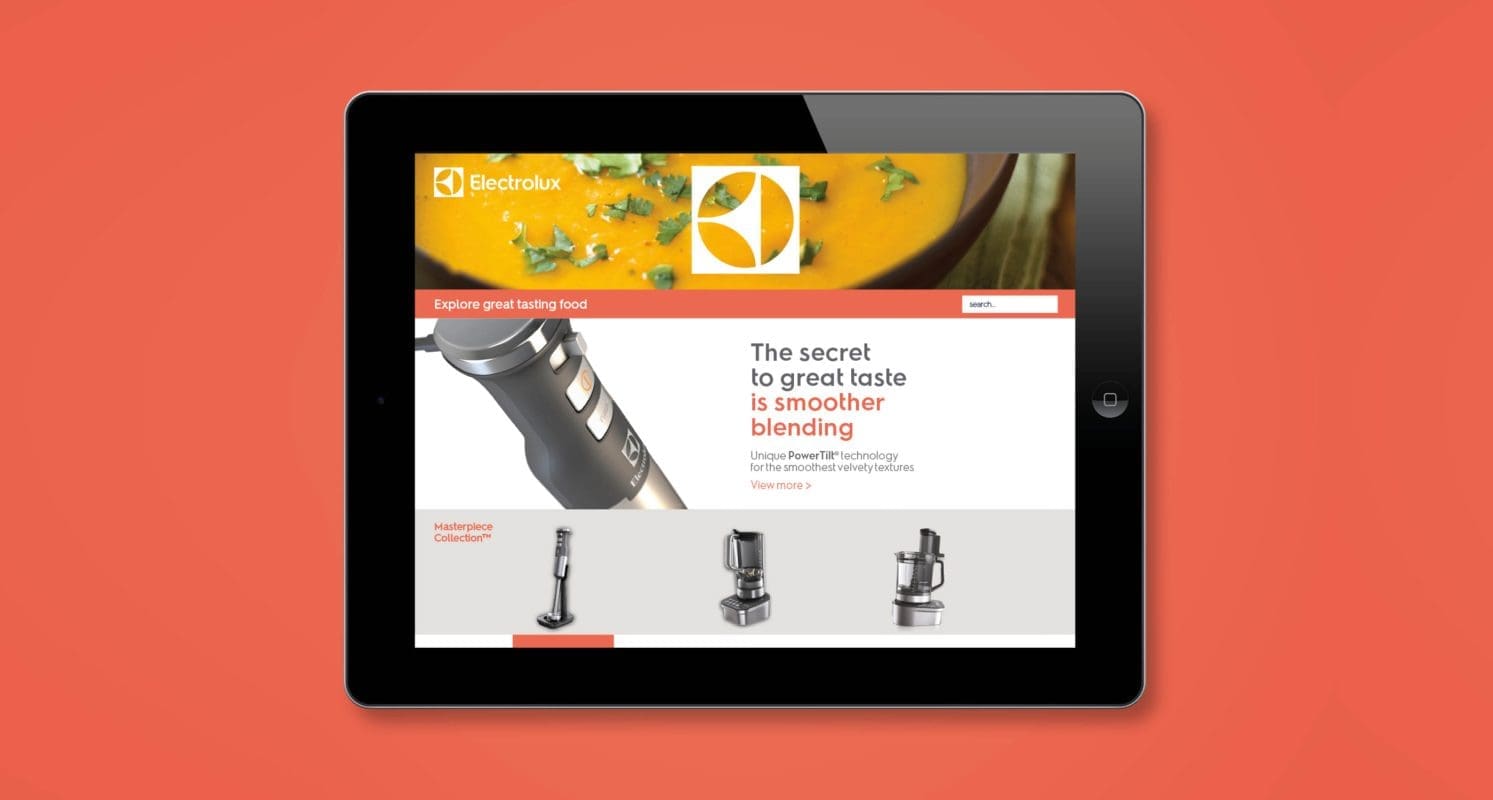
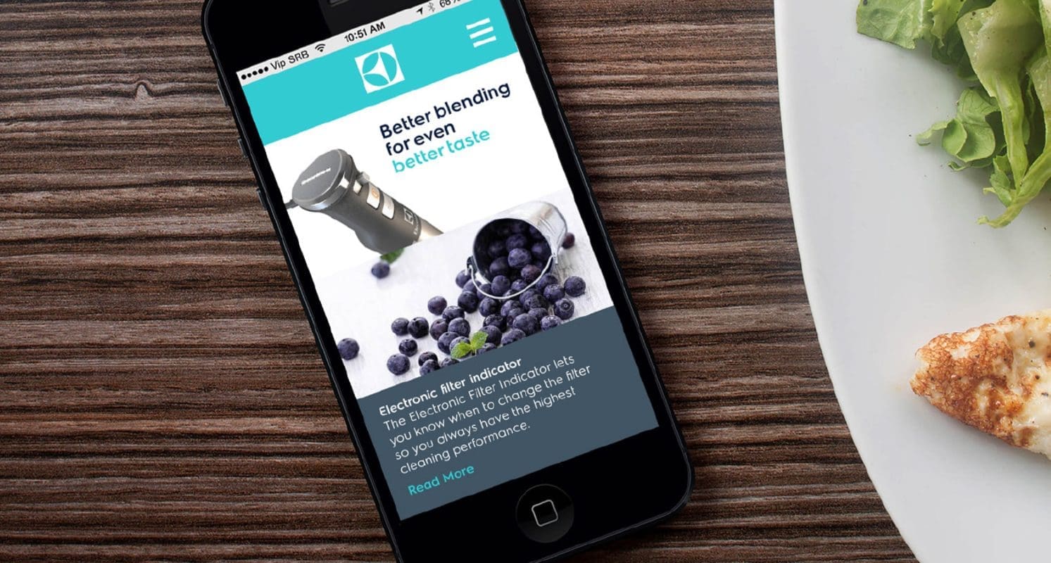
Equipped with a deep understanding of Electrolux’s consumers, resulting from a long-standing partnership, Prophet worked with Electrolux’s team to build a brand identity that would appeal to consumers on an emotional level. A key insight led to the idea; consumers want to see the benefit of a product not just the features – a beautifully poached egg, a pile of soft, fluffy towels or a perfectly crisp white shirt.
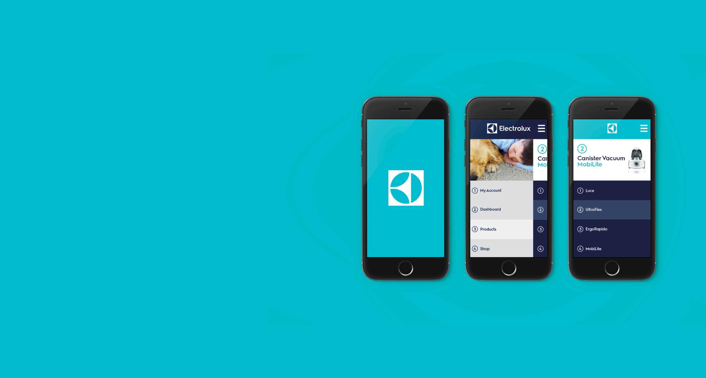
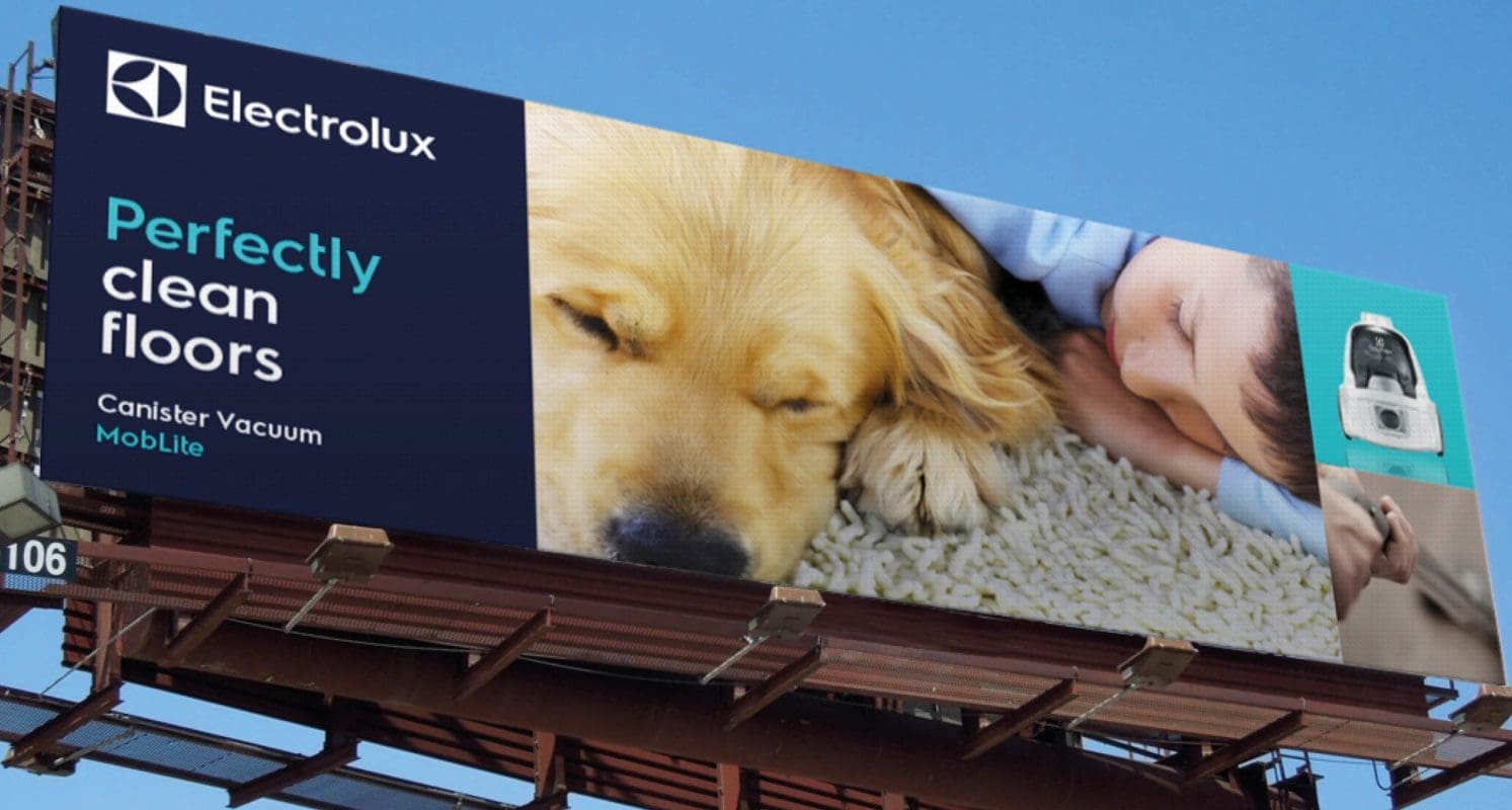
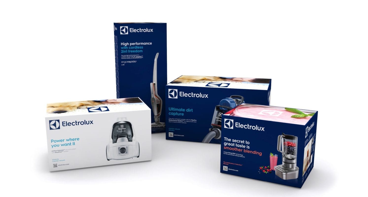
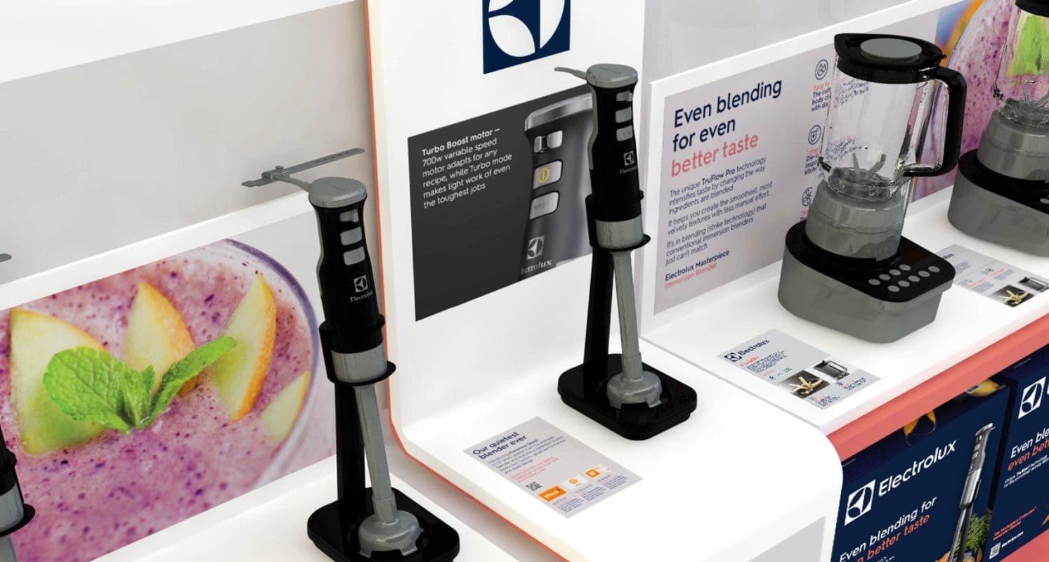
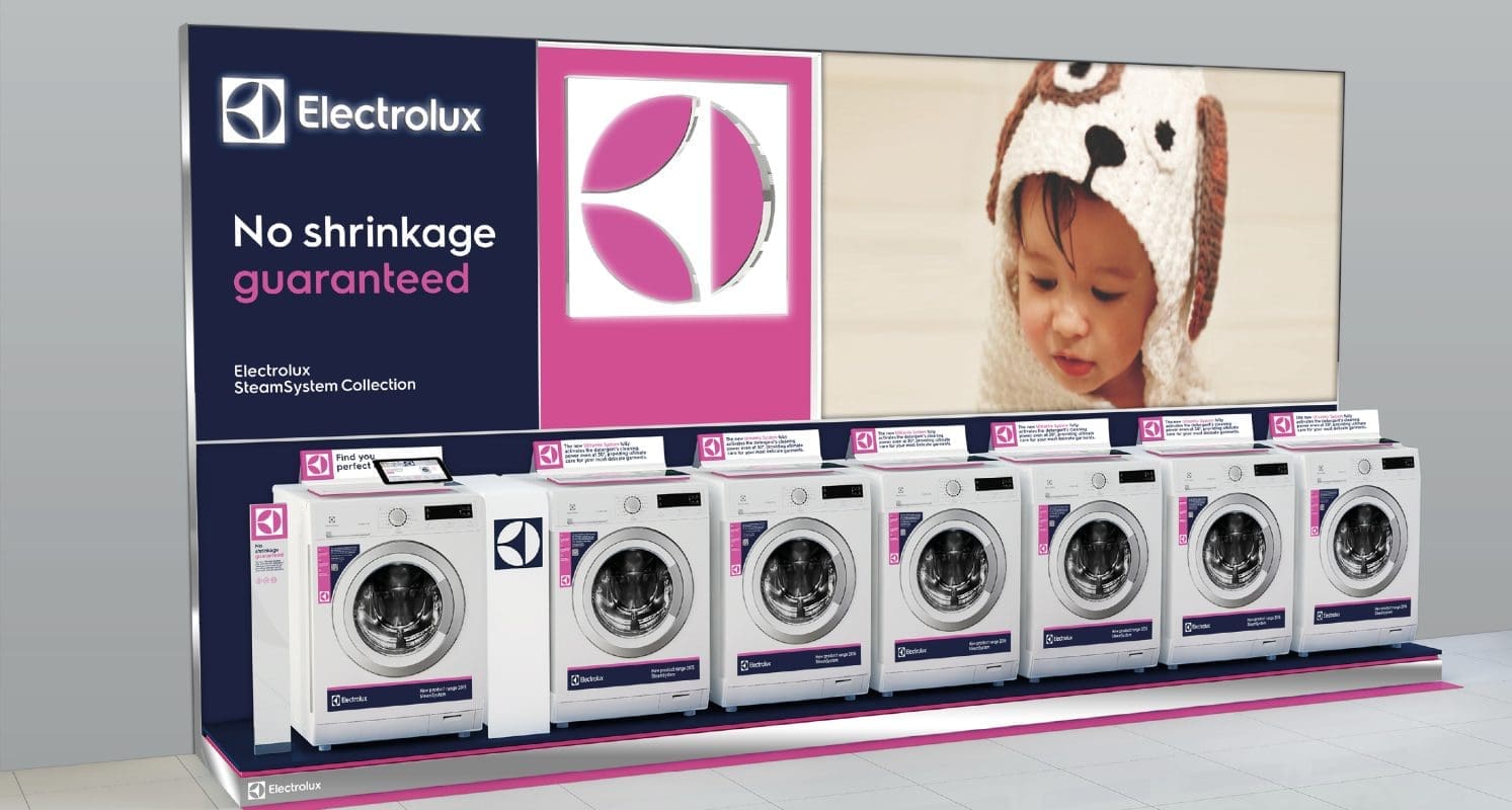
Each aspect of the identity was modernized. The logo was stripped of superfluous shapes and the tagline, maximizing its visibility and impact. The font was updated to a custom, modern sans serif, echoing the shapes in their iconic brand symbol. The symbol was given a new lease on life, creating stopping power wherever it is encountered. The letters in the logo were extended into a custom brand typeface, creating a look that is distinctive in appearance on anything from billboards to product stickers. Their core color blue was darkened to have a more premium and modern appeal supported by a palette of bold, vivid colors that will stand out in busy retail environments.
Results
The new visual identity has been embraced by all corners of the organization and will change the way customers interact with Electrolux – in-store, online, on packaging and through mobile devices.
Read more about Electrolux’s redesign in Design Week, Creative Blog and Little Black Book. In the period after activation, Electrolux saw sales in North America grow by 2.2%, and margins increase by 3.9%.