CASE STUDY

JetBlue

Sending an iconic airline and true challenger brand soaring into the future  

Challenge

JetBlue, a prominent U.S. airline, was founded with the grand ambition of challenging other established carriers. Based on the promise of excellent, affordable service, JetBlue consistently offers customers a better way to travel. 

Despite being known for its distinctive wit and irreverent spirit, the company’s visual identity had grown tired, having travelled a few too many miles without a meaningful rebrand since its initial launch. JetBlue no longer reflected how its employees and travellers saw the carrier, nor did it capture what made the brand special. To address this, JetBlue engaged Prophet to refresh its brand and better reflect its competitive edge in the airline industry.   

Solutions

We evaluated each touchpoint in the JetBlue experience, assessing the airline’s existing identity and market positioning. Initially, our focus was on re-energizing JetBlue’s day-to-day marketing communications. However, through close collaboration with the JetBlue team, it became clear that a more comprehensive approach was needed.

Our scope expanded, and we embarked on crafting a holistic vision for the brand’s future. Together, we developed and launched a completely revitalized JetBlue brand identity. 

Our scope expanded, and we embarked on crafting a holistic vision for the brand’s future. Together, we developed and launched a completely revitalized JetBlue brand identity. 

Results

The ambitious rebranding initiative has positioned JetBlue for its next stage of growth and demonstrates its ongoing dedication to innovation. Entering a transitional year with an invigorated visual identity, this strategic shift has already led to increased customer interest and conversion. JetBlue continues to challenge industry norms, redefining what customers can expect from a cost-conscious airline. And this differentiating spirit is now beautifully reflected in the new brand identity and the plane liveries. 

Re-asserting JetBlue’s challenger spirit

Our idea centered on a core truth at the heart of the brand: its challenger spirit and character. Every creative decision was made to vividly bring this unique personality to life. 

“JetBlue’s brand is synonymous with irreverence and personality, yet its identity wasn’t fully embodying these traits. Our mission was to bring this back at a time when the company was preparing itself for its next stage of growth.”  

Andres Nicholls 
Global Executive Creative Director  
Prophet

An expression of joy

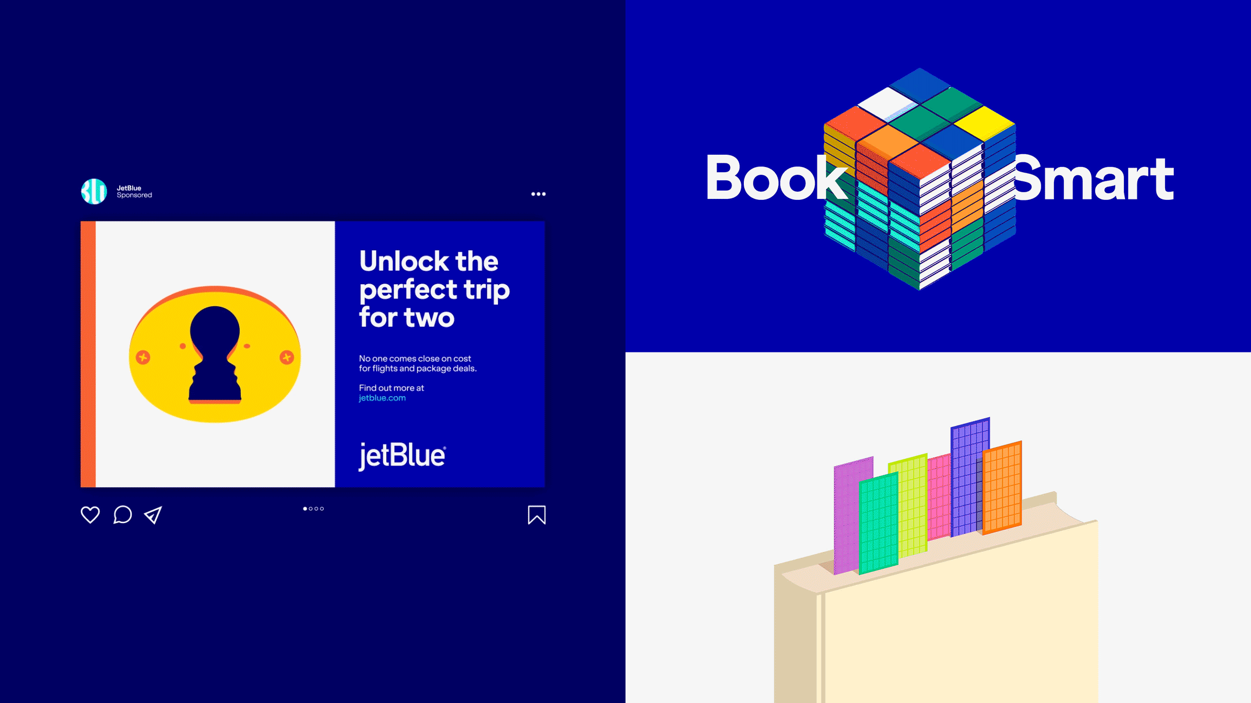
A joyful, fun and contemporary brand expression came together through an enhancement of their colour, type and imagery. A system that gave the brand flex and the ability to play, delivering genuine brand moments that put a smile on customer’s faces.

Wit, positivity and plenty of carry-on character

Tone of voice has always been a key differentiator for JetBlue. We meticulously crafted every element of the visual identity system to amplify that voice. It’s designed to be flexible and seamlessly adapting to the practical requirements of each touchpoint, ensuring the effective delivery of JetBlue’s distinctive writing style. From the typeface to the color palette and copy, every aspect communicates with humor, capturing JetBlue’s youthful energy and positivity.

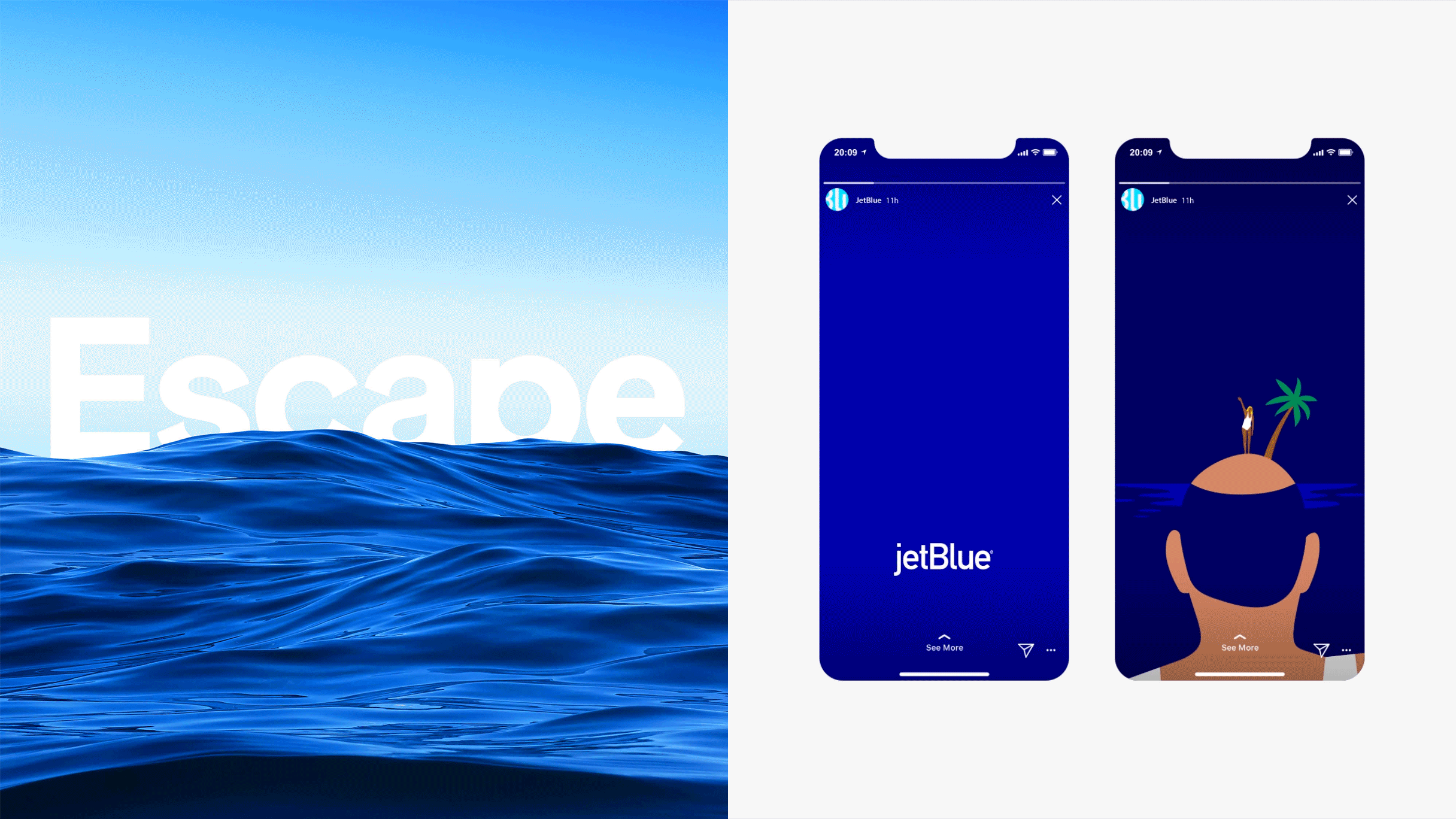
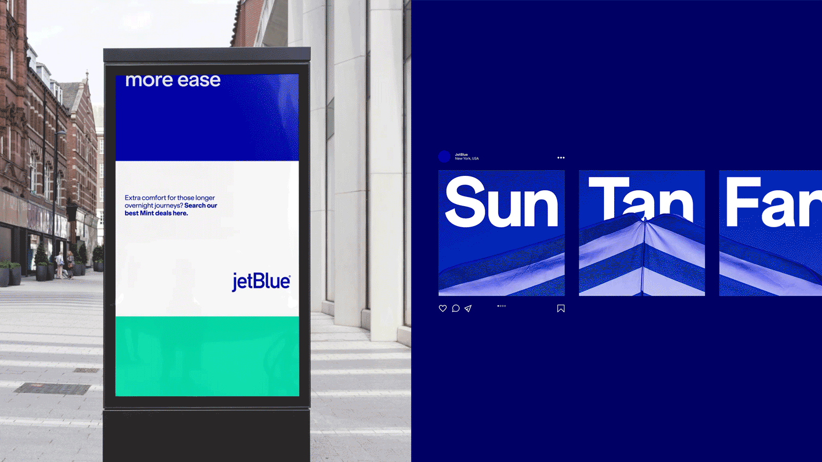
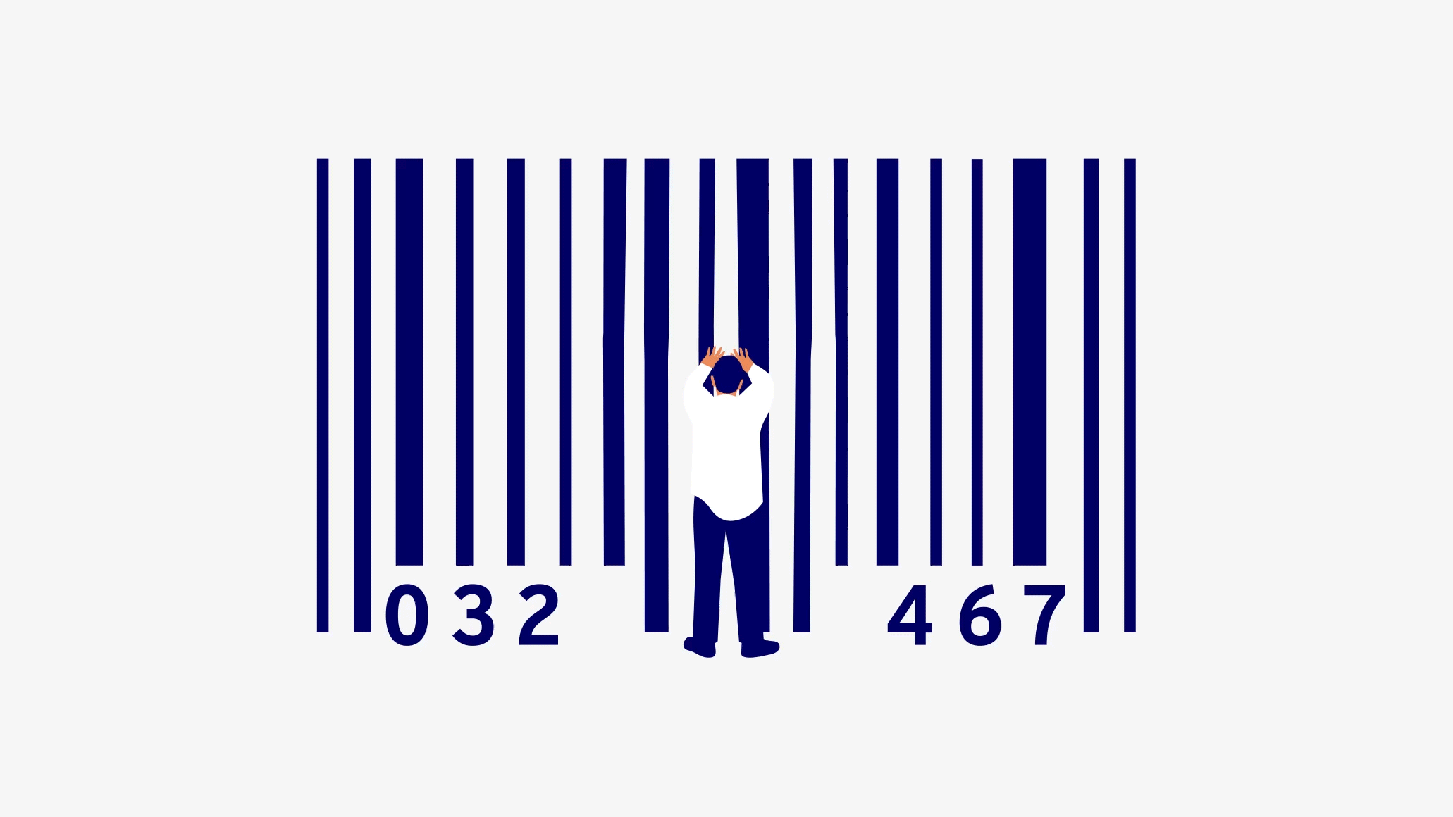
Illustration that tells a story 

Collaborating with Ben Wiseman, we crafted playful illustrations that narrate travel stories and provide imaginative perspectives. Ranging from the whimsical to the extraordinary, they express concepts that can’t always be captured through photography alone – providing yet another way for JetBlue to stand apart from the crowd. 

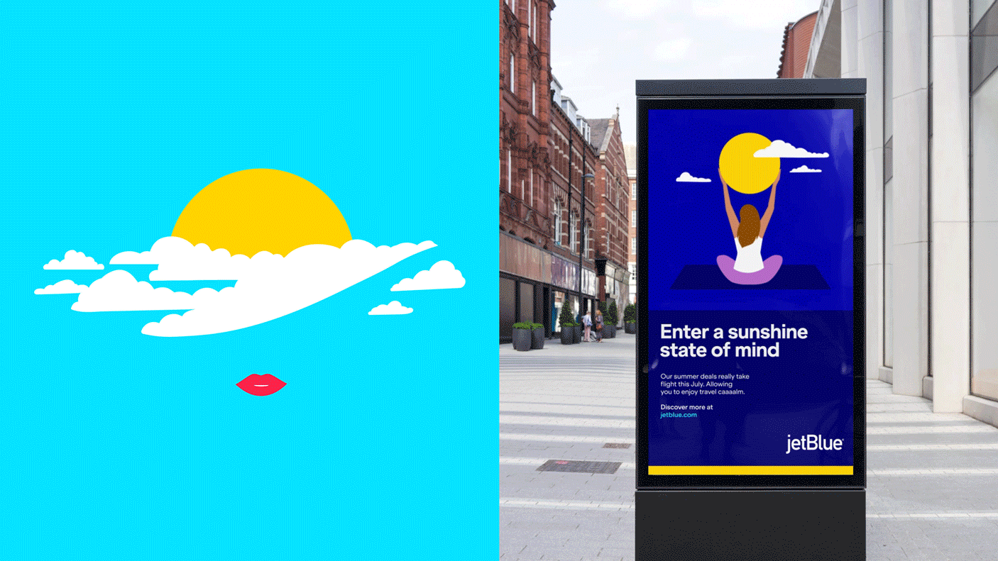
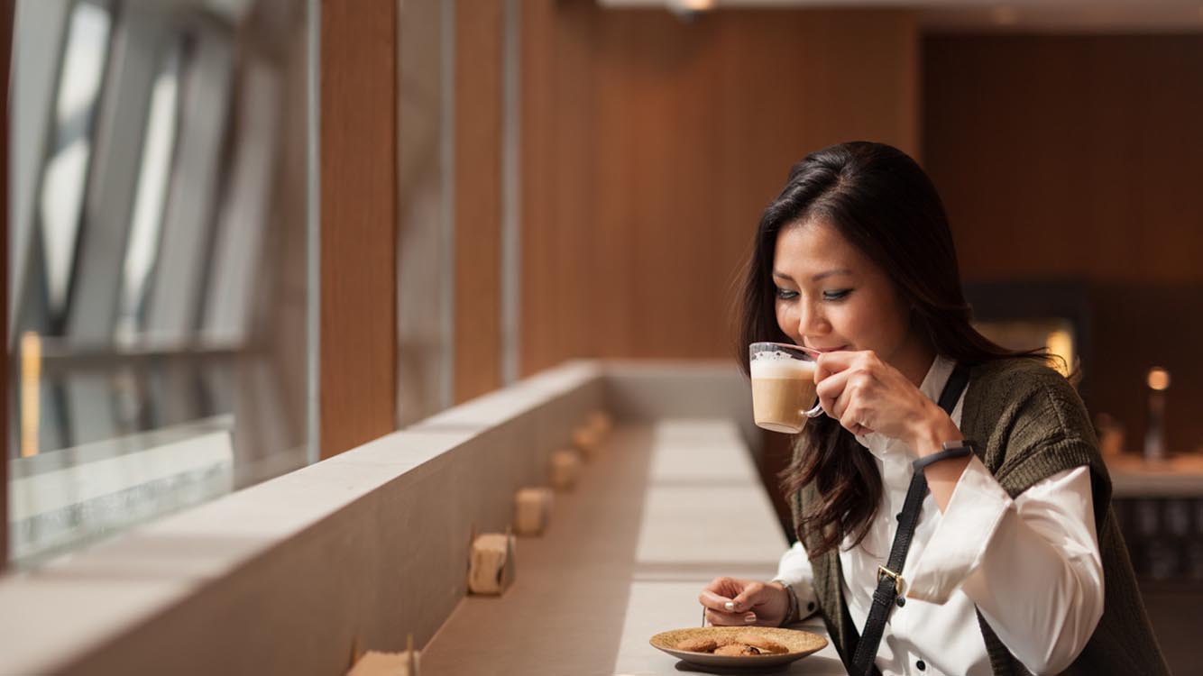
Imagery captures moments we love 

We’ve all encountered the typical, overly polished destination images. Our approach was to capture those authentic micro-moments that resonate with customers. By keeping imagery simple, subtle and uncluttered, our marketing becomes more relatable – without falling into clichés. 

Created to drive impact 

JetBlue’s new designs aim to turn heads, make a statement and elevate every moment of the experience. Setting an ambitious vision from the outset, Prophet and JetBlue have reshaped the brand expression into one that honors the past while preparing the carrier for its next phase of growth. The rollout continues across many of JetBlue’s primary marketing and communication channels.

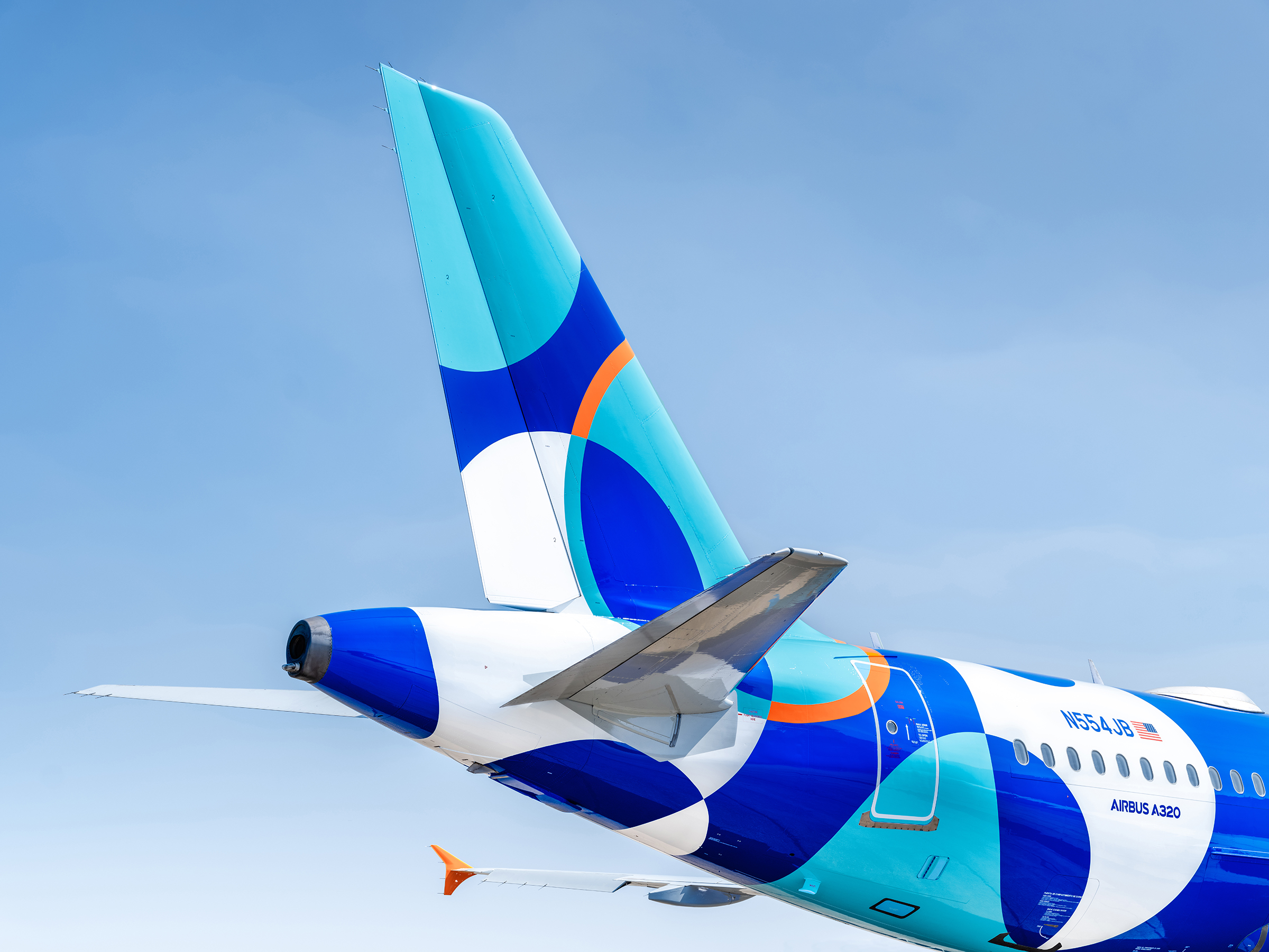
Reimagining JetBlue’s liveries  

The project also evolved to include a redesign of JetBlue’s commercial livery. The reimagined identity and updated livery honor JetBlue’s legacy by retaining recognizable tailfin patterns, now extending beyond the tailfin to envelop the entire rear fuselage, ensuring maximum brand impact, visible both in the skies and at the gates.  

“Opportunities like this don’t come around very often. Guiding transformative change for an iconic brand like JetBlue, working so closely with their team, has been a privilege. The company is on an exciting journey and being part of it has been a phenomenal experience.” 

Chris Benson 
Associate Creative Director
Prophet

Launching JetBlue to the world  

The first of the new designs took flight in the second half of 2023, heralding the beginning of JetBlue’s fleet-wide transformation. We’re proud of how we helped make the fleet bolder. Bluer. Newer.

CASE STUDY

China United Airlines

Transforming the brand experience to new heights and journeys abound 

Challenge

Following a merger and transformation to position itself as a mass-market and low-cost airline in 2014, China United Airlines (China United) achieved rapid business growth, transporting over 10 million passengers every year. As one of the first airlines to be relocated to Beijing’s Daxing Airport, China United has maintained exceptional operations that ensure high quality and safety, reaching all four of its key objectives. China United’s successful launch at the Daxing Airport marks a new chapter of its journey as a key player in China’s aviation industry. 

Striving to provide its customers with diverse and affordable flight options, China United continued its transformation through its data strategy and product innovation. With this ambition, the airline wanted to further inject energy and momentum into its brand, propelling the company to elevate its passenger experience. 

To achieve its vision of becoming a trusted and preferred airline by all stakeholders, China United partnered with Prophet to refresh its brand identity and end-to-end customer experience. 

Solutions

Our team set out to create a distinctive and ownable brand identity for China United. We began by diving into the unique brand DNA and uncovered two distinctive equities:  

  • Diversity: China United brings people together with diverse travel destinations and experiences, giving travelers a variety of choices and options to make their journeys special. 
  • Energy: From past to future, China United is constantly evolving for the betterment of our communities, passengers, and employees, thanks to its collaborative and efficient culture. 

Prophet translated these unique equities into a brand-new design direction “Evolving travel”. Building upon the design direction, we crafted a new brand logo with a kinetic logomark and its Chinese logotype. We also curated a distinctive brand palette and typographic style, developed a travel photography style fused with the warmth and romance of magic hours, and created a series of applications throughout the passenger journey. The brand’s fresh visual identity expertly uses dynamic lines to capture the vibrant energy and fluid motion of the China United brand. 

Prophet translated these unique equities into a brand-new design direction “Evolving travel”. Building upon the design direction, we crafted a new brand logo with a kinetic logomark and its Chinese logotype. We also curated a distinctive brand palette and typographic style, developed a travel photography style fused with the warmth and romance of magic hours, and created a series of applications throughout the passenger journey. The brand’s fresh visual identity expertly uses dynamic lines to capture the vibrant energy and fluid motion of the China United brand. 

Results

Our work to transform the China United brand supercharged the airline’s ambition to offer a world-class end-to-end customer experience, breathing new life into the passenger journey. From new check-in experiences to new inflight amenities and captivating livery designs, the dynamic visual identity enables China United to create more delightful moments for its customers and employees.  

Creating the New Brand Logo

The new brand logo is designed based on the alphabet “C” for China United Airlines. The sleek contours of the letter “C” embody the excitement and thrill of takeoff, symbolizing the wings of boundless freedom in flight. The use of dynamic, circular lines not only signifies a continuous journey but also represents the spirit of exploration and innovation that drives the airline forward, capturing the essence of China United’s commitment to delivering exceptional travel experiences. 

Defining Distinctive and Impactful Brand Colors

In a departure from conventional industry norms, our selection of high contrast and saturated colors brings a fresh and distinctive allure to the brand. This unconventional palette injects life into our design, leaving a lasting impression that is both impactful and unmistakably unique.  

Transforming the End-to-End Passenger Journey

We helped to prepare for the application of the new visual identity throughout the passenger journey from online to offline (O2O), ensuring a unified brand experience, creating a cohesive and elevated visual language across the touchpoints. 

Constantly Evolving 

China United is dynamic and continually evolving. From its past to its future, transitioning from a low-cost airline to a world-class economy carrier, Prophet has helped China United in its constant evolvement for the benefit of society, passengers, and employees. 

Discover More 

In the bustling Beijing Daxing International Airport, China United proudly serves tens of millions of passengers with exceptional quality. Prophet played an important role in infusing visual experiences and thoughtful touchpoints that seamlessly guide and delight customers throughout their journey with China United. 

“The upgraded brand logo and visual identity of China United Airlines have imbued the organization with renewed energy and momentum, driving us to constantly improve our services in order to create wonderful travel experiences for our passengers.” 

China United Airlines

CASE STUDY

Turkish Airlines

Launching a delightfully different experience

Challenge

Turkish Airlines had doubled its yearly passenger load, revenue skyrocketed from $2.33bn to $11.4bn, and the carrier had been crowned Europe’s best airline 3 years in a row. In an industry plagued by bankruptcy, consolidation and government bailouts, Turkish Airlines wanted to build on this momentum and compete with airlines having larger destination networks, newer planes and higher recognition.

Solutions

We started by learning about the ambition and business strategy of Turkish Airlines, which was to draw more international transfer passengers into Istanbul and better compete with other transfer hubs in the region. In parallel, we started to build a picture of how the aviation industry might evolve in the future. Through that research, we learned that cities were an important piece of the strategy, as increased urbanization is leading to more air travel.

We realized that Turkish Airlines had the opportunity to highlight its urban credentials, in particular Istanbul, a city with a rich heritage and a modern, vibrant and entrepreneurial community. Istanbul is a place of contrasts, and compared to the cities of competitor airlines from Dubai, Abu Dhabi and Doha this was a huge differentiator.

Results

We created a unique customer experience and brand identity for Turkish Airlines around the idea of being “Delightfully Different” involving every part of the customer journey before, during and after the flight. We created moments that surprise and delight; whether it’s serving traditional Turkish coffee and tea at 35,000 feet with Flying Chefs or making the arrival lounge at Ataturk Airport as special and relaxing as the flying experience. Our ambition was to create memorable occasions that reminded passengers why Turkish is different.

We developed briefs using the new positioning for a new visual identity and corporate design, advertising, PR and digital campaigns, along with sponsorship opportunities for the brand. The rollout of the new concepts began with a new advertising campaign featuring Kobe Bryant and Lionel Messi (already viewed over 140 million times on YouTube) and the launch of the new in-flight catering concepts.

Turkish Airlines continues to soar. Since the launch, passenger numbers increased 24%, revenue 28% and operating profit 12%. In the often-turbulent business of airlines, that’s some Delightfully Different news we can all toast to.

Impact

24%

more passengers

28%

increase in revenue

12%

increase in operating profit

CASE STUDY

Cathay Pacific Airways

Driving true customer loyalty

Challenge

Cathay Pacific has long been known for delivery of exceptional customer service and experiences, voted “World’s Best Airline” more times than any other. However, they found that their loyalty program, Marco Polo Club, was outdated. Passenger recognition and reward were based on sectors and miles flown system that was not properly recognizing the contribution from fares that passengers paid.

The rewards and benefits offered by Cathay Pacific were out-of-sync with passenger value and competitor customer loyalty programs. This resulted in a missed opportunity to create stronger loyalty and patronage – particularly for leisure and family travelers. Our challenge was to help Cathay Pacific better understand its customer base and create a program that would drive share of wallet and desired behaviors – and ultimately bring balance back to the loyalty equation.

Solutions

Prophet helped by improving the fairness and transparency of the Marco Polo Club. We revisited program benefits to determine which would align with Cathay Pacific’s customer-oriented nature and how they could offer other unique and inspiring loyalty benefits.

We aimed to create a long-term, sustainable solution for Marco Polo Club by employing a “parallel-path” approach:

  1. An analytical investigation using over three million customer transactions.
  2. Ideation of key benefits for each program tier to identify what matters most for different customer types.

The synthesis of creative insight and analytical modeling informed the final Marco Polo Club redesign – new program tiers supported by business cases to help Cathay Pacific bring the new model to life.

The revamped scheme uses club points to replace club miles and sectors, providing benefits and a customer experience more accurately aligned with customer profiles. Points are based on a combination of fare class, cabin and distance flown; and the program offers the most valued benefits for lower tiers plus additional benefits for elite members.

Benefits span the customer experience, from reservations to check-in and baggage, to lounge access and more. There are new rewards for mid-tier customers such as additional companion benefits, and a renewed sense of exclusivity for their most high-value customers.

Results

Cathay Pacific rolled out its new strategy and believes the redesigned loyalty program allows optimal rewarding of its most valuable customers while providing the most important benefits to today’s frequent flyers.

Your network connection is offline.

caret-downcloseexternal-iconfacebook-logohamburgerinstagramlinkedinpauseplaythreads-icontwitterwechat-qrcodesina-weibowechatxing