CASE STUDY
Internet of Production Alliance
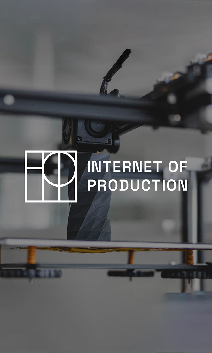
Branding a nonprofit revolutionizing mass production for all
Challenge
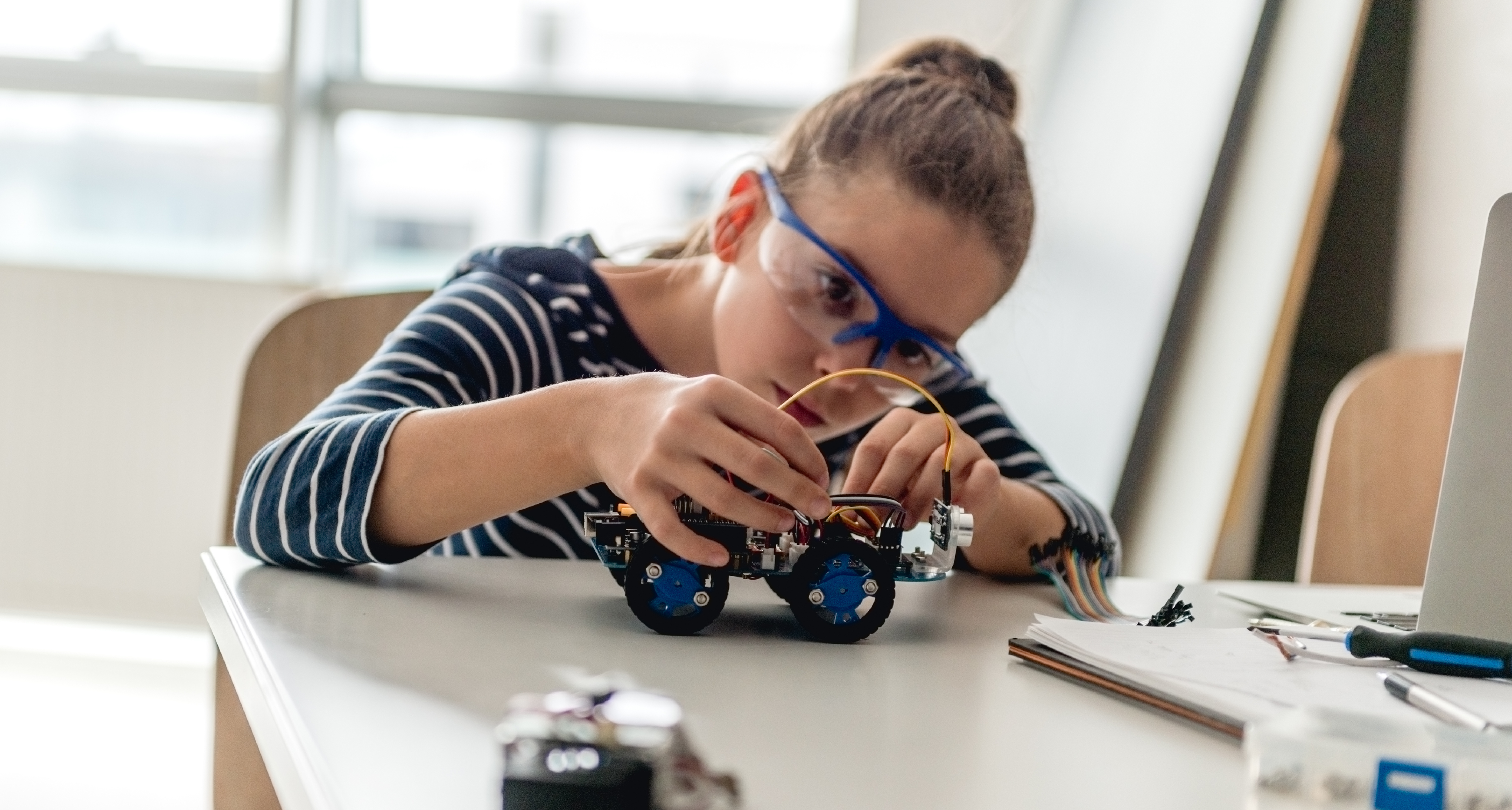
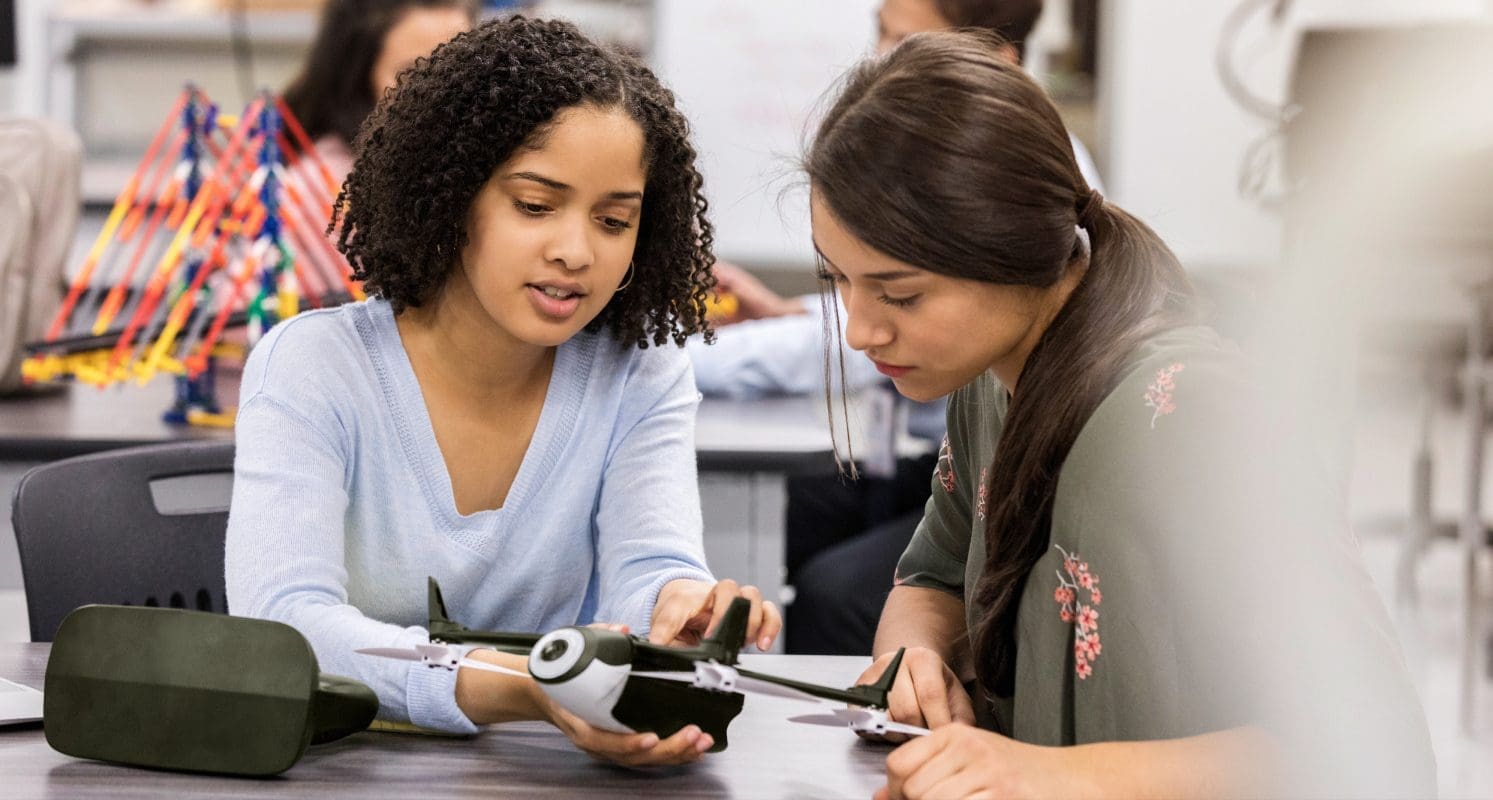
In a rapidly globalizing, tech-driven world, traditional mass production systems are falling short: they’re too complex, slow, inflexible and damaging to the environment. The Internet of Production Alliance, a nonprofit organization, aims to revolutionize this space by transitioning to a decentralized production model — one that empowers individuals to produce goods locally and sustainably. By bringing together innovators, entrepreneurs, engineers, academics, makers, manufacturers, designers and NGOs, the Alliance envisions a transition from mass production to production by the masses. These open, accessible, and decentralized systems will allow people to produce whatever they want, wherever they want.
It’s a complex mission. The organization required a compelling brand strategy to rally members internally and create cohesion. And it needed to effectively communicate this extraordinary vision to external audiences, attracting partners and donors.
Solutions
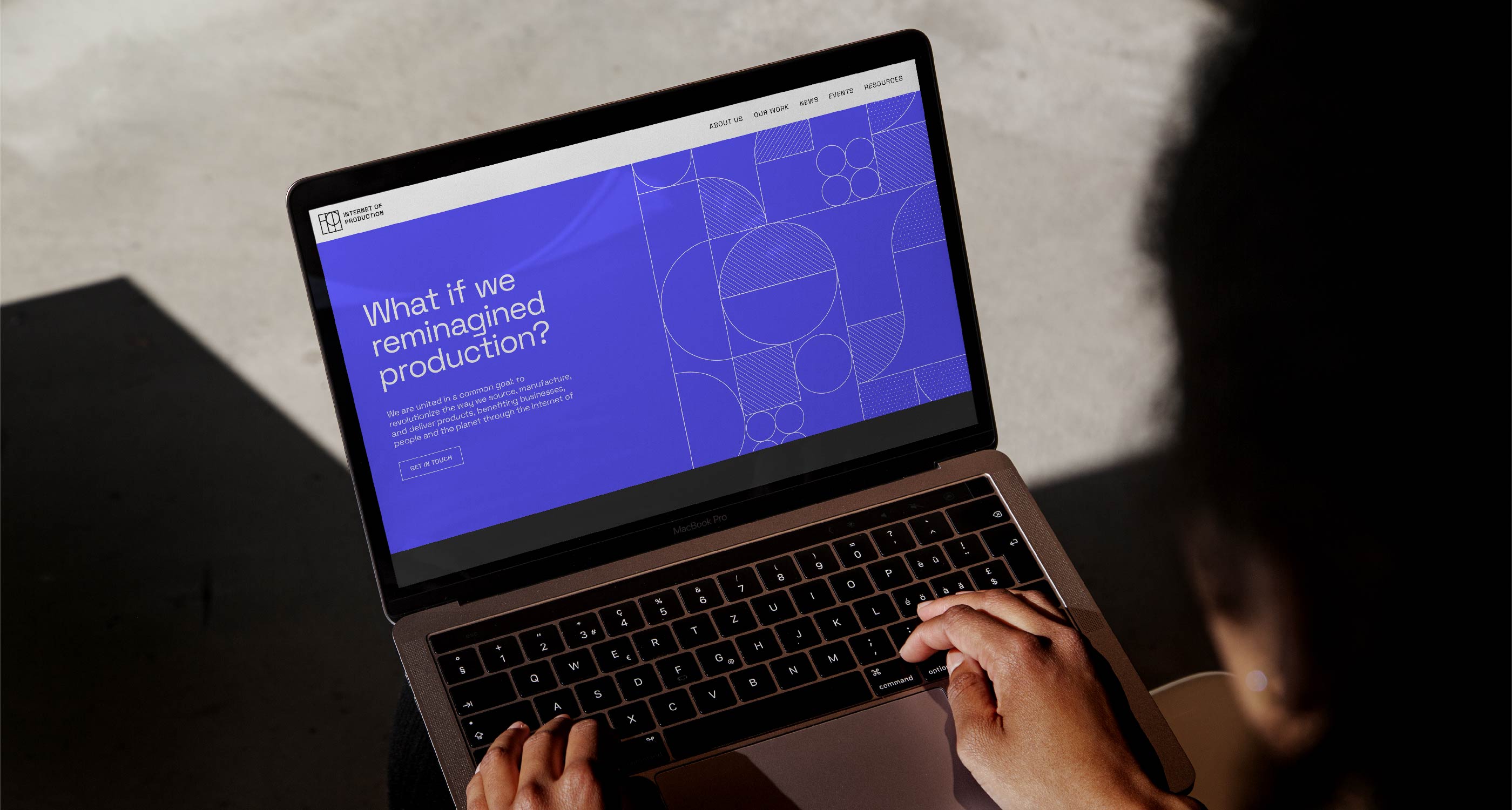
Prophet moved fast. In just 12 weeks, we consulted with their key stakeholders and developed a brand positioning strategy that rallied members around a shared vision: a future where everyone can contribute to the production of physical goods. We highlighted how the Internet of Production uniquely delivers its brand promise by harnessing the transformative potential of decentralized production, benefiting businesses, individuals and the planet. The positioning was brought to life through tone and messaging recommendations, enabling alliance members to communicate effectively, show up as a united front and build equity in the new brand.
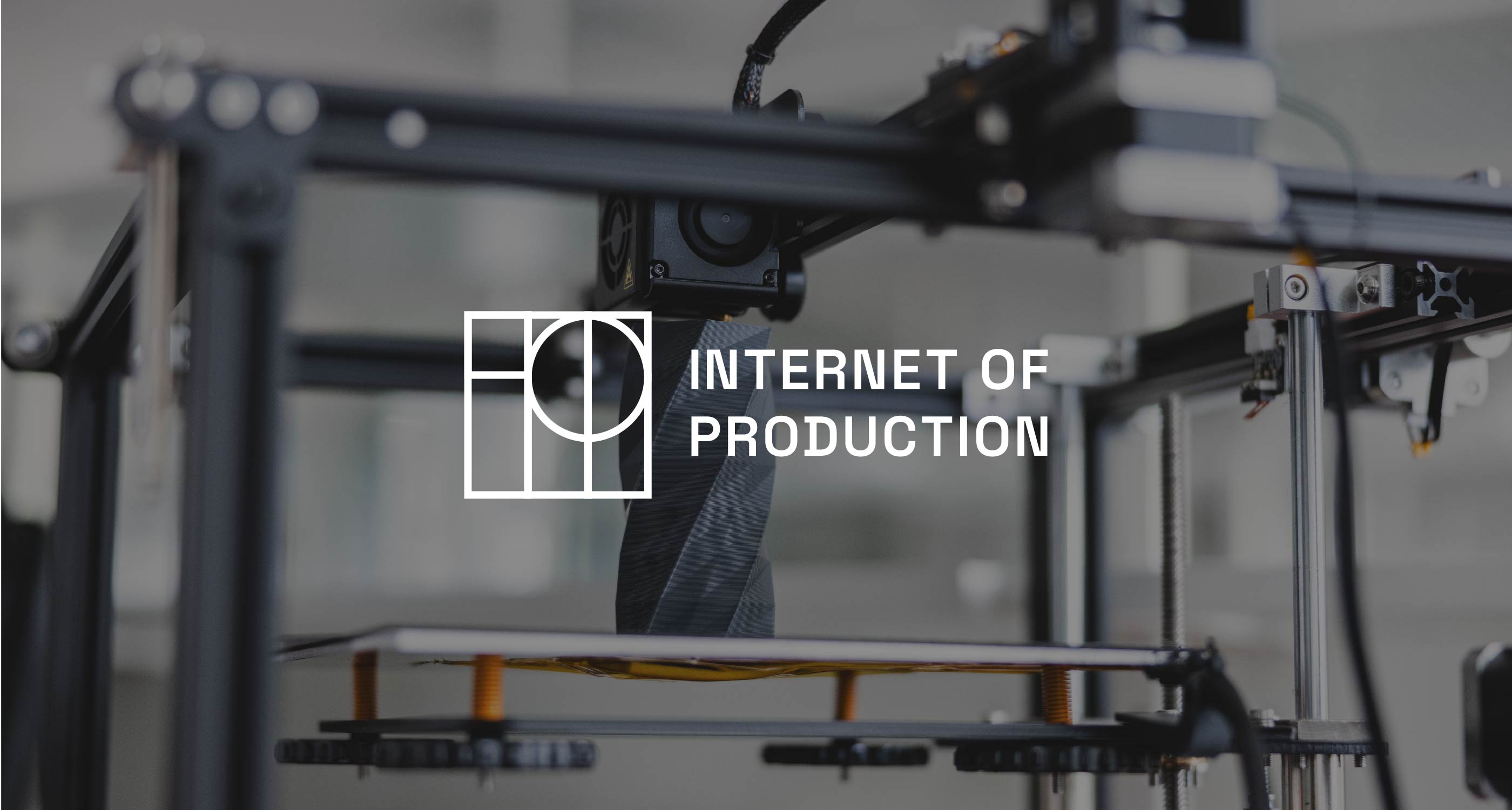
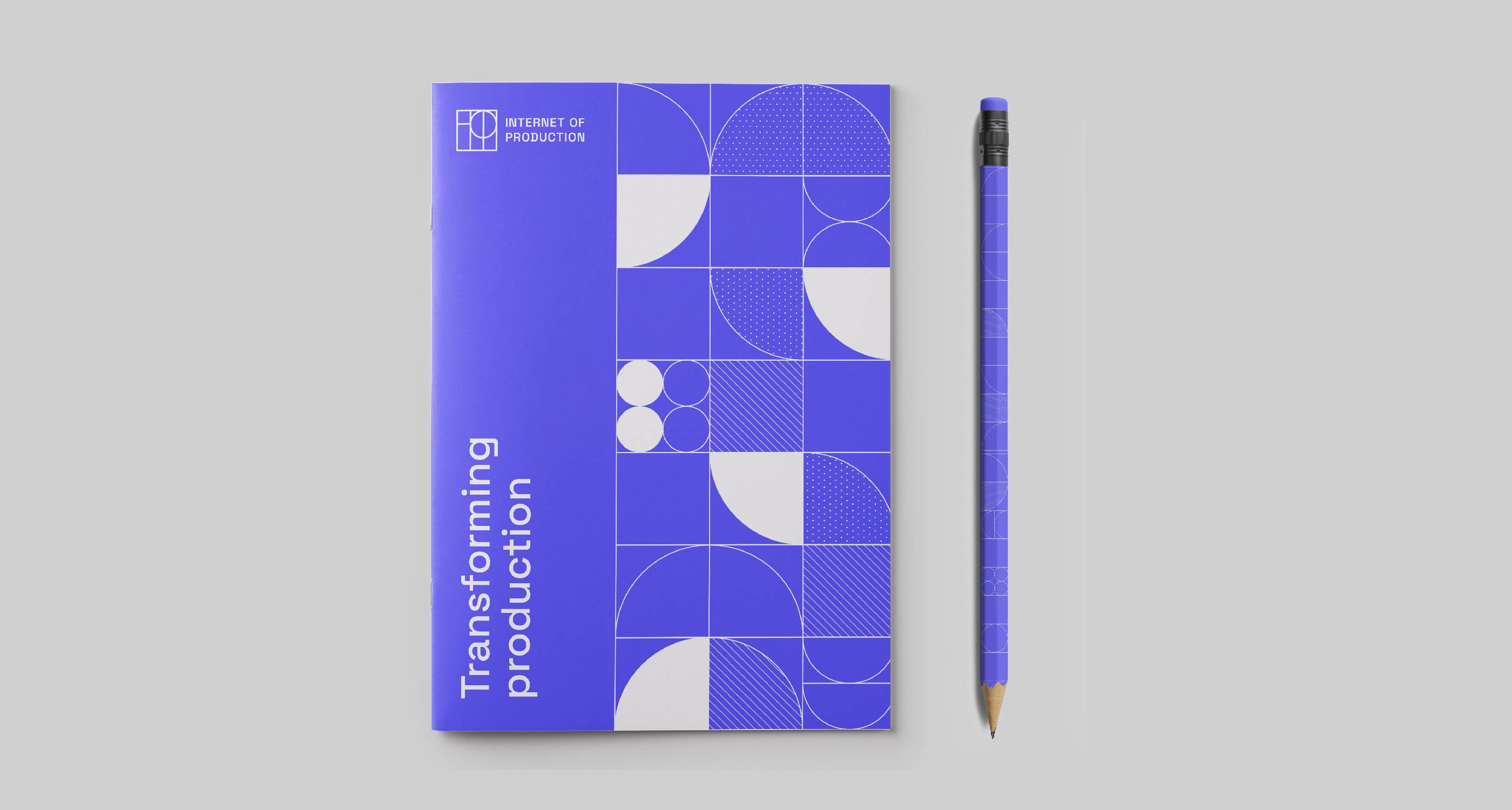
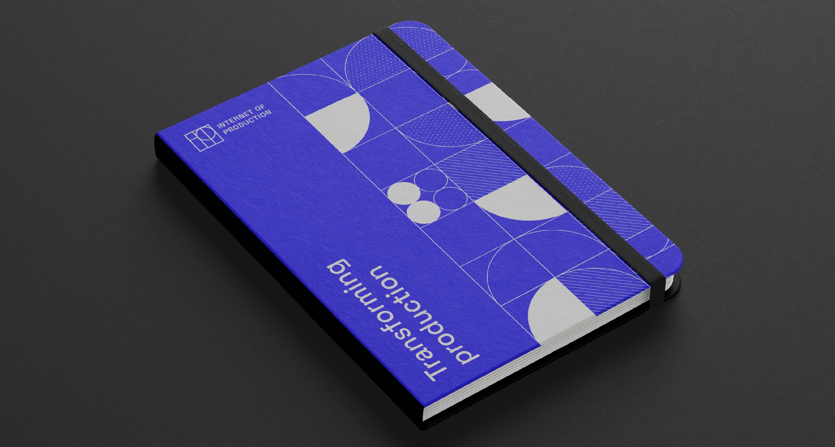
We then designed a compelling visual identity inspired by the technical blueprints that are so familiar to stakeholders, blending manufacturing precision with a human touch.


Results
The organization strategically sought to engage new donors and partners, focusing on corporations and high-net-worth individuals. The brand’s rejuvenation empowered the Internet of Production Alliance to captivate these audiences, significantly enhancing the organization’s stature and trustworthiness. As a result, the Internet of Production Alliance has attracted talented new staff and seen its fundraising pipeline increase by over 300%, showcasing the remarkable impact of the rebrand.

“Previously, we hesitated to present our cause or direct people to our website due to its appearance. Our messages were getting lost. Now, we feel excited and eager to showcase our brand to the world; we’re proud of our brand – it is attractive and it reflects the scope of our ambition. What Prophet did, and even the wonderful way they did it, changed the game.”
Andrew Lamb
Chair & Co-Founder of the Internet of Production Alliance