CASE STUDY

M Passport

Designing the first signature family program for Marriott Hotels

Challenge

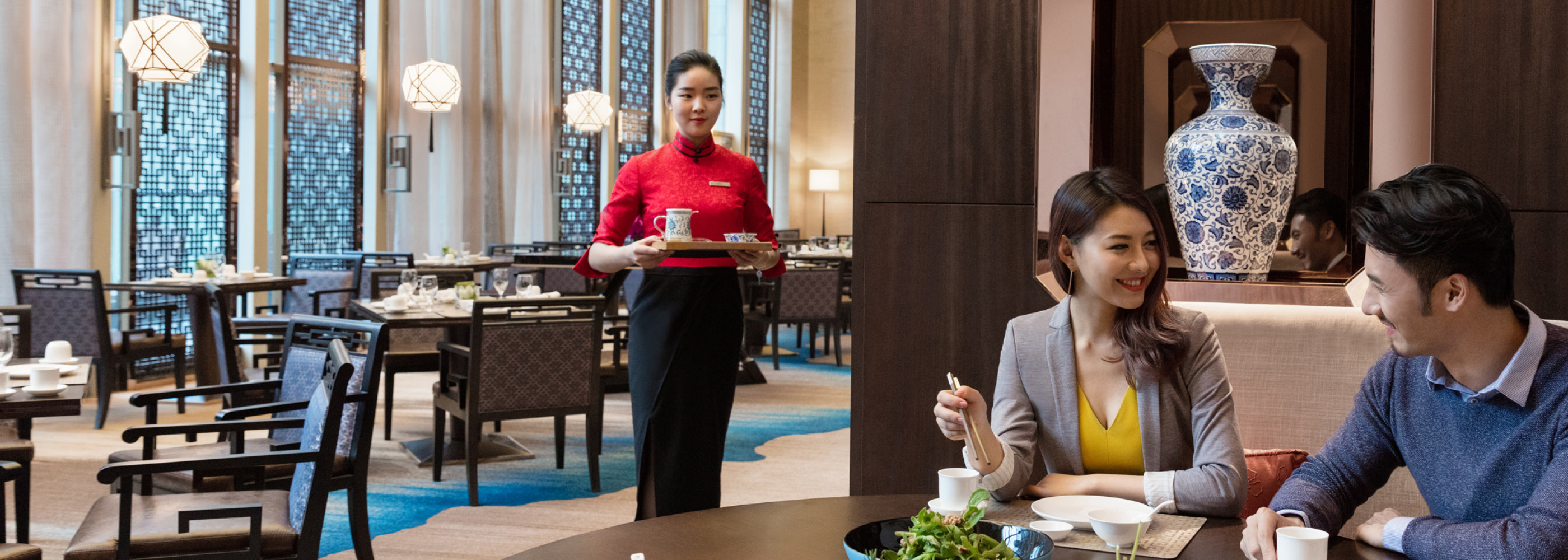
To capture a greater share of the growing leisure market in APAC, Marriott Hotels needed to shift its reputation from being viewed as reliable business travel accommodations, to desirable family-friendly destinations.

Through research, Prophet found that parents highly value the options for daily activities on their vacation. Even though Marriott Hotels across Asia were offering great activities for kids, the Marriott International brand wasn’t getting credit due to guests not attributing the programming back to the master brand. So, to win with families, Prophet needed to help Marriott Hotels boost its family hotel activities offerings and develop a clearer connection between kids activities and the Marriott International brand.

Solutions

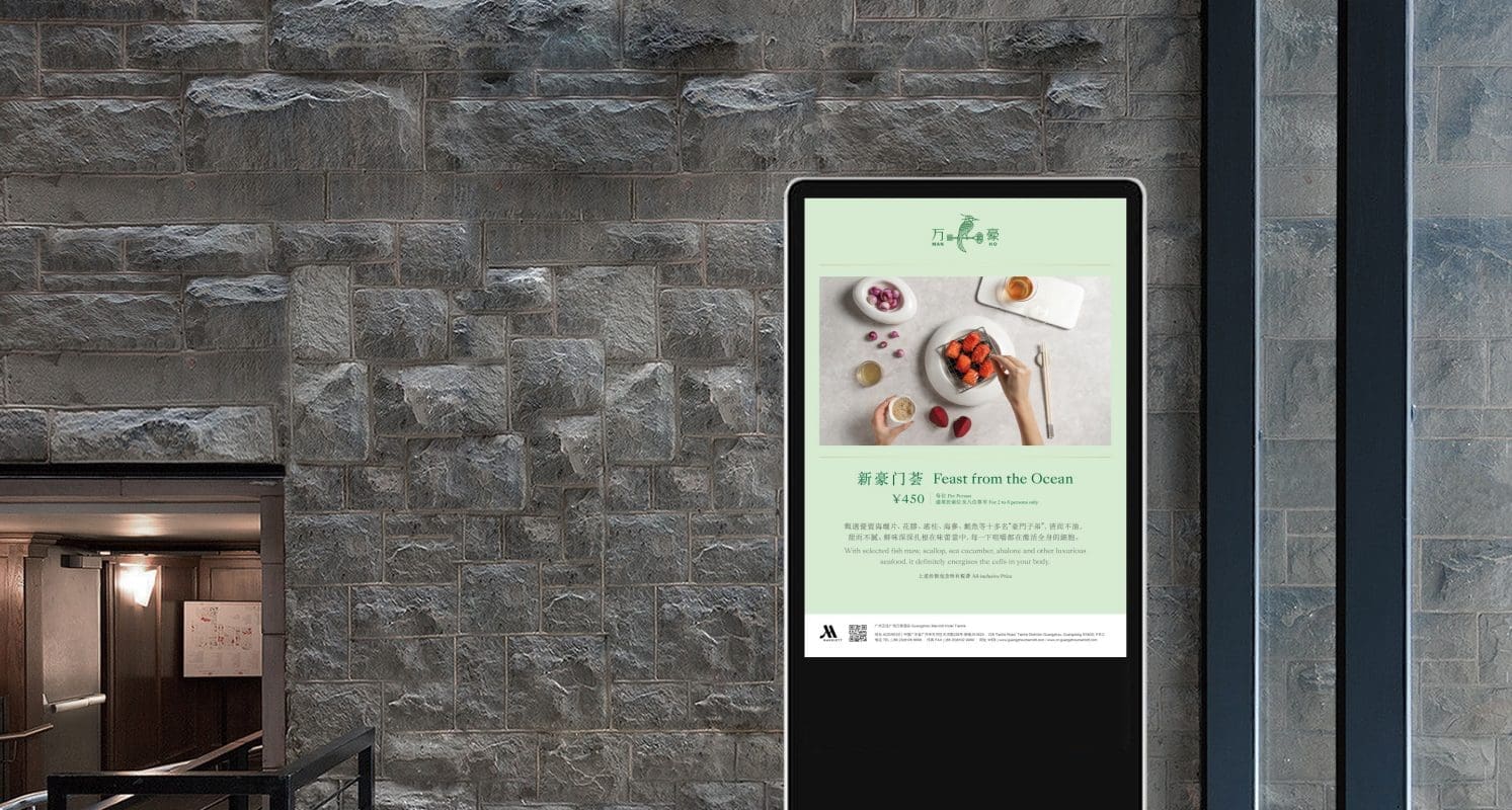
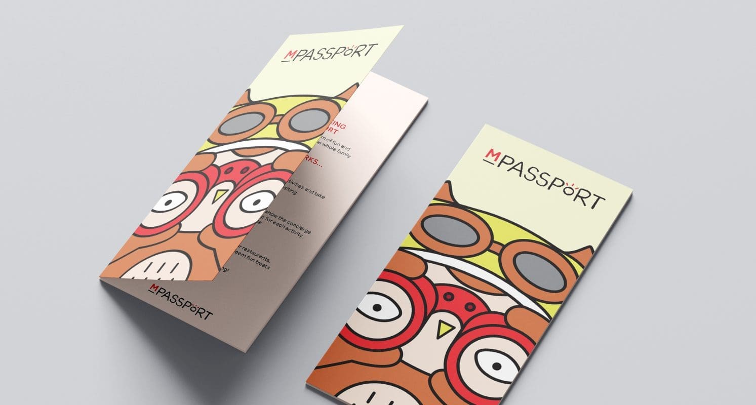
We created M Passport, a program designed to engage and support children as they grow up while giving parents peace of mind that their children are having fun and learning along the way. M Passport is a kids-focused program that provides children with three key benefits – Brilliant Body, Brilliant Mind and Brilliant Heart aligning with the Marriott Hotel brand positioning of “Inspiring Brilliance”.

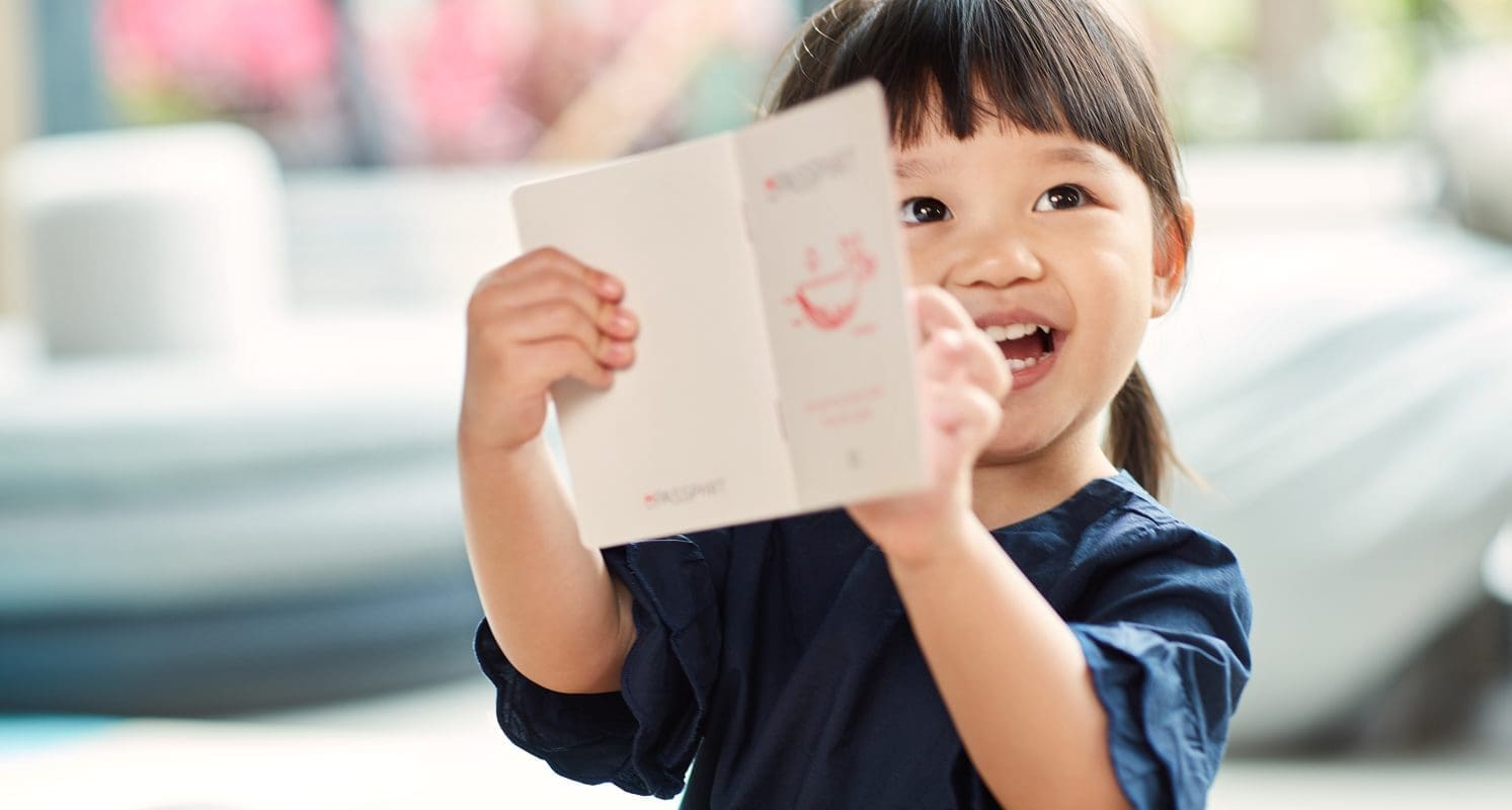
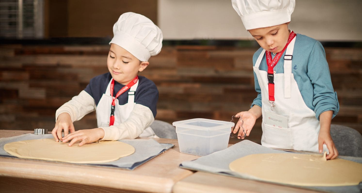
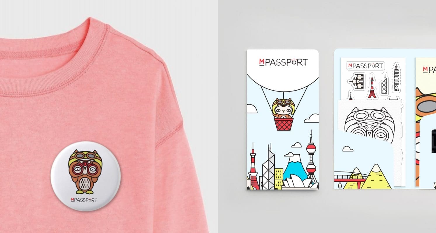
M Passport comes to life in a gift children receive upon arrival, a “passport” booklet where they collect stamps for completing activities that stimulate Mind, Body and Heart. Activities are categorized under each of the three key benefits, which have a corresponding stamp design. Stamps can then be redeemed for rewards, such as ice cream, cookies or a local souvenir. In addition to the booklet, children receive postcards to draw on and fill out stickers, and buttons to serve as souvenirs of their Marriott stay. The program is available to guests in both resort and urban properties, where the kids’ activities are customized accordingly. In resorts, many activities are done on-site, while urban properties offer a map of the city to allow exploration on property and immersion in the city around the hotel.

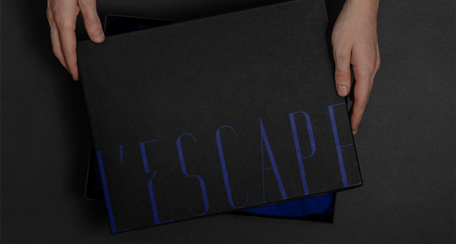
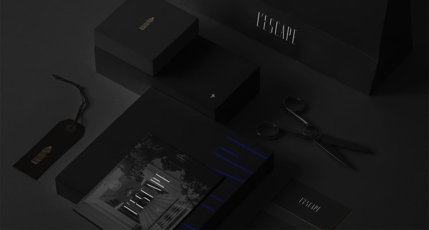
We designed a unique visual identity system for M Passport based on its key benefits and Marriott International’s brand positioning ‘Inspiring Brilliance’. The M Passport word mark, combined with the brand font, creates a ‘light bulb moment.’ While staying consistent with the Marriott International master brand, Prophet’s design teams added playful and fun elements through simple line illustrations that showcase local animals, icons and sceneries. The illustration style is based on the simplistic lines of the M Passport logo.

Building on the feedback and learnings from the proof-of-concept program at resorts, the visual identity system has recently been expanded to showcase a broader array of designs for urban properties, including imagery of Owen the Owl, the M Passport program mascot, on location at various historic APAC sites – from Sydney to China, Hong Kong, Singapore, Korea and more.

Results

APAC became the first region to fully roll out this global program, beginning with a proof-of-concept in 2018, and now expanding to over 20 properties across APAC. The program has distributed over 15,000 copies of M Passport to Marriott’s little guests, generating 6,210+ M Passport package room night bookings, and driving more than 137.4 million total impressions and over 18.7 million reach. M Passport plans to roll out further across additional urban properties in 2021.

Impact

15k

Copies of M Passport delivered

6k

M Passport package room night bookings

CASE STUDY

Marriott

Creating a unique story and identity for Man Ho

Challenge

Marriott was looking to drive the reputation and revenue of Man Ho, its signature Cantonese restaurant in JW Marriott and Marriott hotels throughout Mainland China and Hong Kong. The restaurant needed a signature look and feel to help differentiate itself from other popular hotel restaurants. Prophet was tasked with creating a unique brand story and a refreshed visual identity to articulate Man Ho’s unique proposition.

Solutions

Prophet started by conducting interviews with the head chef and other key stakeholders to identify unique traits that aligned with Man Ho’s aspirations. Through an iterative approach, we developed a new brand positioning and story for Man Ho that was inspired by the idea of taking diners on a culinary journey through time, with Cantonese dishes that have been cultivated and refined from one generation to another.

The positioning was brought to life through a refreshed logo and identity system which juxtaposes tradition with contemporary color combinations. The bird-and-key logo represents the ancient carrier bird that transported messages and ideas from one person to another to symbolize the journey that the recipes have been on.  This is a strong symbol, representing how Man Ho unlocks the secret behind the ingredients that elevate Cantonese cuisine.

Prophet also art-directed professional photoshoots with real-life chefs at Man Ho to curate a set of photography that tells the stories behind Man Ho’s food. Visual applications and brand guidelines were also developed to ensure consistent execution of the brand identity.

Results

The new Man Ho brand positioning and visual identity is in the process of being implemented in properties across Mainland China and Hong Kong.

Our work with Marriott’s Man Ho was awarded bronze at Transform Awards Asia-Pacific 2019.

CASE STUDY

Verra Mobility

Launching a new brand post-acquisition

Challenge

Transportation is in the midst of rapid innovation – driverless cars, disruptive technologies, mobile solutions – and American Traffic Solutions (ATS) was right in the middle of it, providing commercial fleets with tolling solutions and providing municipalities with smart traffic enforcement technologies. ATS as an organization was changing rapidly too – adding new capabilities and team members via strategic acquisitions.

With a confluence of the global mobility marketplace and the growth of ATS capabilities, all roads led to the need for a new brand and corporate story. A brand that signaled the type of company that ATS was becoming. A brand that motivated and united employees to move the world through smart mobility.

Solutions

Prophet was brought in to help ATS and its leadership to shape its corporate story and build a new brand. We began by looking at where all great brands start: the heart. Through a combination of employee and customer interviews, we sought to find out what made ATS, as well as the recently acquired brands of Highway Tolling Administration (HTA) and Euro Parking Collection (EPC), the titans of their industry. We also looked outside-in to understand where the transportation solutions category was going.

Our research uncovered that traffic solutions no longer represent what ATS truly does. So, we crafted a brand purpose to reframe the category where ATS plays – smart mobility. The result was a bold new direction for the company – one that served as a guiding light for where it was headed, and motivated employees to be a part of something bigger. Grounded by a new purpose, we turned our attention to customers – crafting a simple, yet powerful brand promise that articulated the value delivered by ATS every day: solutions that keep the world moving safely and easily.

But what would this new brand be without a new name? While American Traffic Solutions was well-known as an industry leader, a new name was needed to signal this strategic move. Enter Verra Mobility – a name that connotes truth (ver) and scale to impact the entire world (terra), while rooting the company in the fast-growing and high-valued smart mobility landscape.

The final piece of the puzzle was to solidify the brand internally. Our research revealed that one of ATS’ strongest competitive advantages was its people – people who always went the extra mile to serve customers. And with the acquisition of HTA and EPC, there was an opportunity to unite everyone under the new Verra Mobility brand. Through extensive research aimed at understanding the needs and motivations of both current and prospective employees, Prophet created a new Employee Value Proposition to build pride with Verra Mobility’s current talent, while simultaneously attracting the talent that would be needed to support the company’s new direction as a leader in smart mobility.

Results

The new Verra Mobility had a measured impact on stakeholders across the board.

For employees, the brand was introduced in June 2018 via a high-energy firm-wide meeting. The energy around the new brand was infectious, and Verra Mobility leaders have praised how the brand successfully brought all employees, both legacy and acquired, under a single purpose and compelling employer brand.

For customers, the new brand has expanded the scope of what the company can offer, creating opportunities for new partnerships and solutions to continue advancing the world of smart mobility.

For investors, the refreshed brand purpose has reshaped the company’s frame of reference to the highly valuable smart mobility sector. The brand was successfully taken public in Q3 2018 (NASDAQ: VRRM), with Verra Mobility leadership ringing the closing bell at the NASDAQ on October 18, 2018.

On April 1, 2019 – Verra Mobility’s stock reached an all-time high of $12 per share, achieving a market cap of $2.04B

CASE STUDY

L’Escape

Creating a Parisian escape in the heart of Seoul

Challenge

Shinsegae Chosun Hotel Group had ambitious plans to expand its footprint in the hotel space in Korea. Increasing luxury hotel competition and continued growth in overseas travelers seeking unique, avant-garde experiences in Seoul presented an opportunity for Shinsegae to create a new hotel brand from scratch.

With renowned French designer Jacques Garcia secured for the hotel’s internal design, our challenge was to create a unique boutique hotel concept and a compelling brand strategy to drive exceptional hospitality and food & beverage experiences in a crowded space with shifting consumer expectations around luxury.

Solutions

Prophet worked closely with Shinsegae to define a winning brand portfolio that captures distinct opportunities in the Korean travel market, with clearly defined roles and relationships for each of their hospitality brands.

We began to define a distinctive hotel concept by uncovering fresh insights across three lenses: competitors, boutique differences and consumers.

  • Competitors: Through expert interviews and in-depth auditing, we uncovered key insights about the boutique hotel sector and its evolution as well as best practices of key competitors.
  • Boutique Difference: We conducted extensive research and audits across the globe to define four key elements of French style by talking to Parisian experts in fields of fashion, luxury and design.
  • Consumers: Finally, we conducted in-depth quantitative research with over 2,000 respondents across 5 countries, as well as qualitative customer interviews with experts in the luxury space, to understand what would most intrigue travelers.

The result was outstanding – we created a unique idea, hotel name and story that delivers a hospitality experience like no other: A Parisian Escape in the Heart of Seoul.

L’Escape was born.

The hotel is a hidden retreat full of surreal sophistication where moments are treasured, and memories are born. Like a bird escaping its cage, guests are free to explore intimate spaces and celebrate special moments.

L’Escape is for those who wish to get away from reality, a place that releases pleasure seekers from traditions and conventions, and liberates them to create their own dreams and fantasies. This concept is expressed through the open bird cage on the logo, leaving people to wonder where the bird has gone. The missing bird appears on other visual elements such as photography, creating a powerful juxtaposition with the logo. A color palette of gold on black and blue hints to sophistication and elegance.

We brought the brand strategy to life by creating unique yet coherent visual identities for the boutique hotel and its F&B offerings. We also developed complete branding concepts for the F&B outlets within the hotel: bar Marque d’Amour, contemporary restaurant L’Amant Secret and Chinese restaurant Palais de Chine.

Results

A unique luxury hotel experience that brings 19th Century Paris to modern Korea for the first time, L’Escape opened in July 2018 to critical acclaim. Our inspiring work with L’Escape won 2 GOLD awards at the 2018 Transform Awards APAC for best brand development and best visual identity. A judge commented, “An excellent creative concept to stand out in a crowded market. Excellent execution and sophisticated attention to detail.”

The hotel was the first independent hotel brand launched by the Shinsegae Chosun Hotel Group in the bustling shopping district of Myeong-dong. Prophet has equipped Shinsegae with a clear and unique boutique hotel concept that is new to the market and reflected throughout the hotel experience.

Since its opening, it has drawn much fanfare and traffic on its Instagram site. Its concept and story have attracted celebrity chefs and mixologists with partnerships with brands such as Mott 32 and Maison M’O. In February 2020, L’Escape was awarded an iF design awards for its website design.

CASE STUDY

The Cosmopolitan

Launching a new brand in a commoditized market

Challenge

As a new player in an overcrowded, commoditized market, The Cosmopolitan of Las Vegas leadership team faced an uphill battle. Not only were they charged with bringing a new offer to market in the face of a severe global economic downturn, but they were also an independent single-property enterprise competing against a host of well-established companies possessing multi-property portfolios.

Further, time was of the essence. A new ownership group had recently taken over the development of the property and needed it to open in December 2010 – allowing only 15 months for the team to create a compelling new vision for the offer and in turn, translate that into reality.

Solutions

The Cosmopolitan of Las Vegas and Prophet teams worked in partnership to transform the entire casino-resort experience. By challenging existing conventions, inspiring new ways of thinking and unlocking insights about what was missing in the market we were able to reimagine every aspect – restaurants, retail, casino, hotel rooms, pools and entertainment venues.

The key to success was the importance of redefining luxury for the Las Vegas market. By conceiving of an experience that would resonate with “people who feel at home all over the world” we created an offer that was contemporary, authentic, energizing and welcoming – setting a new standard for the category for years to come.

Results

The resort has launched to acclaim from hospitality experts and customers alike. The Cosmopolitan of Las Vegas has achieved the highest combined average daily hotel room and occupancy rates on the Strip. In addition, the resort has been named to Conde Nast Traveler’s global “Hot List Hotels 2011”, was featured on Travel and Leisure’s 2011 “It List” of the world’s best hotels, received the Design Grand Prix award from the Cannes International Festival of Creativity and in 2016 was named as the #1 “Most Instagrammed Luxury Hotel” by Bloomberg.

CASE STUDY

Club Marriott

Enhancing the guest experience for Chinese travelers

Challenge

Club Marriott, Marriott International’s Food and Beverage membership program in APAC, was looking for opportunities to grow. The program, where members get discounts on food and beverage in their local market, needed a new strategy. The goal was to expand the program beyond local food and beverage discounts to a more holistic membership program that was better tied to Marriott Rewards and offered consumers more benefits. Marriott enlisted Prophet to help redefine the brand strategy and also create a new, refreshed visual identity that would appeal to a broader audience and help explain the newly expanded membership program.

Solutions

Prophet worked with Marriott to create a new brand positioning for the Club. “We Bring More to the Table” plays on Club Marriott’s core offering around food and also includes a set of new services and experiences that the Club would offer – bringing to life the idea of “more.” These included broader hotel benefits like access to the gym, pool and spa, as well as dining benefits like exclusive dinners, chef’s tastings and more. The idea was to create a more holistic local program for people who wanted exclusive membership to a club in their local hometown without all the pomp and pretense.

We also worked with Marriott to re-design the Club Marriott visual identity to bring this new strategy to life. The icon-based system provided flexibility for each of the local markets to illustrate their individual offerings while showing the potential total offerings of the Club Marriott program.

Results

To date, the new program has attracted over 200,000 members and is reaching larger scale with new hotels being added every month. Following its success, the program will be rolled out in other key countries in the Asia-Pacific region including Singapore, India, Vietnam, Japan, South Korea, Malaysia, The Philippines, Indonesia, Guam and Thailand.

CASE STUDY

Turkish Airlines

Launching a delightfully different experience

Challenge

Turkish Airlines had doubled its yearly passenger load, revenue skyrocketed from $2.33bn to $11.4bn, and the carrier had been crowned Europe’s best airline 3 years in a row. In an industry plagued by bankruptcy, consolidation and government bailouts, Turkish Airlines wanted to build on this momentum and compete with airlines having larger destination networks, newer planes and higher recognition.

Solutions

We started by learning about the ambition and business strategy of Turkish Airlines, which was to draw more international transfer passengers into Istanbul and better compete with other transfer hubs in the region. In parallel, we started to build a picture of how the aviation industry might evolve in the future. Through that research, we learned that cities were an important piece of the strategy, as increased urbanization is leading to more air travel.

We realized that Turkish Airlines had the opportunity to highlight its urban credentials, in particular Istanbul, a city with a rich heritage and a modern, vibrant and entrepreneurial community. Istanbul is a place of contrasts, and compared to the cities of competitor airlines from Dubai, Abu Dhabi and Doha this was a huge differentiator.

Results

We created a unique customer experience and brand identity for Turkish Airlines around the idea of being “Delightfully Different” involving every part of the customer journey before, during and after the flight. We created moments that surprise and delight; whether it’s serving traditional Turkish coffee and tea at 35,000 feet with Flying Chefs or making the arrival lounge at Ataturk Airport as special and relaxing as the flying experience. Our ambition was to create memorable occasions that reminded passengers why Turkish is different.

We developed briefs using the new positioning for a new visual identity and corporate design, advertising, PR and digital campaigns, along with sponsorship opportunities for the brand. The rollout of the new concepts began with a new advertising campaign featuring Kobe Bryant and Lionel Messi (already viewed over 140 million times on YouTube) and the launch of the new in-flight catering concepts.

Turkish Airlines continues to soar. Since the launch, passenger numbers increased 24%, revenue 28% and operating profit 12%. In the often-turbulent business of airlines, that’s some Delightfully Different news we can all toast to.

Impact

24%

more passengers

28%

increase in revenue

12%

increase in operating profit

CASE STUDY

Cathay Pacific Airways

Driving true customer loyalty

Challenge

Cathay Pacific has long been known for delivery of exceptional customer service and experiences, voted “World’s Best Airline” more times than any other. However, they found that their loyalty program, Marco Polo Club, was outdated. Passenger recognition and reward were based on sectors and miles flown system that was not properly recognizing the contribution from fares that passengers paid.

The rewards and benefits offered by Cathay Pacific were out-of-sync with passenger value and competitor customer loyalty programs. This resulted in a missed opportunity to create stronger loyalty and patronage – particularly for leisure and family travelers. Our challenge was to help Cathay Pacific better understand its customer base and create a program that would drive share of wallet and desired behaviors – and ultimately bring balance back to the loyalty equation.

Solutions

Prophet helped by improving the fairness and transparency of the Marco Polo Club. We revisited program benefits to determine which would align with Cathay Pacific’s customer-oriented nature and how they could offer other unique and inspiring loyalty benefits.

We aimed to create a long-term, sustainable solution for Marco Polo Club by employing a “parallel-path” approach:

  1. An analytical investigation using over three million customer transactions.
  2. Ideation of key benefits for each program tier to identify what matters most for different customer types.

The synthesis of creative insight and analytical modeling informed the final Marco Polo Club redesign – new program tiers supported by business cases to help Cathay Pacific bring the new model to life.

The revamped scheme uses club points to replace club miles and sectors, providing benefits and a customer experience more accurately aligned with customer profiles. Points are based on a combination of fare class, cabin and distance flown; and the program offers the most valued benefits for lower tiers plus additional benefits for elite members.

Benefits span the customer experience, from reservations to check-in and baggage, to lounge access and more. There are new rewards for mid-tier customers such as additional companion benefits, and a renewed sense of exclusivity for their most high-value customers.

Results

Cathay Pacific rolled out its new strategy and believes the redesigned loyalty program allows optimal rewarding of its most valuable customers while providing the most important benefits to today’s frequent flyers.

Your network connection is offline.

caret-downcloseexternal-iconfacebook-logohamburgerinstagramlinkedinpauseplaythreads-icontwitterwechat-qrcodesina-weibowechatxing