CASE STUDY
Josun Hotels & Resorts
Creating a winning brand portfolio strategy

Background
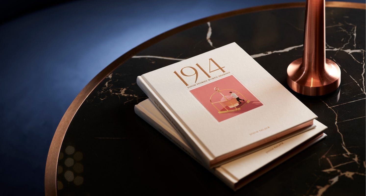
Established in 1914, Josun Hotel has become an exemplary hospitality brand, transforming into the current Josun Hotels & Resorts while maintaining its original “First & Best” mentality.
In a market where new entrants have raised the bar on hospitality, Josun Hotels & Resorts wanted to position its brands at the forefront of hospitality experiences in South Korea. Prophet worked closely with Josun to create an independent portfolio of brands, each targeting different consumer groups.
Approach
Prophet helped Josun Hotels & Resorts define a winning brand portfolio that captures distinct opportunities in the Korean travel market, with clearly defined roles and relationships for each of their hospitality brands. Understanding that each hospitality brand needs to meet the unique needs of Josun’s varied audiences, fresh insights were uncovered to define distinctive concepts for each brand. Through extensive research, expert interviews and in-depth audits, we created a hybrid brand architecture with a series of flagship brands with reimagined concepts appealing to different target audiences in Korea.
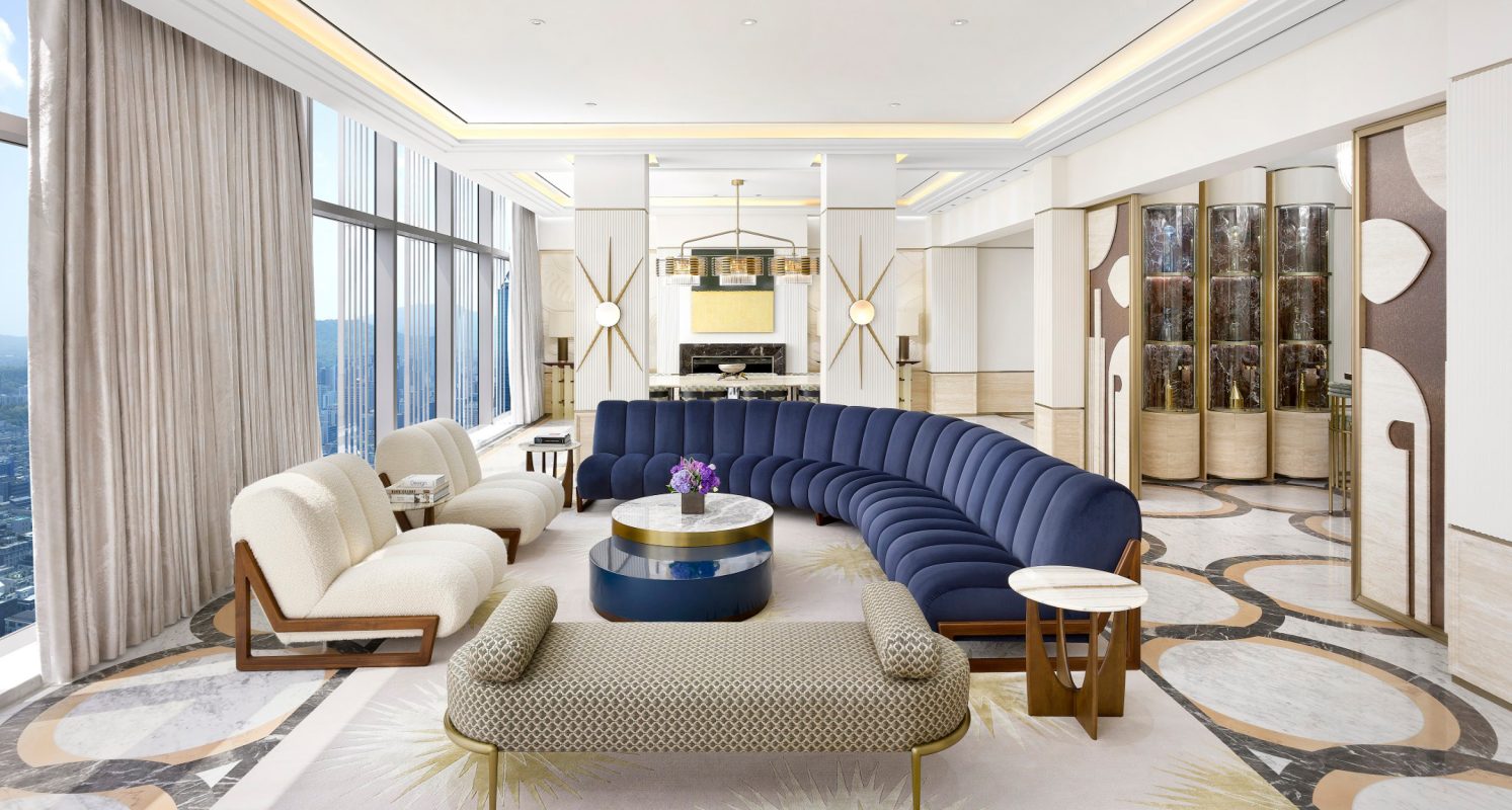
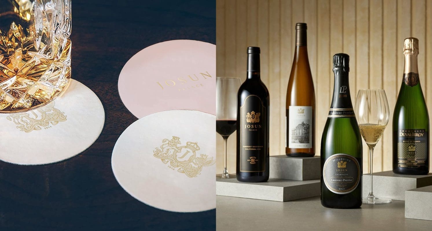
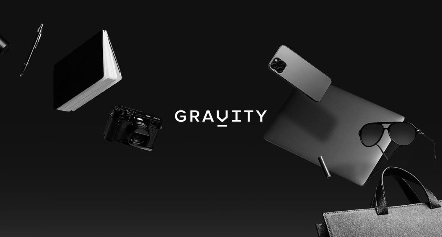
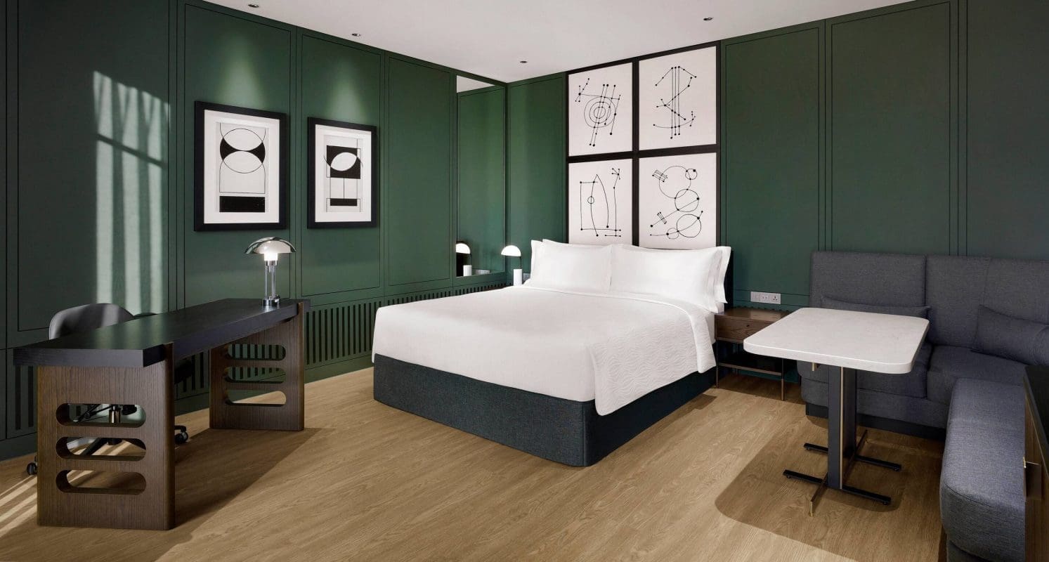
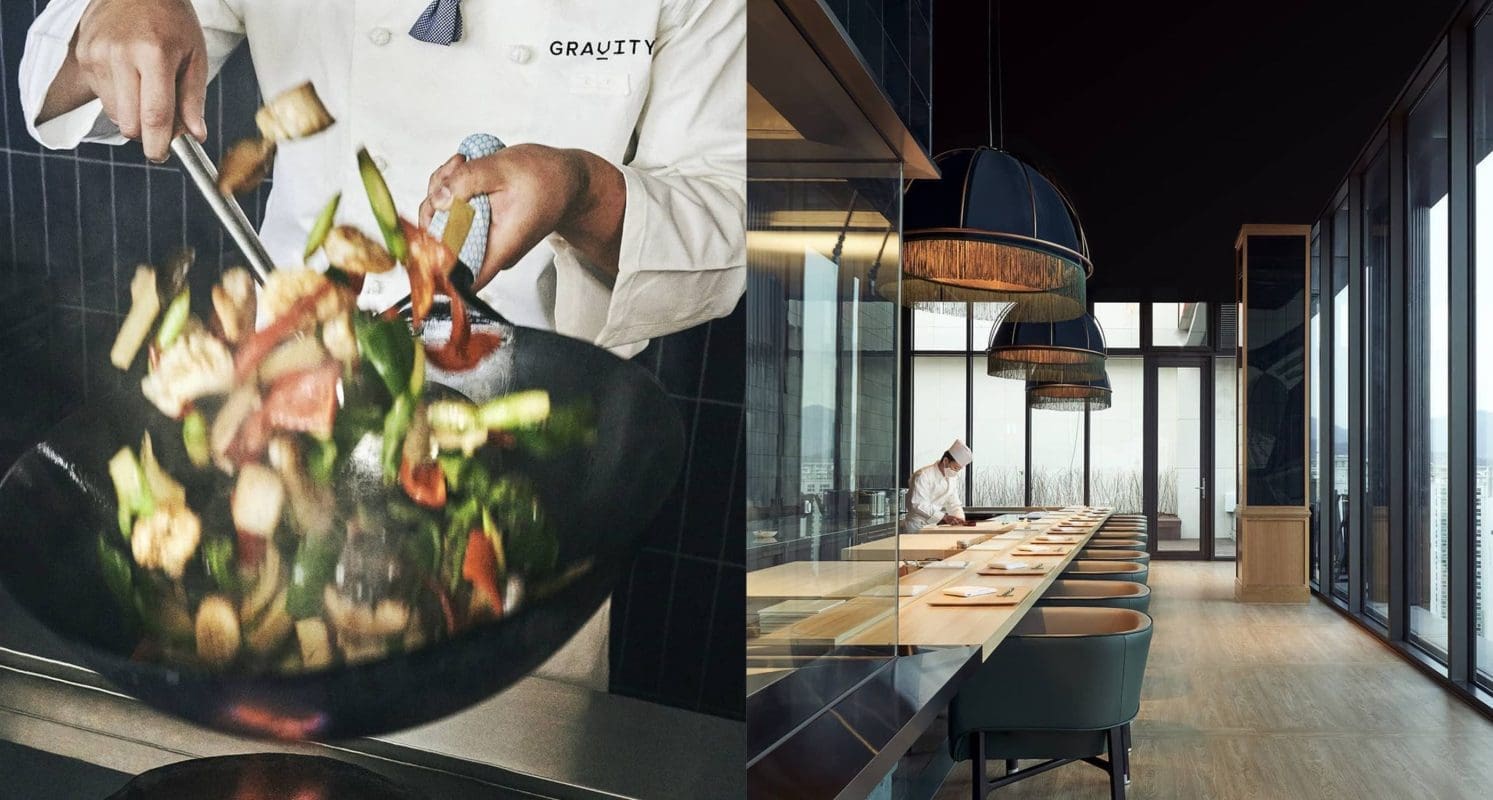
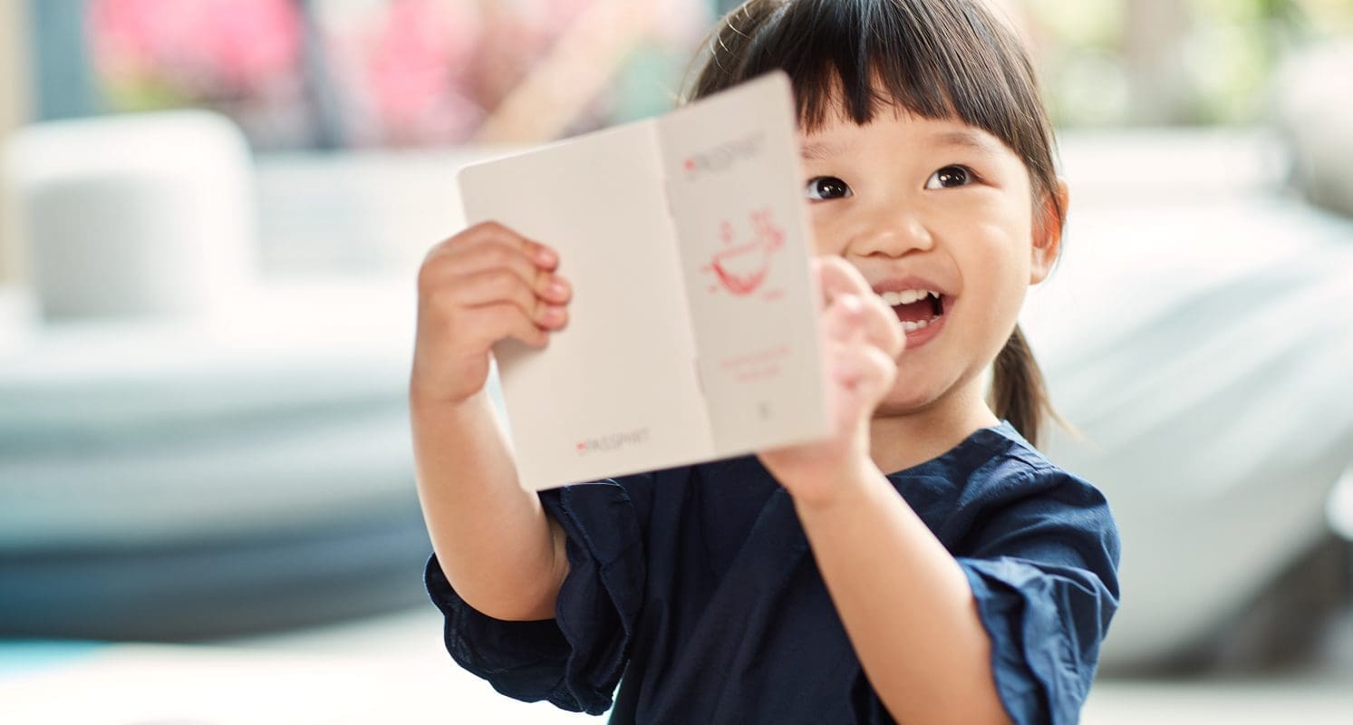
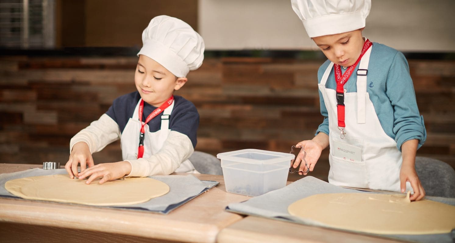
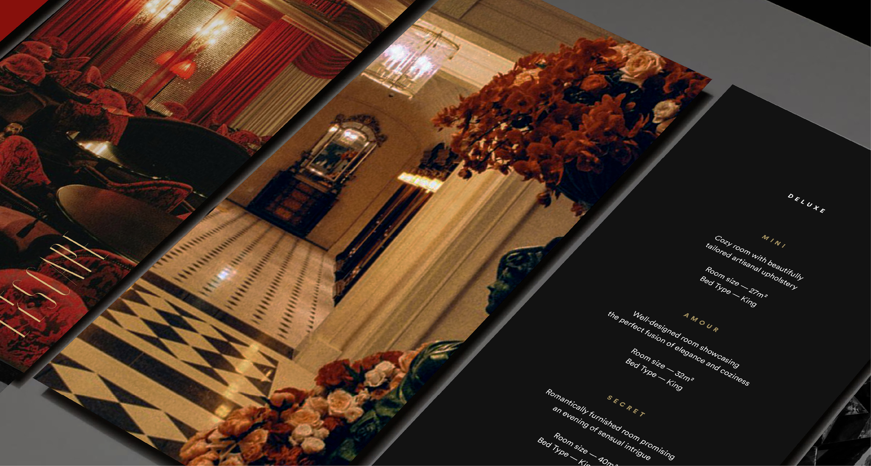
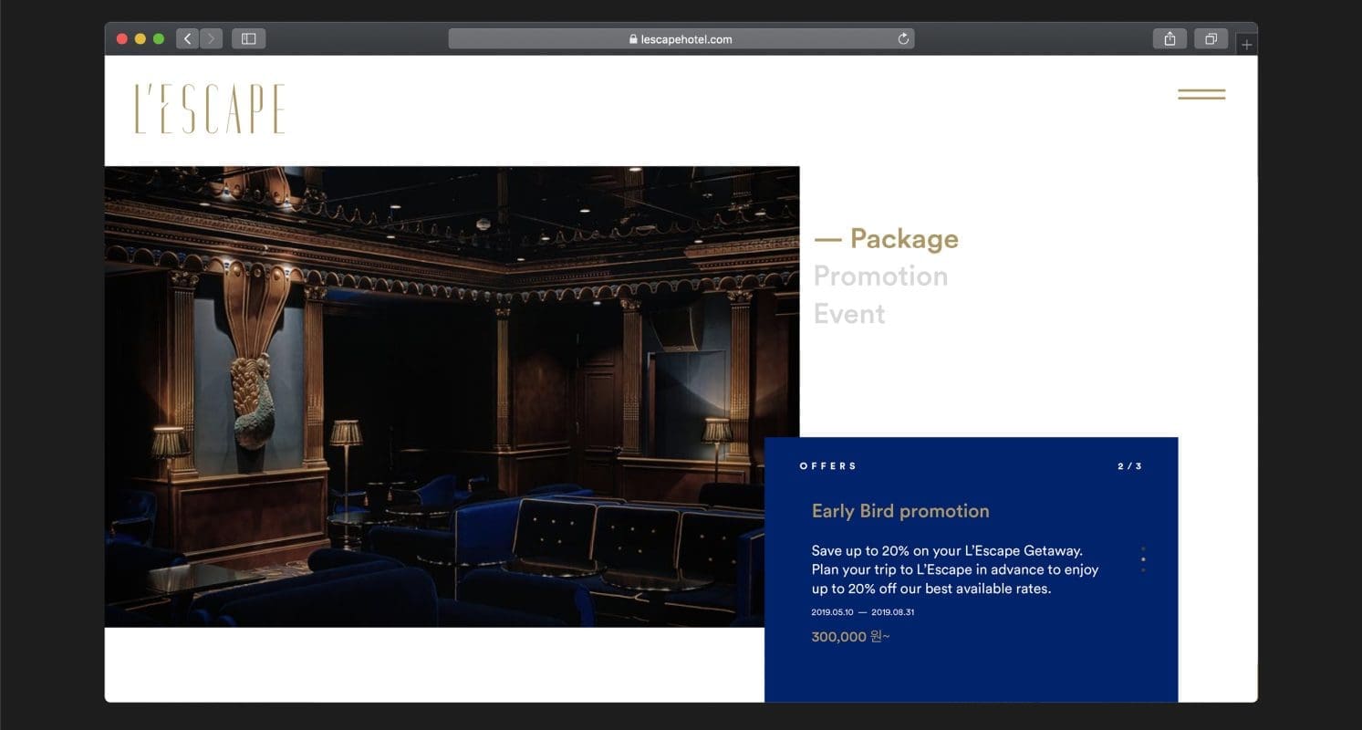
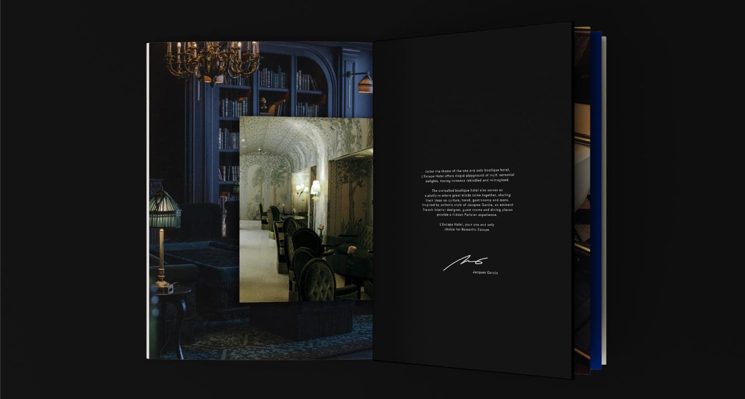
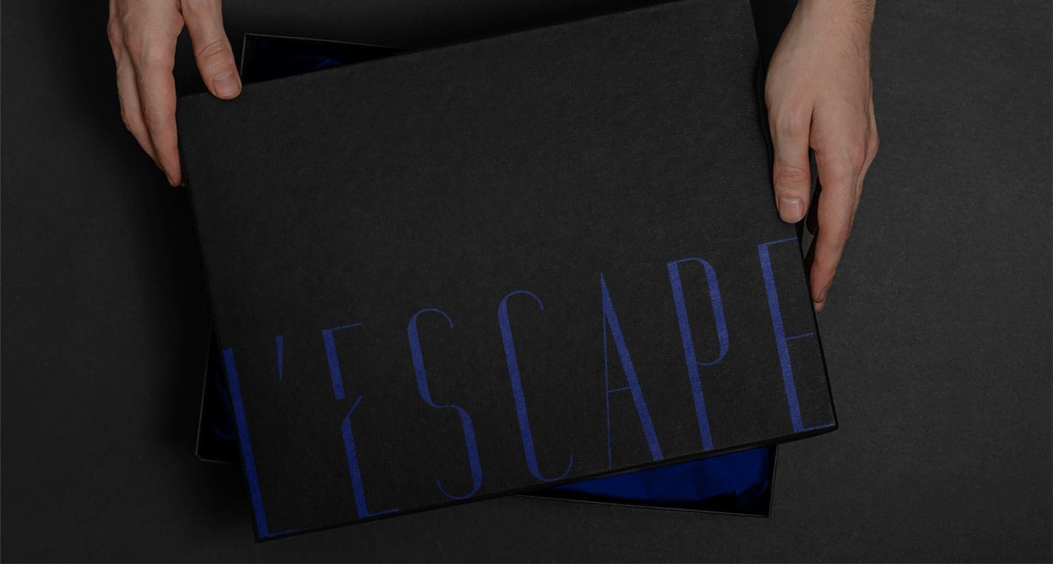
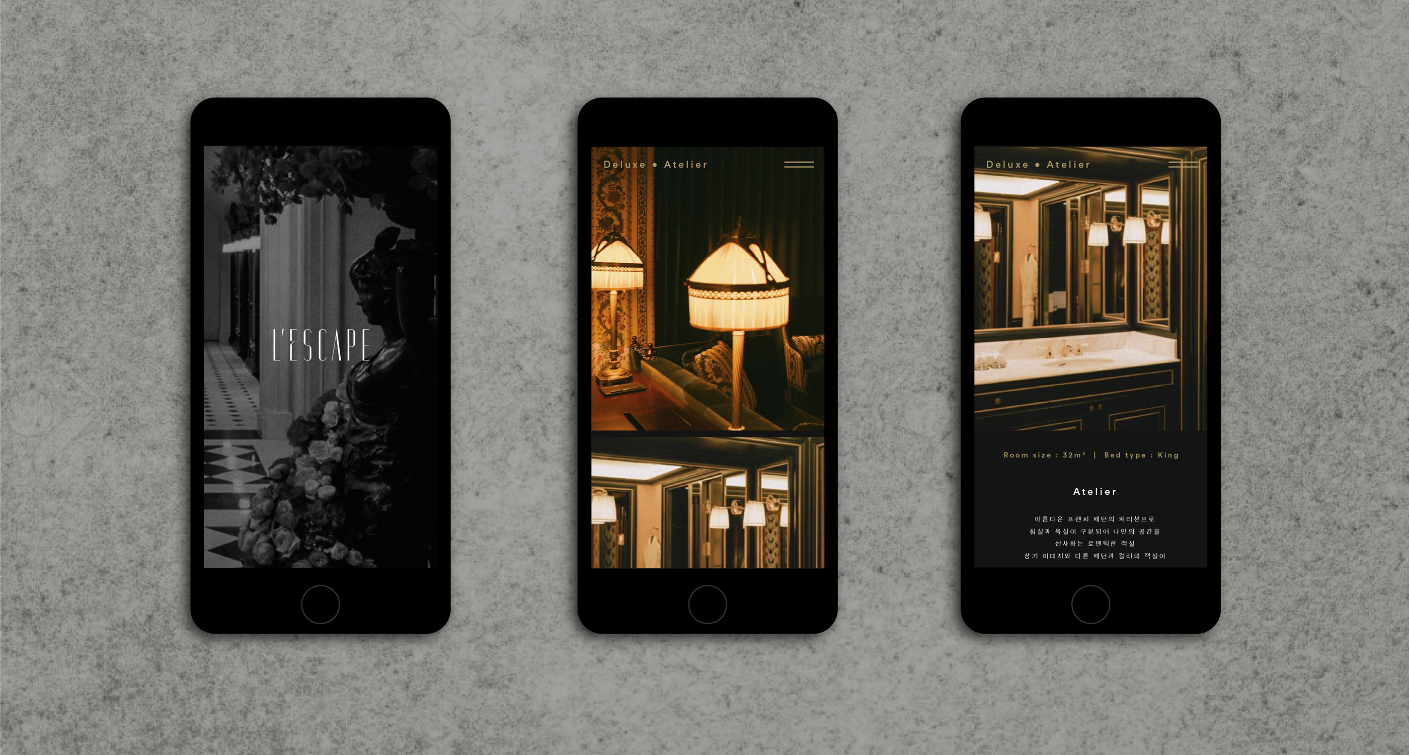
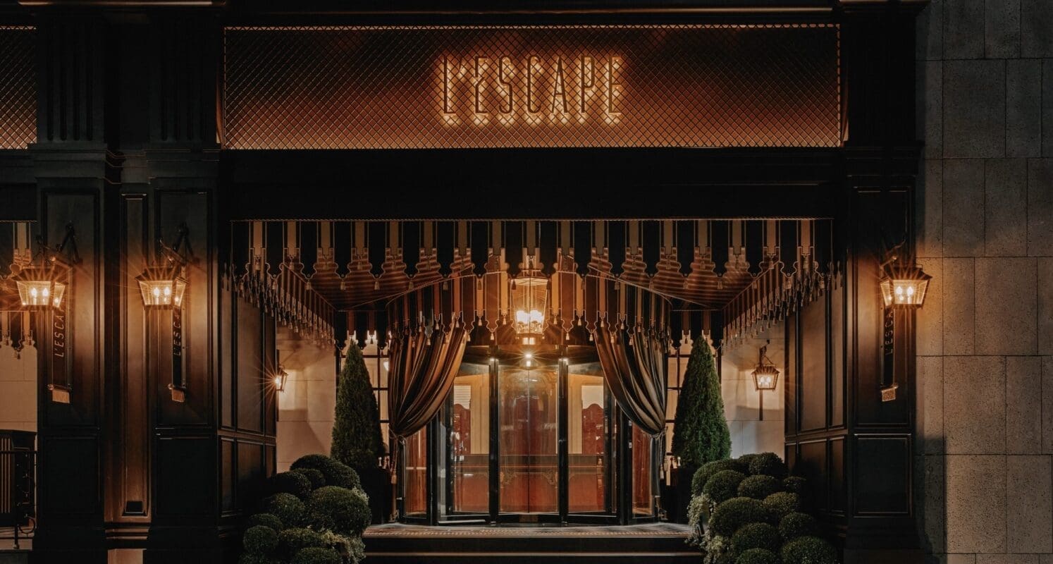
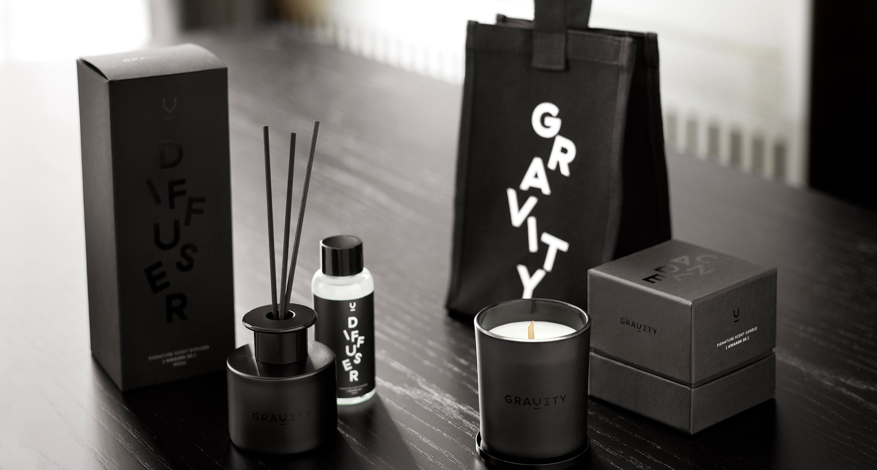
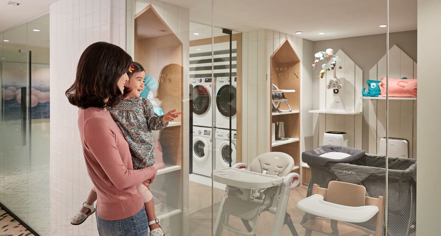
Each hotel brand is tied to its unique idea, name and story that delivers a hospitality experience like no other. L’Escape was born for those who wish to get away from reality and create their own dreams and fantasies, a true Parisian escape in the heart of Seoul. Gravity was created to become a thriving social hub for Millennials, a center of gravity in the community to foster creativity, collaboration and inspiration that blends work and play together. Combining Josun’s legacy with fresh modernity, Grand Josun reflects a refined sensibility for premium customer experiences while catering to families. Lastly, Josun Palace represents the group’s highest-grade luxury offering, encapsulating the key essence of the hotel’s heritage and appealing to “The Cultured Connoisseur.”
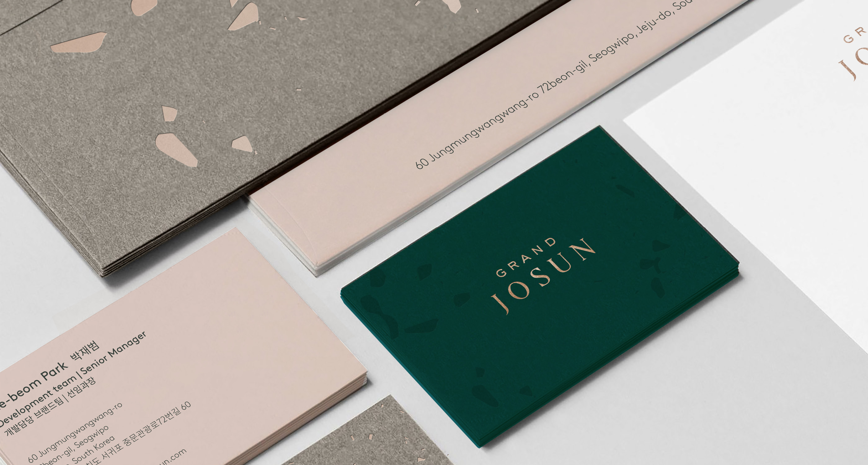
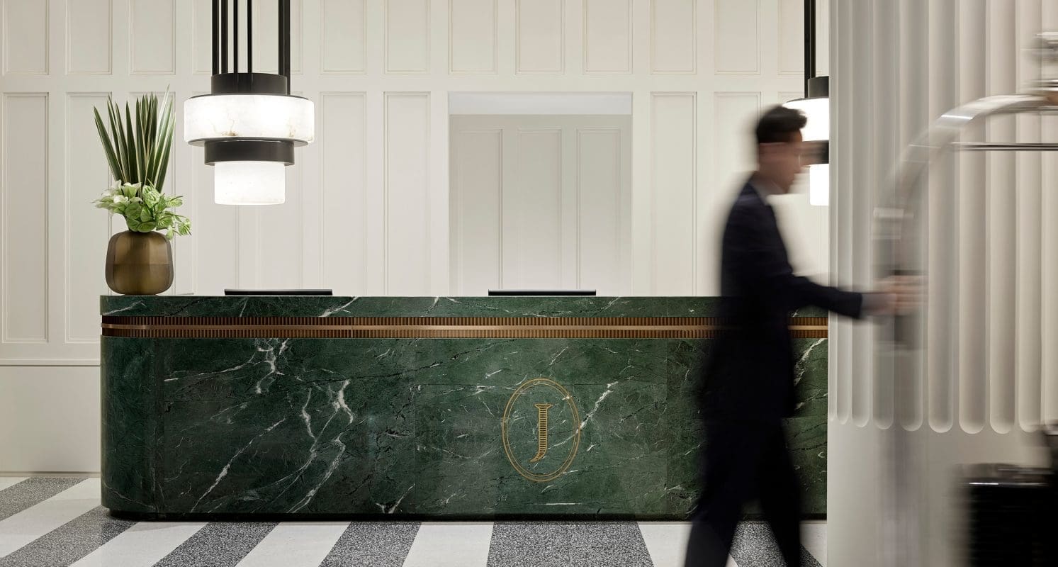
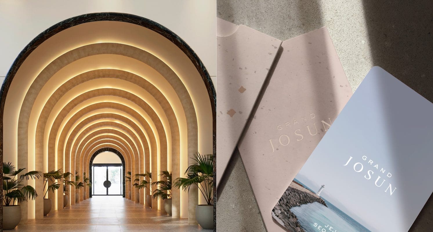
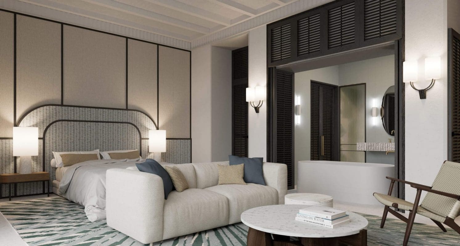
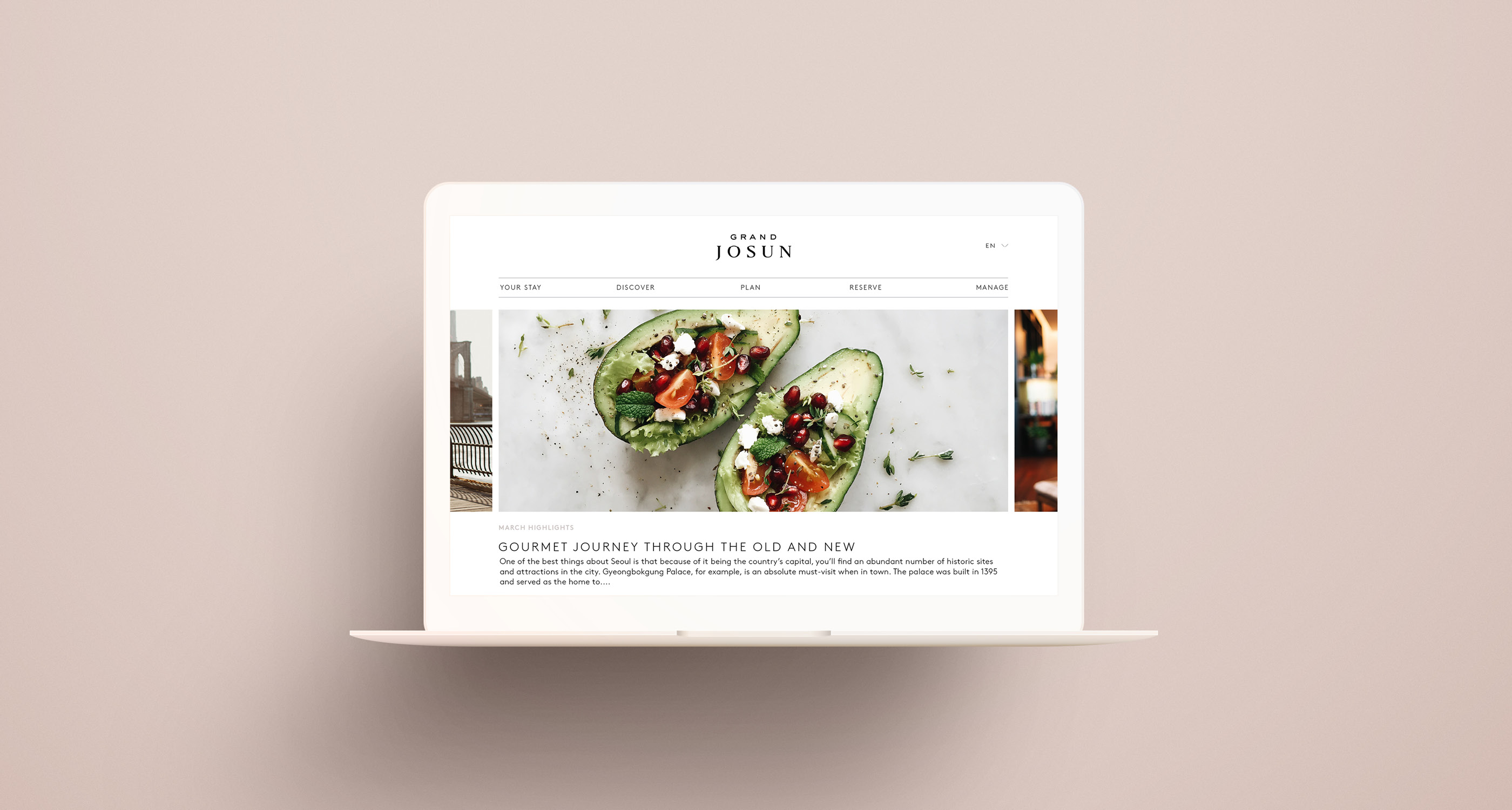
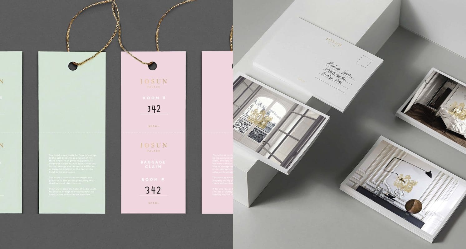
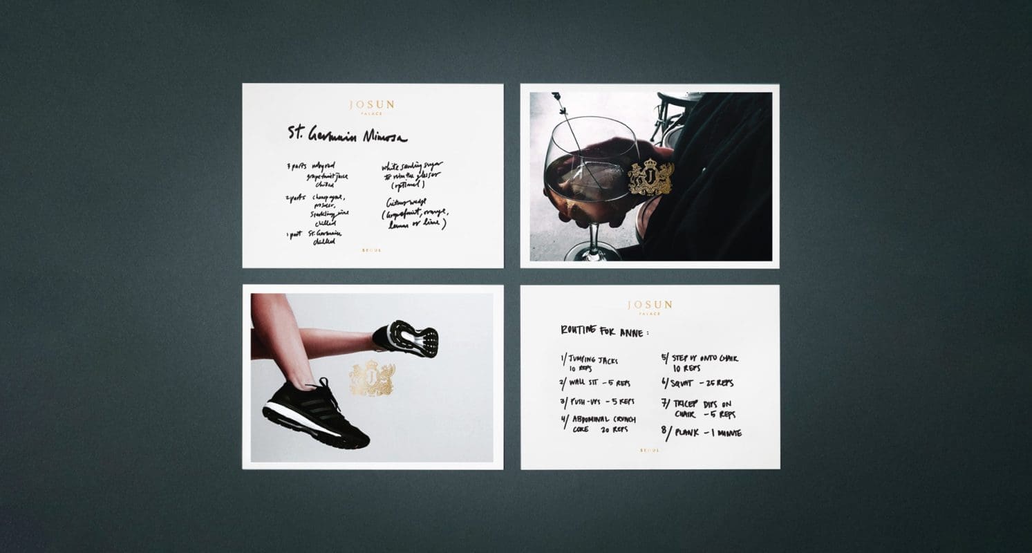
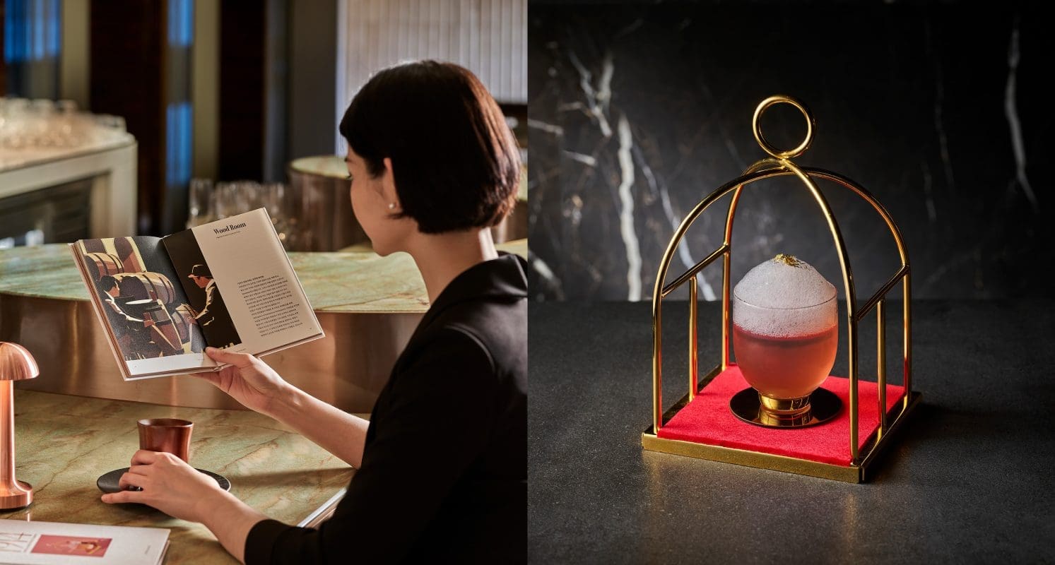
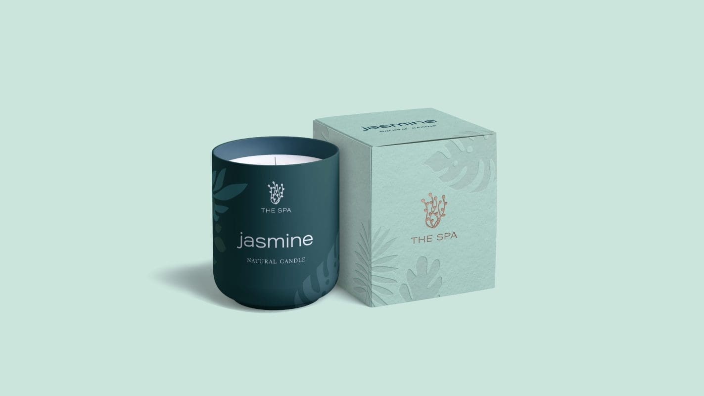
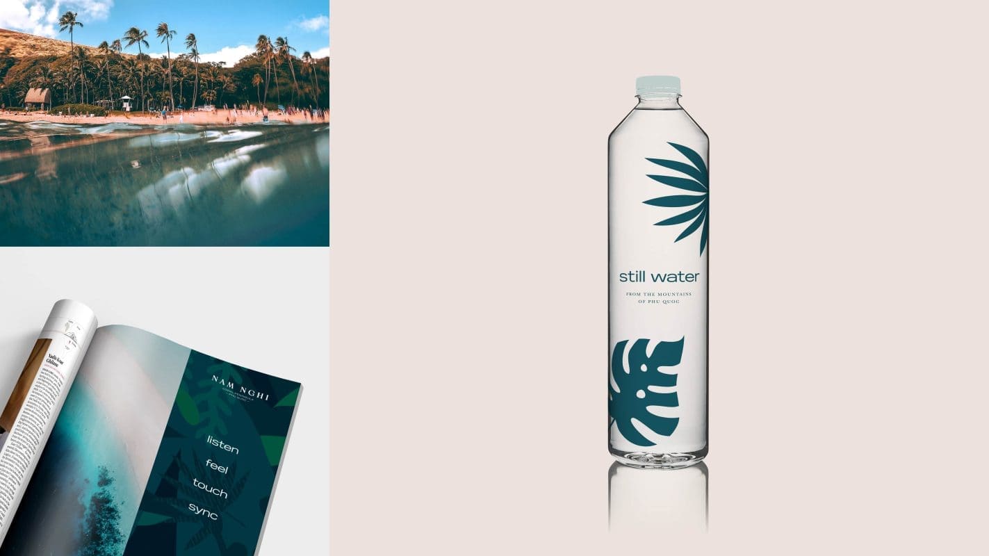
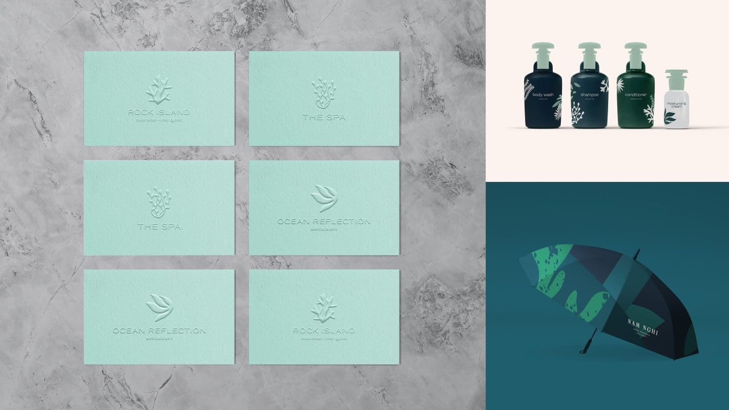
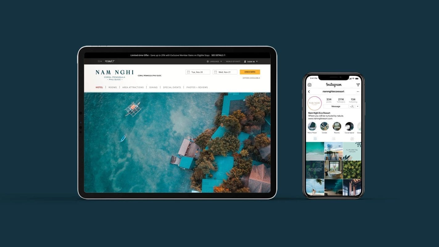
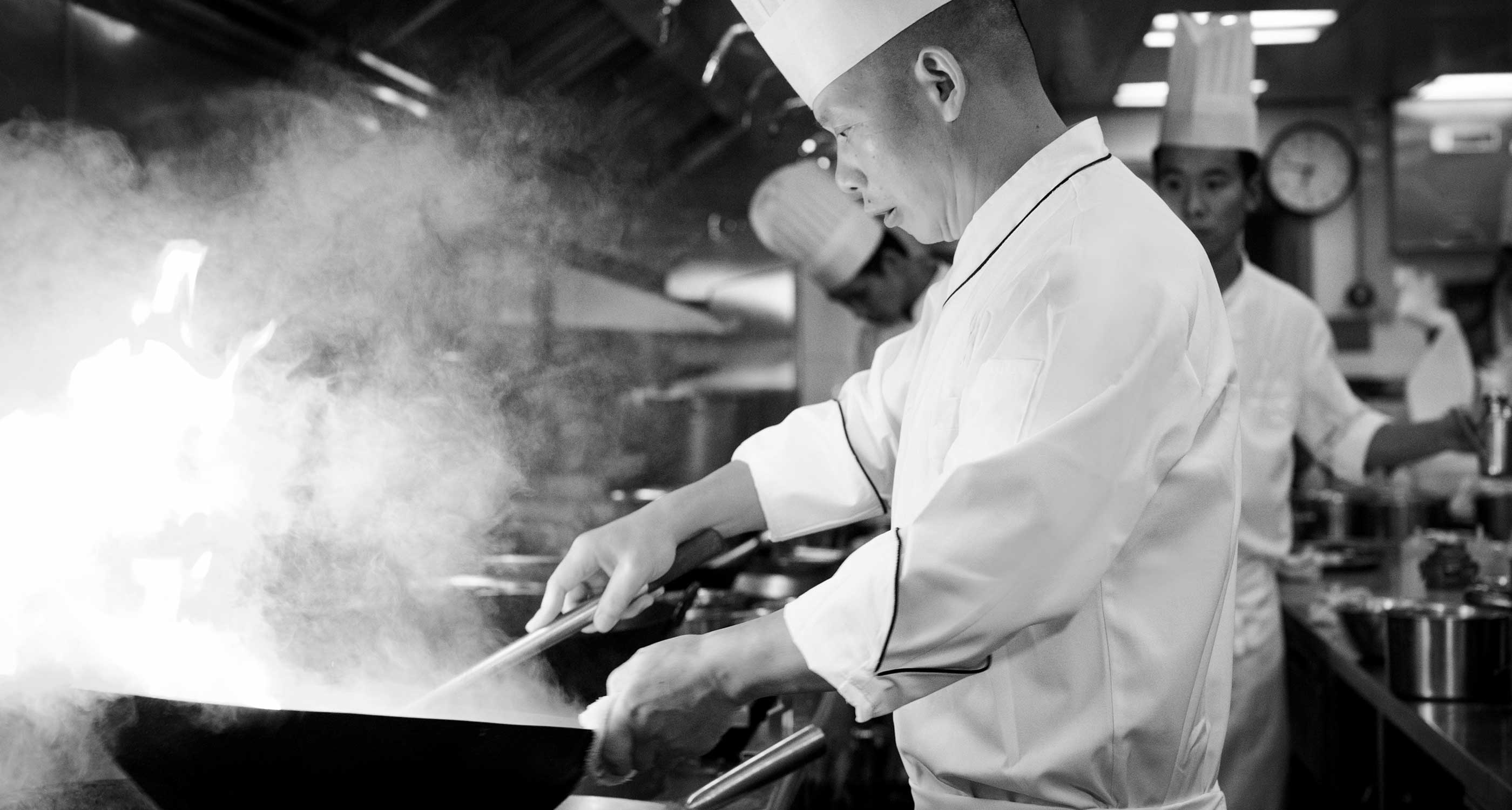
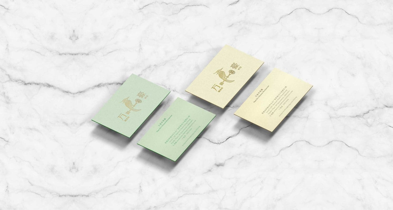
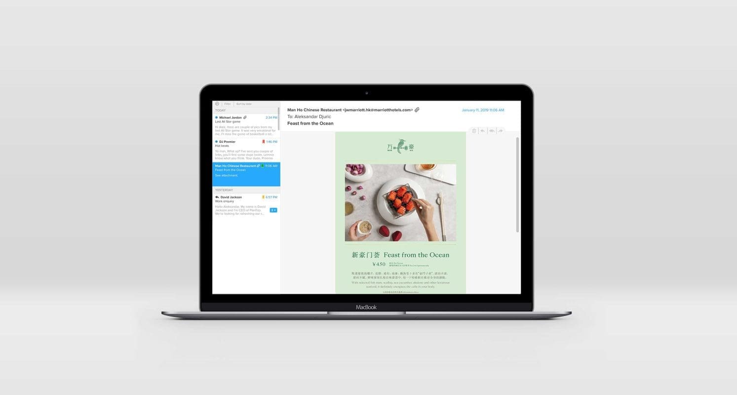
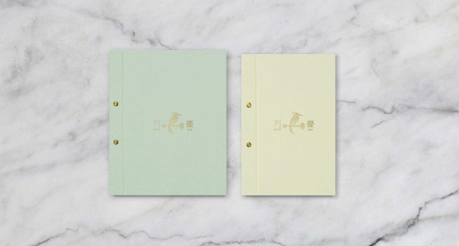
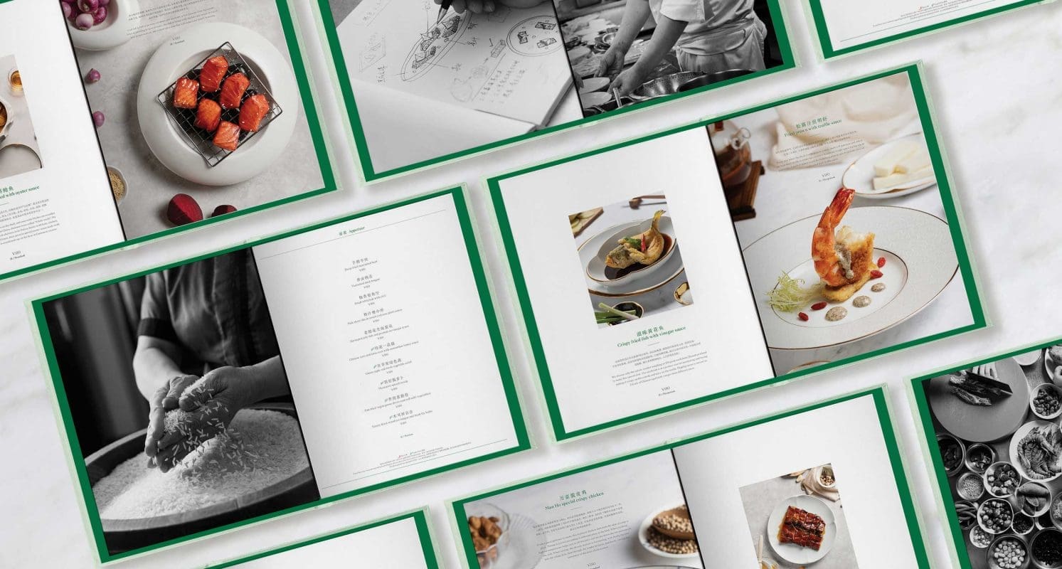
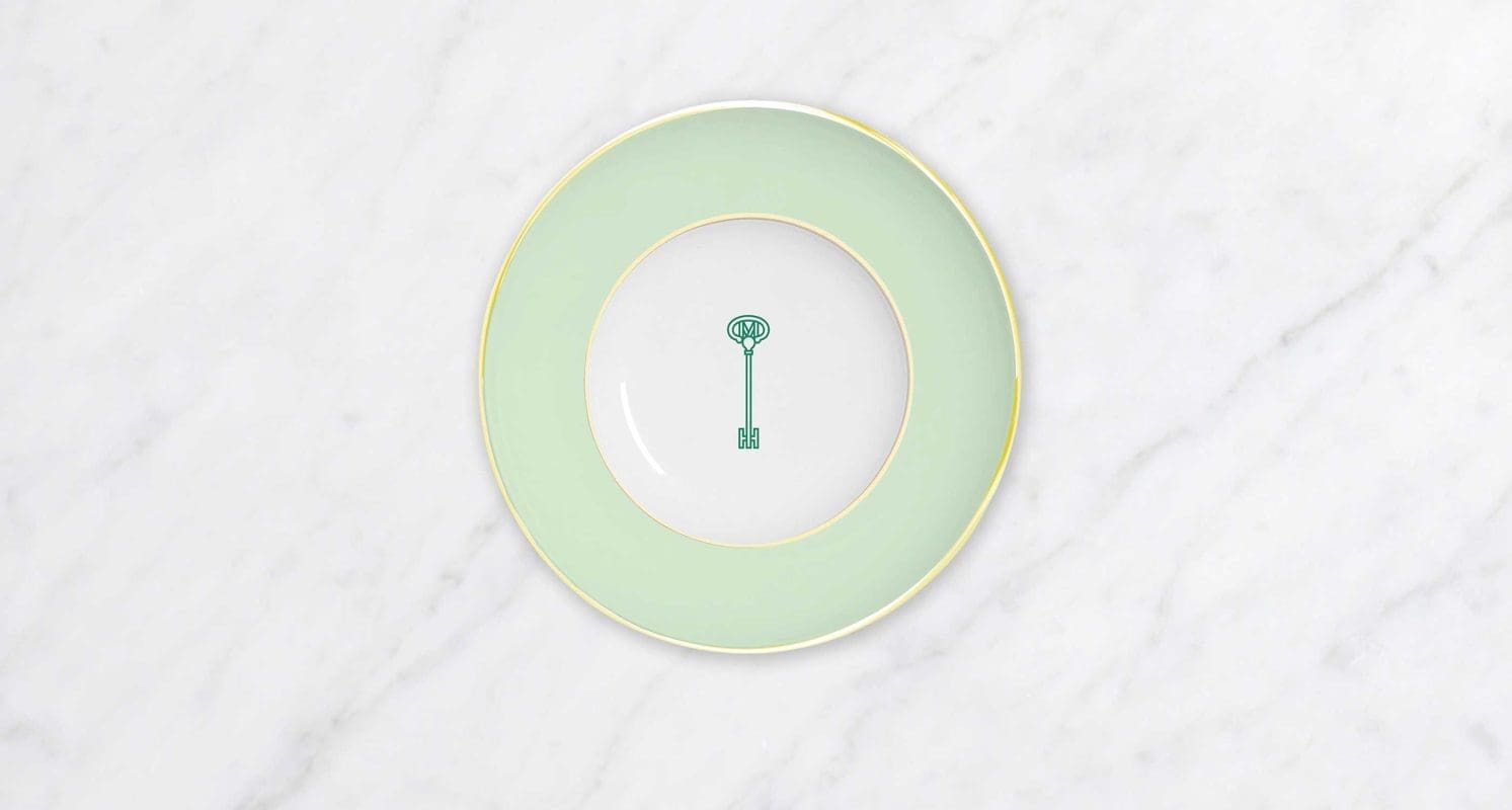
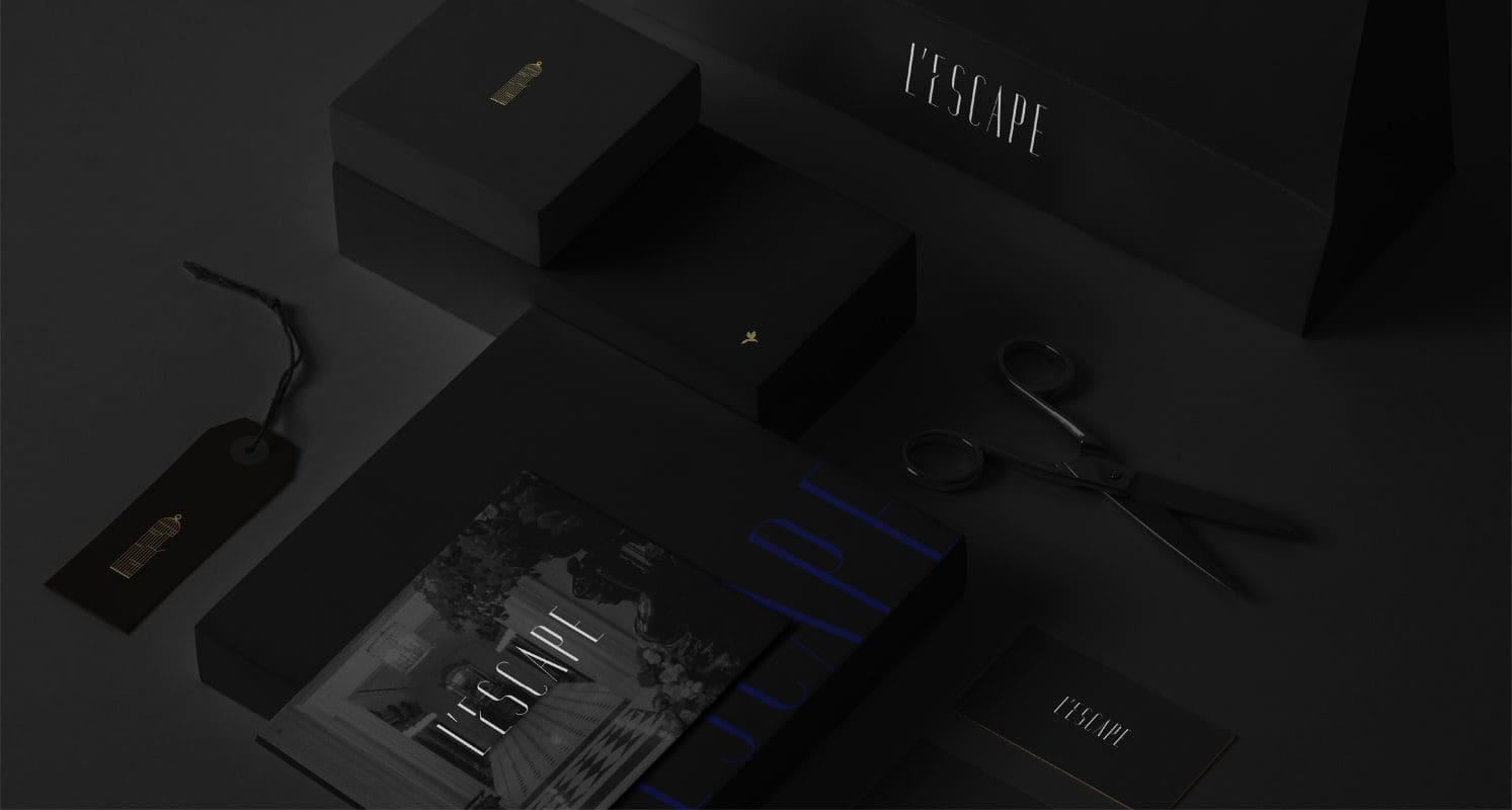
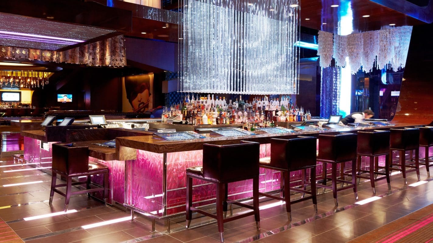
We brought the different brand strategies to life by carefully crafting distinctive visual identities for each hotel. We also developed complete branding concepts for some of the food and beverage offerings within the hotels.


Impact
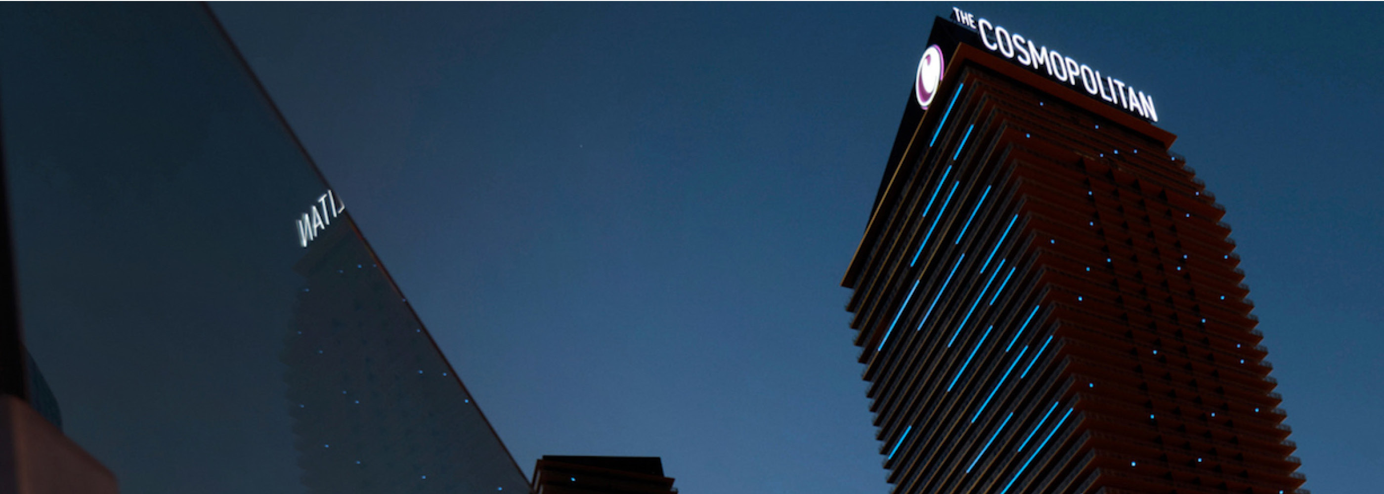
The four new hotel offerings by Josun Hotels & Resorts – L’Escape, Gravity, Grand Josun and Josun Palace – were subsequently launched between 2018 and 2021 to great success. The optimized portfolio and architecture strategy maximized revenues across the brands and serves as a growth engine for the group, unlocking new possibilities in its journey to become a global hospitality brand.
Our work with Josun Hotels & Resorts received critical acclaim including multiple awards from Transform Magazine’s Transform Awards Asia [1][2][3].
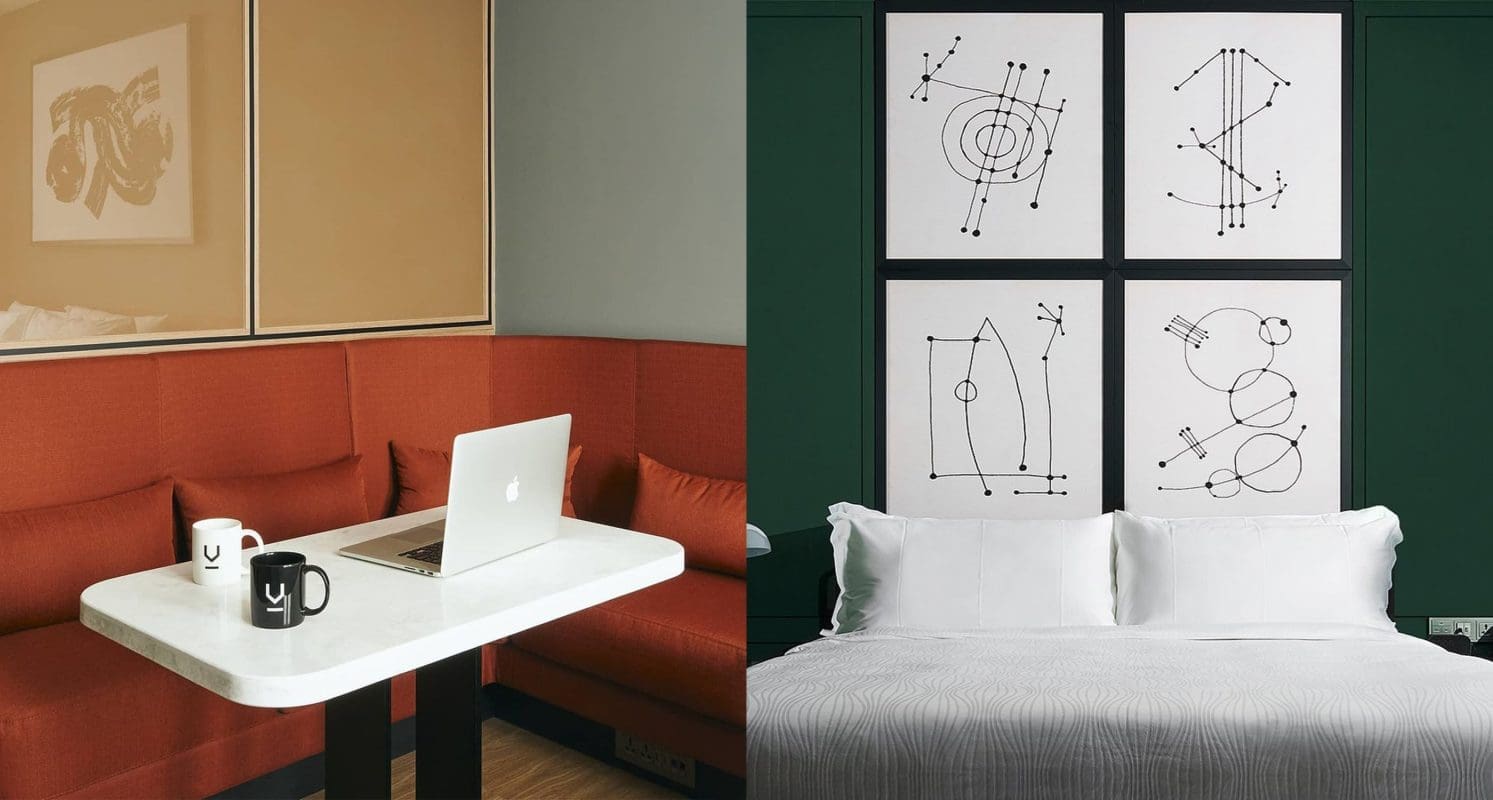
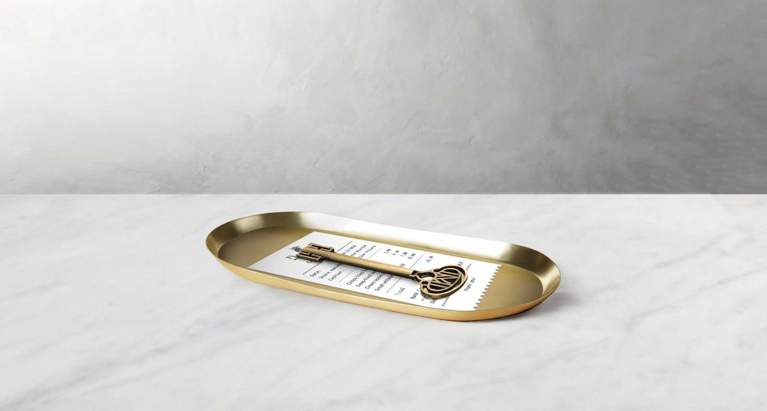
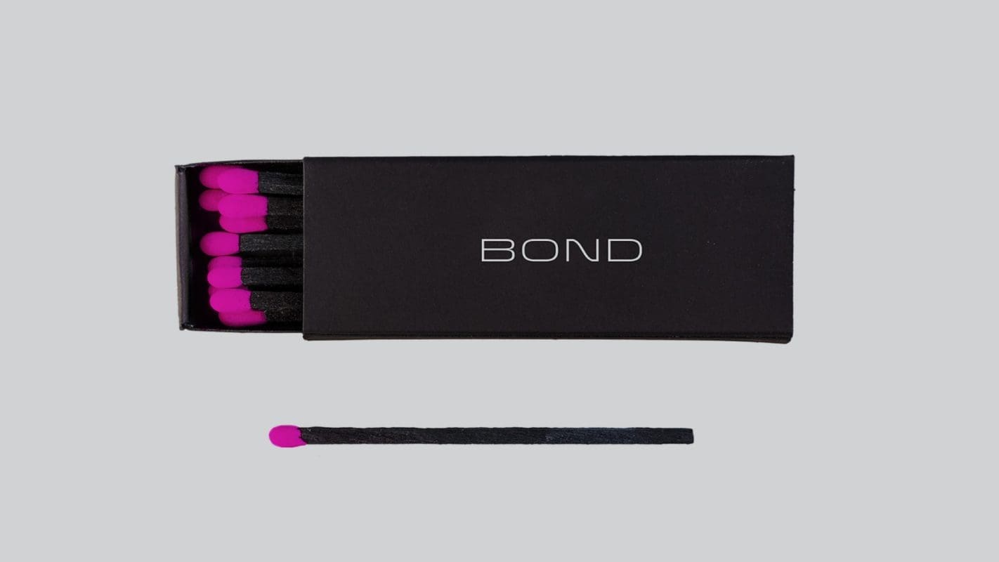
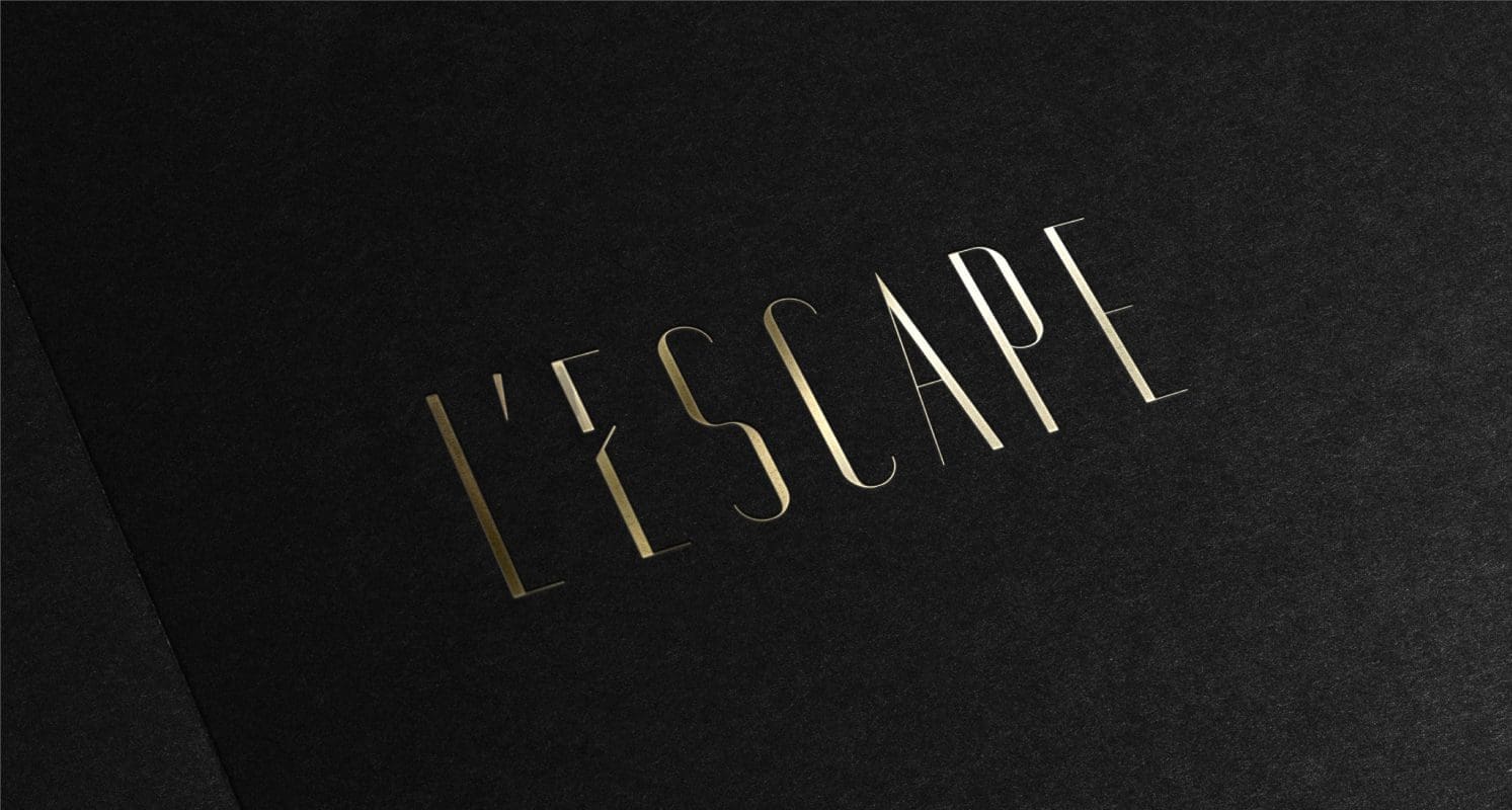
L’ESCAPE
Creating a Parisian escape in the heart of Seoul
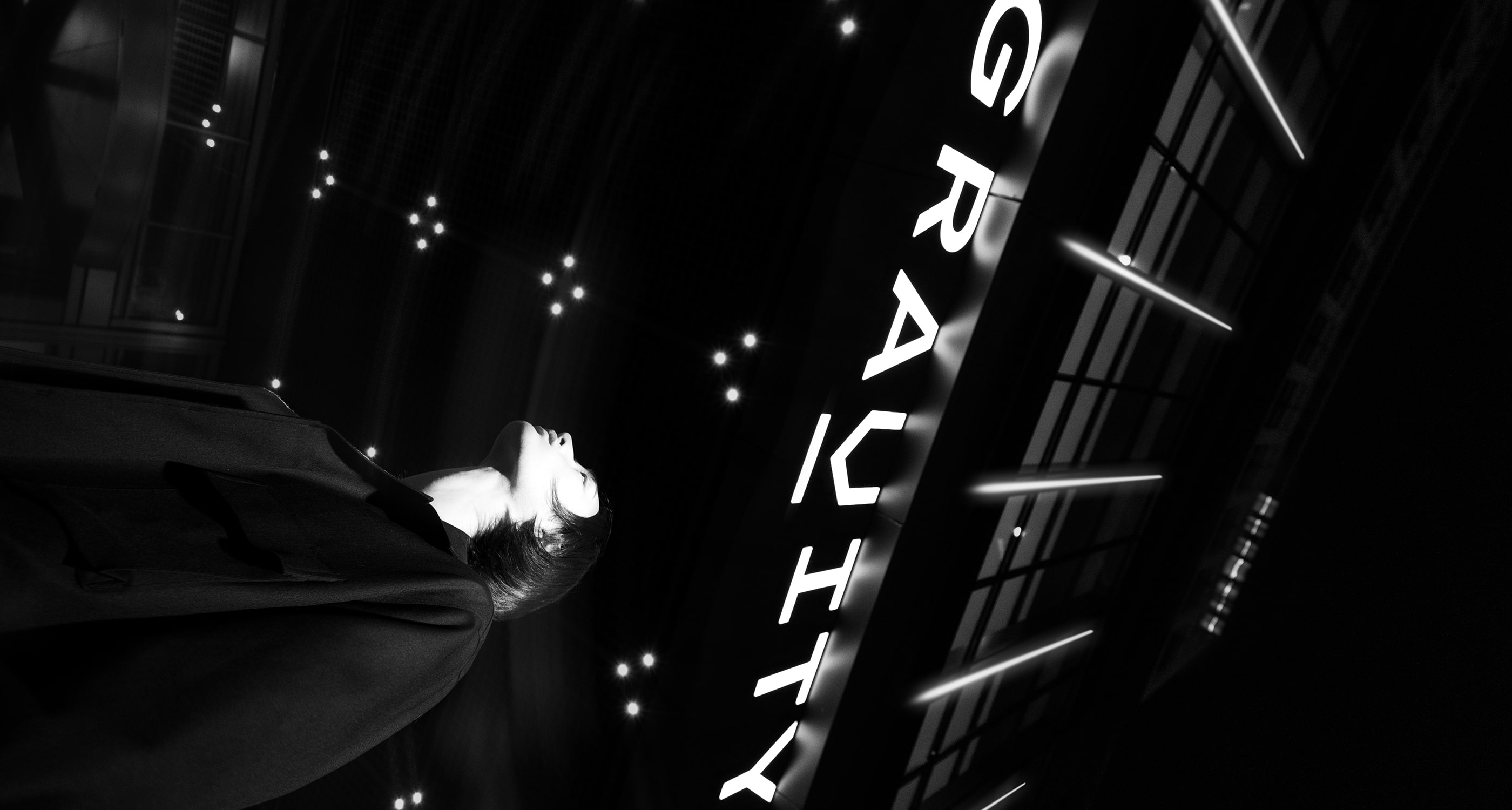
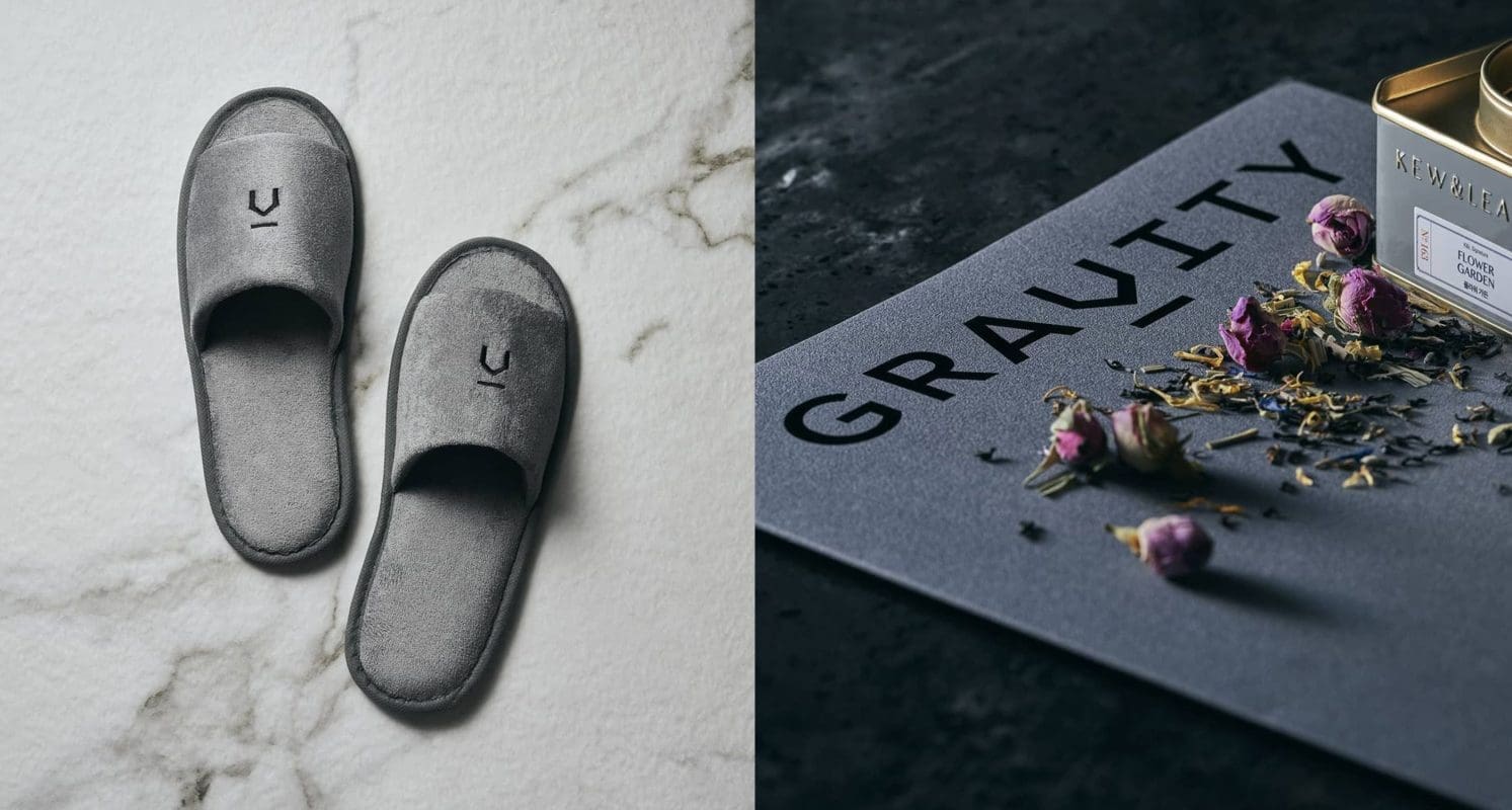
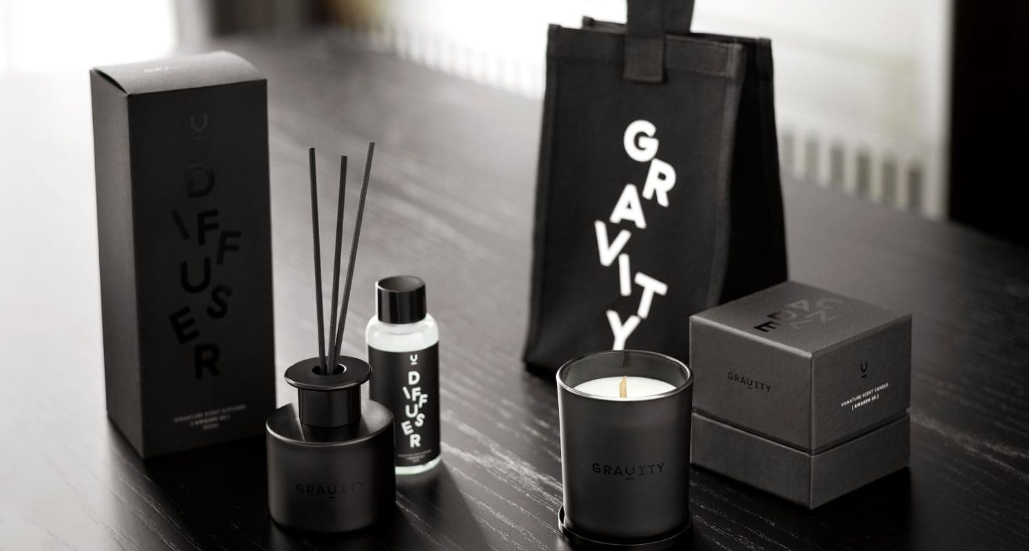
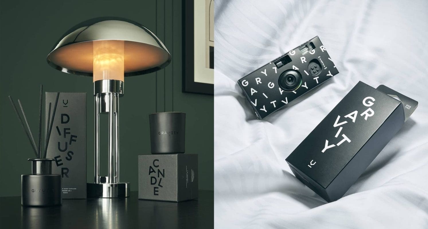
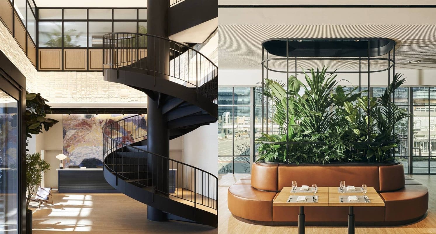
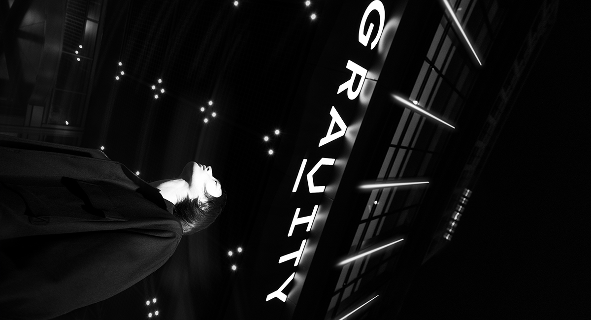
GRAVITY
From hotel to Millennial experience hub
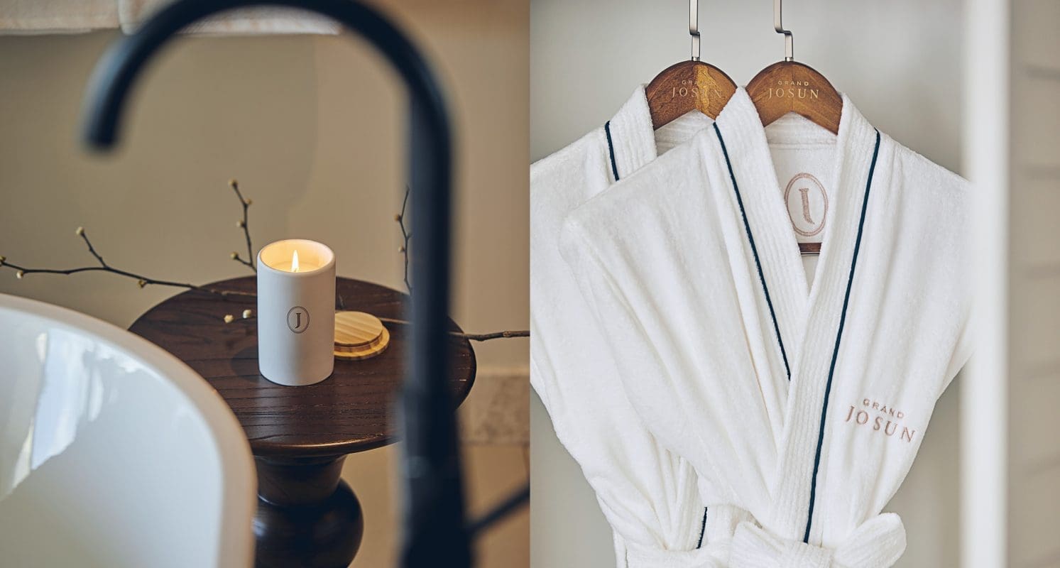
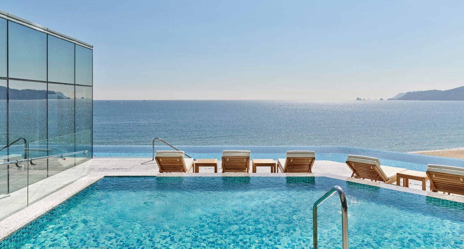
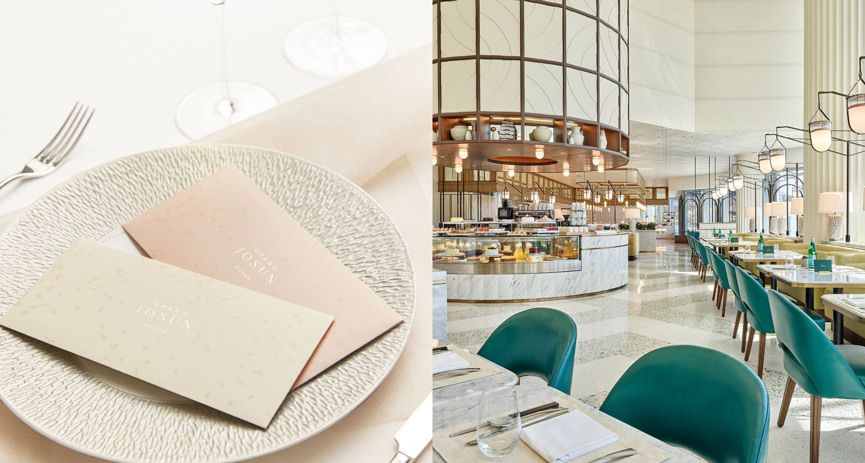
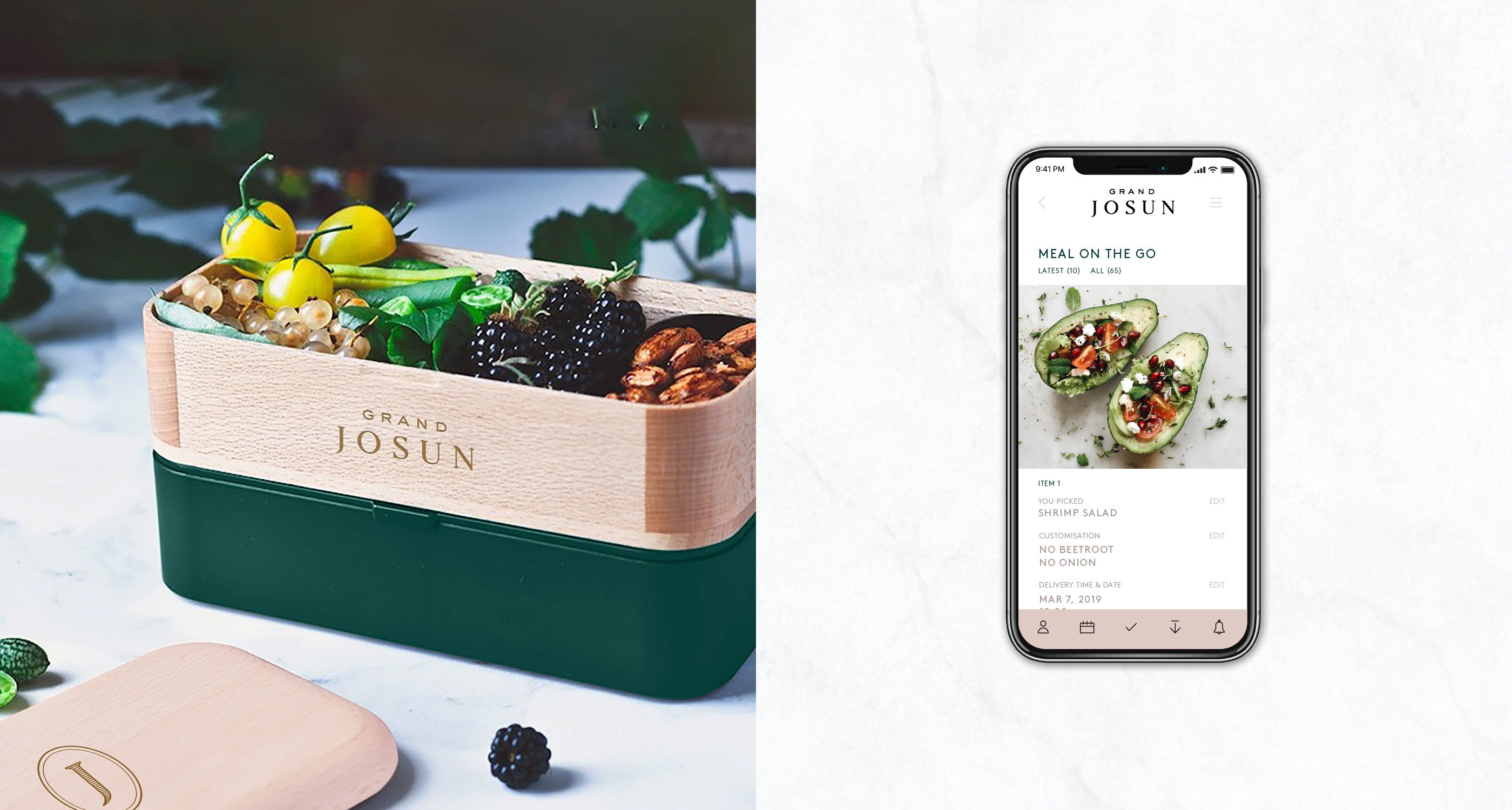
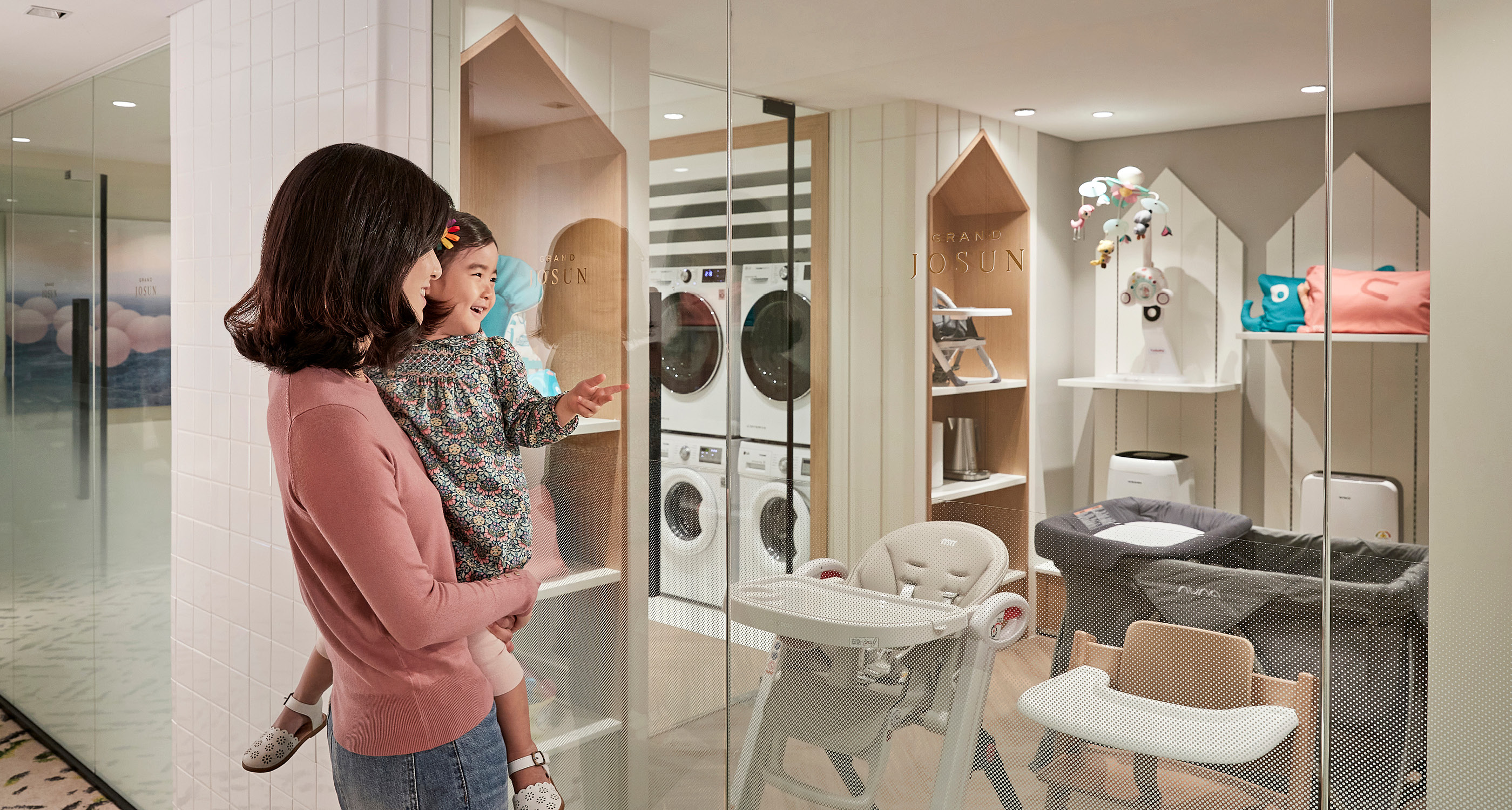
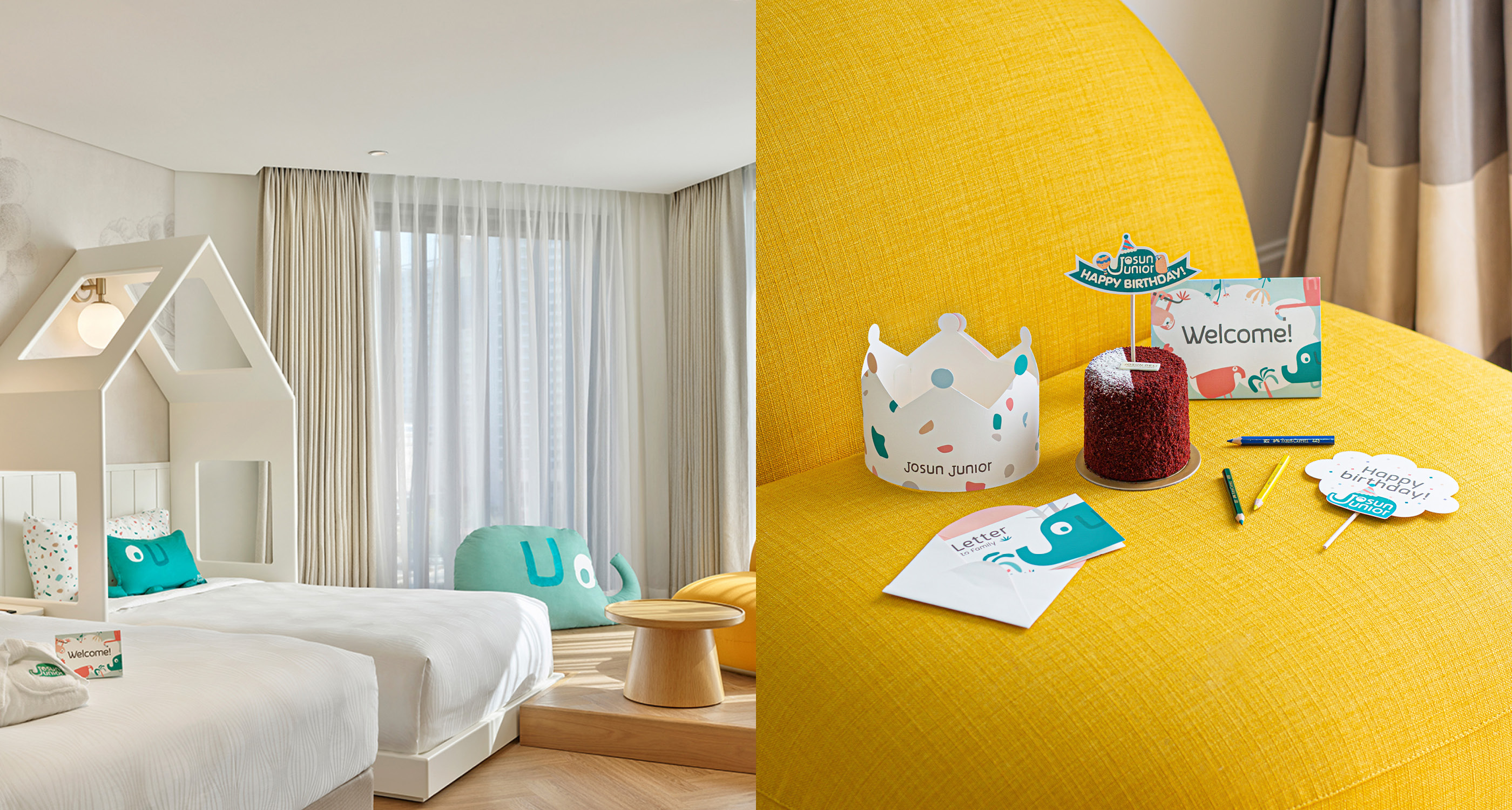
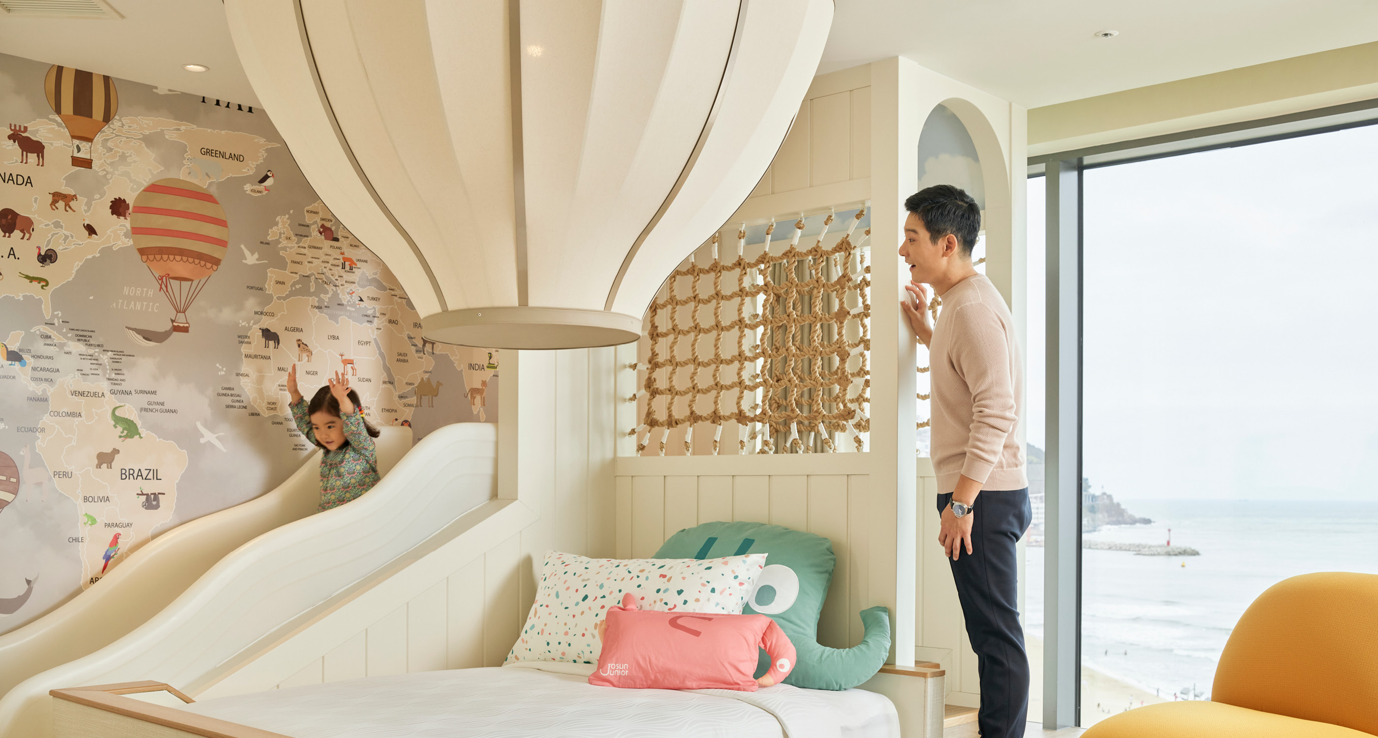
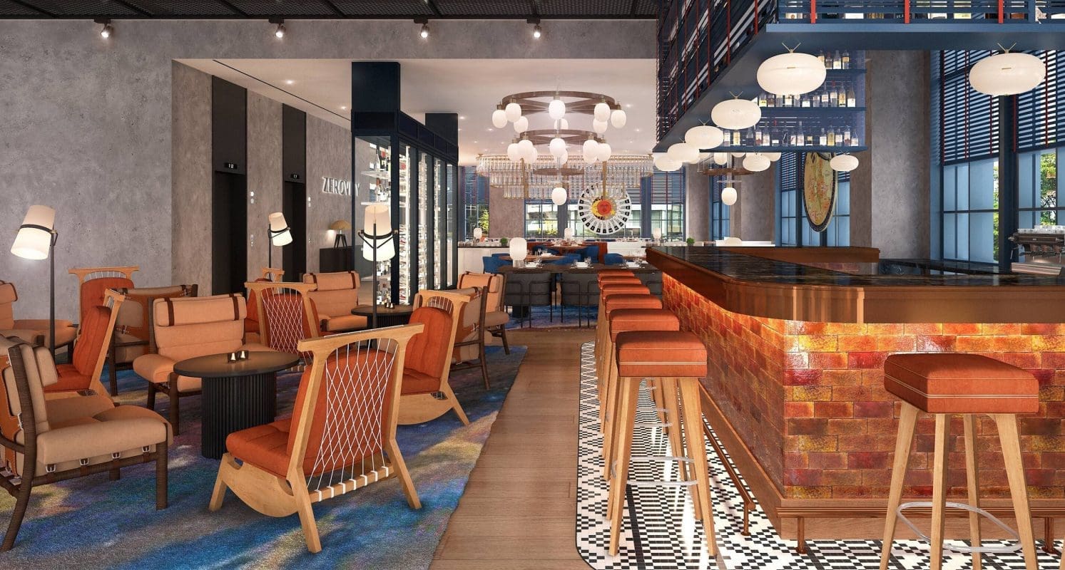
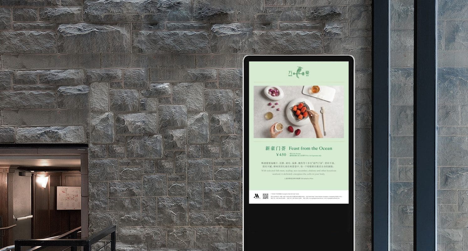
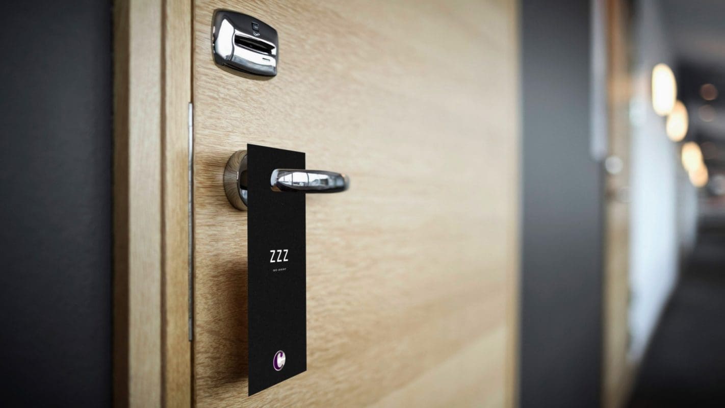
GRAND JOSUN
Extending the Josun heritage to create a premium hotel brand for families

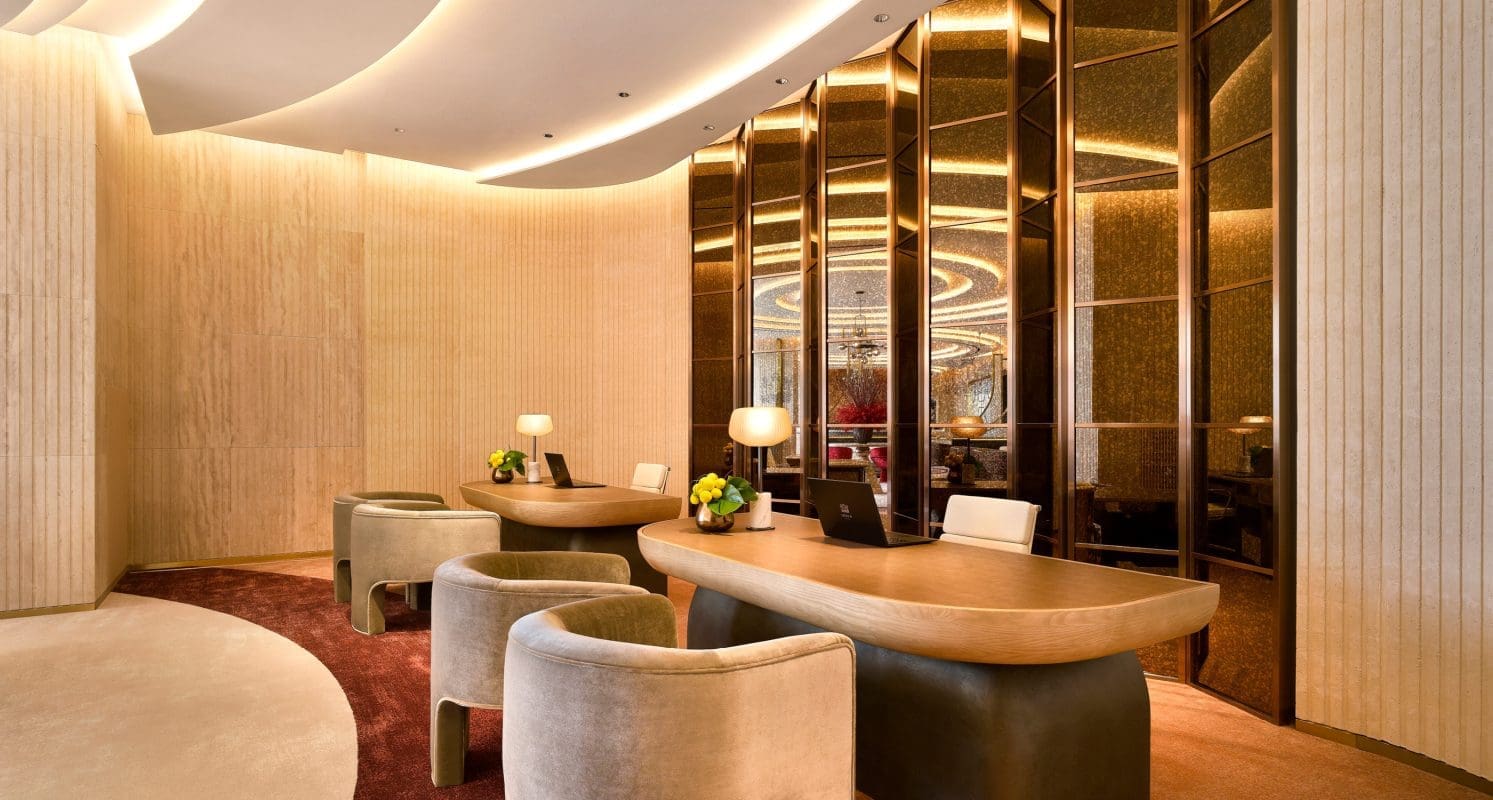
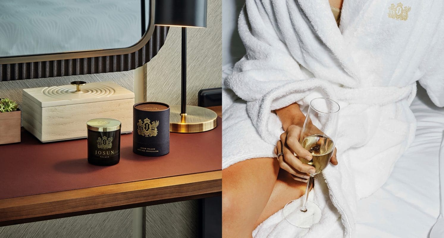
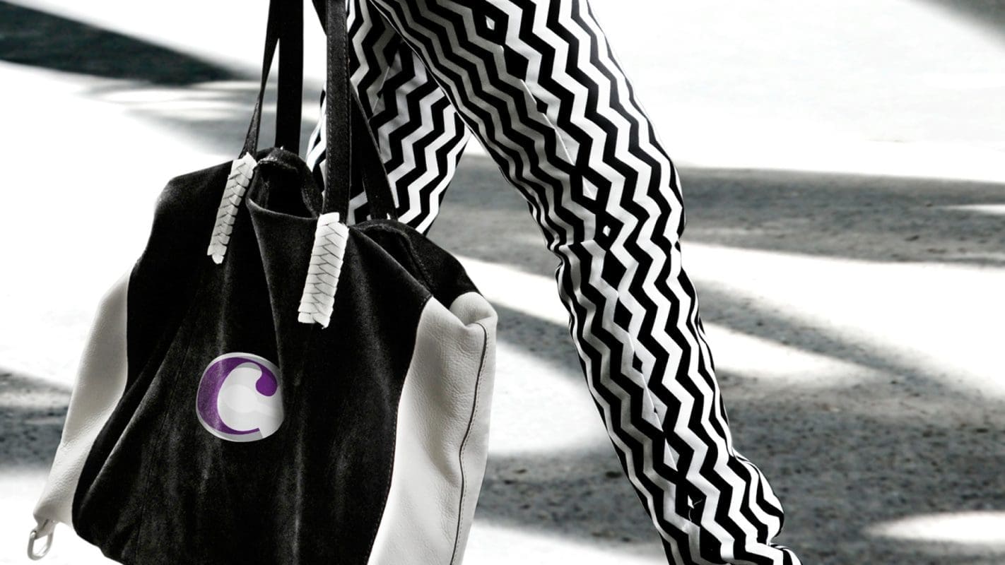
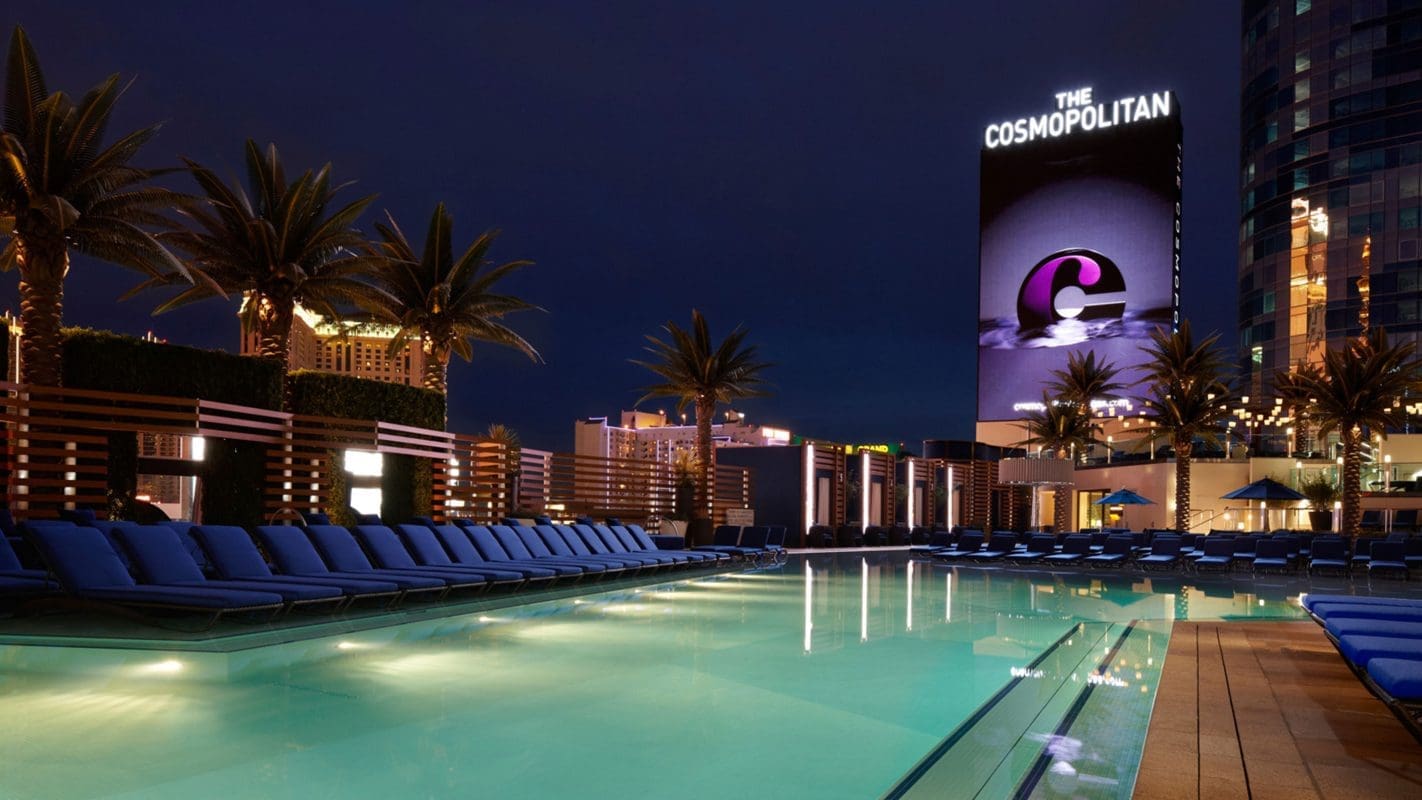
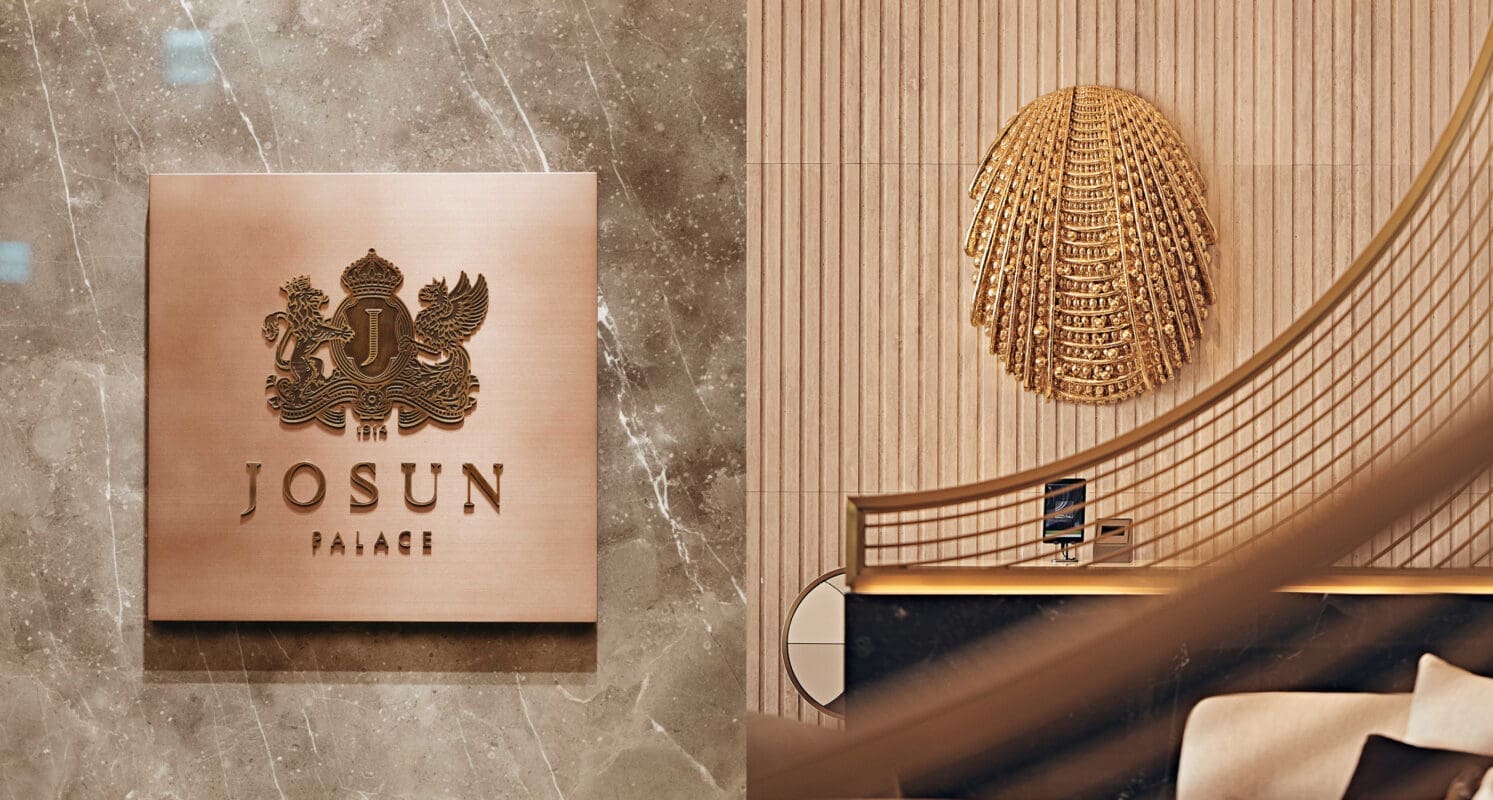
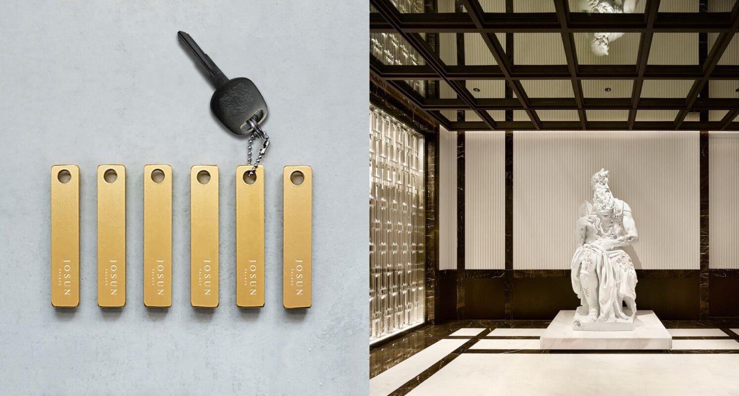
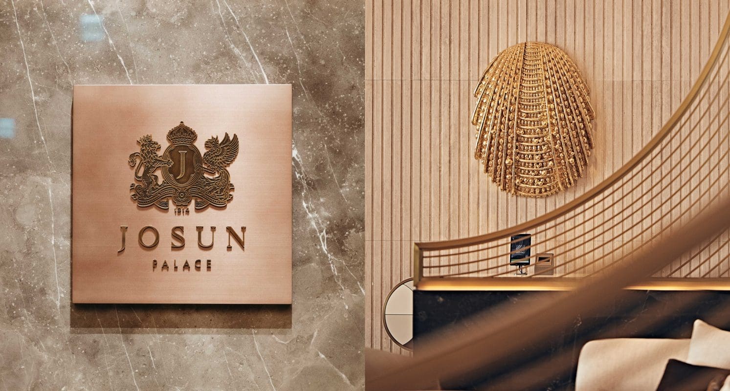
JOSUN PALACE
Creating a luxurious hotel brand under a winning portfolio
Let’s grow together
Have questions about your next growth move? Prophet has answers.