CASE STUDY
Kalmar
A brand refresh for a logistics business making moves in decarbonization
Challenge
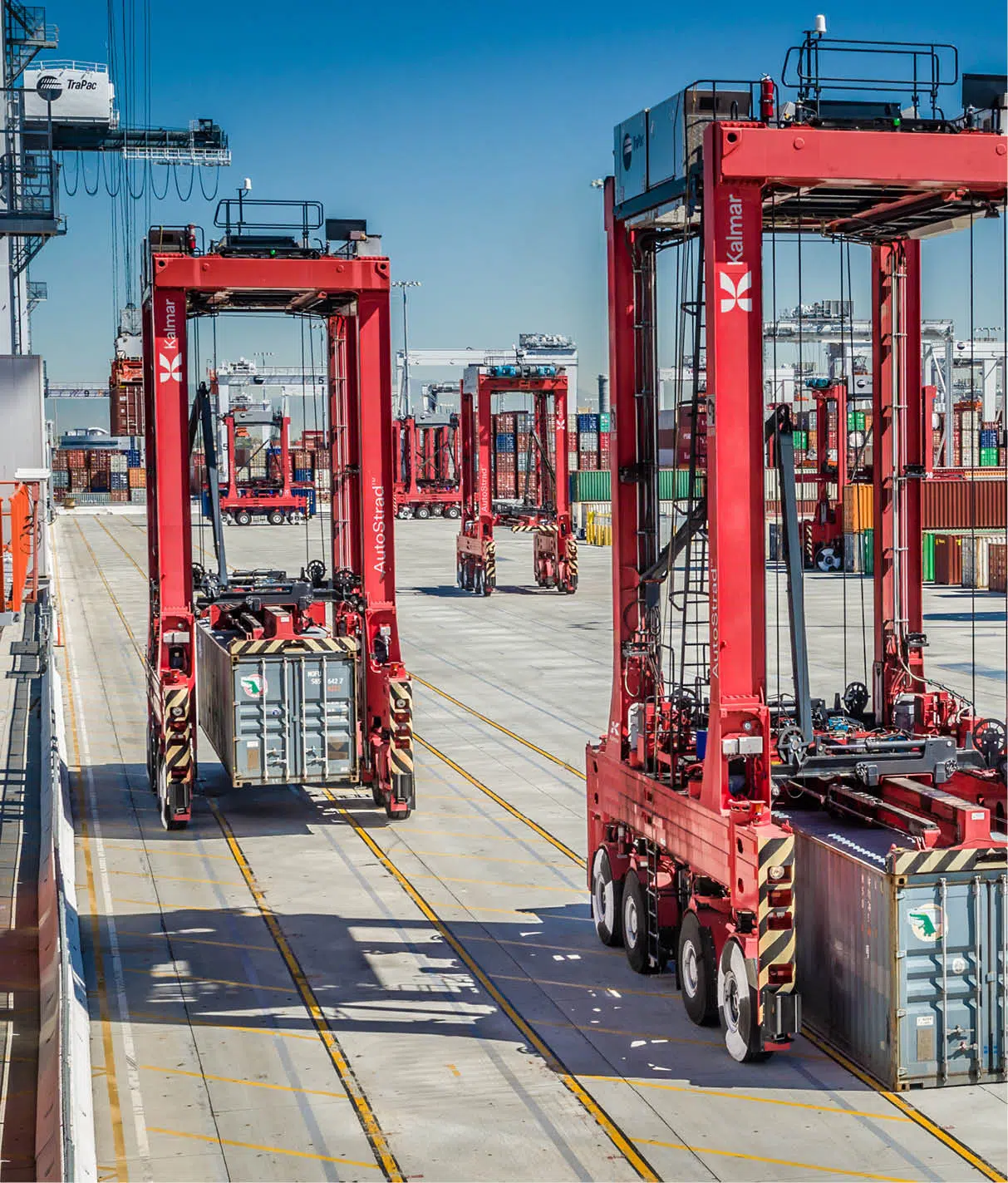
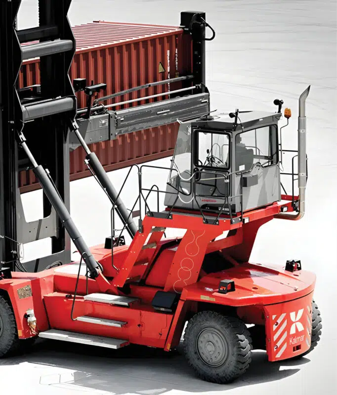
Kalmar belonged to the Cargotec Corporation of logistics businesses, recognized within the industry for their distinctive red color scheme and elephant symbol.
The Cargotec family had grown through acquisition and followed a branded house strategy for the main brands within their portfolio: Cargotec, the holding company, and Kalmar, Hiab and MacGregor.
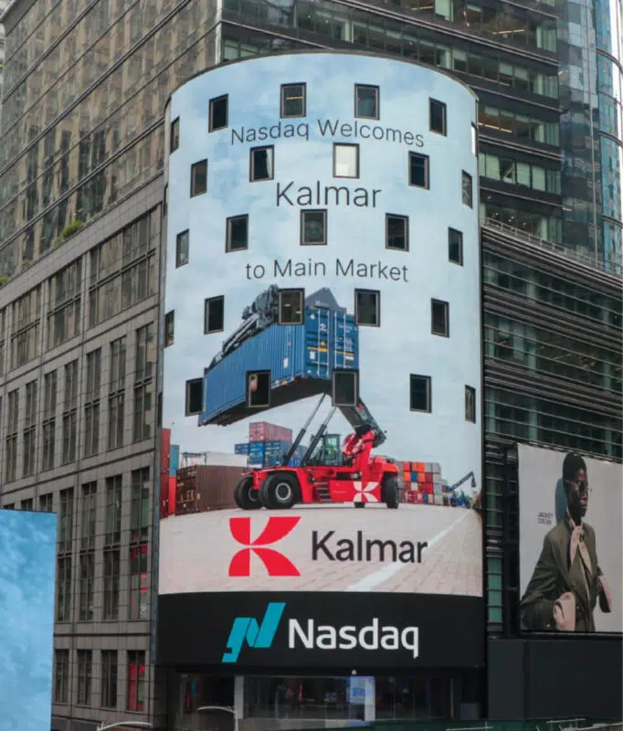
Following Cargotec’s decision to separate its core businesses, Kalmar and Hiab, into two standalone companies, Kalmar took the initiative to create a unique brand positioning, architecture and visual identity to support its future position as an independent, stock-listed company and brand. Prophet was selected as Kalmar’s partner to support this work.
Solution
We followed a three-stage process to refresh the Kalmar brand. First, we defined the brand positioning, building from elements that have always been true to the Kalmar brand, along with new elements that reflected the direction they were taking as a partner to their customers.
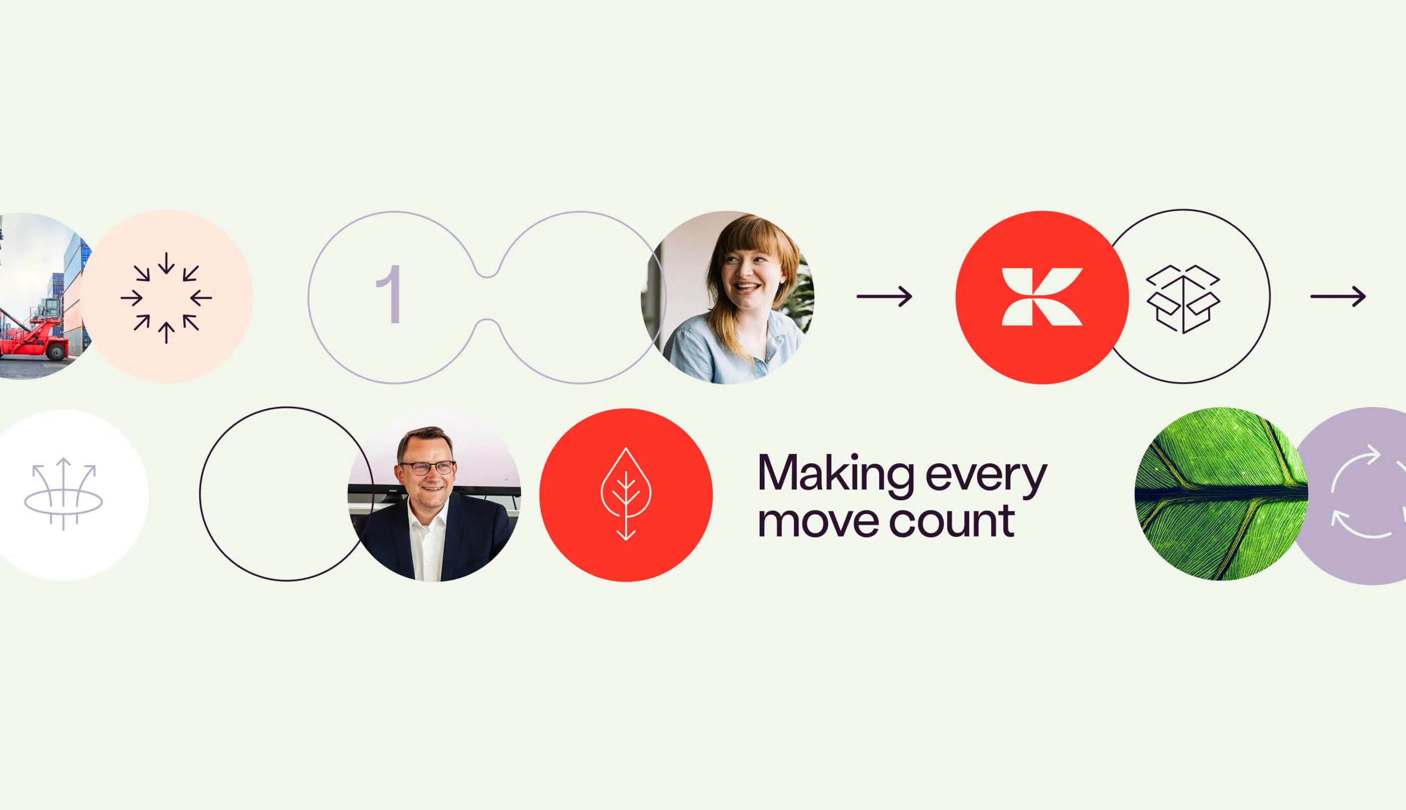
As a heavy logistics business, they played a crucial role helping their customers decarbonize their own operations. Thus, the existing customer promise around the idea of “Making every move count” became a central starting point for the new brand promise.
From here, we defined differentiating brand principles, which formed the foundation upon which brand messaging and activation was built.



A Brand New Identity
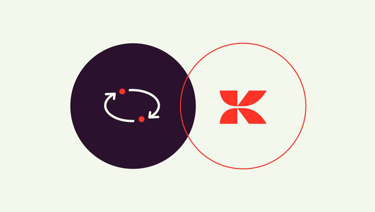
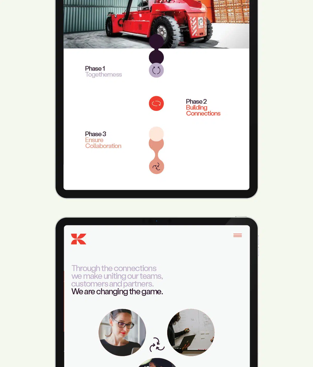
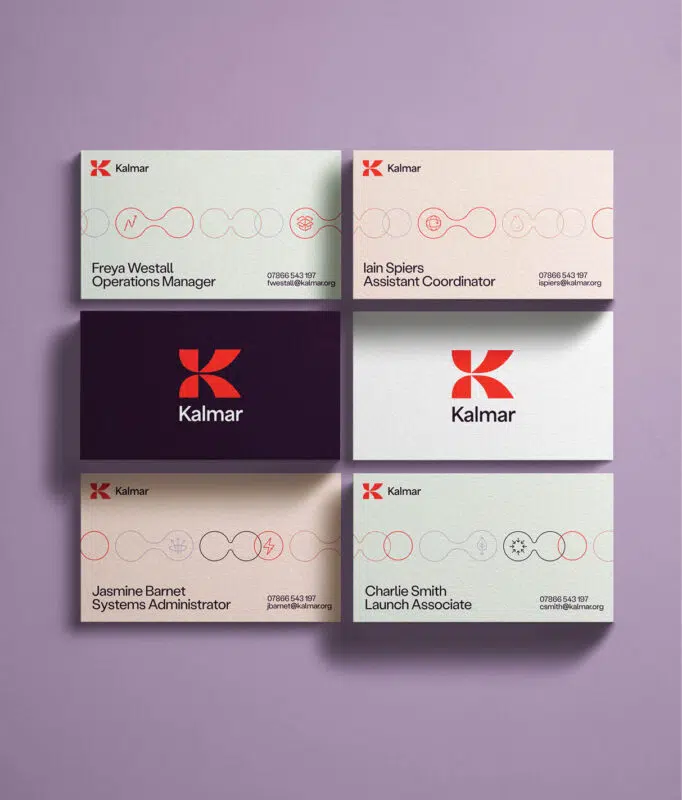
After exploring possible concepts , we landed on an identity ‘bonds of progress’, which represented how Kalmar plays a key part of the global supply chain and is the forerunner in sustainable material handling equipment and services. The bubble-like visualizations also communicate action, progress and collaboration, which are key elements of Kalmar’s brand positioning.
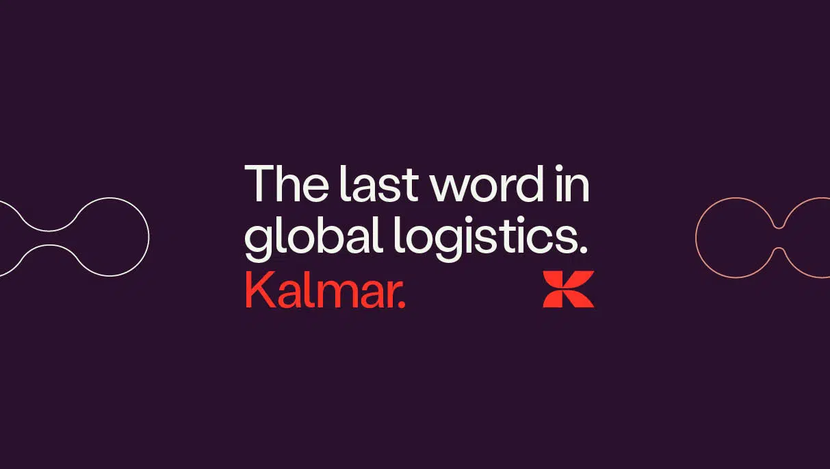
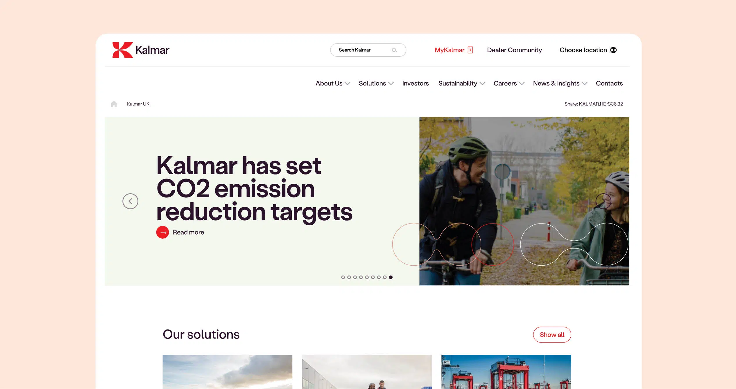
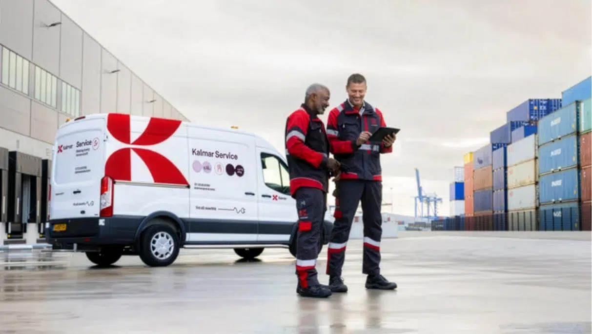
The new visual identity consisted of a new logo, color palette, typography and the ‘bonds of progress’ visualizations. The color palette retains the iconic Kalmar red while introducing new complementary colors to enhance versatility and vibrancy. The new logo consists of two elements: the refined ‘K’ symbol and the Kalmar wordmark.
Honoring Kalmar’s heritage of reliability, innovation and quality, the iconic Kalmar ‘K’ has been brought back with a fresh, modern shape that feels dynamic and expressive, yet still familiar. This refinement ensures the logo remains strong and distinctive, making Kalmar a recognizable and forward-looking brand.
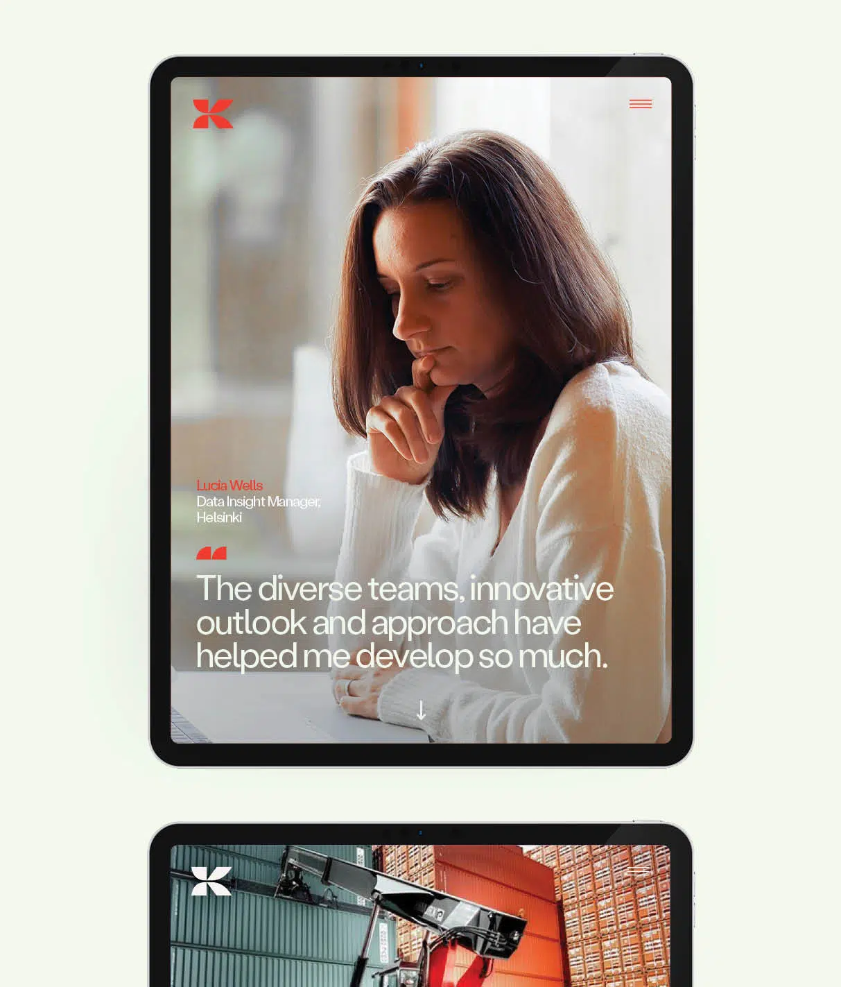
“People have reacted very positively to our new branding, and it has helped us to set the foundation for our future growth.”
Carina Geber-Teir
SVP, Communications,
Investor Relations and Marketing,
Kalmar

Activating the Brand
We built an activation plan to bring the new Kalmar brand to market, both internally and externally. This plan outlined how the updated brand could be launched to deliver the most impact, telling the story of the new brand through a phased, multichannel campaign.
We divided the launch activities into ‘foundational’ and ‘signature’ categories. Foundational activities were things that must be done to support the brand transition to help both internal and external audiences navigate the changes, such as explainer materials and office signage updates. Signature activities were high-impact ideas to tell the brand story through key moments of connection with each audience group, such as events and branded videos.

Results and Impact
The refreshed brand positioning and visual identity were met with a strong positive reaction from both internal and external Kalmar stakeholders.
The launch of the brand led to an all-time high in new visitors to the Kalmar website and an all-time high for impressions on their social media channels.

