
CASE STUDY
Morphy Richards
Reimagining the iconic home appliances brand to delight global audiences

Challenge
Morphy Richards, founded in the U.K. in 1936, is a leading home appliance brand with a long heritage. Despite the popularity, perceptions of the brand – particularly its British heritage – have grown less favorable. In some markets, consumers have begun to see the brand as unimaginative and outdated.
The new owner acquired the company in 2023 and tasked Prophet with reimagining Morphy Richards’ brand identity, unlocking growth opportunities in international markets. Morphy Richards needed to be reimagined as a truly global brand, with a plan for product development over the next three to five years.
Solutions
To achieve maximum growth, we believe that a company’s brand strategy should always go hand-in-hand with its business strategy. So, we started by learning all we could about Morphy Richards’ vision. We conducted in-depth interviews with senior management and distributing partners in different markets, reaching a precise alignment: Morphy Richards strives to become a leader in small home appliances in multiple categories. As a premium brand, it is innovative and has a distinctive style. Morphy Richards is committed to connecting closely with consumers, providing products that fill their daily lives with delightful surprises.

Multi-Lens Positioning Model
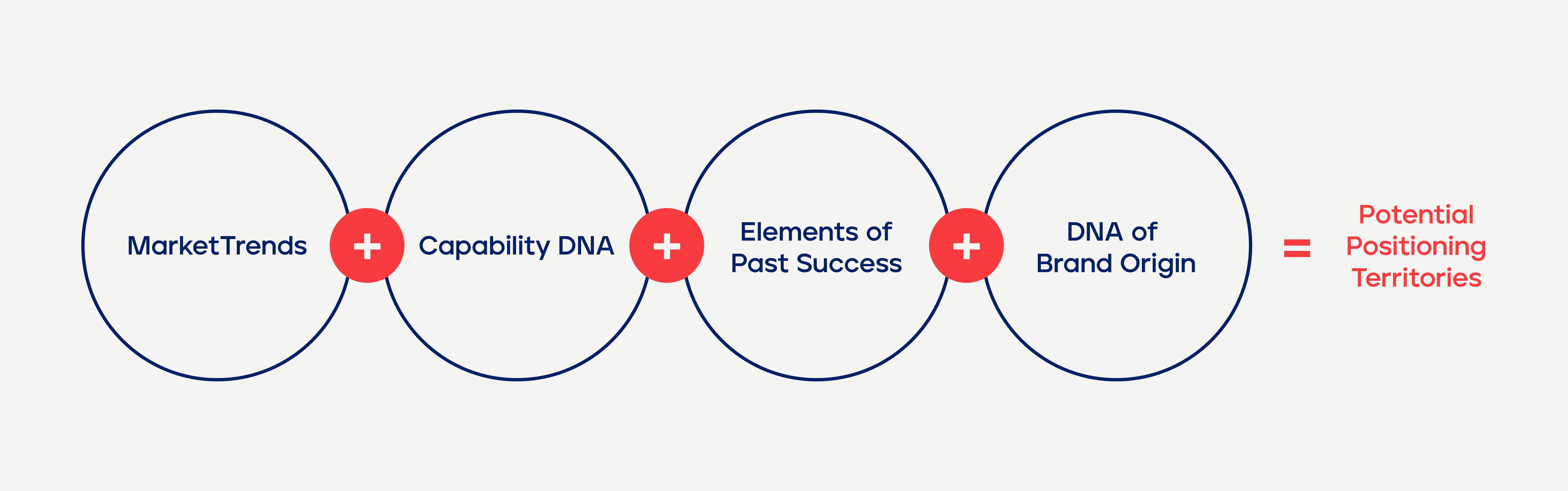
After we helped Morphy Richards answer the critical “who are we?” question, we helped it articulate the values and promises it brings to consumers. We also showed how those elements deliver against the brand’s positioning. These comprehensive frameworks laid a solid foundation for Morphy Richards’ future brand building. The refreshed brand positioning also provided clear direction for product upgrades and innovation.
We recommended updating the brand tagline from “Smart Ideas for Your Home” to “Smart Ideas for Your Life” to reinforce the brand positioning and underline Morphy Richards’ extended value proposition. The product team at Morphy Richards has begun to incorporate the refreshed brand positioning into the product design and planning process. The concept of “integrated innovation” has become the center of gravity of new product development.
Based on the new brand positioning, we developed a visual identity system. We retained the brand’s classic red elements while transforming traces of its British look into a dynamic and stylish visual system. It is modern, yet also true to the Morphy Richards legacy. We developed a detailed brand book, providing clear definitions and guidelines for applying different elements of the visual identity system, including the logo, graphics, colors, packaging, fonts and photography.

Results
Morphy Richards officially launched its new brand identity in April 2024. The refreshed brand has injected new energy into the Morphy Richards organization and helped its brand team clarify the goals and mission for brand building and product development, driving uncommon growth in its new chapter.
To support the brand positioning upgrade, Morphy Richards will continue to launch innovative products in international markets, striving to elevate people’s quality of life by bringing smart ideas to their homes.


“Our team holds great respect for the new brand positioning of Morphy Richards, which represents both our past legacy and future ambitions. It has become a benchmark for our work. Despite the challenges, this process has helped us align multiple departments.
Before every product idea, we now ask ourselves: Does it convey ‘smart life’? Is it innovative? And does it create an improved user experience? We are excited about this positive, purposeful change. We believe it will endure through longer growth cycles, enabling Morphy Richards to enter thousands of new households and become genuinely known and loved.”
Ray Zheng
CEO

Embracing “Morphy Richards Red”
Morphy Richards has been using two visual identity systems in different global markets. The visual system with the “Morphy Richards Red” as the primary color has been used longer and on a broader scale, especially in China. We recommended Morphy Richards retain this classic red in the refreshed visual identity to reserve and consolidate its brand assets.


Creating an Ownable Supergraphic System
We developed a modular grid system incorporating the arc elements from Morphy Richards’ “M” and “R” to design a flexible, simple, and easy-to-use supergraphic system.


Interpreting the Unique DNA of British Design
As a brand that originated in the U.K., elements of Morphy Richards heritage are essential in the new brand positioning. Prophet’s design teams in Hong Kong and London immersed themselves in debates about what makes British design truly distinctive, ultimately settling on four characteristics of the British DNA that would strengthen the brand in its reinvention. These characteristics are fundamental elements and design logic to create the “most Morphy Richards” visual system.


