CASE STUDY
Food Bank of Contra Costa and Solano
Enhancing Digital Communications in the Fight To End Hunger
Challenge
Food Bank of Contra Costa and Solano’s mission is “Leading the fight to end hunger, in partnership with our community and in service of our neighbors in need.” To do so, they distribute food directly to low-income people at community sites and make food available for other nonprofit organizations serving the ill, needy and infants. This team distributed 40 million pounds of food between March 2020 and February 2021.
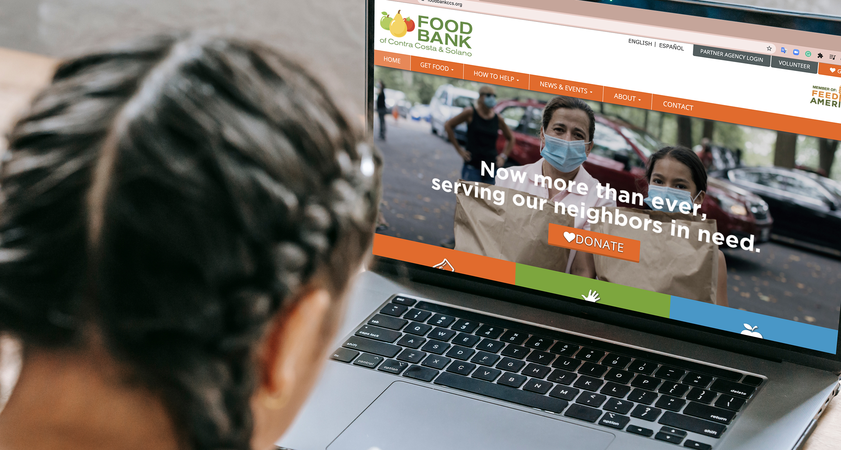
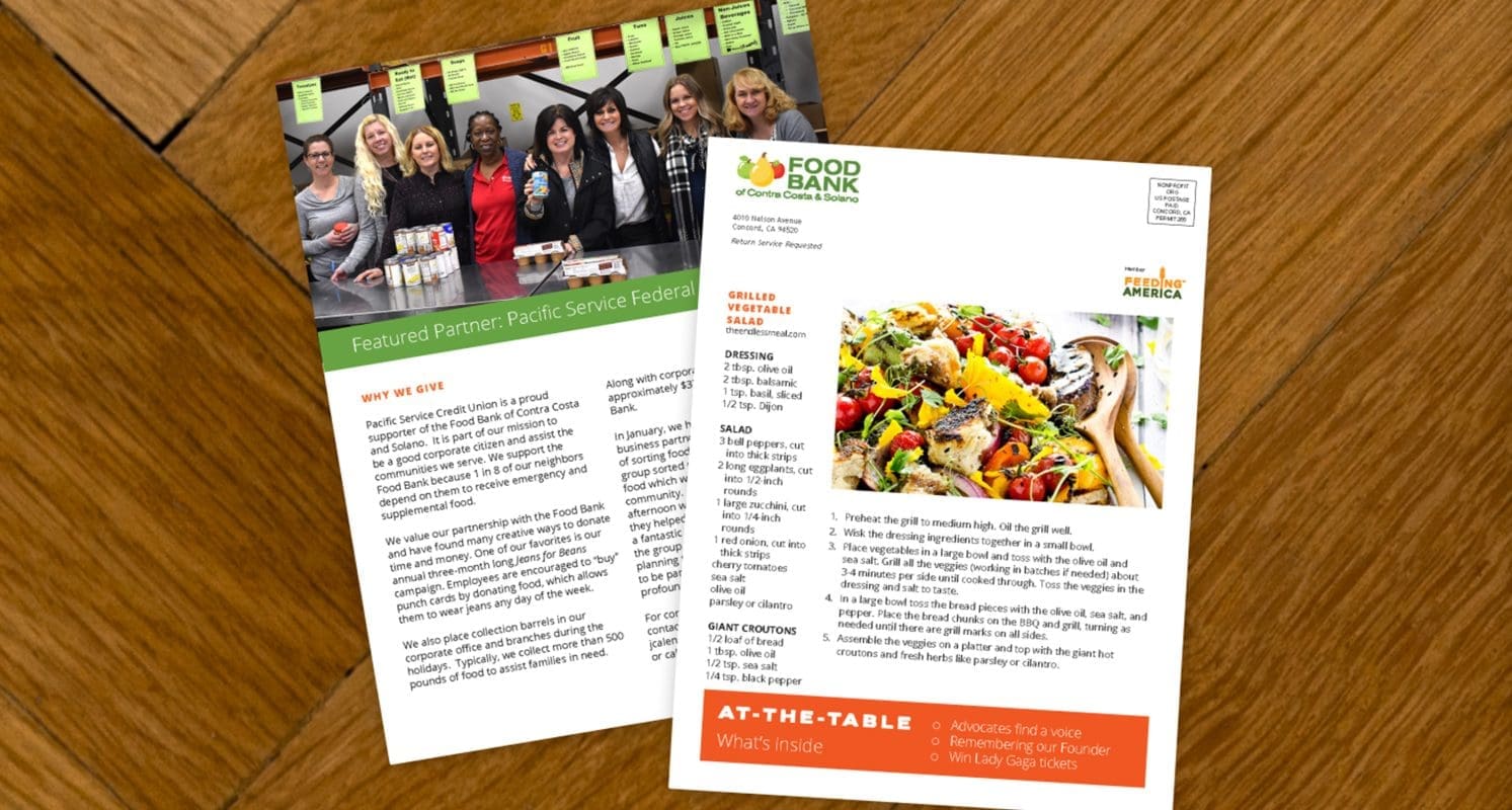
Food Bank asked us to help with its newsletter communication. The original printed newsletter was titled “Bread Connection” and dated back to the early 90s. Though minor layout changes were made through the years, the digital newsletter had an outdated layout with too much text and no audience focus. Additionally, articles were comprised of a too wide range of content including event updates, program statistics and stories about the brand’s service.
Solutions
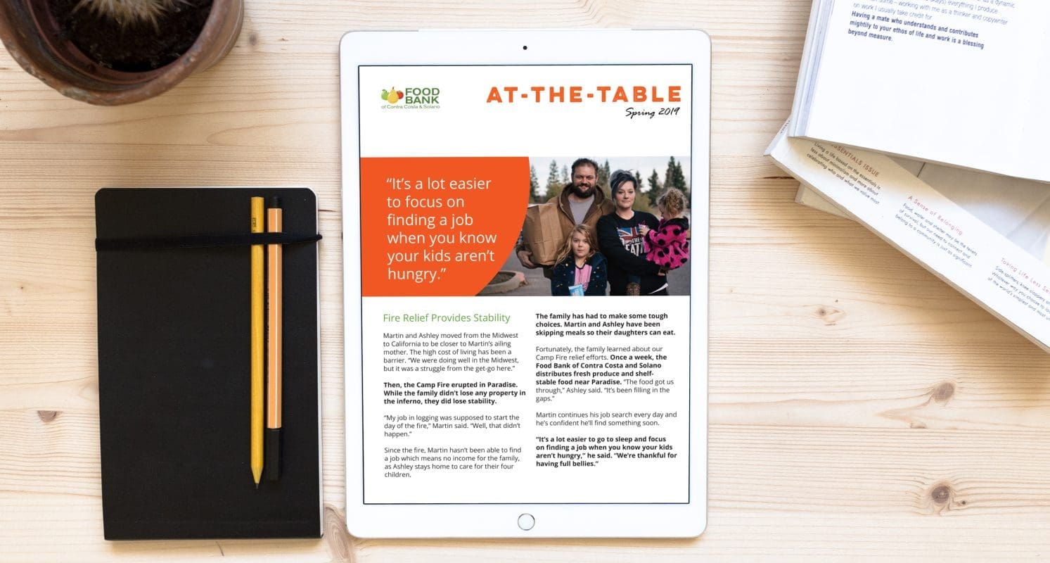
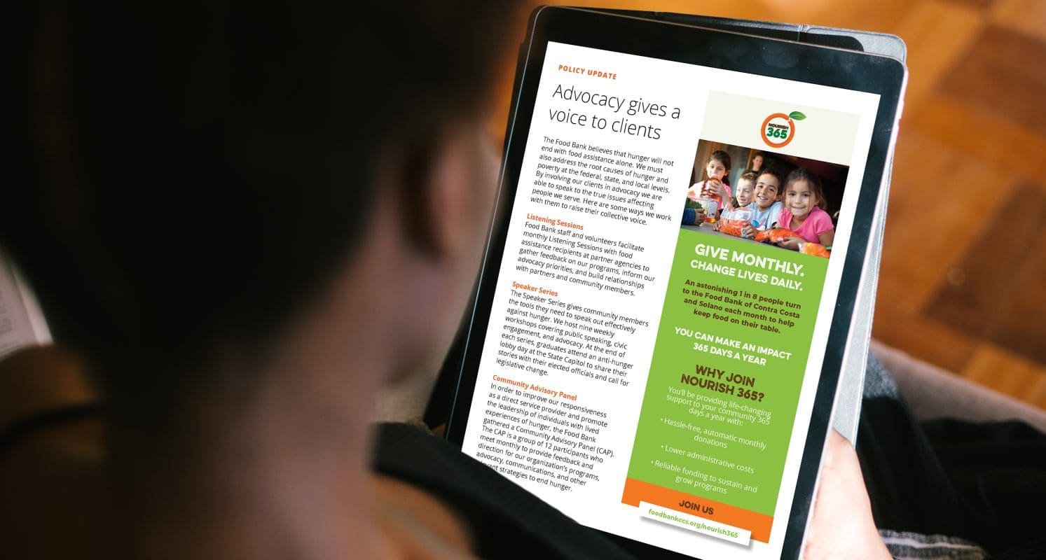
Prophet helped Food Bank of Contra Costa and Solano define a targeted messaging approach, a topic framework and target audience for the print newsletter. After desk research and gathering employee feedback, the new title “At the Table” was selected. It reflects the coming together of families to share stories and inviting the donor to have “a place at the table” while staying connected to what’s happening.
The design of the printed newsletter was modernized to resemble a magazine’s balance between photos and white space. The digital newsletter audience was defined with help of a persona– Amy, a mom who wanted a hopeful, actionable, engaging email that could be applied to her life hassle-free. The digital issue was rebranded as “Refresh” and was given a design rework and new functionality (mobile responsiveness).

Results
Today, Food Bank of Contra Costa and Solano sends its newsletters to donors who have given any gift within last three years as well as volunteers who have served hours within last two years. With a clearer focus, the Food Bank team found it easier to create purposeful, written content an impactful newsletter when developing each newsletter.
It saw an increase of about $3,000 in donations directly related to the printed newsletter in the first year, trackable from paper remit envelopes in each edition.
Its digital newsletter saw 82% of their active list, which currently has 22,395 subscribers, open at least one newsletter in the past year.

“Prophet’s rework of our newsletters was a gamechanger in our offline and online communication with donors and volunteers.”
Rachel Braver
Community Marketing Manager
Impact
3k
uplift in dollars donated via print newsletter
82%
open rate for email newsletter in past year