CASE STUDY
Samsung
Fusing insights & design to supercharge sales

Challenge
Innovation has always been the core driving force at Samsung – ensuring the brand not only keeps its spot as the market leader in technology and sales but also continues to push boundaries as a visionary pioneer of IoT, AI and 5G powered products and ecosystems.
Samsung’s annual EU Forum, its flagship event in the region, brings retail partners together to showcase its newest smart products and thought leadership. Each year, Prophet develops the strategic direction and supporting material for this high-profile event. In particular, the Prophet team was tasked to highlight the strides Samsung had made over the past year, better understanding what convinces or stops real people from getting on board with smart technology and showing how Samsung’s superior connected products cater to these needs to make life that little bit simpler.
Solutions
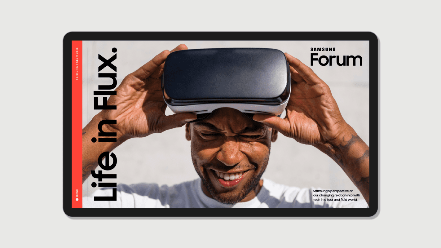
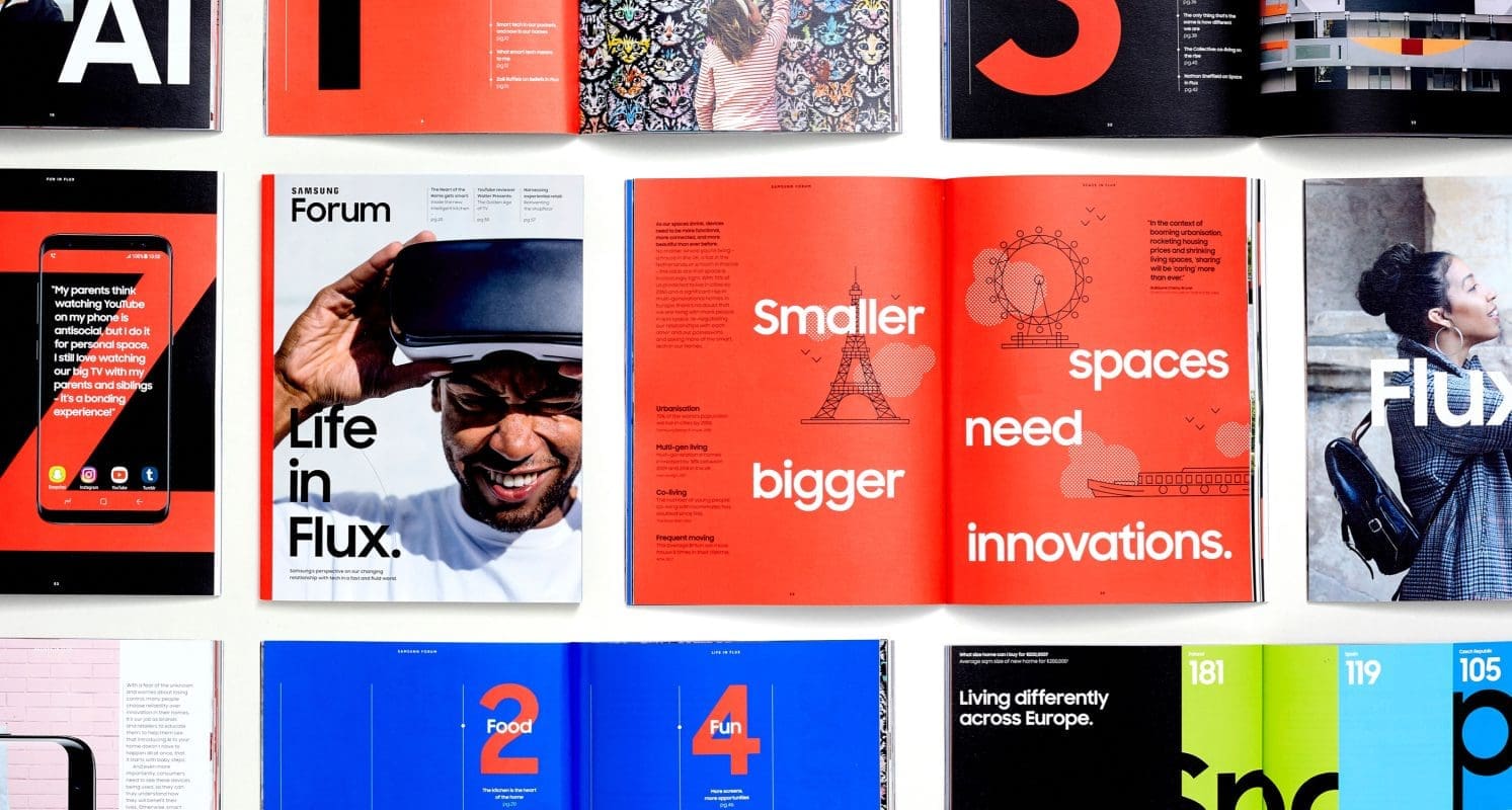
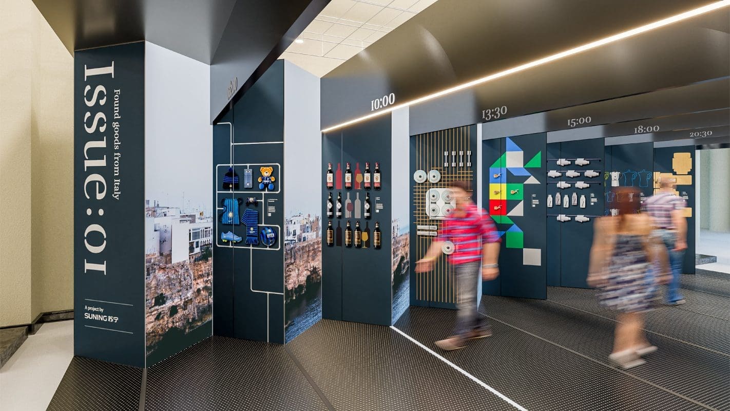
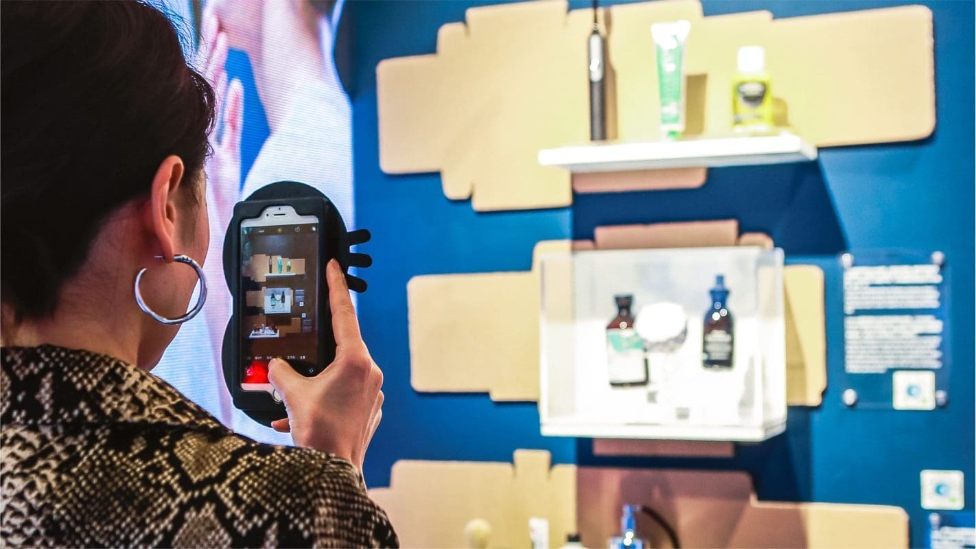
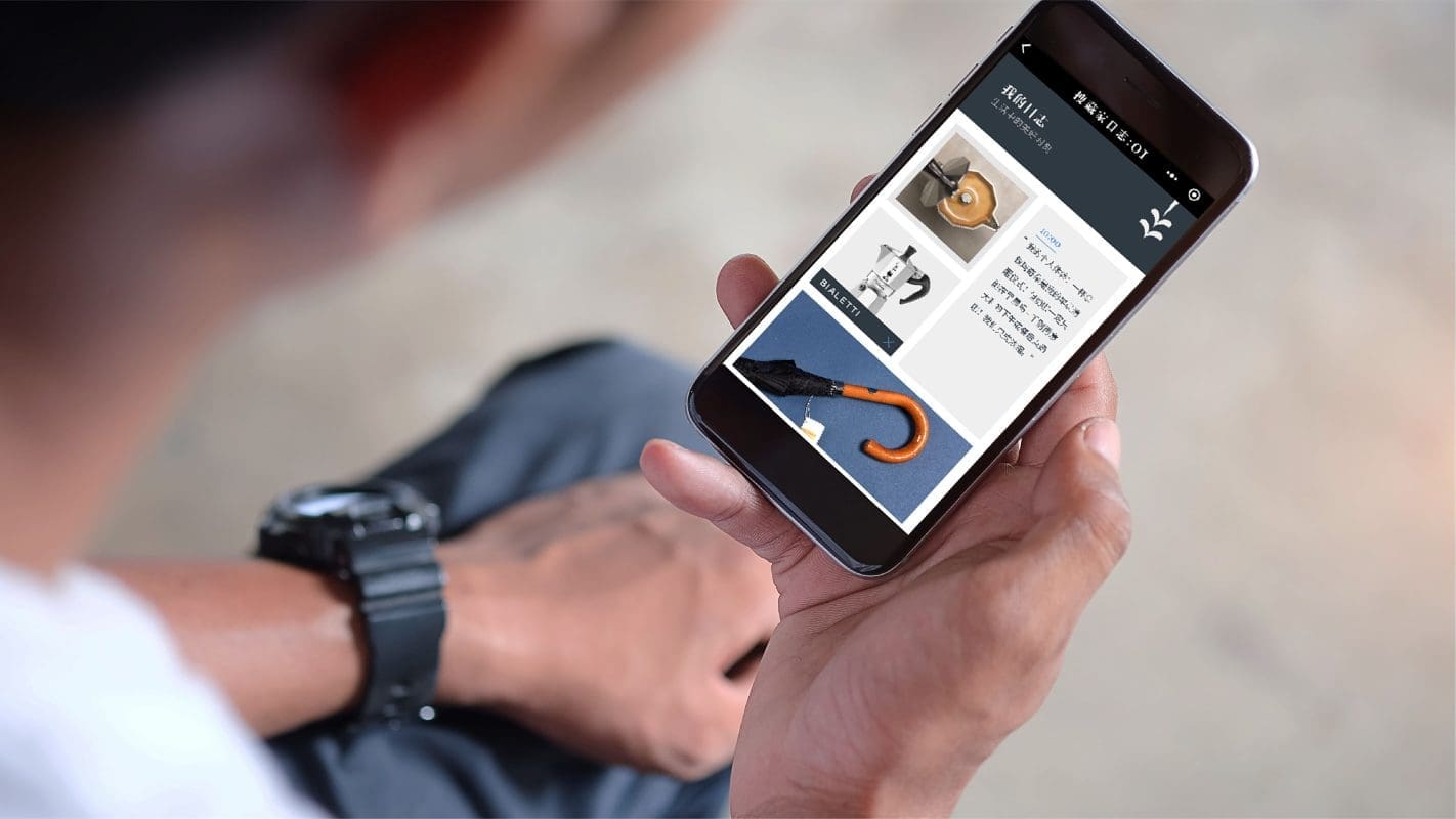
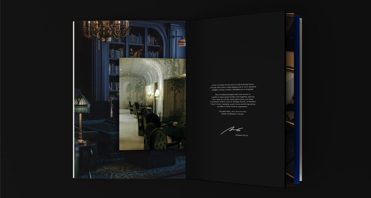
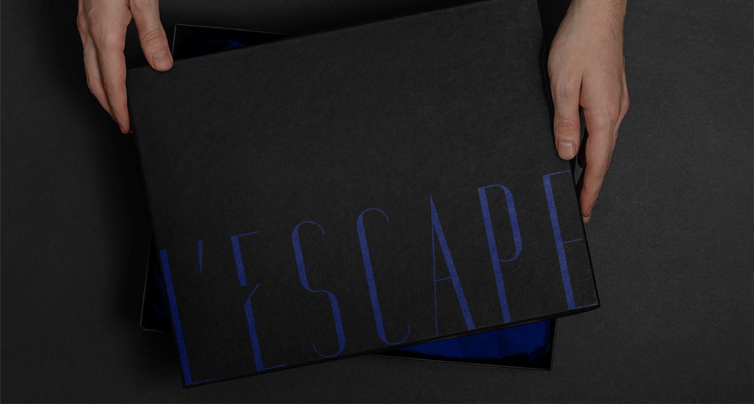
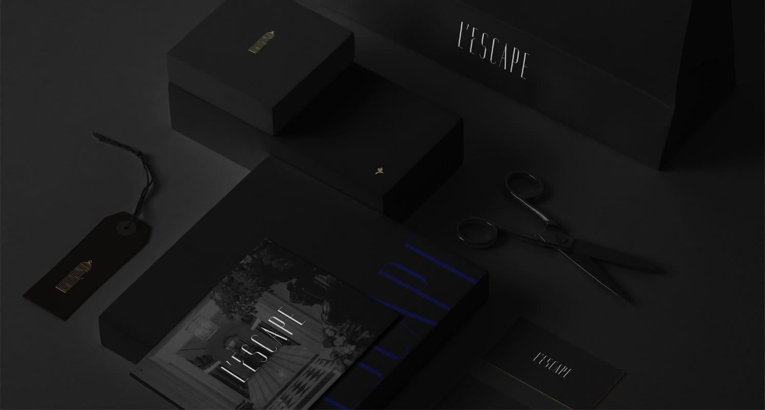
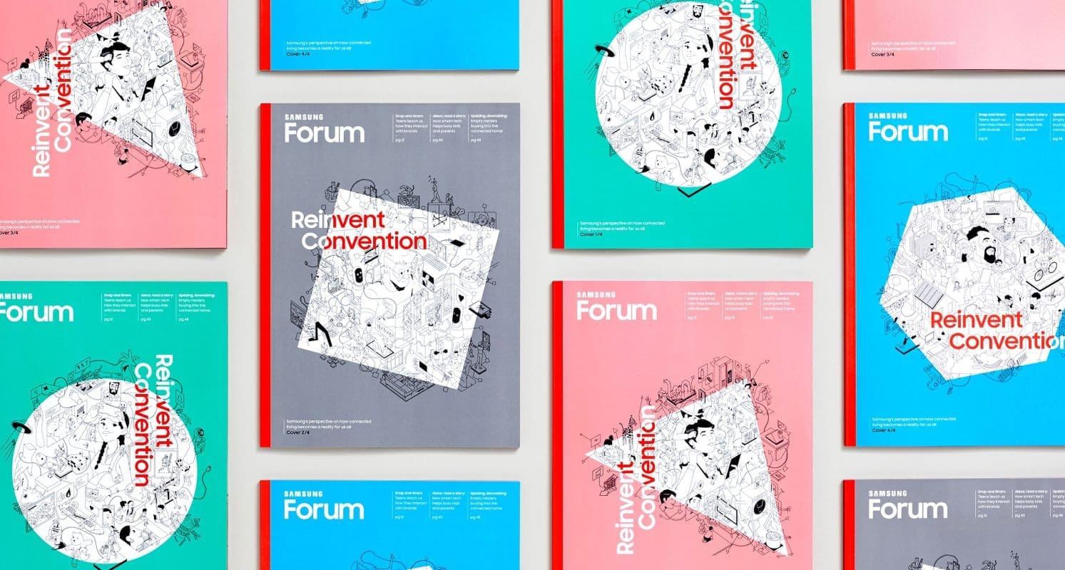
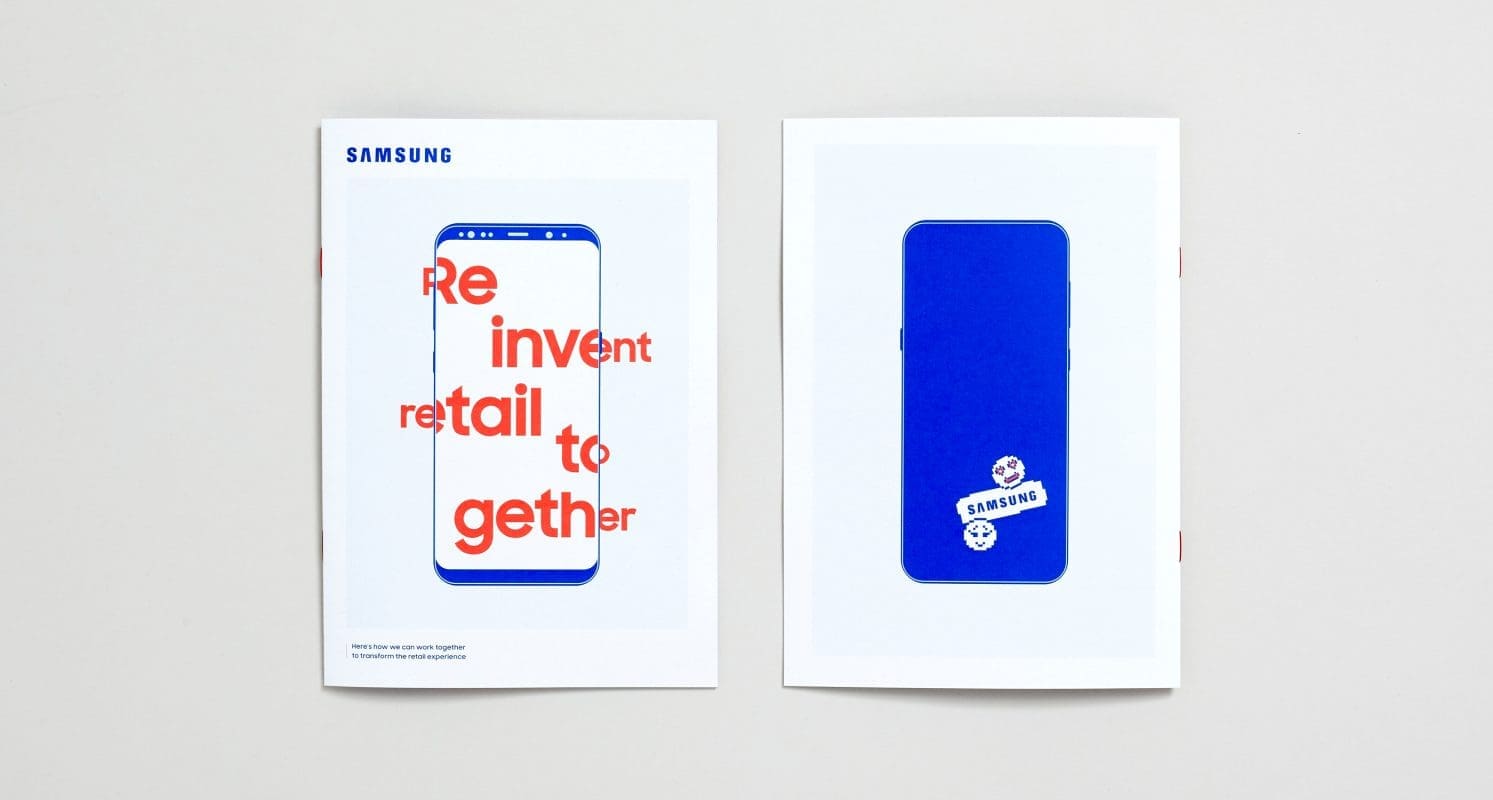
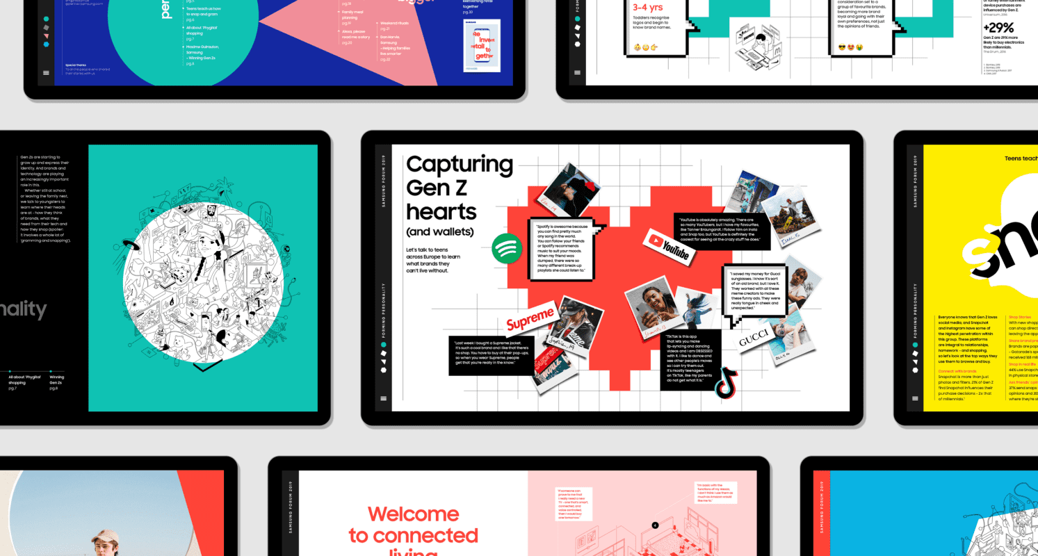
Prophet developed the storyline for the three-day event around the theme ‘Reinvent Convention.’ As well as developing the agenda and session content, Prophet fused insights and creativity to create and design a highly visual, 80-page print and digital magazine filled with Samsung’s valuable thought leadership. The magazine included cutting-edge trends, real consumer stories documenting how people actually live with their tech day-to-day and expert interviews on the future of technology.
Merging the impactful with the playful, bold magazine design was reflective of breaking boundaries, challenging conventions and re-inventing for the better.
Results
As the tech industry gets even more crowded it’s important for Samsung to consistently demonstrate leadership in the space. Enhancing Samsung’s reputation, the magazine has become a key asset for the business that not only inspires the uptake of innovative, user-centric Samsung products and services from retailers but also improves business processes by continuing to work as an effective tool to engage decision-makers and guide sales conversations.
Having now driven the 2016, 2017, 2018 and 2019 editions, the impact and reach of the thought leadership continues to grow. Beyond the EU Forums and other European events throughout the year, the magazine is also used extensively within the organization to educate and inspire Samsung employees.