CASE STUDY
Hikma
Building a brand as big as its business
Challenge
Following years of tremendous organic growth, Hikma, the multinational generics pharmaceutical company, soon realized the scale of the business had become far greater than the scale of the brand.
It had also made a number of acquisitions, but this was having a detrimental effect. Having such a fragmented brand was limiting Hikma’s brand strength and ability to build a powerful reputation as a global company among external stakeholders and employees alike.
Solutions
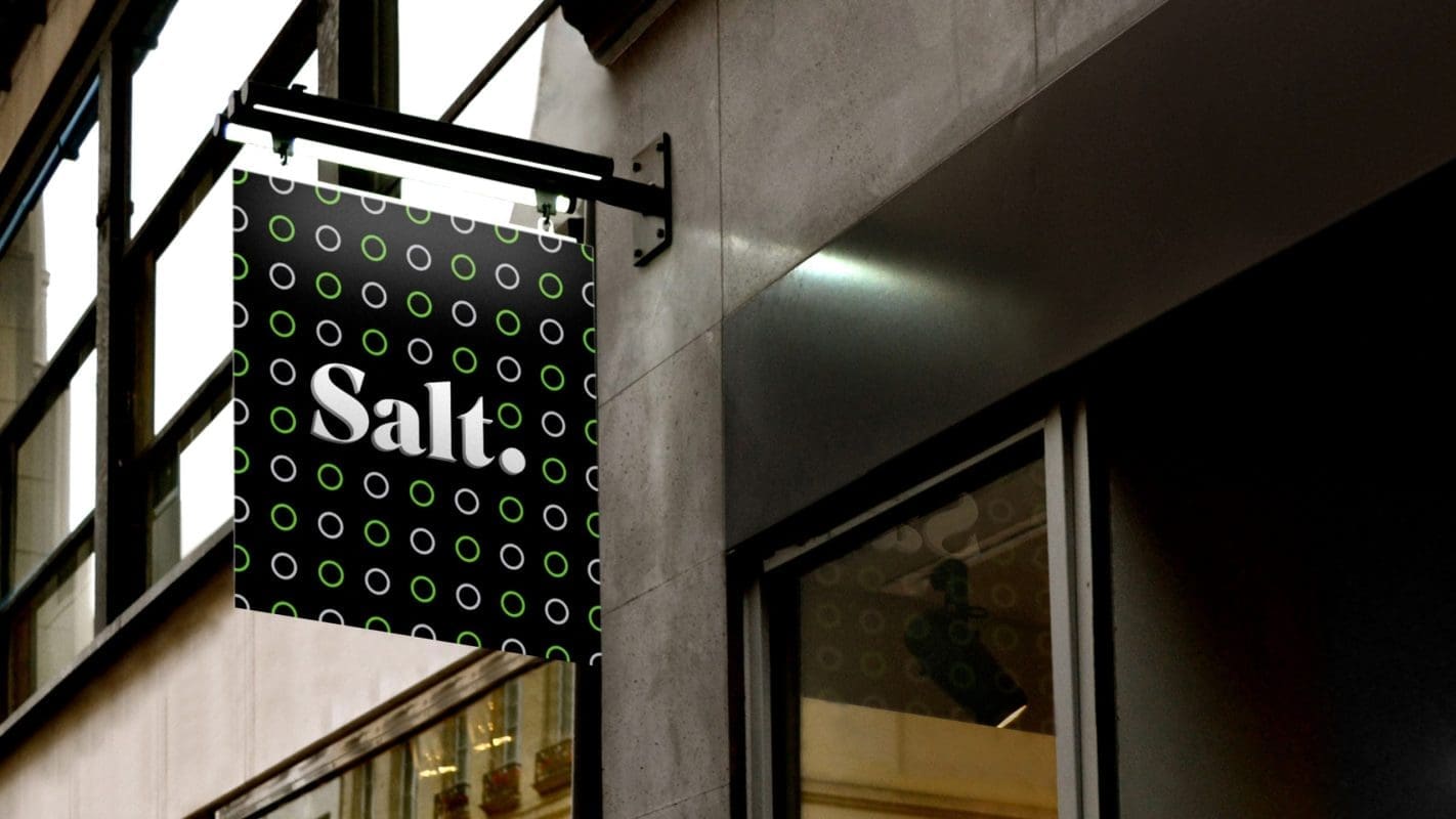
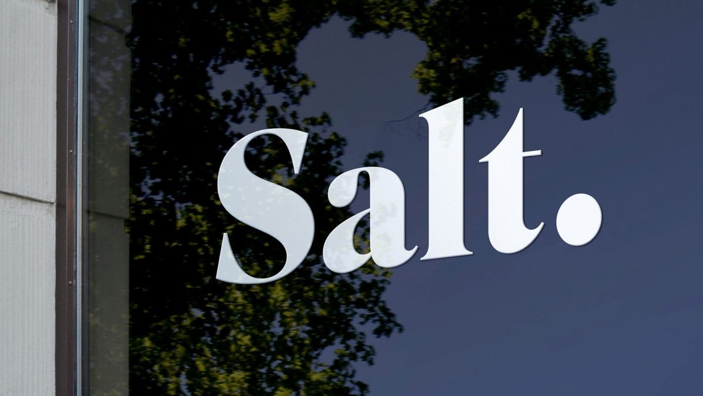
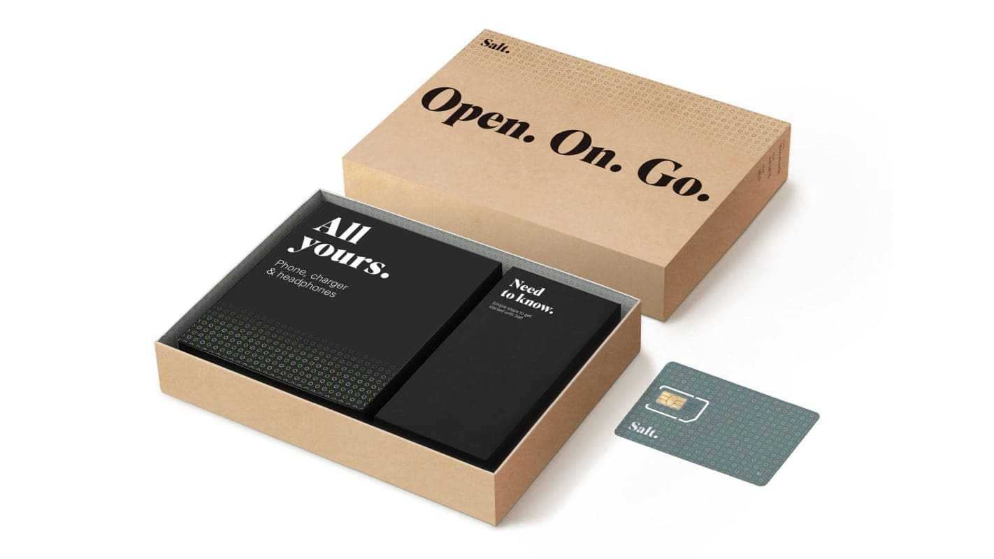
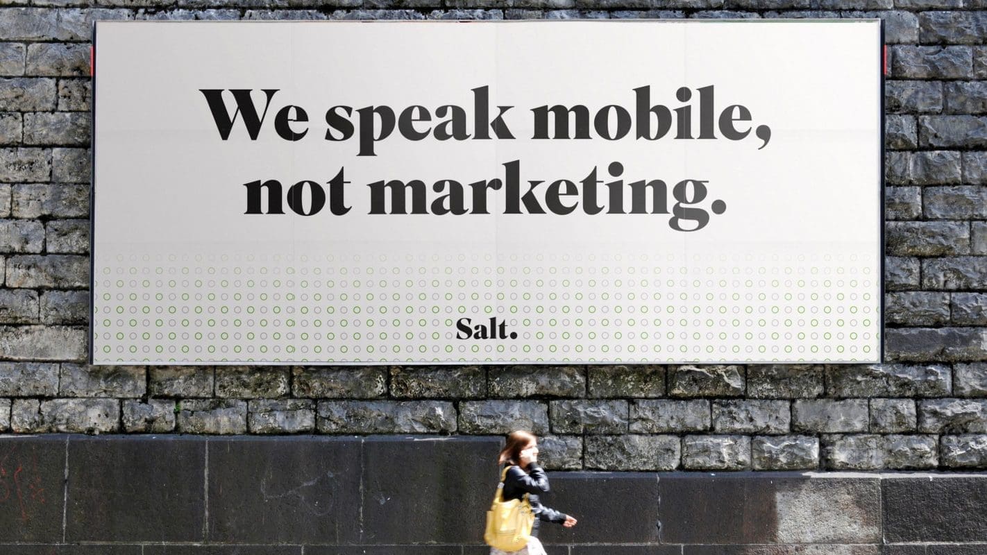
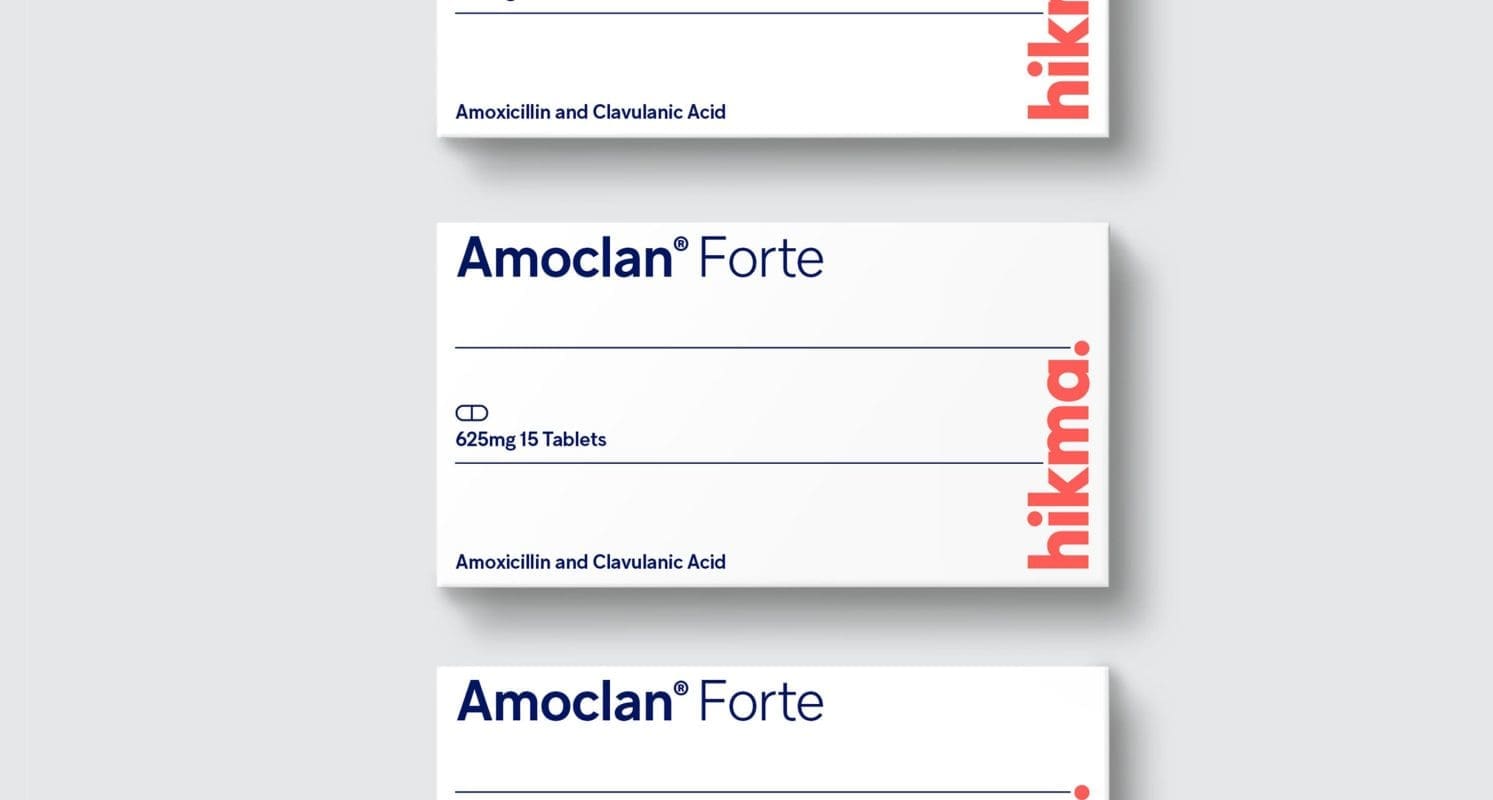
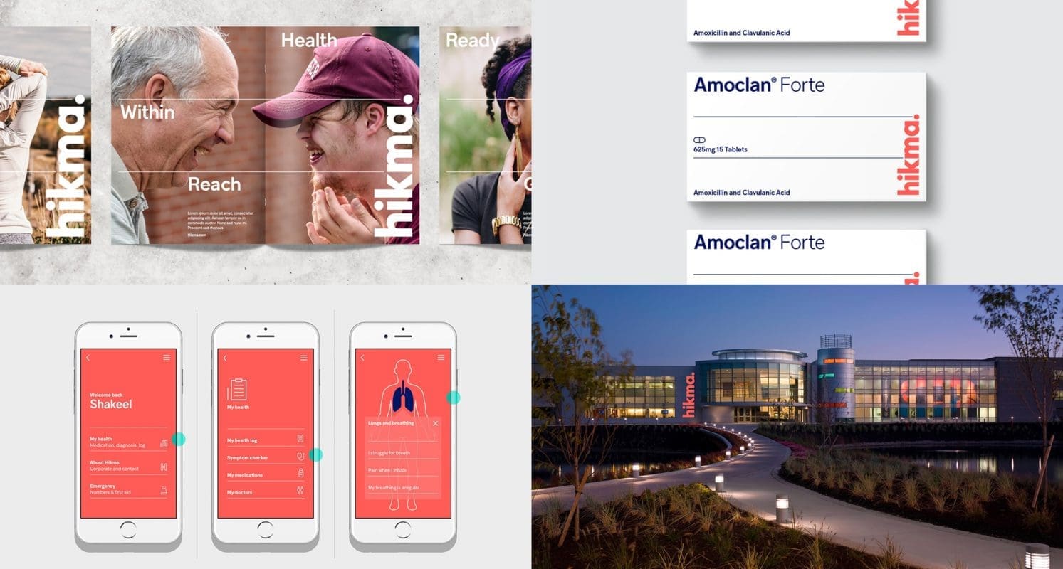
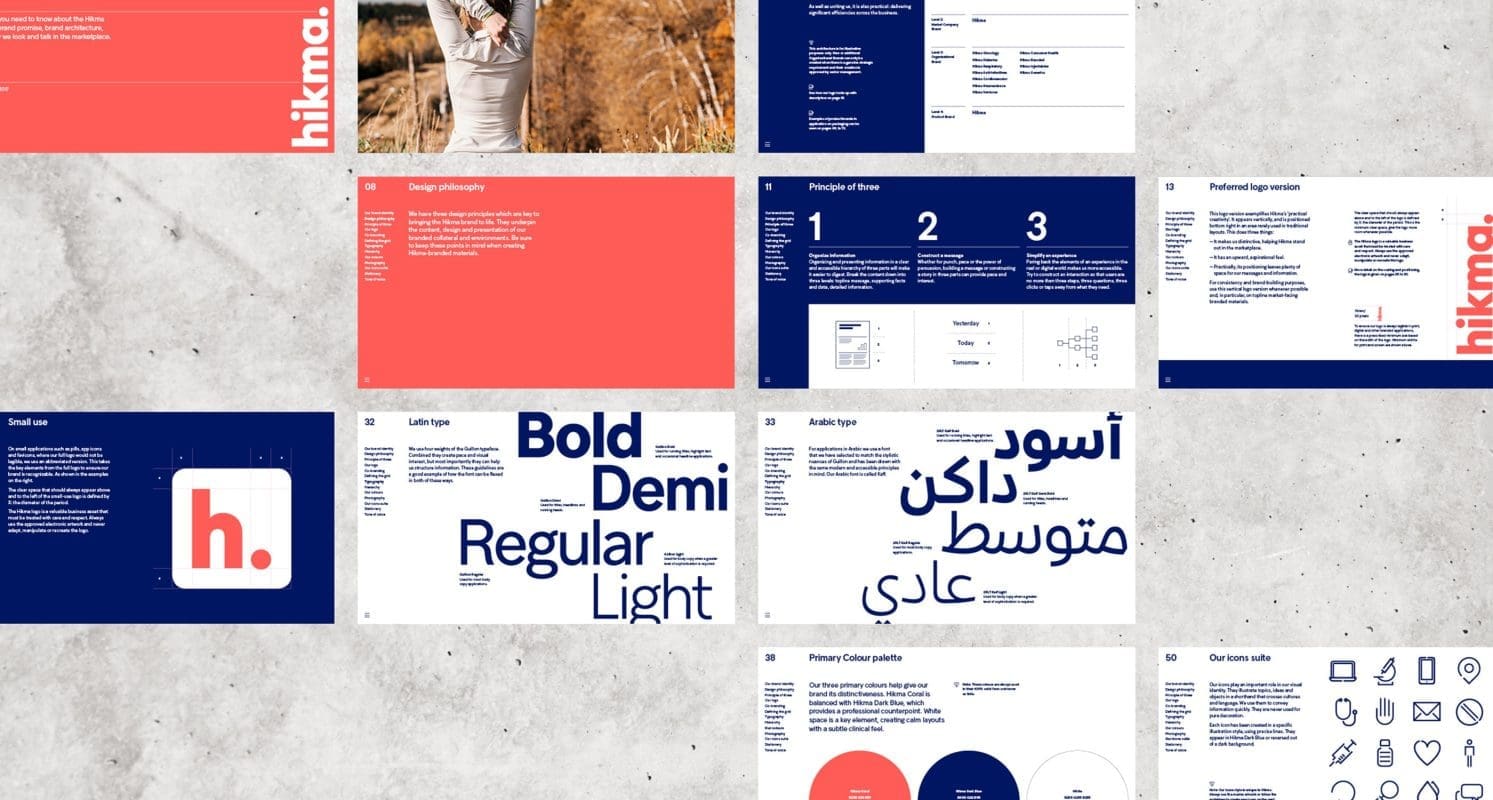
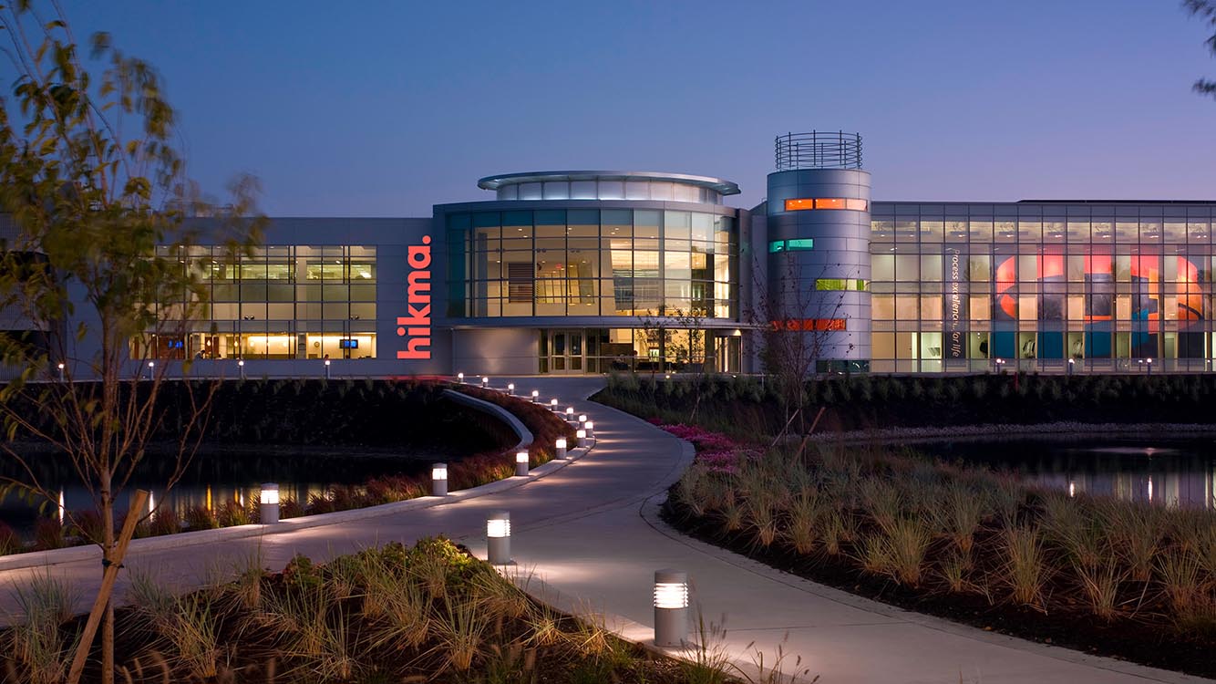
In a complex generics environment, Hikma needed a simple, unified brand that would help to set it apart on the global playing field. Reducing the complexity and confusion created by its current portfolio of multiple brands, Prophet worked to consolidate under one, global master brand to build consistency and drive impact.
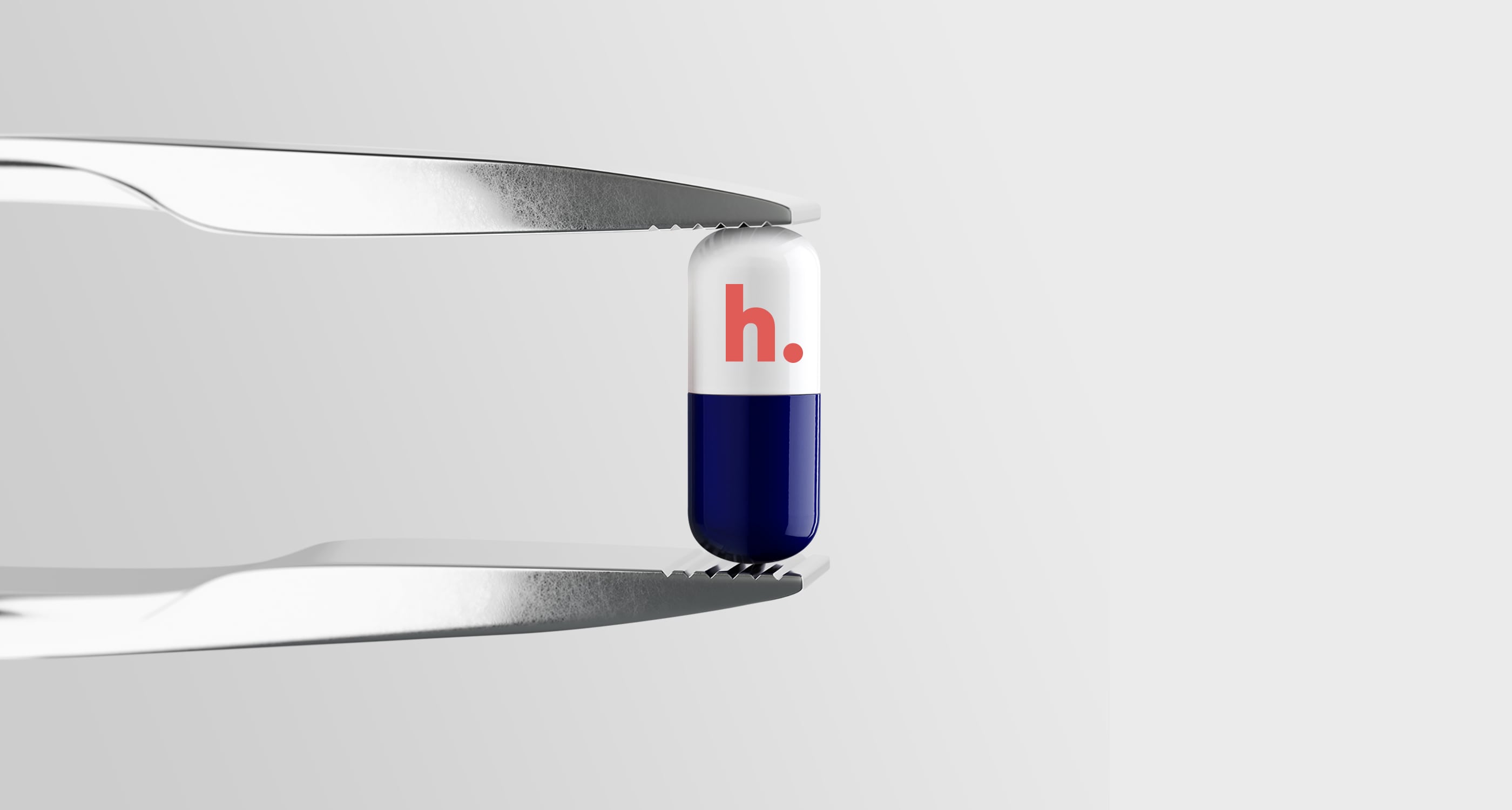
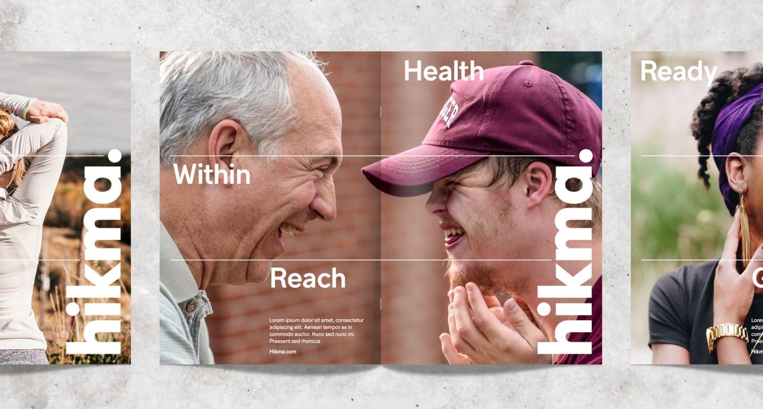
A brand positioning was also developed: ‘Better Health Within Reach’, which successfully anchors Hikma’s core fundamental belief that good quality medicine should be available to anyone, anywhere. This has been brought to life with a differentiating digitally-enabled visual identity system that clearly signals and supports a new chapter for the business.
Results
Winner of the coveted Grand Prix at the 2019 Transform Awards Europe, along with Gold awards for Best Brand Architecture Solution and Best Brand Consolidation, the new Hikma brand is getting remarkable recognition and seeing results both inside and outside the organization.
In the six months following the new brand launch, the share price has increased by 130% – tracking well above its competitors. Not only have Prophet helped to position Hikma more prominently in the competitive marketplace, but internally the feedback from employees and leaders across the globe has been overwhelmingly positive. Pride in the company has grown, the primary benefit being the unifying sense of ‘One Hikma. One Culture,’ that has worked to bring those sites that were previously under a legacy brand or sub-brand name into the embrace of the unified Hikma family.
‘The move to a single enterprise brand, paired with the new positioning and visual identity, has been truly transformational for our company,’ commented Brooke Clarke, VP Corporate Affairs at Hikma. ‘Employee feedback from across the globe has been incredible. The new brand has created a real momentum and focus on being more connected, finding efficiencies and better ways of working together, and building our ‘One Hikma.’ It has really set us up well for the future.’

“The move to a single enterprise brand, paired with the new positioning and visual identity, has been truly transformational for our company.”
Brooke Clarke
VP Corporate Affairs at Hikma