CASE STUDY
Enotek
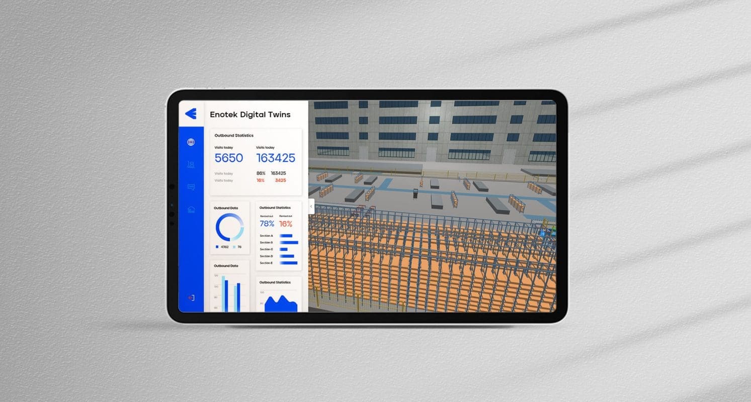
Transforming a logistics technology brand for a smart future
Challenge
Eoslift is a Chinese intralogistics solution provider. Since its inception in 2008, the company has evolved from a forklift manufacturing company into a vertically integrated technology company with proprietary hardware, software and smart solutions. For the next way of growth, it aspires to become a leading logistics technology company that provides innovative solutions across a broad set of industries and geographies.
Eoslift came to Prophet to modernize its brand identity to reflect its evolved ambitions.
Solutions
Prophet worked closely with Eoslift to rejuvenate its brand positioning, name and visual identity.
Our team took a holistic approach to rethink Eoslift’s brand strategy through internal and external immersions. Based on conversations with the organization’s key stakeholders, we illustrated the positioning territories and landed on one final positioning direction. Through this thorough process, we created relevant, ownable and differentiated brand positioning that is rooted in the company’s ambition – to maximize business value through innovative technologies.
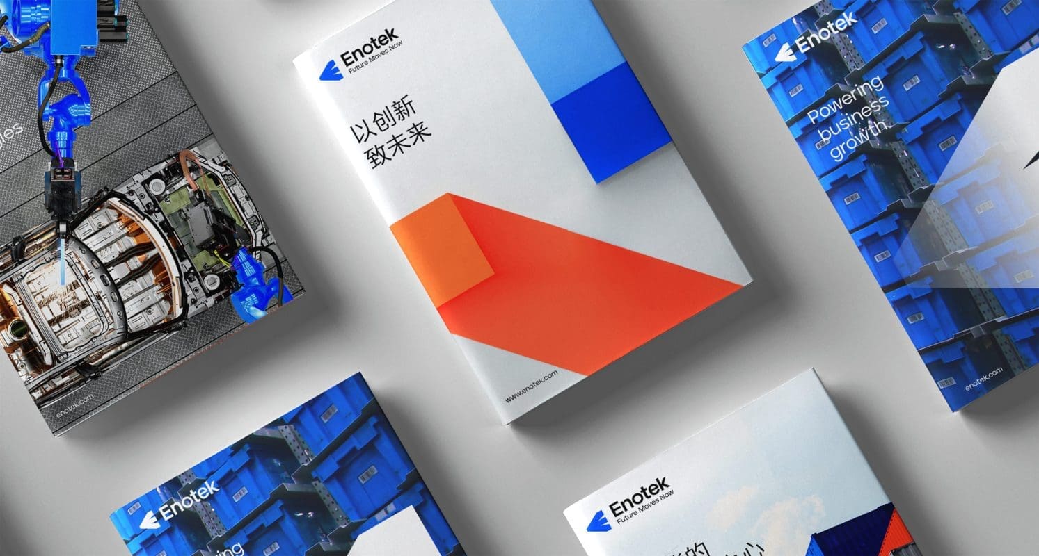
Next, Prophet helped Eoslift develop a new brand name “Enotek,” signaling a new chapter. Enotek inherits the company’s DNA and culture, core capabilities and commitment to customers. The new name’s starting letter, “E” represents the organization’s commitment to producing products of excellence and excelsior. The “En” represents its goal to envision and enable, while “Eno” and “Tek” represent Enotek’s use of innovation and technology. We also created the brand tagline, “Future Moves Now,” and a compelling brand story to illustrate Enotek’s transformation to its customers and partners.
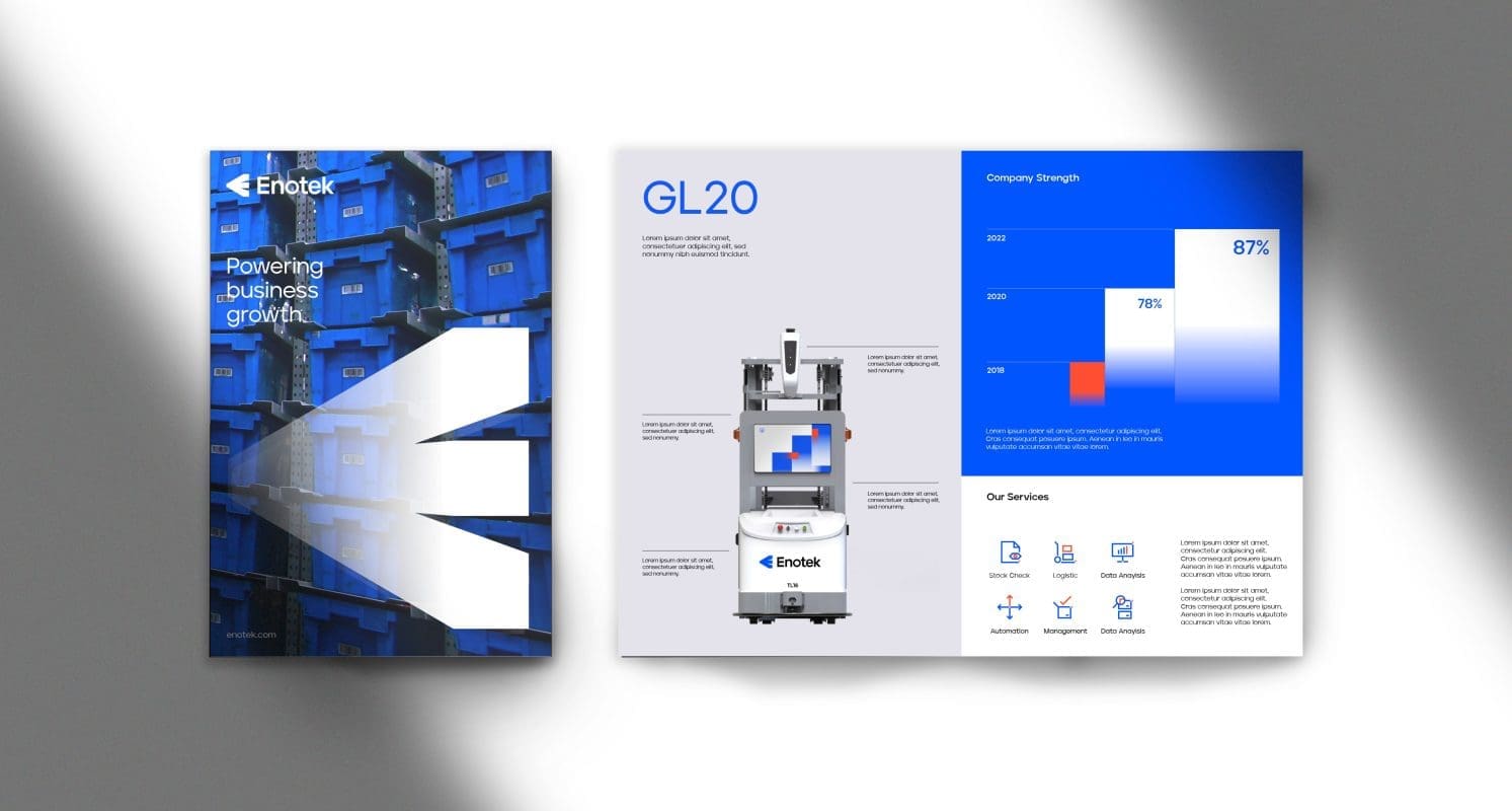
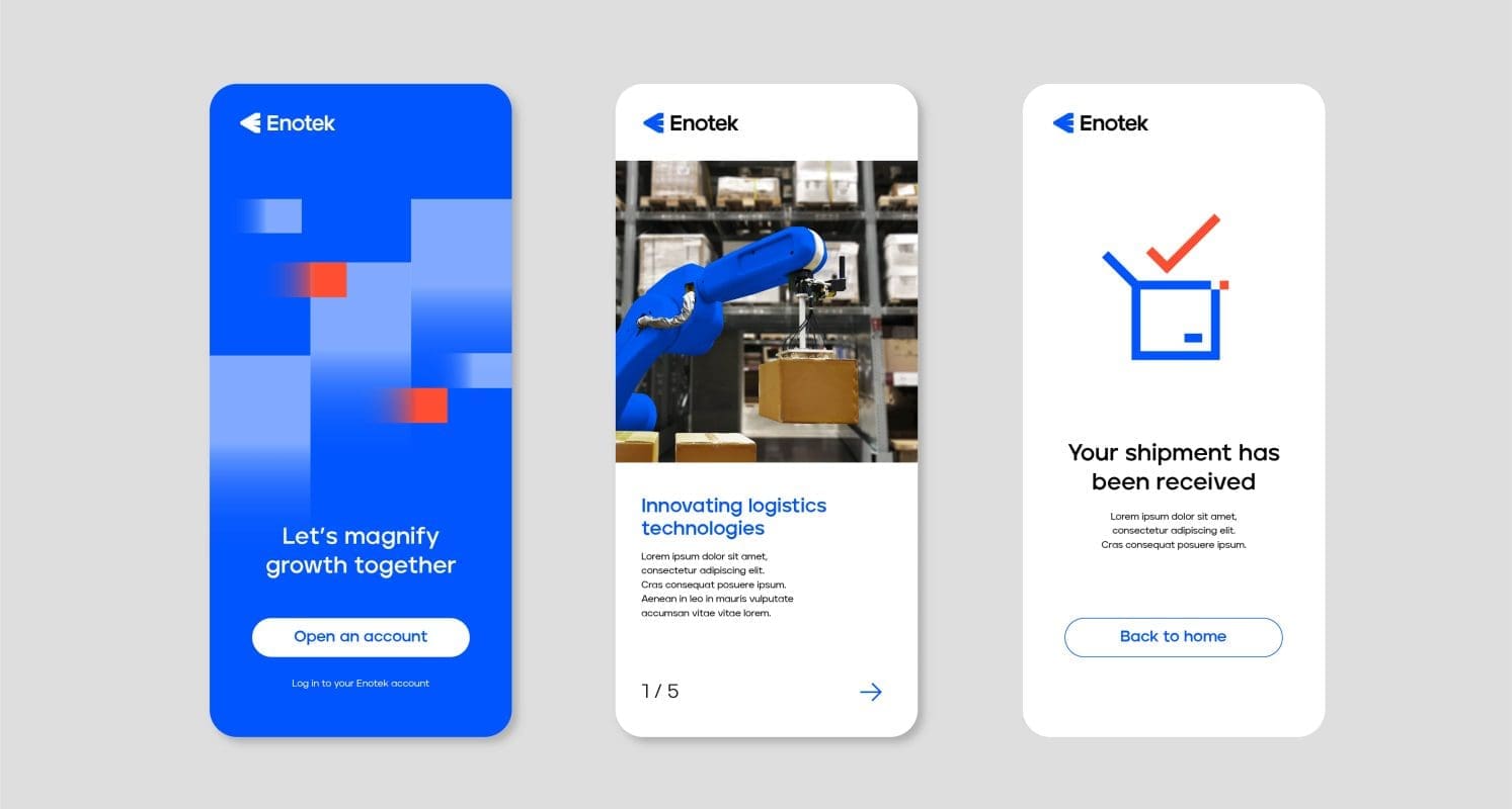
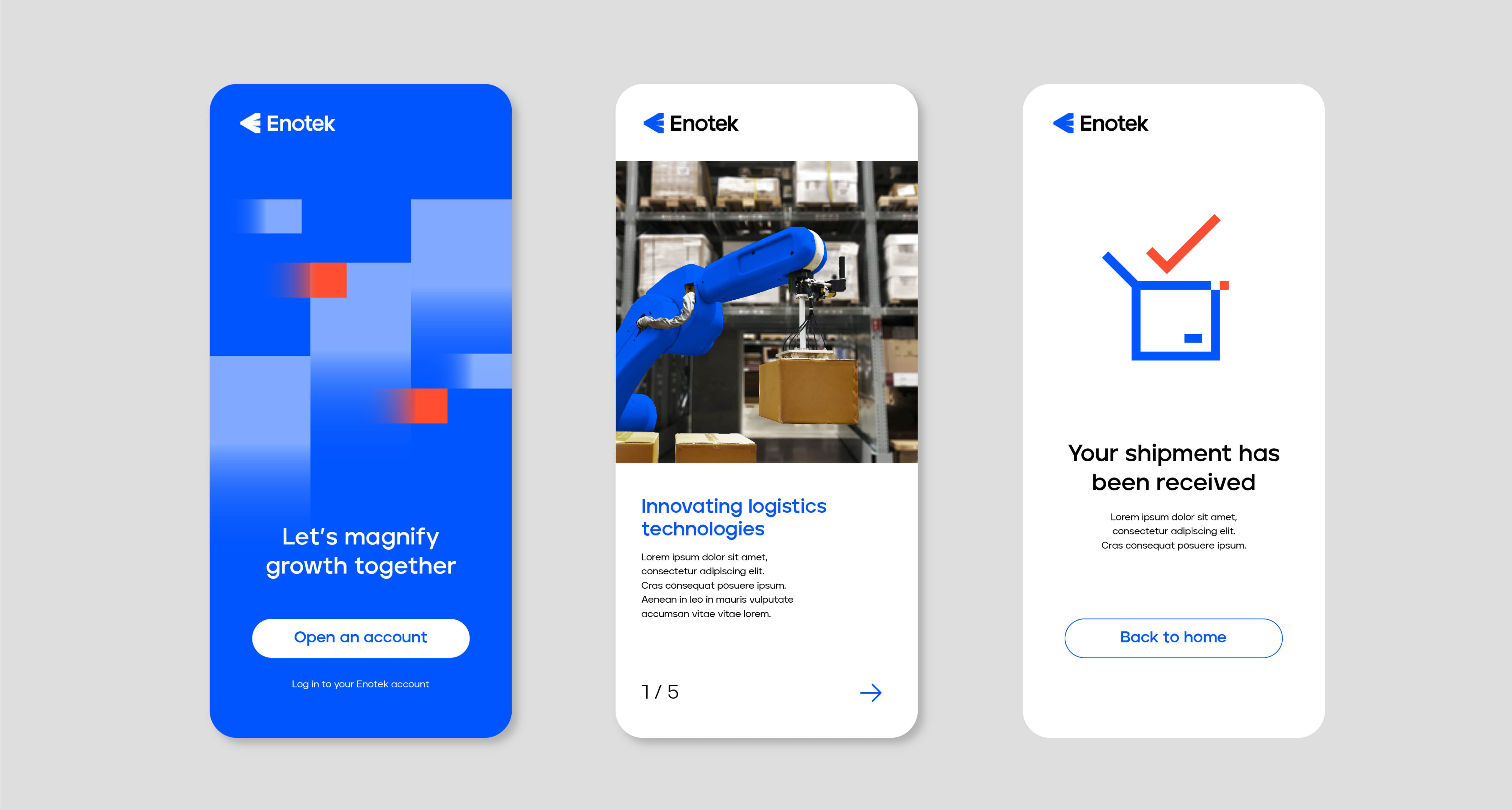
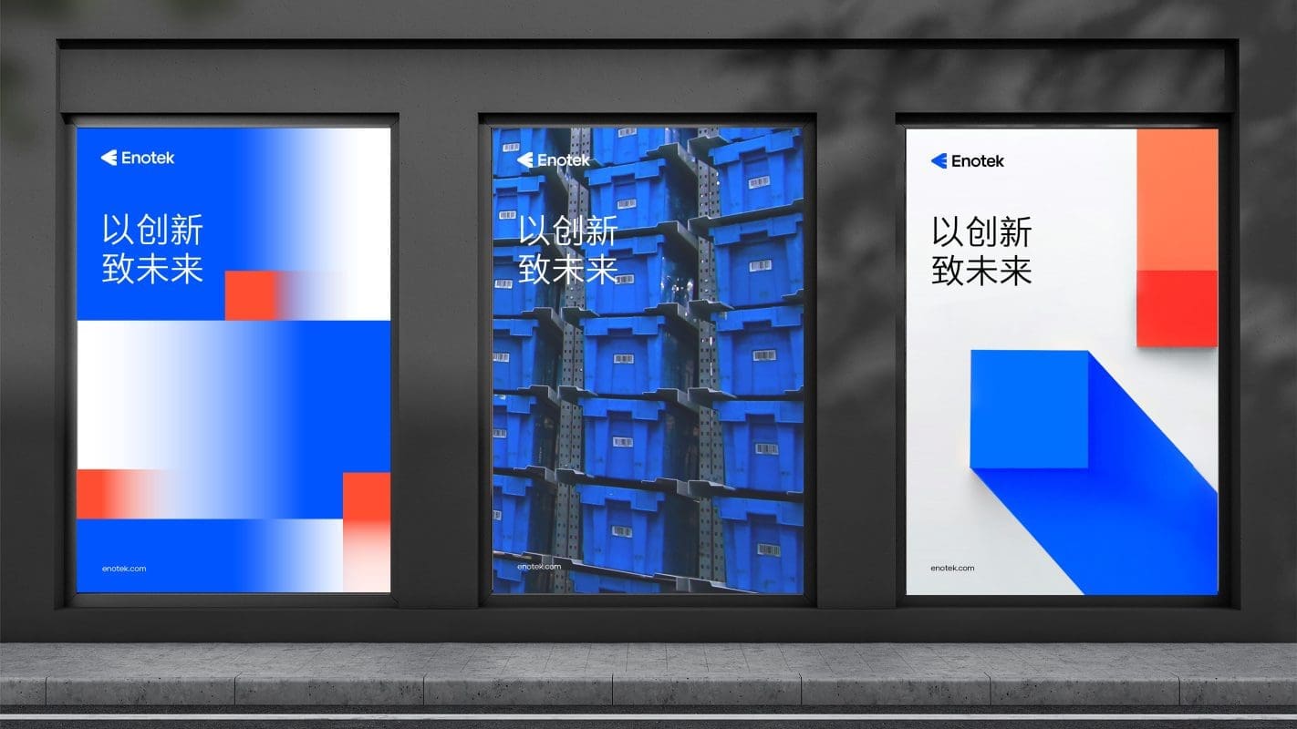
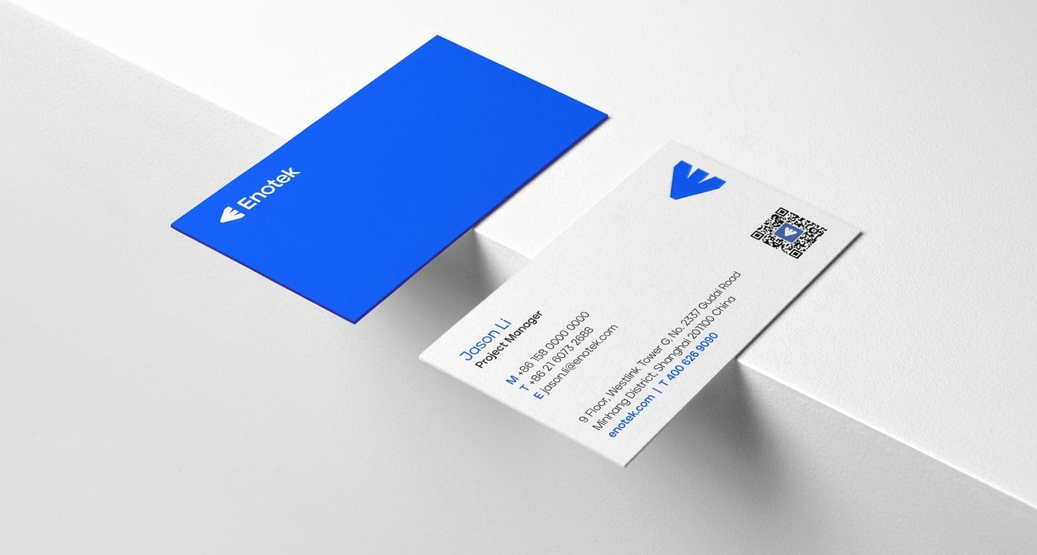
Anchoring on the renewed brand strategy, Prophet’s Asia design hub then developed a flexible, vibrant and future-forward visual identity that brings the brand’s ambition to life. We retained Enotek’s heritage by keeping a square box and blue color from the original logo, using them as core elements in the new one. The arrow symbol is constructed by connecting a small square with three larger squares to form an “E” – signifying the spark that ignites growth. Lastly, we adjusted the original blue color into a more vibrant tone to inject the young energy of the brand.

Results
Enotek launched its new brand with refreshed strategy, tagline and visual identity in January 2022. The new brand identity empowers Enotek to stay relevant to its customers while setting itself apart from competitors. The company strives to attract new investors and inspire its employees with a redefined vision, unlocking the next stage of growth.
Lastly, our work with Enotek was recognized by Transform Magazine’s Transform Awards Asia 2022, winning gold for the category of Best Visual Identity from the Transport and Logistics Sector and bronze for the Best Brand Evolution (Business) category.