CASE STUDY
Sun Life
Developing a brand story that resonates in Hong Kong
Challenge
Sun Life engaged Prophet to reposition its brand and develop a new marketing campaign that would help cut through the clutter and inspire customers to engage with Sun Life versus competitors. Sun Life couldn’t compete in terms of spending and scale, so they needed to develop a brand story that would resonate and a campaign that would stand out.
Solutions
Prophet realized that what the industry was communicating was at odds with what consumers really wanted. Insurance providers spoke about fear and the need to hedge against life’s inherent risks, whilst people hoped for bright futures for themselves and their loved ones. Prophet identified an opportunity to frame insurance as an enabler of dreams rather than a guardian against inescapable peril.
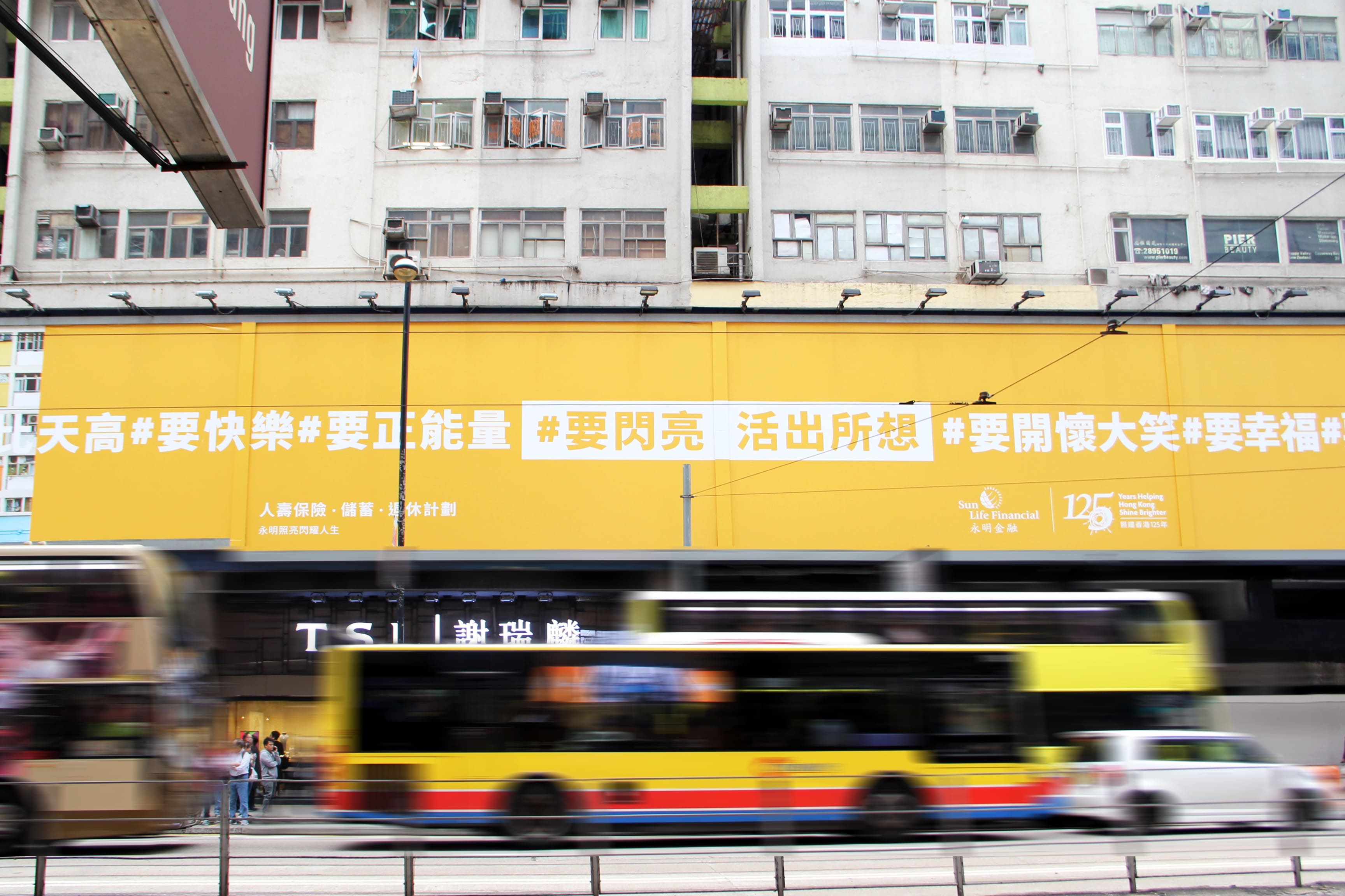
Prophet created Sun Life’s brand positioning leveraging one key insight: consumers in Hong Kong want to dream bigger and live brighter lives—and they want their financial services provider to help. To bring the positioning to life, we translated “Dare to Dream. Live a Brighter Life” into the creative concept of the #BE campaign – “Be everything you want to.” The #BE campaign expressed Sun Life’s promise, that they are here to encourage and challenge people not just to dream, but to turn their dreams into a reality. The campaign was executed across channels including television, print and at various out-of-home touchpoints including street billboards and the MTR.
Results
The new brand positioning and the #Be Campaign drove a lot of impact, increasing brand awareness among target customers and energizing the Sun Life employee and agent base to rally around a refined and inspiring brand story. It gave Sun Life the ability to target the right customers, better articulate the value of their products and deliver a consistent, engaging brand experience for agents and customers alike.
Our work with Sun Life won GOLD for ‘Best creative strategy’ at 2018 Transform Awards APAC.