CASE STUDY
AXA
Meet Emma, the future of humanized insurance experience
Challenge
AXA is one of the world’s leading insurance companies offering diverse financial services globally. To successfully grow its business in Asia, the client recognized the need to create a more consistent and human brand throughout the region.
On the back of a new global vision – from Payer to Partner – AXA partnered with Prophet to develop an Asia-specific solution that would deliver on their ambition to:
- create a more consistent customer journey and brand experience across the region
- develop a new customer engagement proposition that also humanize the experience through a new digital platform
- develop digital touchpoints to drive greater engagement with existing and potential customers.
Solutions
Through deep consumer research and segmentation, Prophet partnered with AXA to create a regional well-being strategy, develop a new customer experience, and run UX & UI sprints to design a new digital product.
We began by conducting a multi-country regional segmentation, incorporating both qualitative and quantitative research across five key markets in Asia (China, Hong Kong, Philippines, Thailand and Japan). Over 4,000 customers were surveyed to better understand what they wanted from an insurance company when it came to their health, well-being and mental health. This research created the foundation for the development of a value proposition that defined the future of digital customer experience (DCX) at AXA.
To bring the strategy to life, we set out to reimagine the customer experience, taking a fresh look at how to create a new insurance platform that combined insurance e-servicing, 3rd party health and wellness digital services and a new conversational chatbot and virtual concierge. Importantly, at the core of this new experience was an empathetic and human approach on well-being topics for customers, elevating the AXA brand on an experience level never attempted at the organization.
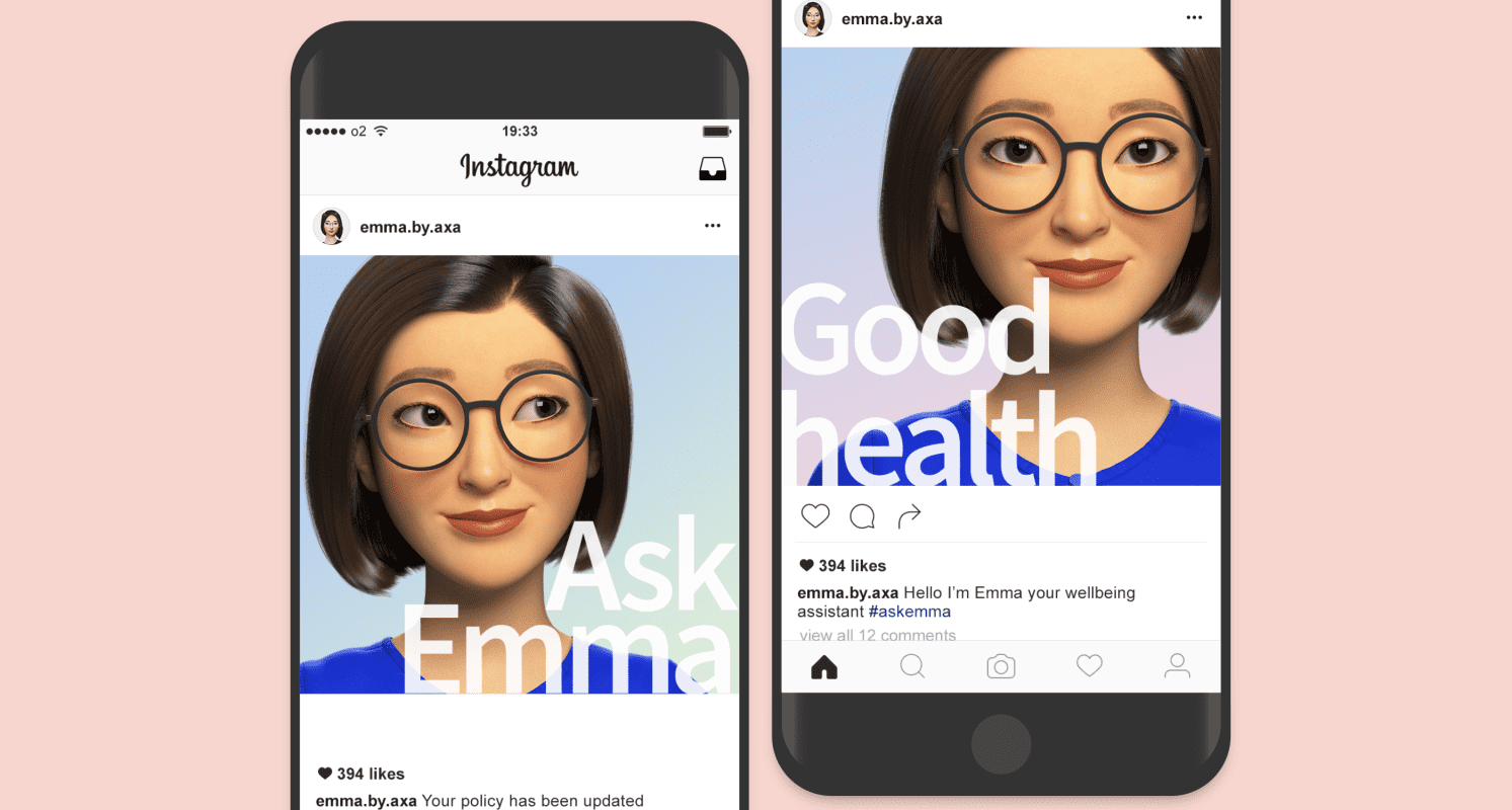
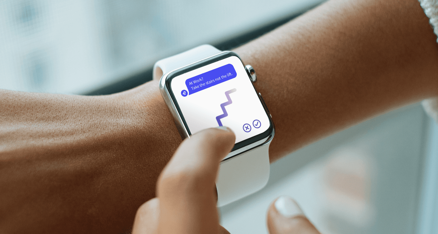
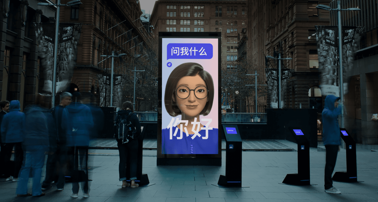
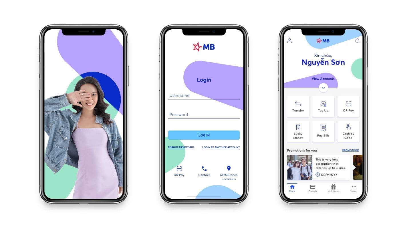
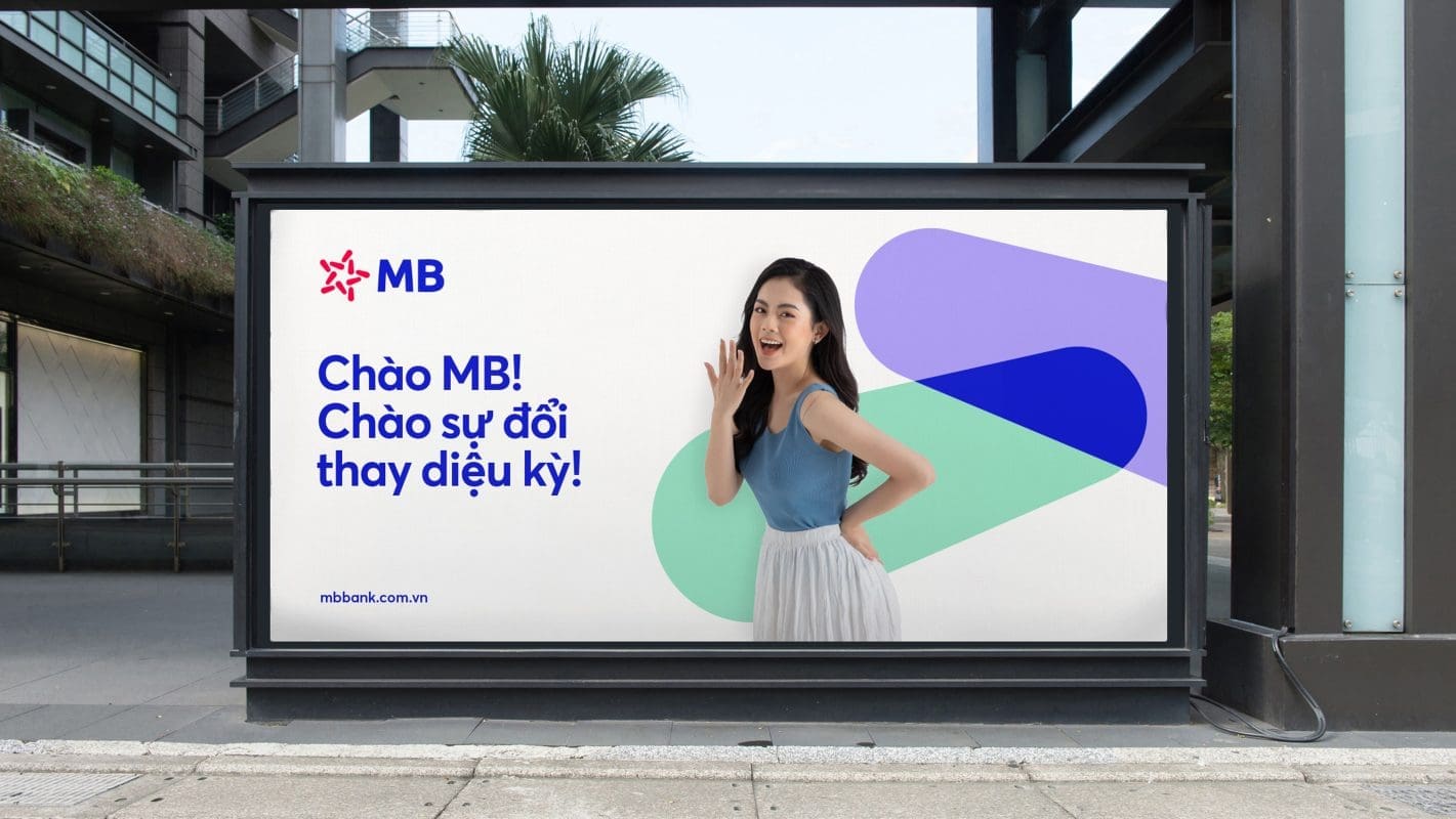
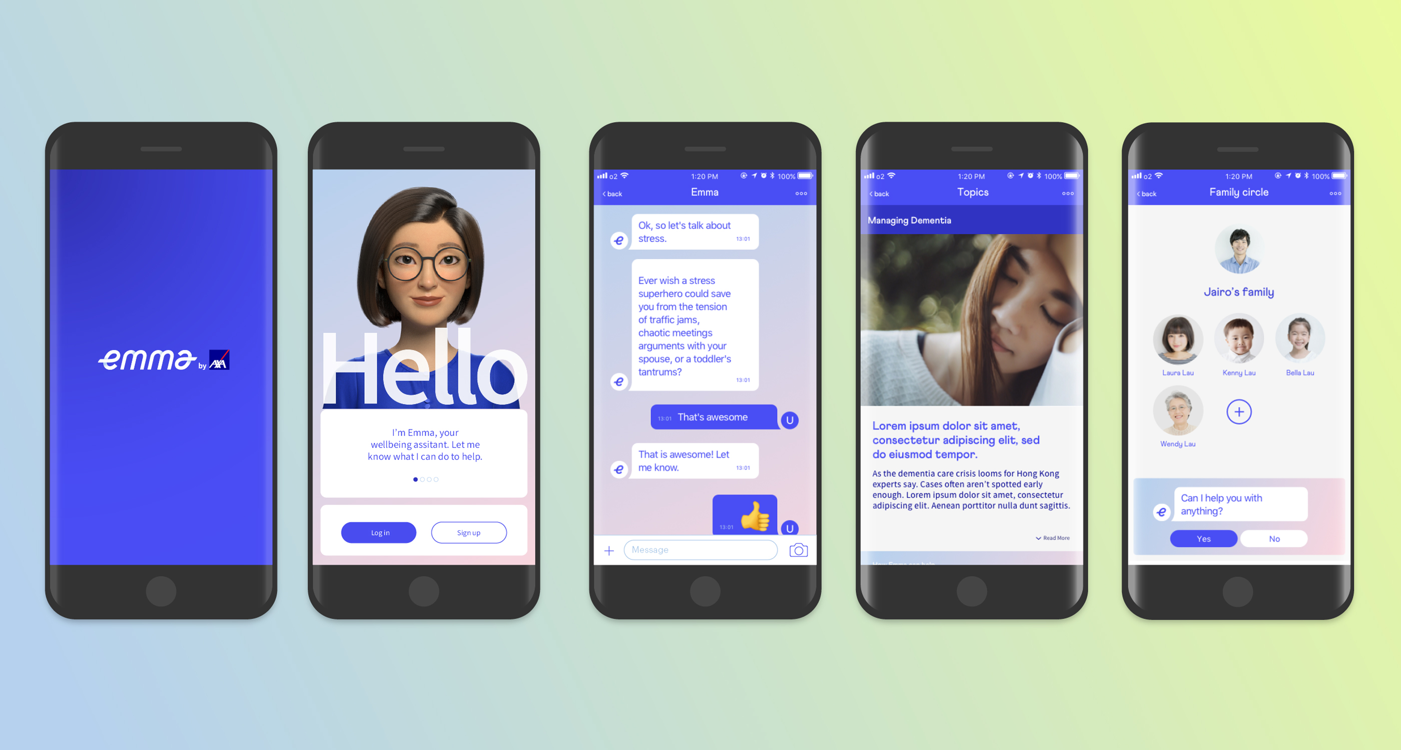
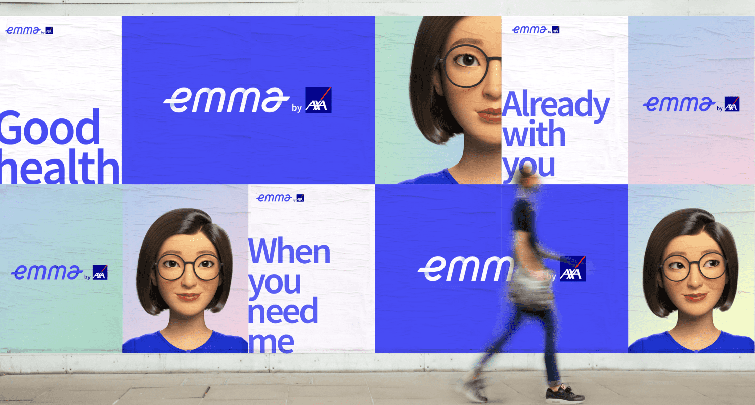
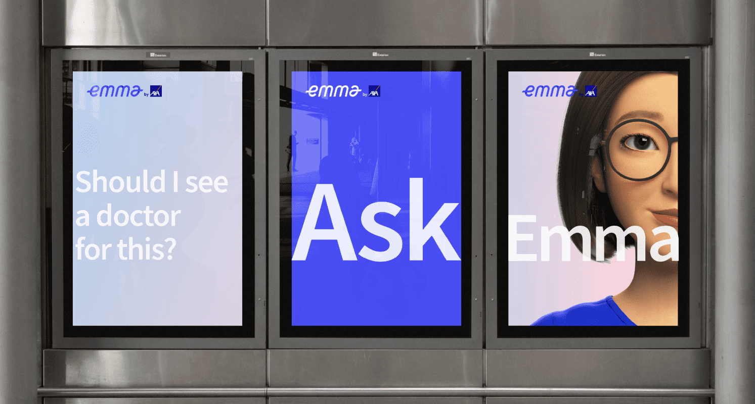
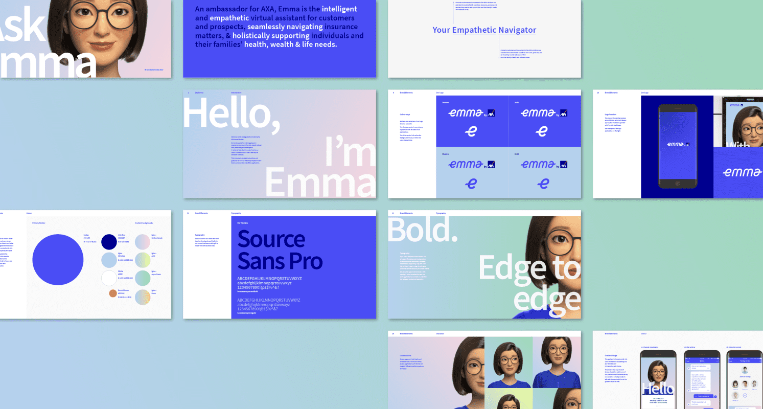
From this strategic foundation, Emma was born — AXA’s first humanized user interface, which became the core of the brand’s new digital customer experience. This seamless experience – from claims to servicing, health content, symptom checker, and more – was embodied in a single Emma ecosystem for current AXA customers as well as prospects.
With Payer to Partner at the core of its proposition, Emma’s persona was designed to be an Empathetic Navigator, helping individuals find the solutions and content most relevant to their well-being needs. Prophet further “personified” Emma, crafting a real-life avatar, her tone of voice, and the visual expression across a full identity system.
A key highlight of the process was a two-day Hackathon to create “Emma”. Over 70 global leaders and stakeholders across diverse disciplines gathered together to “hack” the Emma experience. It was the first time in AXA’s history and probably the largest cross geographic collaboration of its kind.

Results
Emma was piloted then launched in Hong Kong in Q4 of 2019.
Emma is bridging the gap between digital engagement and financial advisor partners. As of 1H of 2020, Emma’s launch in Hong Kong drew more than 2 million logins, exceeding expectations. Emma is now being rolled out across the rest of Asia.
The digital brand experience we created for AXA won the gold award for “Best Use of Digital in the Financial Services Sector” at the 2021 Digital Impact Awards Asia, as well as two awards at the 2020 Transform Awards Asia, including a gold award for “Best Brand Experience” and a silver award for “Best Visual Identity” from the financial services sector.