CASE STUDY

Suning International

Creating an immersive social commerce experience

Challenge

Best known for their mass-market electronics stores, Suning’s brand was limited in terms of its perception and stretch. They saw an opportunity with their Suning International group to create a new innovative brand that would not only be attractive for their new customer but also help to elevate perceptions of the group itself as being more pioneering and innovative.

The company approached Prophet to define a clear brand philosophy and retail experience concept for Suning International’s O2O offering. The concept would be launched as a pop-up exhibit for Salon del Mobile Milano Exhibition in Shanghai, debuting the upcoming store concept.

Solutions

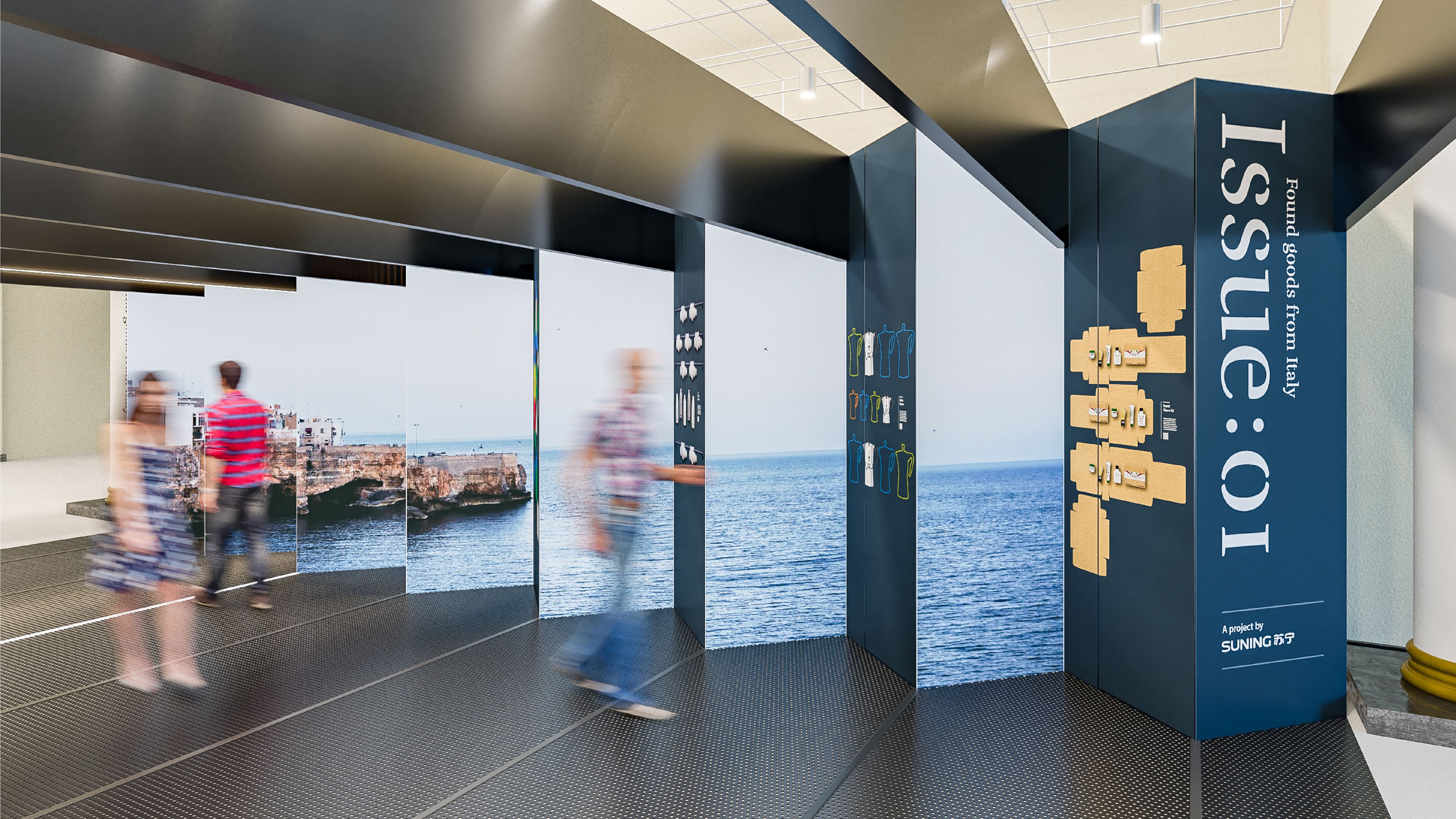
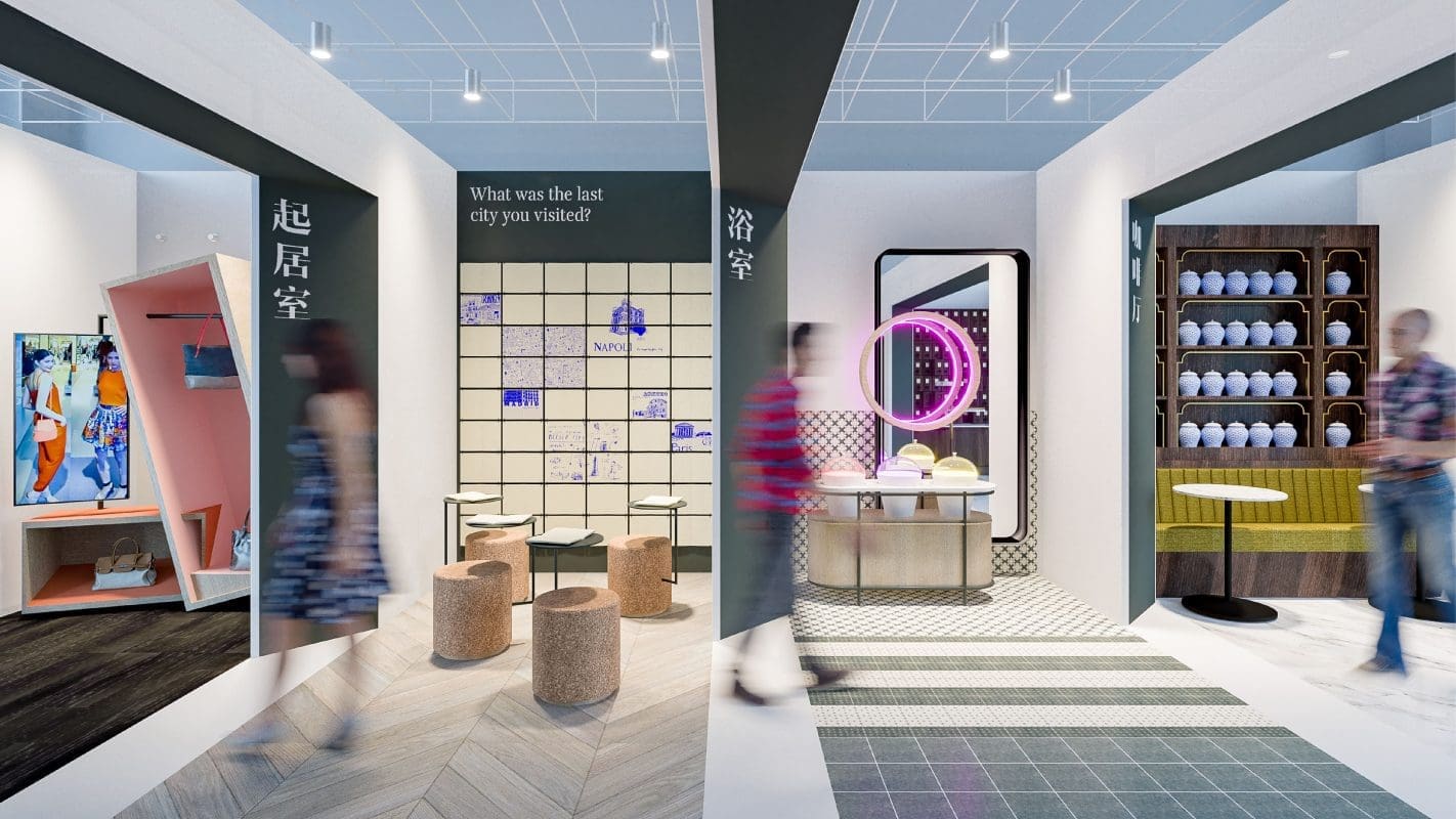
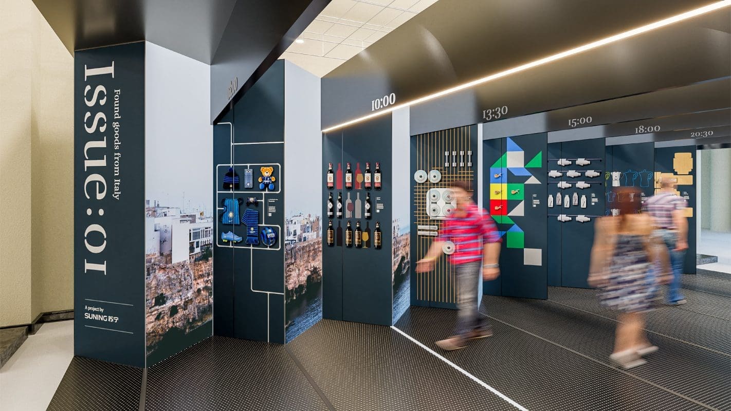
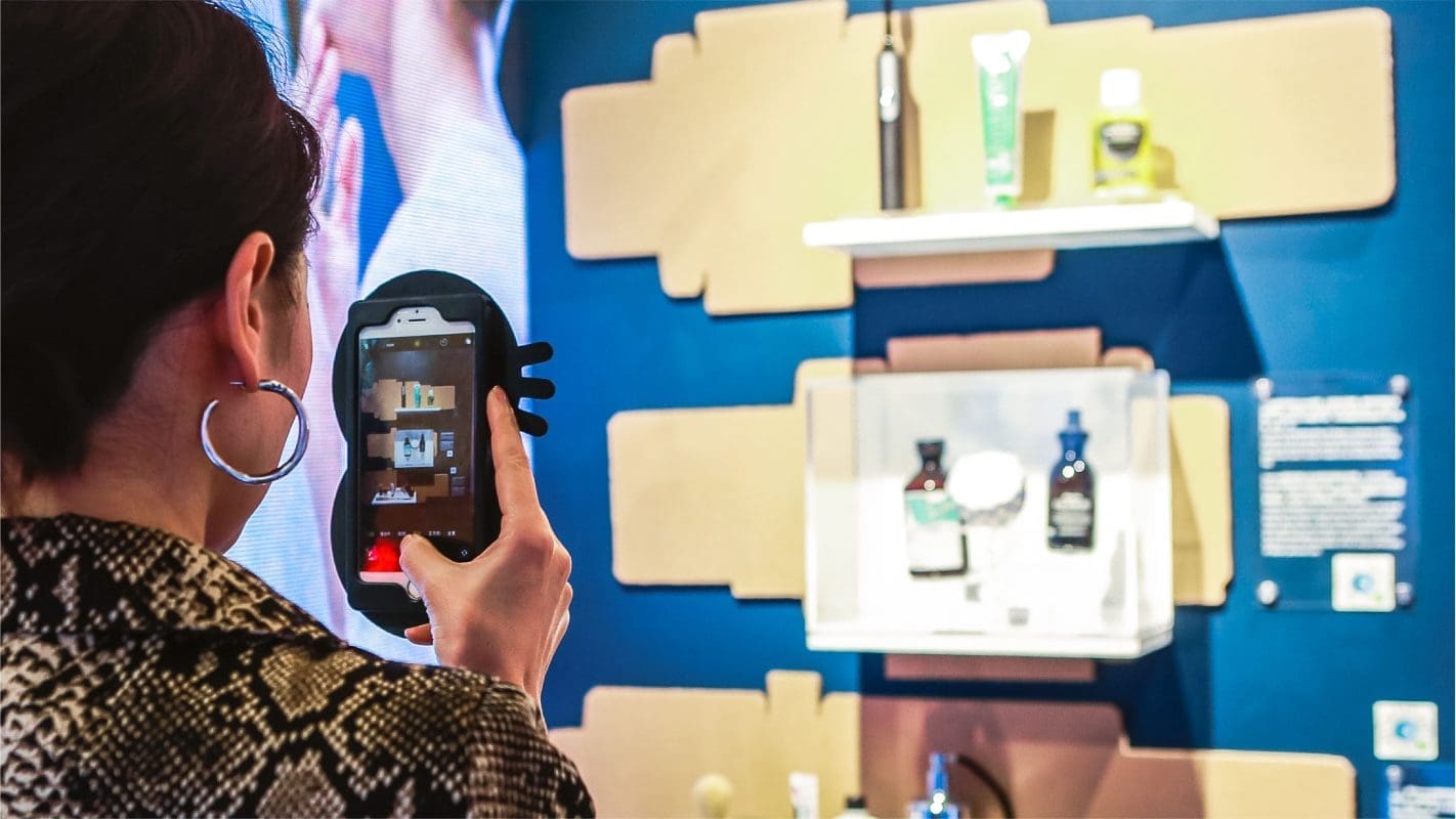
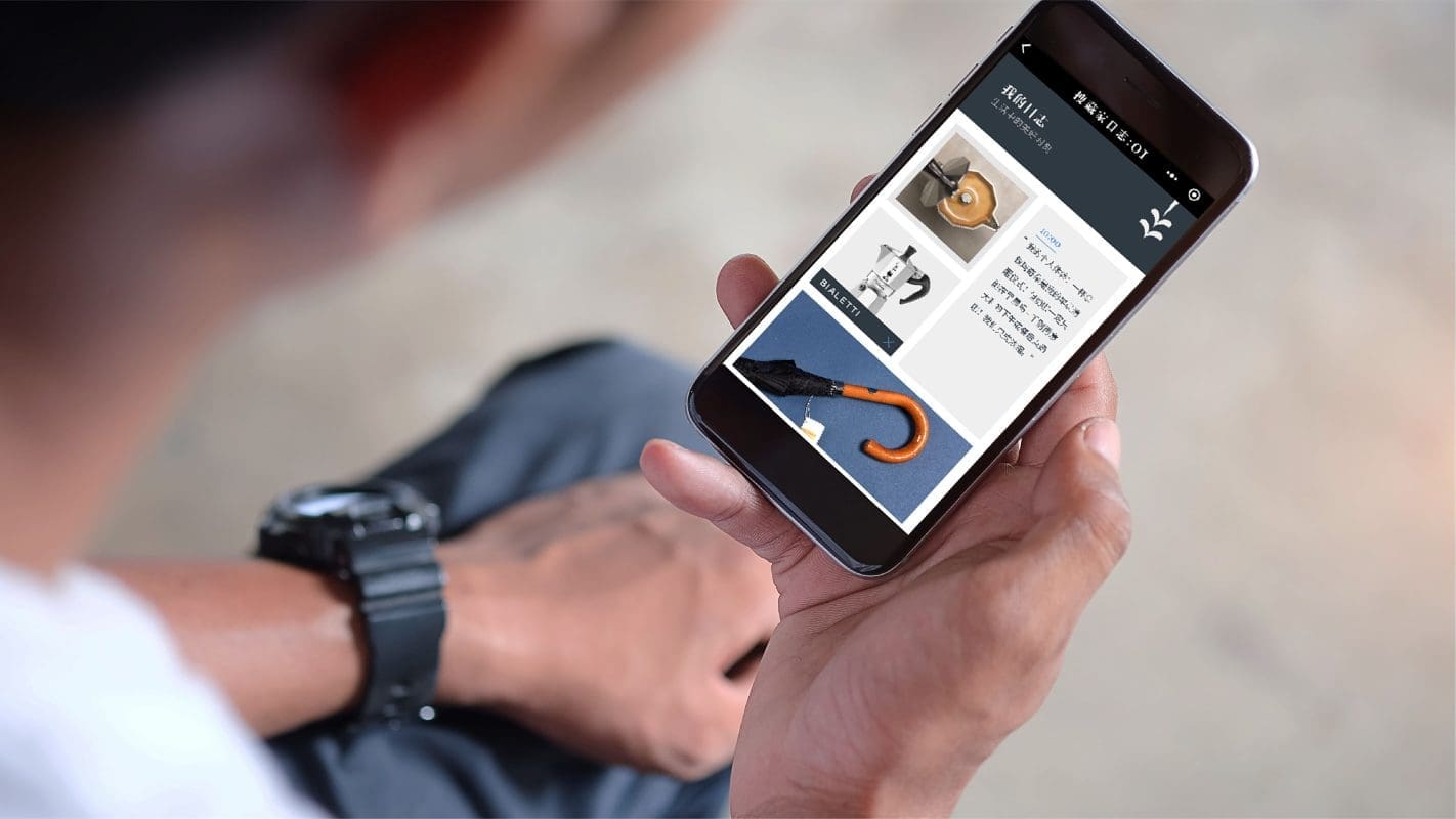
Prophet worked closely with Suning International to help develop an innovative experience and optimize its brand strategy towards the global market. We created a philosophy around a global community of curators, who believe that life should be culturally enriching, openly inspiring and actively shared. The exhibition design brought this idea to life as ‘Issue:01 – Found goods from Italy’, a lenticular hallway of inspirational products, curated video and multi-sensorial experiences, which documented a day in the life of two global citizens and their daily experiences in Italy.

“We’re responding to a new generation of consumers who love to discover and experience new things and share their finds with others. With the rise in global travel and access to more products and experiences than ever before from around the world, we want to create a brand and platform that empowers this global community of curators. We are bringing together select items of substance, from around the world, that will bring small moments of joy to everyday life,” said Young Kim, partner and executive creative director at Prophet.

Results

Within the exhibit, visitors could collect and share their own personal online journal of products and stories through a WeChat mini program that showcased the seamless O2O journey that Suning International offers.

The Suning International concept debuted in November 2018 in Shanghai, generating significant media interest and visited by over 22,000.

Our work with Suning International was awarded bronze for ‘best brand experience’ at Transform Awards Asia-Pacific 2019.

CASE STUDY

COLMO

Designing a simply extraordinary brand of smart home appliances

Challenge

Midea Group approached Prophet to create a new premium home appliance brand for an upcoming range of smart, connected kitchen products. Planned as a standalone brand, the opportunity was open to create a new name, strategy, story and visual look and feel.

Solutions

Prophet defined the essence of the brand as ‘Simply Extraordinary,’ a big idea that captured the philosophy of highly crafted products that are effortlessly simple in delivering an extraordinary user experience.

With this idea in mind, Prophet created the name ‘COLMO’, derived from the Italian for ‘summit’ or ‘crown’ to highlight the ambitions and quality of the brand and to add some international, European flavor.

The visual identity is also born from this idea, with an abstract crown symbol and elegant matching wordmark. Color is used sparingly to create a modern, sophisticated look with contemporary iconography and typography to support product descriptions and features.

Results

COLMO was unveiled in October 2018 on Mont Blanc and launched its first range of beautifully designed, award-winning products in December. It was launched at AWE 2019 (Appliance and Electronics World Expo) in Shanghai, showcasing a full new range of 13 Kitchen appliances.

Our work with COLMO won four awards at Transform Awards Asia-Pacific 2019, including Gold for ‘best visual identity’, Silver for ‘best strategic or creative development of a new brand’, Bronze for ‘best naming strategy’, and a Highly Commended award for ‘best creative strategy’.

CASE STUDY

FORA

From co-working to pro-working

Challenge

London is leading the global market in the co-working sector. With over 1,000 spaces, the competition is intense. After investing close to £400 million to acquire a number of striking buildings across central London, Brockton Capital, the investor behind Camden Lock, Curzon Street and Realpubs, was ready to bring something new and unique to the market. They engaged Prophet to identify a gap in the co-working space that Brockton could uniquely fill and to achieve new growth opportunities within an already crowded market.

Solutions

Prophet moved beyond the hipster, t-shirt and jean crowds of WeWork to a new professional or ‘pro-working’ space that goes beyond just supplying a desk. The spaces offer a more curated, members’ club approach to cater to a different kind of co-working clientele. The solution reimagined the brand experience and redefined what the term co-working could mean with premium hotel-style hospitality, destination restaurant, lobby bar, yoga studios and tech-enabled boardrooms.

“We started by speaking to the people that matter most – those potential customers who would be using the space – to begin the journey of developing the relevant value proposition and customer experience to address their needs,” said Gregg Finlay, Associate Partner and Creative Director at Prophet. “Extensive research and insights led us to the simple truth that became the core and driving force behind the brand: space to be brilliant.’’

From these insights came the inspiration for the name we developed: FORA. A Latin word and plural of ‘forum’- where ideas and views on a particular issue can be exchanged.

Results

From developing the name to defining the brand identity and superior value proposition, the FORA brand clearly differentiates itself from its competitors by standing out as a working space for high-achieving professionals across industries. It has become the fastest growing player in the co-working space, expanding its locations in London and beyond as customers champion the premium experience.

CASE STUDY

Verra Mobility

Launching a new brand post-acquisition

Challenge

Transportation is in the midst of rapid innovation—driverless cars, disruptive technologies, and mobile solutions—and American Traffic Solutions (ATS) was right in the middle of it, providing commercial fleets with tolling solutions and municipalities with smart traffic enforcement technologies. ATS as an organization was changing rapidly too—adding new capabilities and team members via strategic acquisitions.

This transformative initiative came under the stewardship of Platinum Equity, the private equity owner guiding Verra Mobility through its next strategic phase. Prophet partnered closely with Platinum Equity and Verra’s leadership team—aligning brand work to a value-creation roadmap and positioning the company for its upcoming public market strategy. With a confluence of the global mobility marketplace and the growth of ATS capabilities, all roads led to the need for a new brand and corporate story. A brand that signaled the type of company that ATS was becoming. A brand that motivated and united employees to move the world through smart mobility.

Solutions

Prophet was brought in to help ATS and its leadership to shape its corporate story and build a new brand. We began by looking at where all great brands start: the heart. Through a combination of employee and customer interviews, we sought to find out what made ATS, as well as the recently acquired brands of Highway Tolling Administration (HTA) and Euro Parking Collection (EPC), the titans of their industry. We also looked outside-in to understand where the transportation solutions category was going.

Our research uncovered that traffic solutions no longer represent what ATS truly does. So, we crafted a brand purpose to reframe the category where ATS plays – smart mobility. The result was a bold new direction for the company – one that served as a guiding light for where it was headed, and motivated employees to be a part of something bigger. Grounded by a new purpose, we turned our attention to customers – crafting a simple, yet powerful brand promise that articulated the value delivered by ATS every day: solutions that keep the world moving safely and easily.

But what would this new brand be without a new name? Prophet helped ATS define not just a new brand identity, but one that would resonate all the way up to its private equity owners. The shift to ‘Verra Mobility’—symbolizing truth and scale—was a strategic signal, supporting Platinum Equity’s thesis around building global smart mobility leaders.

The final piece of the puzzle was to solidify the brand internally. Our research revealed that one of ATS’ strongest competitive advantages was its people – people who always went the extra mile to serve customers. And with the acquisition of HTA and EPC, there was an opportunity to unite everyone under the new Verra Mobility brand. Through extensive research aimed at understanding the needs and motivations of both current and prospective employees, Prophet created a new Employee Value Proposition to build pride with Verra Mobility’s current talent, while simultaneously attracting the talent that would be needed to support the company’s new direction as a leader in smart mobility.

Results

The new Verra Mobility had a measured impact on stakeholders across the board. Prophet’s work aligned tightly with Platinum Equity’s objectives—crisp brand architecture, unified internal culture and a compelling market story of value. 

For employees, the brand was introduced in June 2018 via a high-energy firm-wide meeting. The energy around the new brand was infectious, and Verra Mobility leaders have praised how the brand successfully brought all employees, both legacy and acquired, under a single purpose and compelling employer brand.

For customers, the new brand has expanded the scope of what the company can offer, creating opportunities for new partnerships and solutions to continue advancing the world of smart mobility.

For investors, the refreshed brand purpose has reshaped the company’s frame of reference to the highly valuable smart mobility sector. This integration played a key role in positioning the business for its Q3 2018 SPAC listing, supporting valuation realization and public readiness. The brand was successfully taken public in Q3 2018 (NASDAQ: VRRM), with Verra Mobility leadership ringing the closing bell at the NASDAQ on October 18, 2018.

On April 1, 2019 – Verra Mobility’s stock reached an all-time high of $12 per share, achieving a market cap of $2.04B.

CASE STUDY

Sun Life

Developing a brand story that resonates in Hong Kong

Challenge

Sun Life engaged Prophet to reposition its brand and develop a new marketing campaign that would help cut through the clutter and inspire customers to engage with Sun Life versus competitors. Sun Life couldn’t compete in terms of spending and scale, so they needed to develop a brand story that would resonate and a campaign that would stand out.

Solutions

Prophet realized that what the industry was communicating was at odds with what consumers really wanted. Insurance providers spoke about fear and the need to hedge against life’s inherent risks, whilst people hoped for bright futures for themselves and their loved ones. Prophet identified an opportunity to frame insurance as an enabler of dreams rather than a guardian against inescapable peril.

Prophet created Sun Life’s brand positioning leveraging one key insight: consumers in Hong Kong want to dream bigger and live brighter lives—and they want their financial services provider to help. To bring the positioning to life, we translated “Dare to Dream. Live a Brighter Life” into the creative concept of the #BE campaign – “Be everything you want to.” The #BE campaign expressed Sun Life’s promise, that they are here to encourage and challenge people not just to dream, but to turn their dreams into a reality. The campaign was executed across channels including television, print and at various out-of-home touchpoints including street billboards and the MTR.

Results

The new brand positioning and the #Be Campaign drove a lot of impact, increasing brand awareness among target customers and energizing the Sun Life employee and agent base to rally around a refined and inspiring brand story. It gave Sun Life the ability to target the right customers, better articulate the value of their products and deliver a consistent, engaging brand experience for agents and customers alike.

Our work with Sun Life won GOLD for ‘Best creative strategy’ at 2018 Transform Awards APAC.

CASE STUDY

Rubix

An award-winning new brand for a leading industrial powerhouse

Challenge

When American private equity firm Advent International merged French industrial supplier IPH with Brammer it marked a major consolidation in the European industrial supplies and solutions market. The combined IPH-Brammer entity presented Prophet with a critical challenge: to create a new brand for this powerhouse to stand out and reach its full market potential.

Solutions

Our team worked quickly to develop a brand strategy to support the evolved priorities and future growth of this newly merged company. Based on the defined brand positioning a name that spoke to the human approach the company adopts to problem-solving was needed, capturing this along with an essence of ingenuity, we landed on Rubix.

We then set about creating a brand identity that would differentiate Rubix from its competitors. In an industry that is widely self-referential, we used storytelling both visually and verbally to stand out from the crowd. Three key brand elements were created to achieve this; a verbal approach that explains how Rubix helps their customers, a brand colour intended to highlight their presence and reach, and a visual device that communicates how they drive their customers’ businesses forward.

Results

With the new brand and go-to-market approach in place, Rubix is uniquely positioned to transform the industry, moving beyond product to become a trusted advisor. Featuring consecutively in the prestigious Sunday Times Top Track 100 in 2018 and 2019 (a league table that ranks Britain’s top private companies with the biggest sales), the reported four percent year-over-year sales growth clearly reflects the successful path the rebranded business is on.

Prophet’s work for Rubix was also acknowledged at the Transform Europe 2020 awards, which recognises excellence in rebranding and brand strategy. Rubix scooped three awards including ‘Best Creative Strategy’ and ‘Best Corporate Rebrand Following a Merger or Acquisition.’

CASE STUDY

L’Escape

Creating a Parisian escape in the heart of Seoul

Challenge

Shinsegae Chosun Hotel Group had ambitious plans to expand its footprint in the hotel space in Korea. Increasing luxury hotel competition and continued growth in overseas travelers seeking unique, avant-garde experiences in Seoul presented an opportunity for Shinsegae to create a new hotel brand from scratch.

With renowned French designer Jacques Garcia secured for the hotel’s internal design, our challenge was to create a unique boutique hotel concept and a compelling brand strategy to drive exceptional hospitality and food & beverage experiences in a crowded space with shifting consumer expectations around luxury.

Solutions

Prophet worked closely with Shinsegae to define a winning brand portfolio that captures distinct opportunities in the Korean travel market, with clearly defined roles and relationships for each of their hospitality brands.

We began to define a distinctive hotel concept by uncovering fresh insights across three lenses: competitors, boutique differences and consumers.

  • Competitors: Through expert interviews and in-depth auditing, we uncovered key insights about the boutique hotel sector and its evolution as well as best practices of key competitors.
  • Boutique Difference: We conducted extensive research and audits across the globe to define four key elements of French style by talking to Parisian experts in fields of fashion, luxury and design.
  • Consumers: Finally, we conducted in-depth quantitative research with over 2,000 respondents across 5 countries, as well as qualitative customer interviews with experts in the luxury space, to understand what would most intrigue travelers.

The result was outstanding – we created a unique idea, hotel name and story that delivers a hospitality experience like no other: A Parisian Escape in the Heart of Seoul.

L’Escape was born.

The hotel is a hidden retreat full of surreal sophistication where moments are treasured, and memories are born. Like a bird escaping its cage, guests are free to explore intimate spaces and celebrate special moments.

L’Escape is for those who wish to get away from reality, a place that releases pleasure seekers from traditions and conventions, and liberates them to create their own dreams and fantasies. This concept is expressed through the open bird cage on the logo, leaving people to wonder where the bird has gone. The missing bird appears on other visual elements such as photography, creating a powerful juxtaposition with the logo. A color palette of gold on black and blue hints to sophistication and elegance.

We brought the brand strategy to life by creating unique yet coherent visual identities for the boutique hotel and its F&B offerings. We also developed complete branding concepts for the F&B outlets within the hotel: bar Marque d’Amour, contemporary restaurant L’Amant Secret and Chinese restaurant Palais de Chine.

Results

A unique luxury hotel experience that brings 19th Century Paris to modern Korea for the first time, L’Escape opened in July 2018 to critical acclaim. Our inspiring work with L’Escape won 2 GOLD awards at the 2018 Transform Awards APAC for best brand development and best visual identity. A judge commented, “An excellent creative concept to stand out in a crowded market. Excellent execution and sophisticated attention to detail.”

The hotel was the first independent hotel brand launched by the Shinsegae Chosun Hotel Group in the bustling shopping district of Myeong-dong. Prophet has equipped Shinsegae with a clear and unique boutique hotel concept that is new to the market and reflected throughout the hotel experience.

Since its opening, it has drawn much fanfare and traffic on its Instagram site. Its concept and story have attracted celebrity chefs and mixologists with partnerships with brands such as Mott 32 and Maison M’O. In February 2020, L’Escape was awarded an iF design awards for its website design.

CASE STUDY

Regal

Evolving an entertainment icon

Challenge

Regal Cinemas, one of the leading movie theater chains in the U.S., turned to Prophet to change its brand identity to reflect its evolving theater experience. With an ever-expanding media landscape and entertainment channels to choose from, the Regal brand needed to communicate that their theaters were ‘The Best Place to Watch a Movie’.

Solutions

Prophet created the new Regal brand to have a connection back to the Regal crown of the past but viewed from a new perspective. The seven sides of the symbol tie back to the aperture of a movie camera and can easily live around the dynamic imagery associated with movies and entertainment. With a sleek wordmark and dramatic visual elements, the system was designed to unify messaging with visual design, allowing the brand to reflect the passion and energy of the movies and legion of movie fans.

With Regal Cinema’s preeminence in the marketplace, the brand name was also truncated to only Regal, to maximize impact and brand memorability.

Results

Prophet helped envision how the brand could be activated across touchpoints from the theater façade to concessions and the digital experience. The brand program was launched in December of 2018 and will be executed in all-new theater renovations throughout 2019.

In Nov. 2019, the Prophet team won a GOLD award for ‘Best visual identity from the travel, leisure and tourism sector at the North America Transform Awards.

Five Wins at the North America Transform Awards

CASE STUDY

Major Payments Provider

Bridging global innovation gaps through digital transformation

Challenge

A major payments technology company had over many years developed a network of 10 innovation centers around the world. Each innovation center was designed and launched by leaders in different geographies and with differing capabilities, operating models and approaches to serving company account teams and their clients.

While some cross-pollination of ideas and frameworks was taking place, there was no standardized agreement on what might be necessary to drive greater value.

The company recognized that a more consistent operating model was needed, and in 2018 the company decided to move all the innovation centers under a single global leader. This new leader was tasked with driving synergies between the innovation center leaders and establishing a new, universally accepted operating model.

Solutions

The company engaged Prophet to bring the innovation leaders together to rapidly build trust among them and encourage knowledge sharing. From there they could work toward consensus on a go-forward operating model and action plan for putting it into practice.

To start the alignment process, Prophet’s team led the innovation leaders in activities that provided insight into their own preferences and motivations within the innovation process, allowing each leader to meet each other on equal footing. The subsequent knowledge-sharing activities were designed to quickly establish commonality and shared interests. The first two activities were so effective that aligning on the go-forward operating model, key areas for standardization and the action plan was remarkably straightforward.

Results

The team quickly aligned on priorities, an action plan and expectations moving forward.  The head of global innovation and design at the company said:

“Designing and delivering this kind of iconic event for a team of highly independent and experienced innovation leaders (who regularly run these kinds of events themselves for our global clients) required a firm who could confidently bring deep, demonstrated subject matter expertise in innovation, digital product development and event facilitation. I trusted the Prophet team to rapidly get us to breakthrough team dynamics and an actionable plan, and they totally delivered.”

CASE STUDY

Embarc Collective

Creating a destination for diverse startup talent

Challenge

Tampa Bay is one of the fastest-growing regions in the U.S. and has great potential to become a vital resource for innovation and technology. An innovation hub will be opened to serve as a central location to bring together startup founders, accelerators and incubators, mentors and other resources for the growth of new businesses in the region.

To ensure the success of the hub, as well as the revitalization and growth of the broader region, Prophet was asked to help build a unique brand identity, including a compelling brand story, directive brand persona and unique visual system.

Solutions

Prophet was retained to develop a new brand, name and visual system for the innovation hub. We started by conducting research to understand key success factors for startup ecosystems, touring other innovation hubs and interviewing key stakeholders. We also conducted research on the competitive landscape, aiming to understand the startup infrastructure, current unmet needs in the market and opportunities for differentiation.

The articulated brand narrative and key offerings allowed the innovation hub to take further shape and develop a sense of identity. Using Prophet’s rigorous creative and strategic process, we explored and selected a name and visual attributes for the hub. The process consisted of multiple rounds of name generation, screenings and filtering. Embarc Collective rose to the top as it perfectly represented the hub’s objectives: to be an inclusive community space for entrepreneurs and their teams to launch and build enduring businesses.

In developing the visual identity for Embarc Collective, their logo became the building blocks for the graphic system, celebrating the future-thinking mindset of the startup community. This foundation was used to inform the broader visual system, using rectangular forms to build a cohesive graphic language. The end result was a complete set of brand guidelines for the visual identity system, ensuring consistent execution of the brand across all touchpoints.

Results

Embarc Collective had a successful launch in 2019 with a distinct name, strategic approach and brand identity that differentiates them within their local Tampa Bay community.

This work received a bronze award for print collateral at the 2019 International Design Awards.

CASE STUDY

The Wharton Center

Defining brand purpose for a performing arts center

Challenge

The Wharton Center at Michigan State University (MSU) is an important asset to the Lansing community. While its well-known for providing entertainment, its purpose is elevated by its support for the performing arts in the local community. The organization brings a unique spirit to Lansing but has recently struggled to demonstrate value to its constituents. While embarking on new programs poised to improve engagement and relevance within MSU, The Wharton Center found that its brand lacked focus – it needed to redefine its role at MSU and within the greater community.

Solutions

The Wharton Center looked to Prophet to help define its purpose and better position it within the extended local community. The Prophet team found that the brand’s purpose and promise were rooted in its core beliefs and reason for existing: to inspire the mind and move the soul by sharing stories, celebrating differences and creating a community through performance and education.

To demonstrate its newly discovered and defined purpose through its visual assets and media, Prophet created a new visual identity for the brand and an implementation plan. The brand evolution focused on the concept of putting “Art at the Center” – it reflects both the variety and dimensionality of the performing arts by using a dynamic logotype. Prophet also introduced representational shapes to add a unique flavor to the graphic system. These shapes represent that performing arts are always alive, moving and evolving through music, dance and variety.

Results

The revitalized brand purpose and visual identity helped The Wharton Center define and express its role within the MSU community. Each year, the Center impacts the lives of more than 30,000 young people, to help them find courage, foster boldness and embrace diverse perspectives. The organization is committed to shaping the world through performing arts and arts education; and sharing stories of its community–of dreams, heartbreaks, struggles and triumphs– and heritage for future generations.

This work received a gold award for key art and a bronze award for print collateral at the 2019 International Design Awards.

CASE STUDY

Equality California

Helping a civil rights organization evolve

Challenge

Equality California had achieved major state policy victories but faced a fraught national political climate and persistent disparities in health and well-being. The organization needed to reframe its ongoing mission for California’s LGBTQ community, and beyond.

Solutions

Prophet helped Equality California think through fundamental questions about its purpose and brand story, helping the organization think about the strategic considerations behind ambitions such as broadening beyond California or doubling down on intersectional advocacy.

Leveraging input from a rigorous qualitative and quantitative research process, Prophet developed a 5-year plan to transform the brand. This strategy laid the groundwork for the new Equality California brand to come to life physically and digitally, through new brand identity, tagline, messaging and mission statement.

Results

Equality California’s refreshed strategy, brand identity and brand assets launched to great celebration. Its new direction set the organization on a path to become an even more inclusive, disruptive and enduring agent of change for years to come.

Impact

40%

increase in monthly Twitter impressions

27k

new members since the rebrand

Your network connection is offline.

caret-downcloseexternal-iconfacebook-logohamburgerinstagramlinkedinpauseplaythreads-icontwitterwechat-qrcodesina-weibowechatxing