CASE STUDY
L’Escape
Creating a Parisian escape in the heart of Seoul
Challenge
Shinsegae Chosun Hotel Group had ambitious plans to expand its footprint in the hotel space in Korea. Increasing luxury hotel competition and continued growth in overseas travelers seeking unique, avant-garde experiences in Seoul presented an opportunity for Shinsegae to create a new hotel brand from scratch.
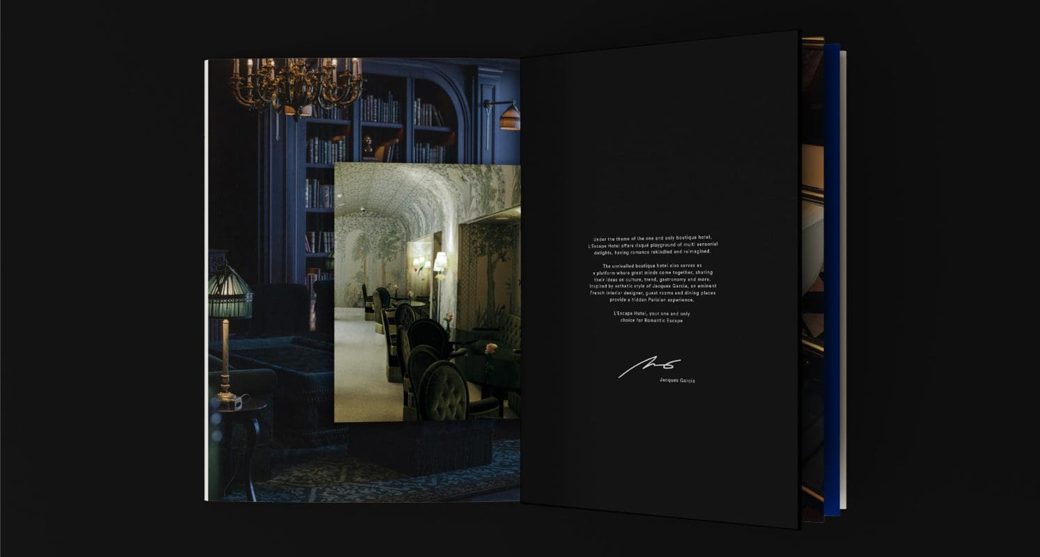
With renowned French designer Jacques Garcia secured for the hotel’s internal design, our challenge was to create a unique boutique hotel concept and a compelling brand strategy to drive exceptional hospitality and food & beverage experiences in a crowded space with shifting consumer expectations around luxury.
Solutions
Prophet worked closely with Shinsegae to define a winning brand portfolio that captures distinct opportunities in the Korean travel market, with clearly defined roles and relationships for each of their hospitality brands.
We began to define a distinctive hotel concept by uncovering fresh insights across three lenses: competitors, boutique differences and consumers.
- Competitors: Through expert interviews and in-depth auditing, we uncovered key insights about the boutique hotel sector and its evolution as well as best practices of key competitors.
- Boutique Difference: We conducted extensive research and audits across the globe to define four key elements of French style by talking to Parisian experts in fields of fashion, luxury and design.
- Consumers: Finally, we conducted in-depth quantitative research with over 2,000 respondents across 5 countries, as well as qualitative customer interviews with experts in the luxury space, to understand what would most intrigue travelers.
The result was outstanding – we created a unique idea, hotel name and story that delivers a hospitality experience like no other: A Parisian Escape in the Heart of Seoul.
L’Escape was born.
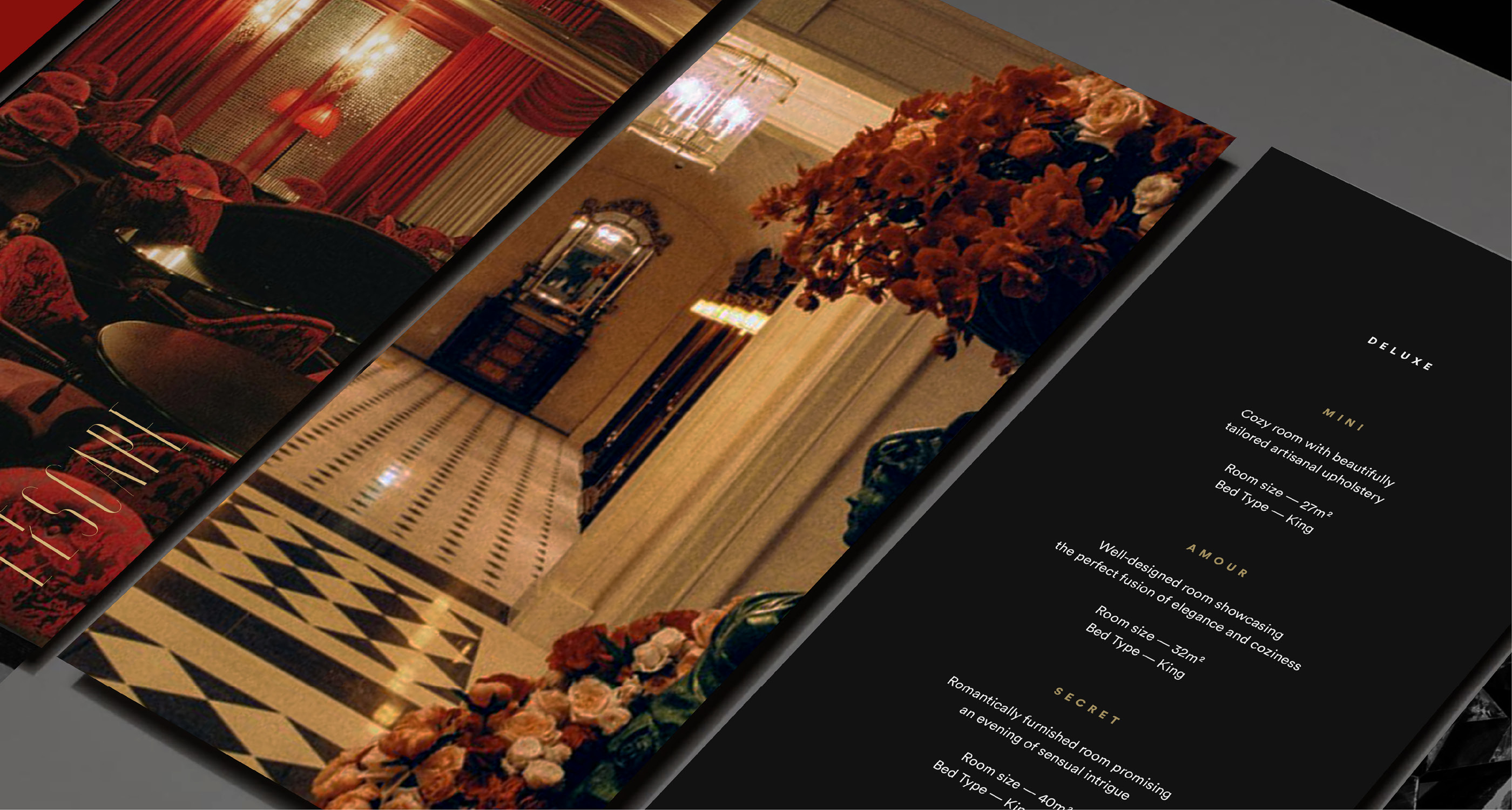
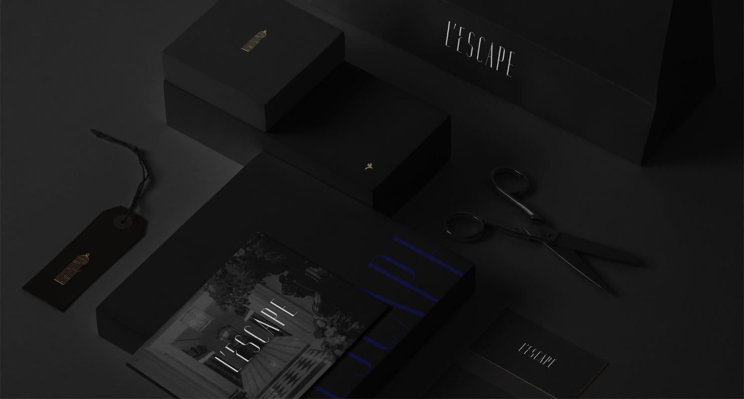
The hotel is a hidden retreat full of surreal sophistication where moments are treasured, and memories are born. Like a bird escaping its cage, guests are free to explore intimate spaces and celebrate special moments.
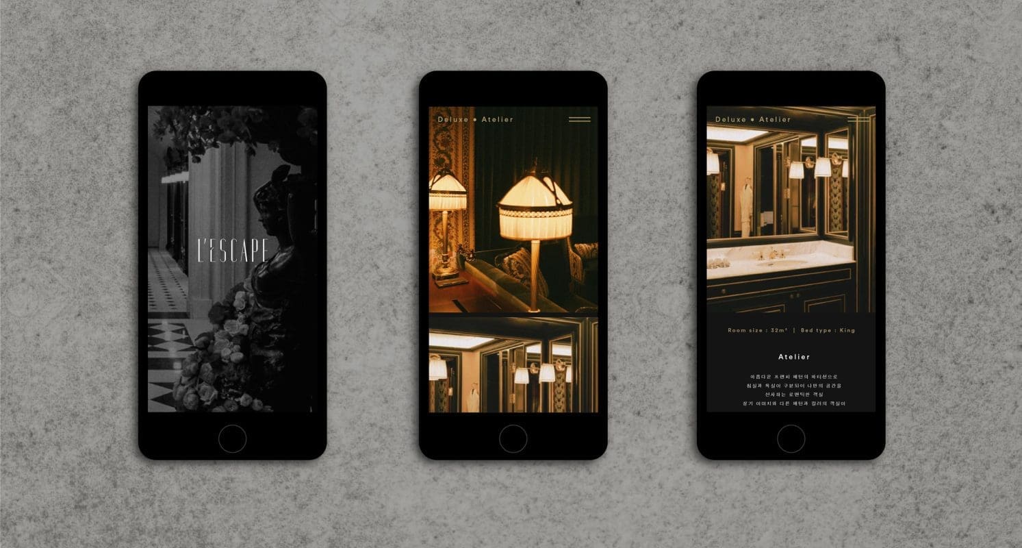
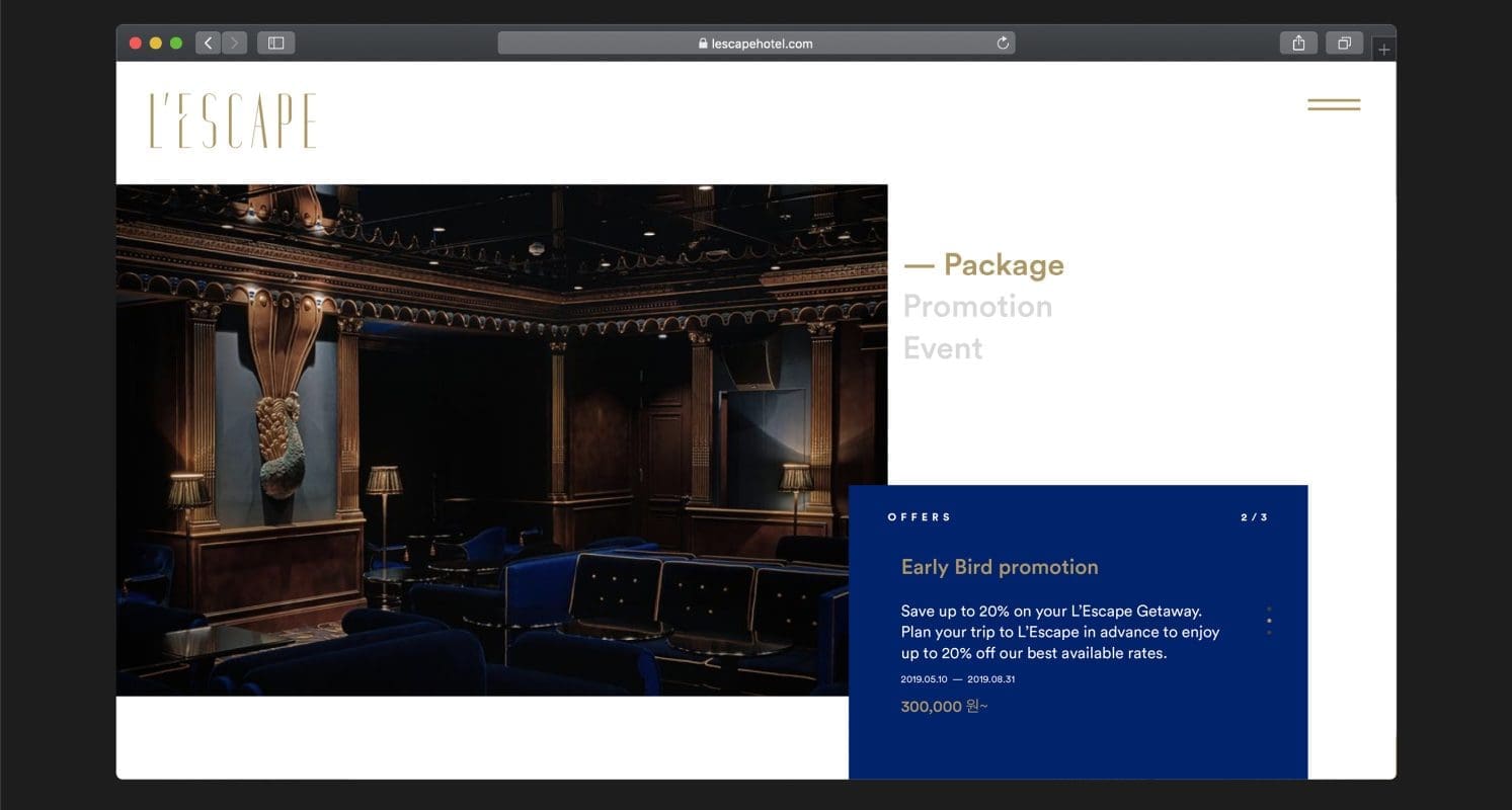
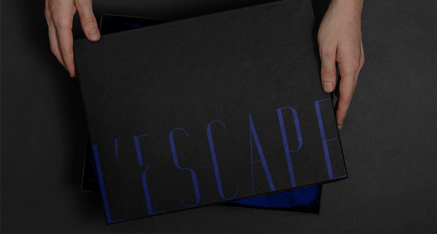
L’Escape is for those who wish to get away from reality, a place that releases pleasure seekers from traditions and conventions, and liberates them to create their own dreams and fantasies. This concept is expressed through the open bird cage on the logo, leaving people to wonder where the bird has gone. The missing bird appears on other visual elements such as photography, creating a powerful juxtaposition with the logo. A color palette of gold on black and blue hints to sophistication and elegance.
We brought the brand strategy to life by creating unique yet coherent visual identities for the boutique hotel and its F&B offerings. We also developed complete branding concepts for the F&B outlets within the hotel: bar Marque d’Amour, contemporary restaurant L’Amant Secret and Chinese restaurant Palais de Chine.
Results
A unique luxury hotel experience that brings 19th Century Paris to modern Korea for the first time, L’Escape opened in July 2018 to critical acclaim. Our inspiring work with L’Escape won 2 GOLD awards at the 2018 Transform Awards APAC for best brand development and best visual identity. A judge commented, “An excellent creative concept to stand out in a crowded market. Excellent execution and sophisticated attention to detail.”
The hotel was the first independent hotel brand launched by the Shinsegae Chosun Hotel Group in the bustling shopping district of Myeong-dong. Prophet has equipped Shinsegae with a clear and unique boutique hotel concept that is new to the market and reflected throughout the hotel experience.
Since its opening, it has drawn much fanfare and traffic on its Instagram site. Its concept and story have attracted celebrity chefs and mixologists with partnerships with brands such as Mott 32 and Maison M’O. In February 2020, L’Escape was awarded an iF design awards for its website design.