CASE STUDY
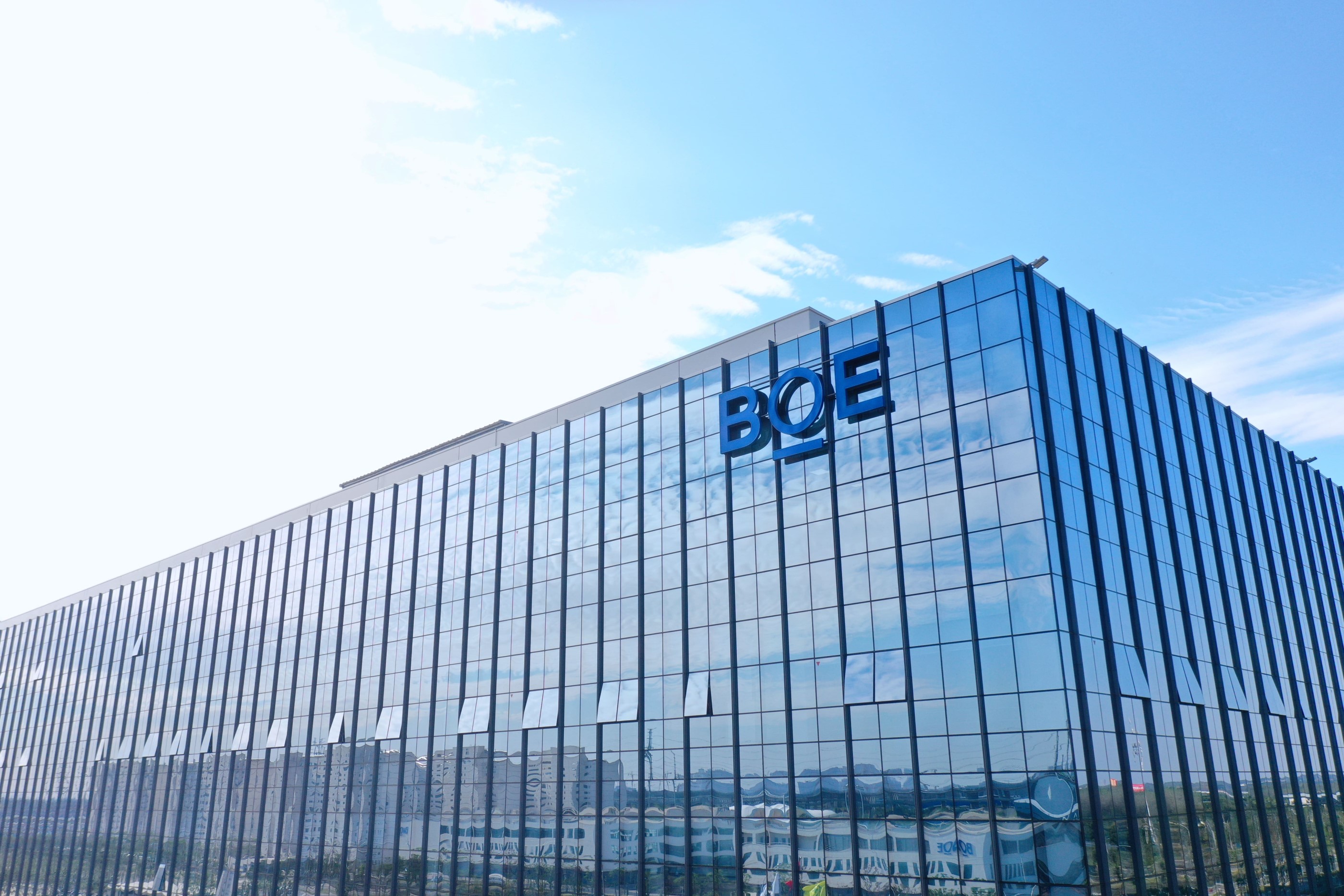
BOE
Building a new technology brand to empower the global IoT industry
Challenge
To fuel a new wave of strategic growth, leading IoT technology company BOE realized the imminent need to upgrade its master brand strategy. BOE came to Prophet with two key objectives: First, to extend its brand perception from a “business-oriented” company to a “consumer-oriented” one by creating a clear and consistent image as an IoT technology leader; second, it wanted to define a new brand architecture that fuels the growth of its diversified business portfolio.
Solutions
Prophet partnered with BOE to help upgrade its master brand and refine its brand architecture. Based on our strategic recommendations, BOE decided to launch a new technology ingredient brand – a first in China’s semiconductor display sector – as a significant strategic move to establish itself as a B2B2C company. The new brand aims to strengthen a strong connection between BOE’s core technologies and its master brand while energizing the global smart technology industry.
Through a series of co-creative workshops with BOE’s business and technical teams, we first clarified the brand’s main objectives, core audience, key technologies and activation strategies. Based on these strategic principles, we defined the naming strategy for the new brand.
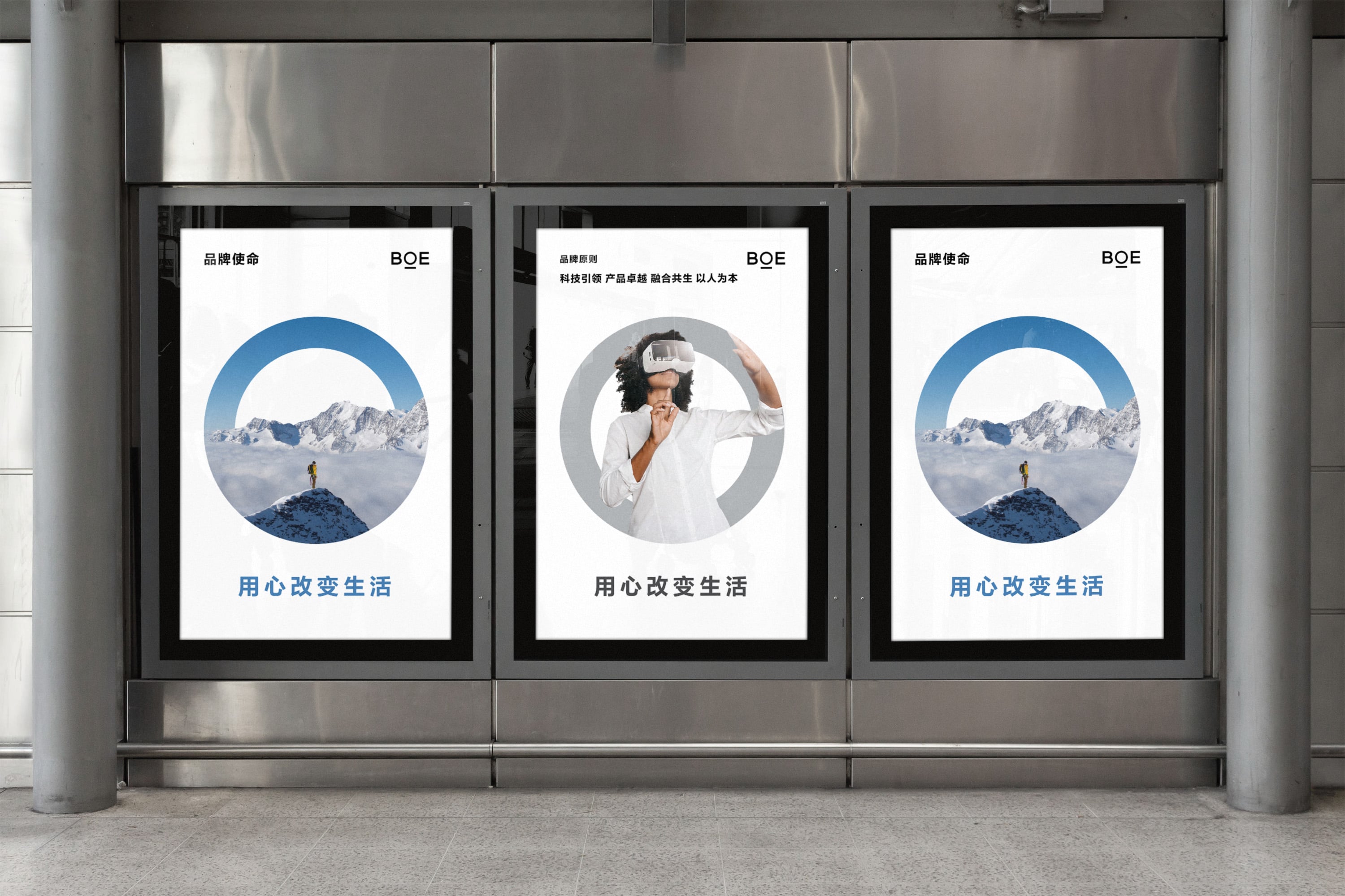
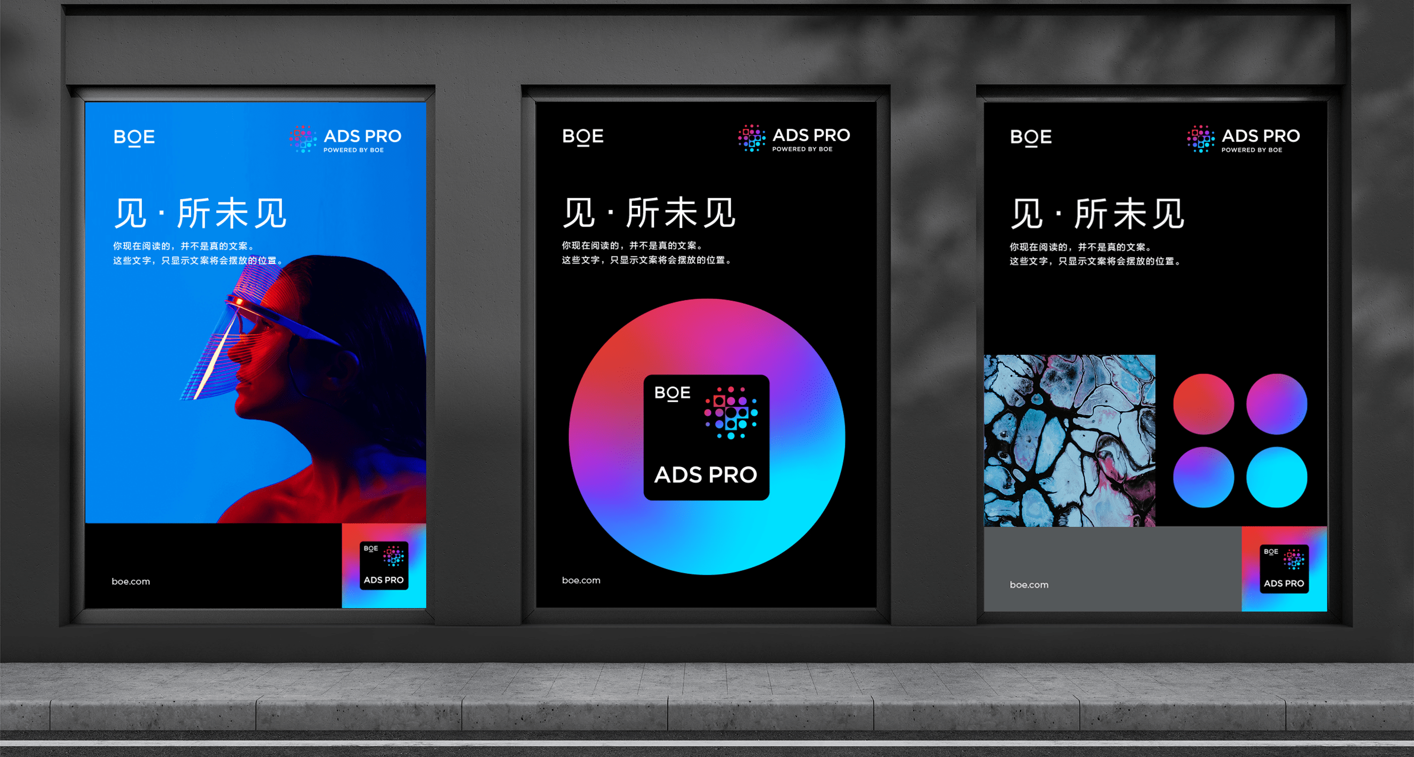
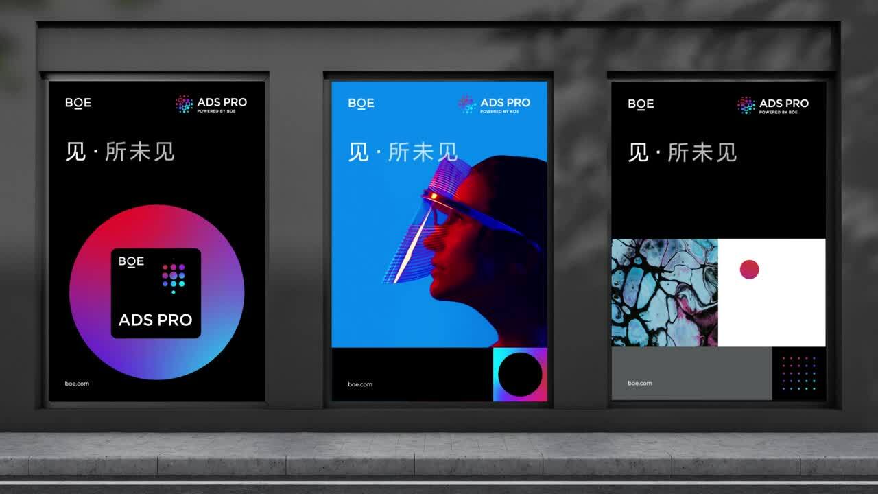
We leaned on our previous relationship with BOE and our deep understanding of its business to create product names for its core display technologies as well as the tagline “See the Unseen.” In addition, we worked closely with BOE to clarify the functional and emotional benefits of the new brand and developed a unified positioning framework for the technology brand and its core display technology products to follow. This allowed communication with BOE’s diverse audience in a simple and straightforward way. We also developed the activation strategies for both BOE’s business and consumer audiences
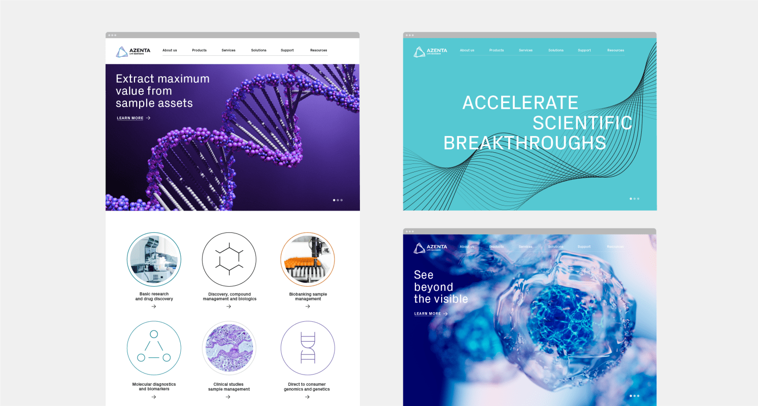
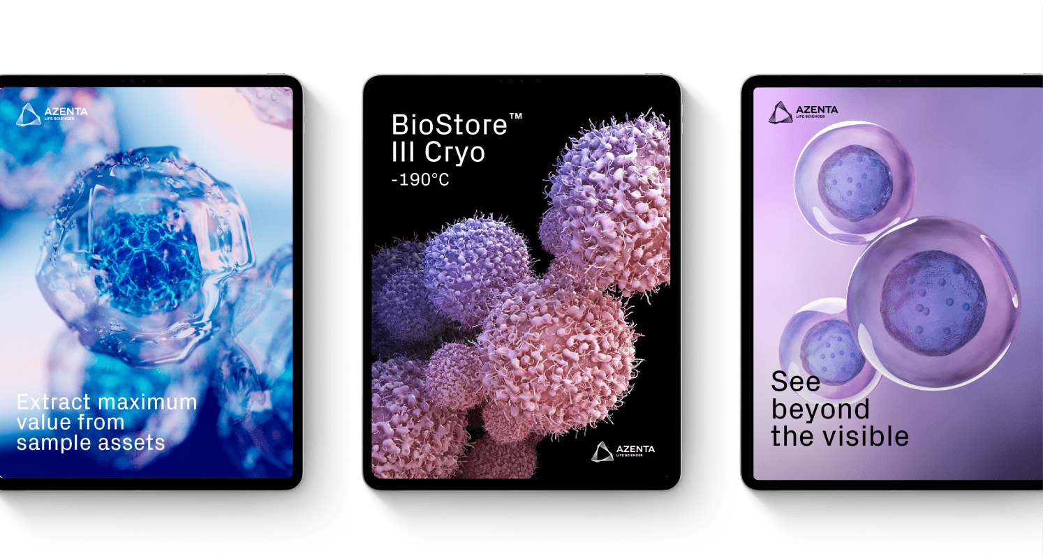
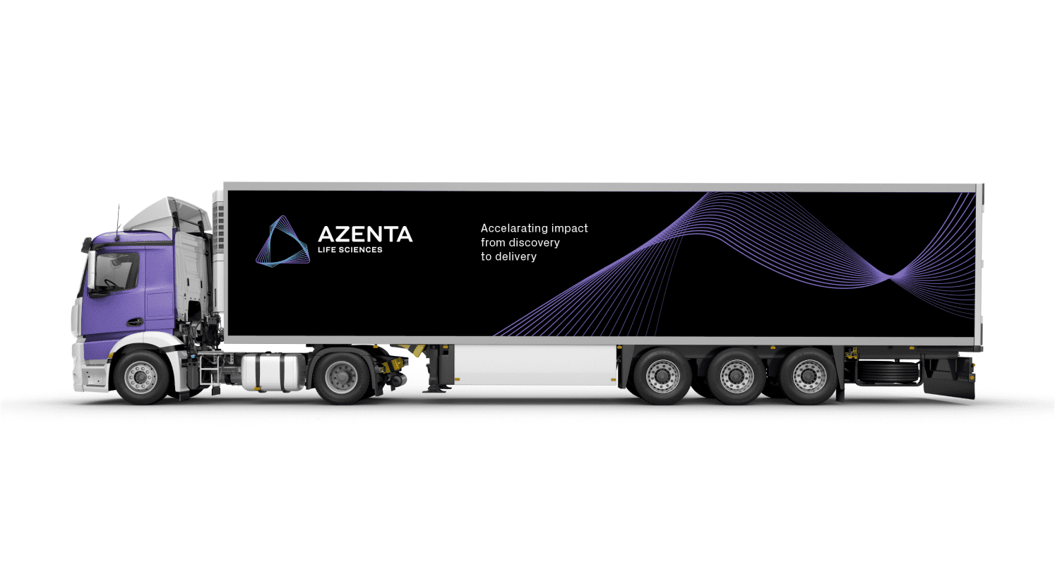
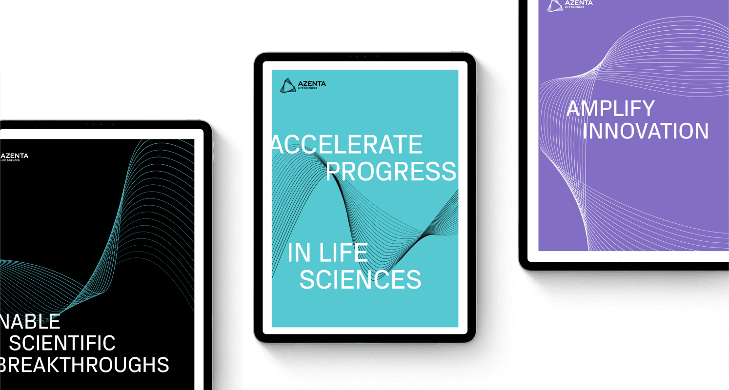
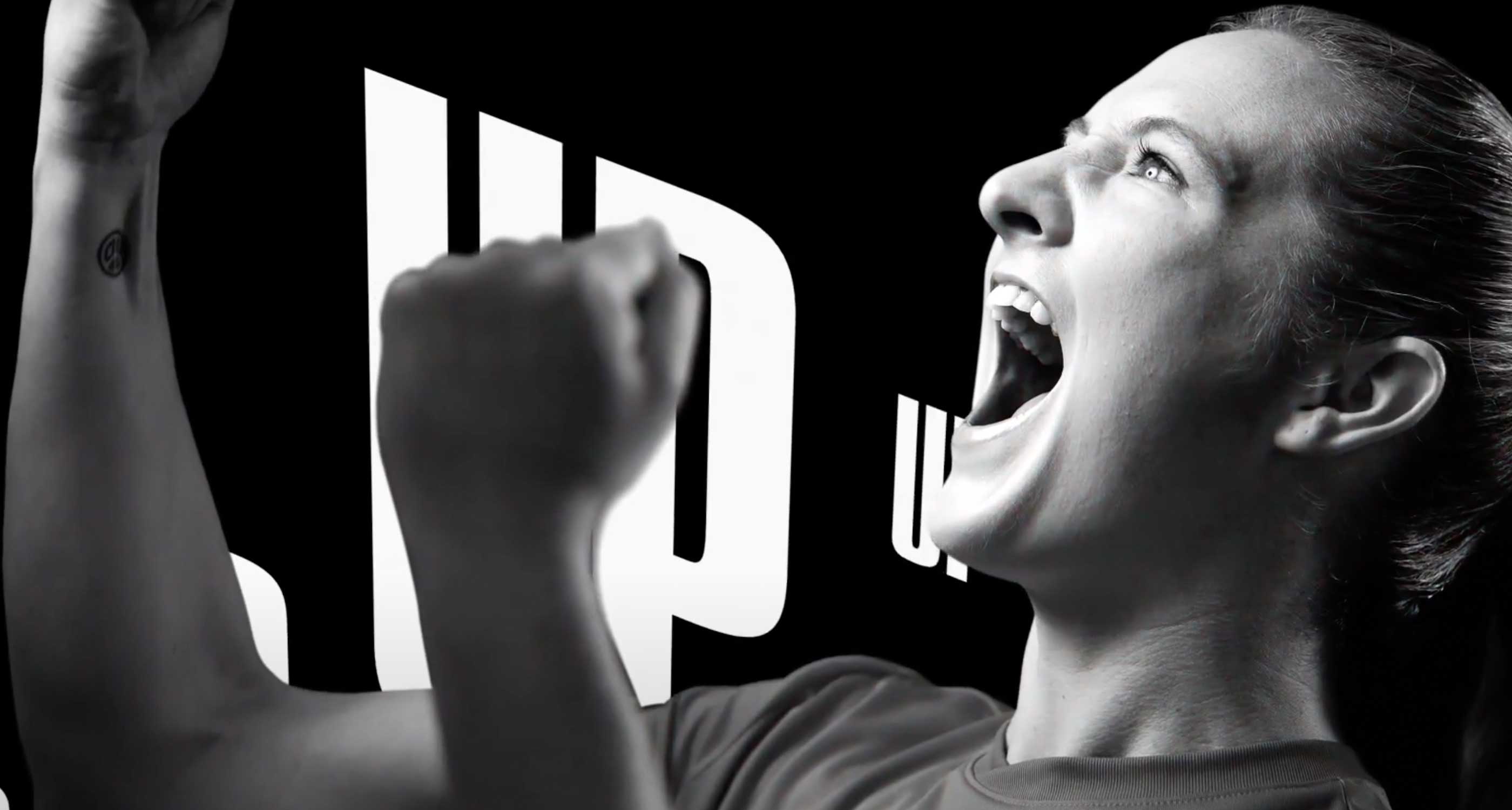
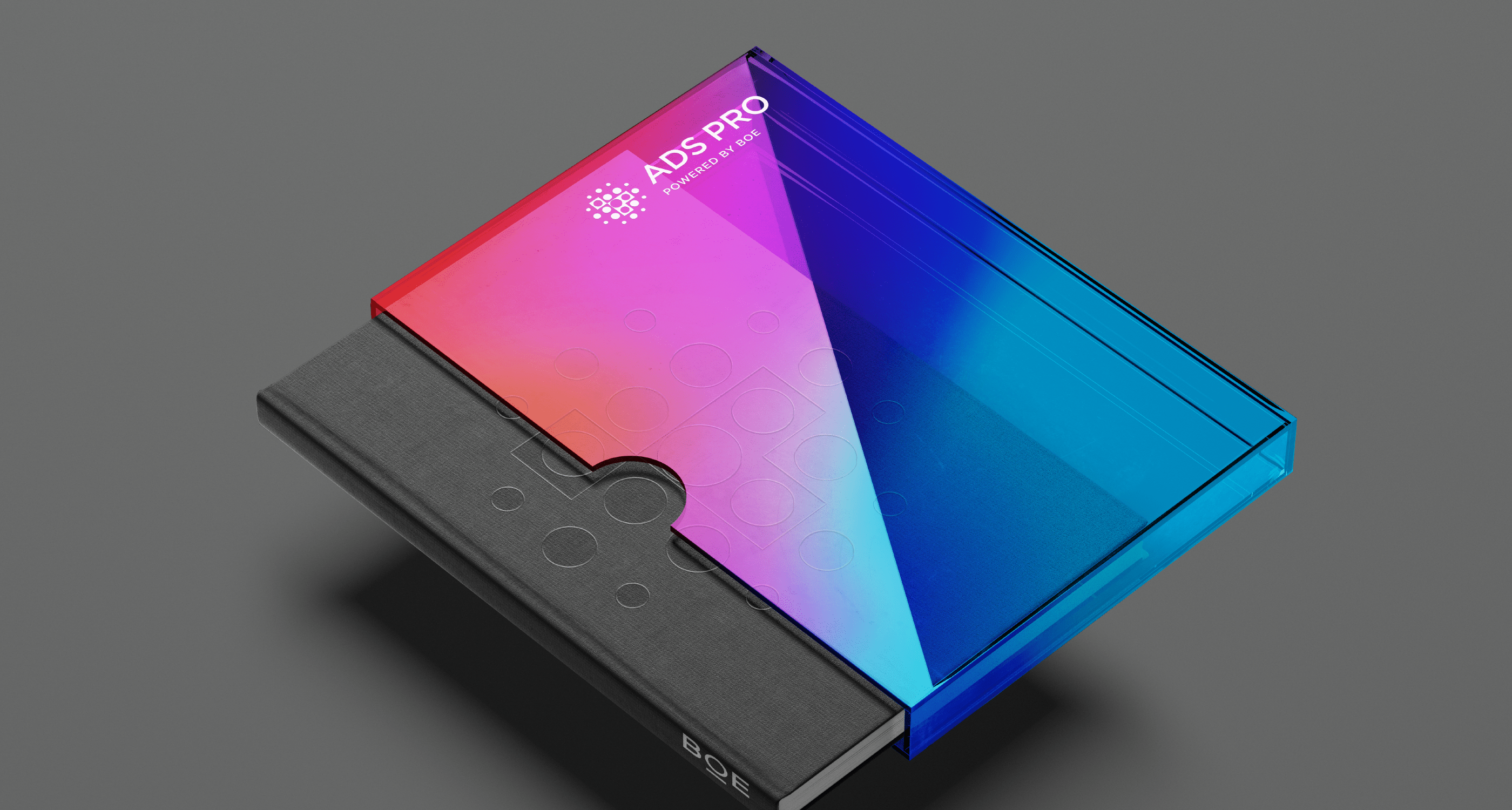
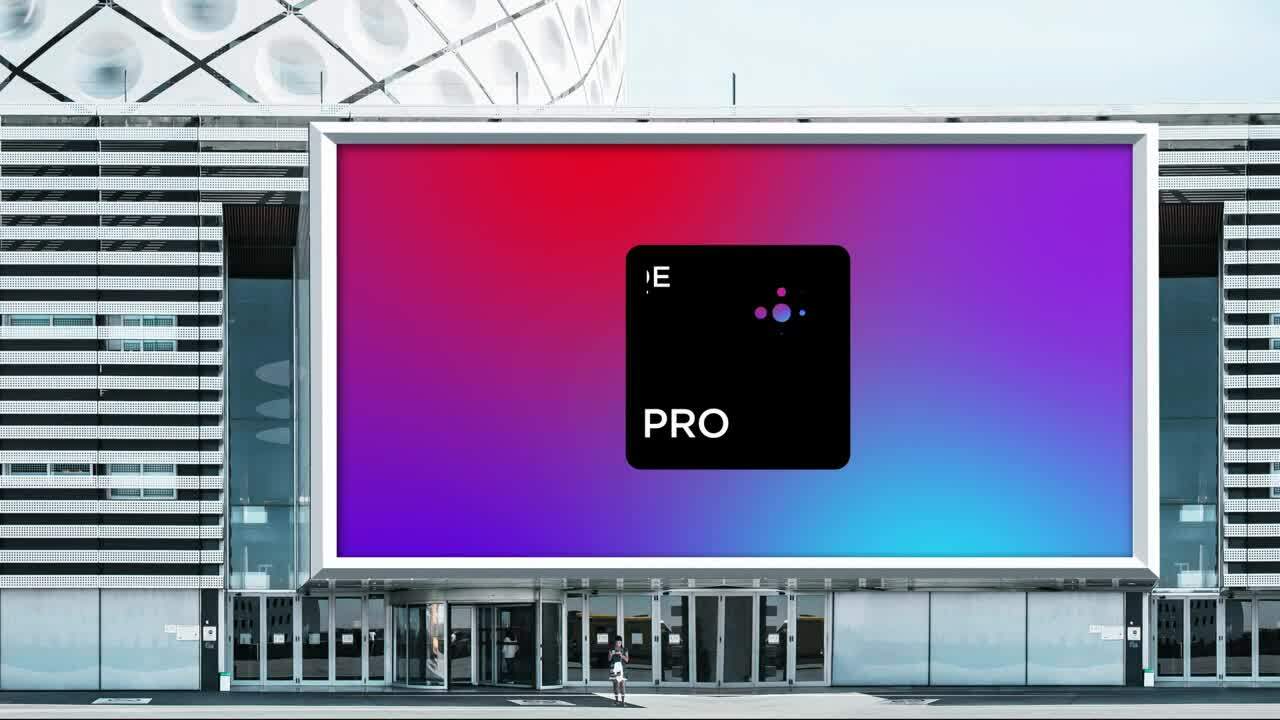
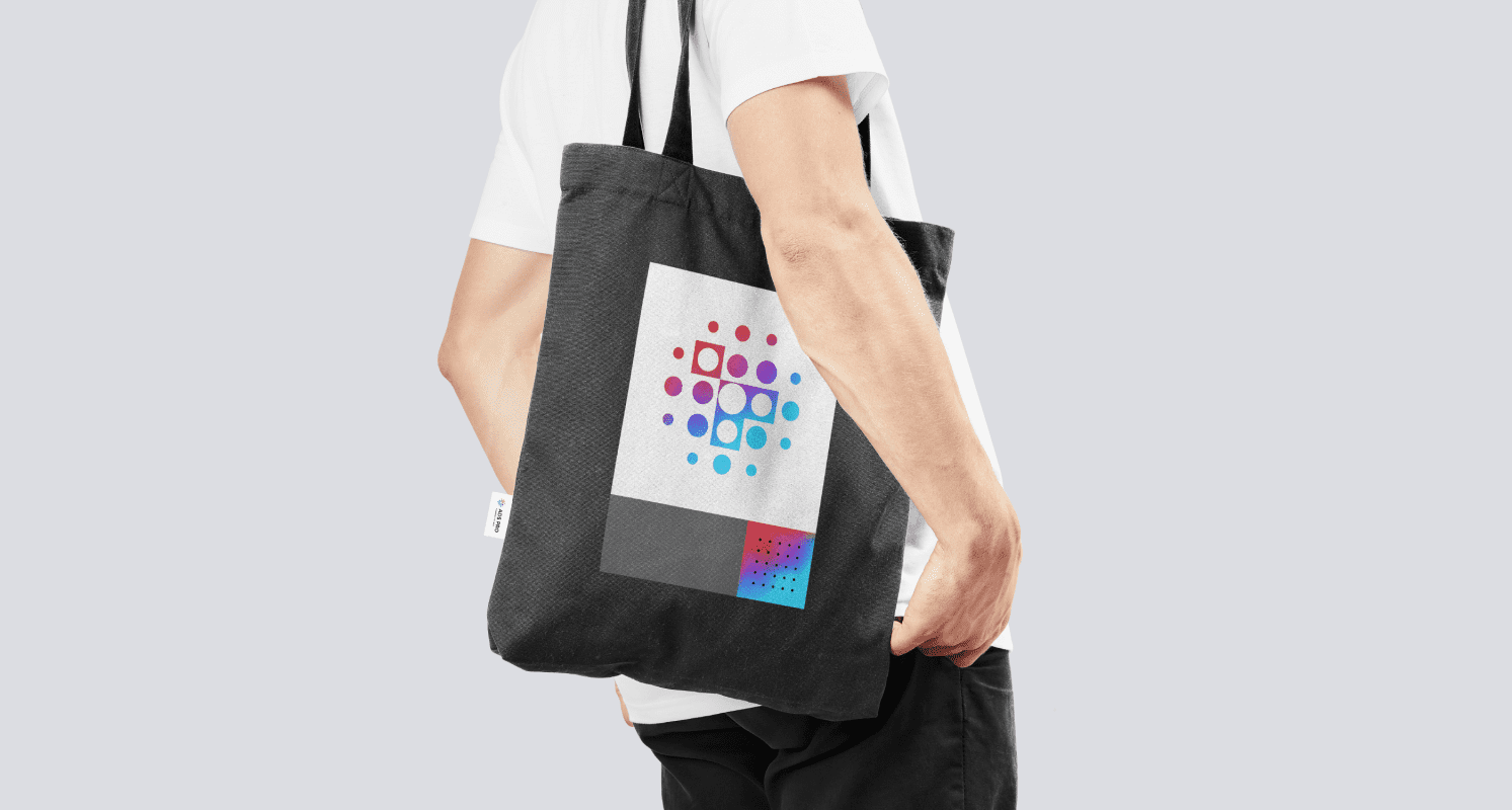
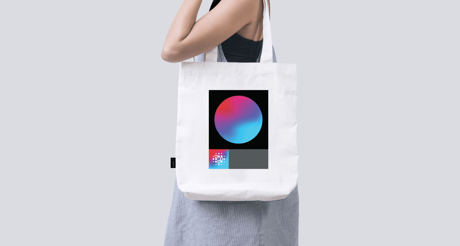
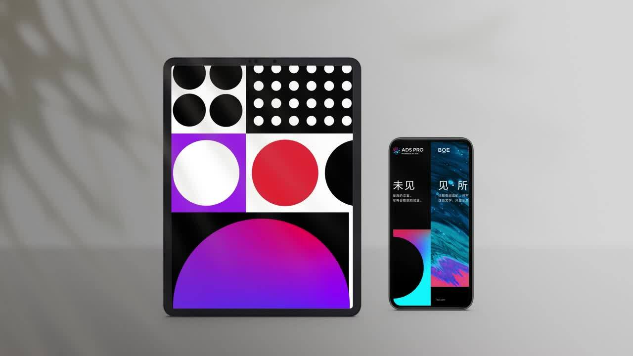
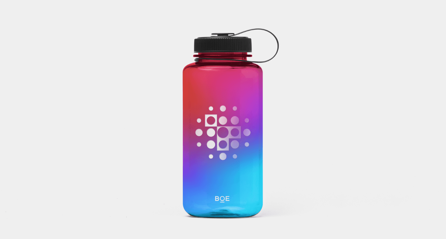
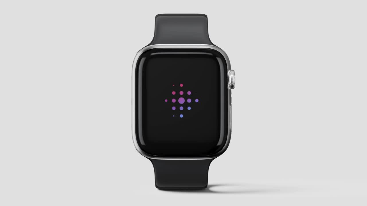
Next, our design team created an impactful visual system, bringing the brand positioning to life through a distinctive identity and a living system. Using the creative concept of “unleash possibilities”, we developed a visual system of dynamic shapes and a high-saturation palette to symbolize the brand’s commitment to deepening the integration of life and technology, unlocking endless possibilities. The design utilizes simple graphic elements of dots and squares. The dots are derived from BOE’s master brand’s logo, representing the company’s ambitious vision, while the squares are meant to mimic screen pixels, symbolizing the innovative technologies that BOE provides to the world.
Lastly, to ensure the new brand’s successful and consistent implementation, we developed a clear and curated brand guideline, which details the final visual identity, the comprehensive visual system and applications.

Results
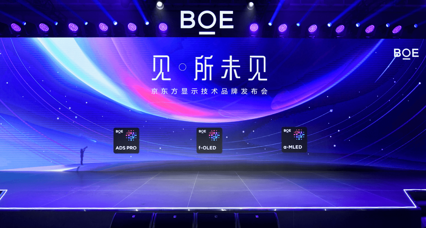
In December 2021, BOE officially launched the first technology ingredient brand in China’s semiconductor display field. The new brand introduces a portfolio of BOE’s premium, proprietary display technologies, including ADS Pro, f-OLED, and a-MLED.
BOE has announced strategic partnerships with both domestic and international technology brands including AOC, Skyworth, Hisense, Lenovo, OPPO, Vivo and Xiaomi, to jumpstart the new technology platform. As one of the key components of IoT innovations, the advancements in display technologies will enrich diverse application scenarios. BOE is committed to continuing to lead the industry forward with new innovations that unleash endless possibilities.
And, our work with BOE earned recognition by Transform Magazine’s Transform Awards Asia 2022, winning gold in the category for Best Visual Identity from the Technology, Media and Telecommunications Section, and silver for Best Development of a New Brand Within an Existing Brand Portfolio and Best Strategic or Creative Development of a New Brand categories.
“With strong diligence and dedication, Prophet demonstrated deep insights into the technology industry and a true understanding of our business. It helped us successfully overcome the roadblocks of rebranding amid a business transformation, elevating our existing brand strategy in a clear and concise manner. All these endeavors were highly effective in repositioning BOE as an IoT company with a refreshed identity system.”
Da Si
Vice President and Chief Brand Officer