CASE STUDY
Vantage
Reinvigorating a Fintech brand to drive growth
Challenge
Founded in 2009, Vantage is a global multi-asset broker offering clients access to services for trading contracts-for-difference (CFDs) on forex, commodities, indices and shares. As competition in online CFD trading intensifies and customer expectations evolve, Vantage’s brand had become less relevant and harder to differentiate. In addition, its visual identity, which served the broker well in the past decade, lacked a clear proposition and emotional appeal.
A business with the scale and ambition of Vantage needs to make sure that its brand expression is not only consistent and coherent globally, but also relevant to both institutional broker (IB) partners and individual retail investors across different markets. Thus, Prophet was engaged to reinvigorate Vantage’s brand with a clear, insights-driven brand positioning and modern, compelling visual identity.
Solutions
Prophet took a hypothesis-led yet rigorous approach to activate Vantage’s internal expertise and explore new external opportunities. By immersing in stakeholder interviews, 360-degree competitor audit, as well as AI-driven customer research, we obtained a comprehensive and nuanced understanding of Vantage, including its ambition to its capabilities, competitors and target customers.
Our strategy team then used these insights to define Vantage’s new brand positioning – to “provide a trusted trading ecosystem that enables customers to achieve their own success, faster and simpler”. Based on the brand positioning, we crafted a messaging framework and the brand voice to guide what the brand says and how the brand speaks. We also simplified its brand name from “Vantage FX” to “Vantage” to better reflect the company’s ambition to be a multi-asset trading platform beyond FX trading.
To bring the strategy to life, our design team built upon the big idea of “Shared Success” and applied the Fibonacci Golden Ratio in creating Vantage’s new visual identity system. The Fibonacci Golden Ratio is not only permeated in nature and art but also prevalent in financial markets – Fibonacci retracement levels are often key indicators to predict market movements. The idea resonates with the brand category and strategy to resemble precision, growth patterns, perfect harmony and concise prediction of patterns in an ecosystem.
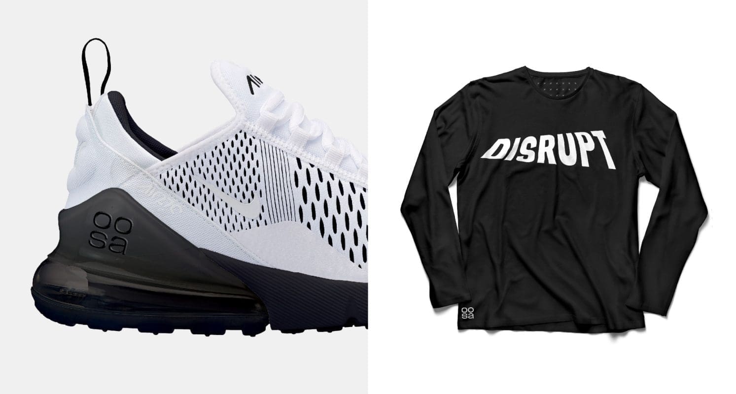
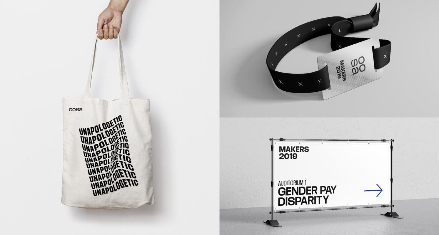
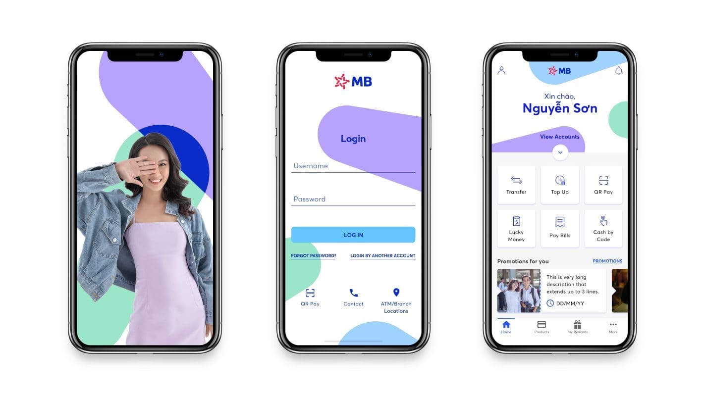
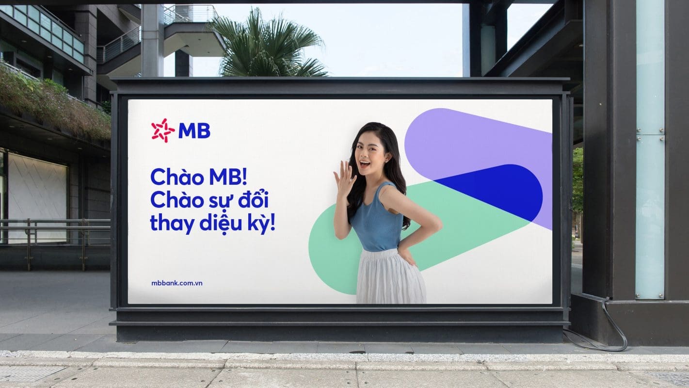
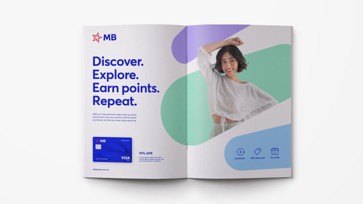
To help Vantage envision its new visual identity, we created customized iconography, brand and photography guidelines, as well as a wide range of applications including website and mobile app re-skin.


Results
Vantage launched its new brand globally with a resounding impact. It was well-received by industry peers at its unveiling in November 2021. The group achieved a significant increase of nearly 30% in new users in three months, compared to the same period before the rebrand.
Vantage was also recognized at the 2021 Transform Awards Asia, for the categories of ‘Best brand development project to reflect the changed mission, values or positioning’ and the ‘Best visual identity from the financial services sector’.
“Our rebranding exercise was the long-awaited change that our business needed, and Prophet was the ideal partner to assist us through the entire process. From the initial interviews to the final reveal of our new brand identity, the Prophet team has been more than instrumental in its assessment and recommendations,” says David Shayer, CEO of Vantage UK.
“The results of the rebrand speak for itself. Removing FX from our name has allowed us to speak more closely to our multi-asset offering, and our new brand puts us closer to our clients who share the same values. With a refocused business direction, we are empowered to continue the work of enhancing our tools and platforms to bring about an unparallel trading experience for our clients.
“The rebrand has also opened doors to some prominent partnerships, including our recent sponsorship of the McLaren Extreme E, which highlights our push for greater sustainability, diversity, and inclusion within the financial services industry in the coming years.”

“From the initial interviews to the final reveal of our new brand identity, the Prophet team has been more than instrumental in their assessment and recommendations.”
David Shayer
UK CEO