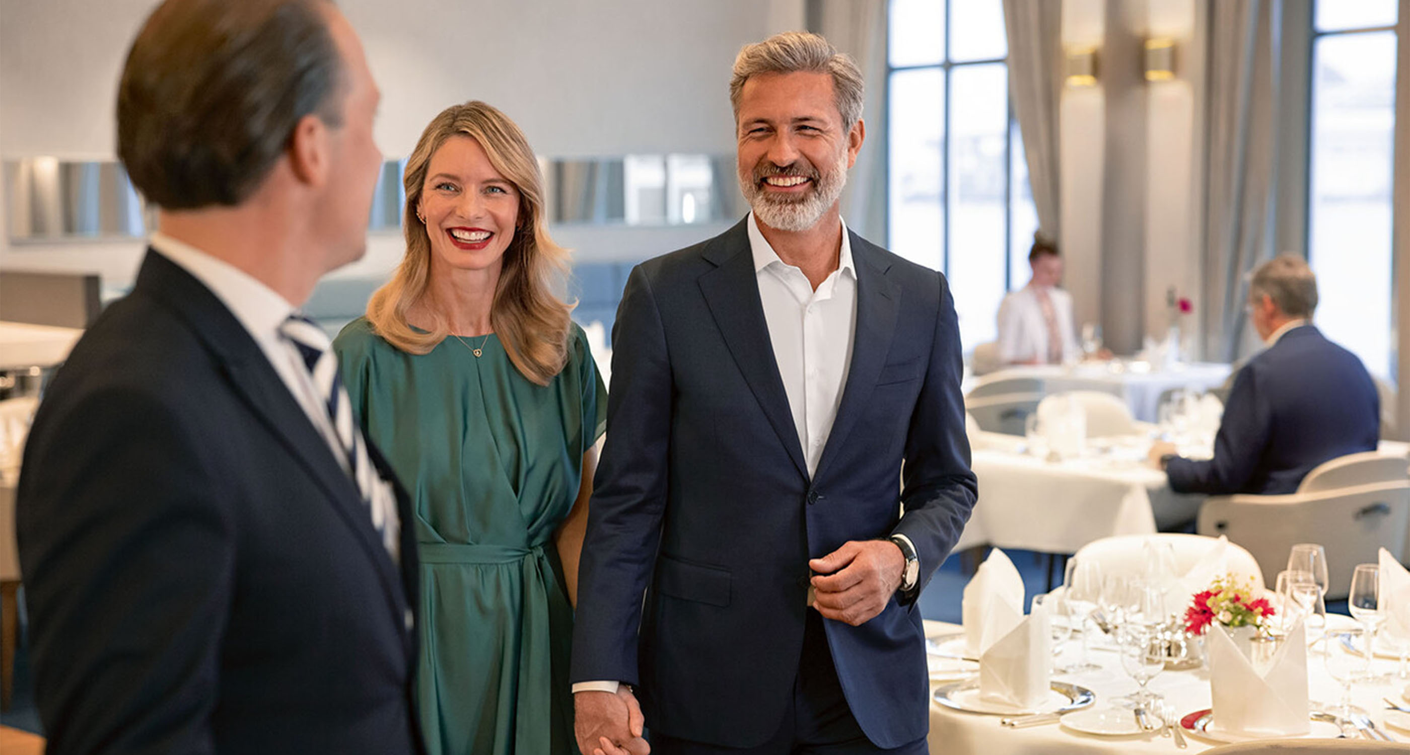
CASE STUDY

20 Minuten

A digital-first transformation for Switzerlandโ€™s most-read news brand

Challenge

Technology is transforming how people discover, engage and consume news. Since its launch in 1999 as a free daily commuter paper, 20 Minuten has grown into one of Switzerlandโ€™s most widely read and iconic news brands.

But as media habits evolved, the brand faced a critical challenge: regaining cultural relevance among young readers. For this audience, traditional outlets were regarded as credible news sources and social platforms dominated entertainment, leaving 20 Minuten caught in the middle. To secure long-term growth and relevance, the brand needed to redefine its role in a digitally led world.

Solution

20 Minuten partnered with Prophet to develop a transformation plan that resulted in a refreshed visual identity, new app and website. The relaunch marked the media companyโ€™s bold shift into a fully digital era, replacing its print edition.

The core challenge was to blend substance with entertainment. Gen Z values both high-quality journalism and engaging, relatable content, yet no media platform in Switzerland had successfully delivered both. Traditional outlets offered depth but often felt inaccessible or dry. Social media delivered fun and inspiration but was increasingly compromised by filter bubbles and misinformation.

Prophet set out to bridge this gap by delivering an integrated foundation that seamlessly combined news and entertainment. We called it โ€œYour perfect content mix,โ€ bringing together strategy and creative to define how the brand should think, speak and look: 

  • A clear audience focus and strategic foundation โ€“ identifying distinct target groups and defining purpose, promise and principles that united editorial, product and marketing around one vision.
  • A revitalized brand voice โ€“ developing a refreshed tone of voice that provides cultural relevance and personality.
  • A modern identity system โ€“ creating a new visual identity including logo, color palette, typography and design templates.
  • Creative direction and implementation support โ€“ ensuring the new identity translated seamlessly into product UX, campaign expression and guidelines.

Making it Move

With the brand adopting a digital-first approach, motion was always going to be at itโ€™s heart. Giving the brand a way to behave on screen not just elevated the brand assets but gave 20 Minuten more dynamic and engaging ways to demonstrate their offer. 

โ€œIt was important to retain what was so iconic about the brand, but at the same time modernize
and provide an identity that amplified their unique variety and choice of content.โ€

Chris Benson
Associate Creative Director
Prophet

An Elevated National News Outlet

20 Minuten unveiled a major brand transformation that marked a new chapter for the platform. The launch signaled not only a refreshed look but a revitalized market presence that responded to the evolving preferences of media consumers across different generations.

Shortly after its launch, the app won Gold in the Customer Experience category of the Best of Swiss App Awards, gained third place in the Design and Business Impact category, as well as other noteworthy placements.

By partnering with Prophet, 20 Minuten has set itself apart as the modern, accessible, credible and entertaining news destination for Switzerland.

CASE STUDY

UBS

From integration to inspiration: how brand defined UBSโ€™s new era

Challenge

When UBS acquired Credit Suisse in 2023, it marked the largest financial services merger in history and a pivotal moment for the industry. With over 100,000 employees and two storied institutions coming together, the challenge extended far beyond operational integration.  

UBS needed to define a new era of leadership and reintroduce itself to the world with clarity, unity and purpose. This was not simply about merging two entities; it was about reinventing the brand to drive long-term growth and cultural transformation. 

The merger represented a defining moment, an opportunity to redefine UBSโ€™s identity on the global stage. The real potential lay not in integrating two legacy brands under one identity, but in leveraging brand as the engine behind cultural alignment, business transformation and long-term success. 

Solutions

To guide UBS through this pivotal transformation, it was essential to anchor the brand in a bold, unifying concept. The breakthrough came in the form of Craft โ€“ a refined and emotionally resonant idea that bridged UBSโ€™s legacy with its leadership ambitions. It centered employees around a shared purpose while signaling clarity, confidence and innovation to the world. Craft also reinforced UBSโ€™s reputation for trust and deep expertise, its commitment to long-standing client relationships and staying true to its Swiss heritage. 

Prophet worked closely with UBS across four core workstreams: 

  • Integration – Orchestrating the brand migration from Credit Suisse to UBS, from business cards and signage to dual-branded branches, ensuring clarity across more than 50 countries. 
  • Strategy – Refreshing UBSโ€™s global brand positioning, divisional value propositions and employer brand.  
  • Transformation – Building a future-ready marketing function with combined teams, aligning global, divisional and local efforts around Prophetโ€™s Uncommon Growth approach. 
  • Activation
    • Bringing โ€œBanking is our Craftโ€ to life, UBSโ€™s first global brand campaign since 2016. Developed by Prophet and executed in partnership with Publicis, the campaign spotlighted UBSโ€™s distinct values, reintroducing the brand to clients, prospects and investors worldwide.
    • We complemented this campaign with the UBS House of Craft experience platform, which features events in partnership with luxury brands such as Dior, IWC and Laurent Ferrier. And in parallel, developed the UBS Craftmakers series to showcase the stories, and craft, of high-profile figures including Formula One drivers and cultural icons Lewis Hamilton and George Russell, stylist June Ambrose, neon artist Chankalun and composer and maestro Long Yu.  

Results

UBS set out to reshape the industry through the largest merger in financial services history โ€” and emerged stronger, with renewed purpose and momentum. Prophet partnered with UBS on a brand-led transformation powered by clarity of purpose and shared values, designed for long-term relevance. In 2025, UBS recognized this work with a Brand Excellence Award, marking another milestone in our 20+ year partnership driving operational success and Uncommon Growth. 

50

We successfully transitioned Credit Suisse brand assets across more than 50 countries

100K+

We defined a singular brand strategy that unites over 100,000 employees

2x

Our employer brand work was recently celebrated in two categories at the 2025 Employer Brand Management Awards in the Financial Services Sector and following a Merger or Acquisition

165M+

We launched UBSโ€™s first unified global brand campaign, reaching over 165 million people in the first wave

โ€œCraft isnโ€™t just a theme โ€” itโ€™s the thread that connects everything we do. From Craftmakers to UBS House of Craft and Adventures in Craft, it all reflects one belief: excellence lives in the details.

For us, craft is how we build trust, spark ideas and show the world who UBS is.โ€œ


Andres Nichollsโ€จ
Chief Creative Officer
Prophet

UBS House of Craft x Dior 

UBS House of Craft is a global platform that reimagines how UBS connects through culture, creativity and craft. In partnership with Dior, recent events in New York and Singapore celebrated the art of haute couture through an exclusive photo exhibition curated by Carine Roitfeld and Brigitte Niedermair, rare Dior couture pieces, a series of public talks by industry icons and live craft demonstrations from Dior Atelier artisans. 
 
Aligning Diorโ€™s legacy of reinvention with UBSโ€™s commitment to excellence, the collaboration created rare experiences for clients and sparked meaningful dialogue around the value of craft. 

UBS House of Craft presents Icons of Time 

An experiential exhibition celebrating the craft of watchmaking, created with Hodinkee and curated by founder Ben Clymer. Bringing together the worldโ€™s leading brands for the first time, the showcase highlighted innovation, excellence and craftsmanship through live demonstrations and talks from renowned watchmakers and collectors, inviting guests to discover the stories and innovations that have shaped modern horology. 

Result

UBS House of Craft has delivered both brand and business impact, reinforcing UBSโ€™ position as a modern luxury leader and transforming how the brand shows up in the world.

100M

UBS House of Craft content has reached hundreds of millions of people on social media 

10K+

UBS House of Craft has attracted over 10,000 guests in 2025 alone, with events in 10 different cities

1000+

It has been covered in more than 1000 articles, on front pages and in media pick-ups in 2025 

UBS Craftmakers

We launched UBS Craftmakers, a content series sharing authentic stories from masters of craft and well as rising talent. Crafted in feel, UBS Craftmakers takes you deep into the mindset, rituals and ambition of these iconic individuals โ€” from F1 World Champion Lewis Hamilton, to pioneering neon artist Chanklaun, award-winning costume designer June Ambrose and renowned Chinese conductor and artistic director Long Yu. 

Result

UBS Craftmakers has been some of the best performing content UBS has ever launched โ€” with Lewis Hamiltonโ€™s film generating over 550,000 video views within 48 hours and 6.6 million social impressions. A recent episode featuring fashion designer Guo Pei and porcelain maker Master Tan won two Silver Dolphins at the Cannes Corporate Awards for its craftsmanship, vision and storytelling.

10M

Impressions for Craftmaker films on social media

550K

Lewis Hamiltonโ€™s Craftmaker film achieved over 550,000 video views within 48 hours

25X

George Russellโ€™s Craftmaker film had 25x more views than any previous UBS Instagram reel

2

A recent episode featuring fashion designer Guo Pei and porcelain maker Master Tan won two Silver Dolphins at the Cannes Corporate Awards

CASE STUDY

Kalmar

A brand refresh for a logistics business making moves in decarbonization 

Challenge

Kalmar belonged to the Cargotec Corporation of logistics businesses, recognized within the industry for their distinctive red color scheme and elephant symbol.  

The Cargotec family had grown through acquisition and followed a branded house strategy for the main brands within their portfolio: Cargotec, the holding company, and Kalmar, Hiab and MacGregor. 

Following Cargotec’s decision to separate its core businesses, Kalmar and Hiab, into two standalone companies, Kalmar took the initiative to create a unique brand positioning, architecture and visual identity to support its future position as an independent, stock-listed company and brand. Prophet was selected as Kalmar’s partner to support this work. 

Solution

We followed a three-stage process to refresh the Kalmar brand. First, we defined the brand positioning, building from elements that have always been true to the Kalmar brand, along with new elements that reflected the direction they were taking as a partner to their customers. 

As a heavy logistics business, they played a crucial role helping their customers decarbonize their own operations. Thus, the existing customer promise around the idea of “Making every move count” became a central starting point for the new brand promise. 

From here, we defined differentiating brand principles, which formed the foundation upon which brand messaging and activation was built. 

A Brand New Identity

After exploring possible concepts , we landed on an identity โ€˜bonds of progressโ€™, which represented how Kalmar plays a key part of the global supply chain and is the forerunner in sustainable material handling equipment and services. The bubble-like visualizations also communicate action, progress and collaboration, which are key elements of Kalmarโ€™s brand positioning.  

The new visual identity consisted of a new logo, color palette, typography and the โ€˜bonds of progressโ€™ visualizations. The color palette retains the iconic Kalmar red while introducing new complementary colors to enhance versatility and vibrancy. The new logo consists of two elements: the refined โ€˜Kโ€™ symbol and the Kalmar wordmark.  

Honoring Kalmarโ€™s heritage of reliability, innovation and quality, the iconic Kalmar โ€˜Kโ€™ has been brought back with a fresh, modern shape that feels dynamic and expressive, yet still familiar. This refinement ensures the logo remains strong and distinctive, making Kalmar a recognizable and forward-looking brand. 

“People have reacted very positively to our new branding, and it has helped us to set the foundation for our future growth.” 

Carina Geber-Teir
SVP, Communications,
Investor Relations and Marketing,
Kalmar

Activating the Brand

 
We built an activation plan to bring the new Kalmar brand to market, both internally and externally. This plan outlined how the updated brand could be launched to deliver the most impact, telling the story of the new brand through a phased, multichannel campaign. 

We divided the launch activities into โ€˜foundationalโ€™ and โ€˜signatureโ€™ categories. Foundational activities were things that must be done to support the brand transition to help both internal and external audiences navigate the changes, such as explainer materials and office signage updates. Signature activities were high-impact ideas to tell the brand story through key moments of connection with each audience group, such as events and branded videos. 

Results and Impact

The refreshed brand positioning and visual identity were met with a strong positive reaction from both internal and external Kalmar stakeholders. 

The launch of the brand led to an all-time high in new visitors to the Kalmar website and an all-time high for impressions on their social media channels.  

CASE STUDY

HRS Group

Reinventing how businesses stay, work and pay 

Challenge

HRSโ€™s roots stem from consumer travel. As a leading hotel portal in Germany and one of the top three in Europe, the iconic “Red Bed” has been synonymous for many years with great hotel deals. Aside from this, HRS built its name by catering to the evolving needs of the business-to-business (B2B) enterprise travel market, including being an early mover to offer travel management services for companies relocating their employees around the world. This enabled new revenue streams beyond sourcing hotel deals, including securing meeting spaces and supporting payment processes. HRSโ€™s approach has always been to actively embrace technology, ensuring customers can conveniently access and manage their travel needs, from accommodation to meetings, through one seamless platform. 

Although these new services led to growth, the travel market was significantly affected during the COVID era. HRS took this opportunity to reflect on their business and brand, and to develop a new positioning that more effectively captures the vision and spirit of their organization.โ€ฏ

HRS approached Prophet to refresh the brand for their enterprise business and signal a new direction and focus. The company also wanted to demonstrate how it had transformed the travel management industry.

Solutions

We started by collaborating with the companyโ€™s leadership and brand team to define a compelling brand positioning and brand architecture. We shifted away from the existing positioning that focused on the technical aspects of the platform and instead, centered on simplicity and impact, outlining the benefits HRS delivers: โ€˜Stay, Work and Payโ€™.

Our work extended across the portfolio of HRS brands. We refreshed the brand and identity with the consumer arm, HRS for Travelers, and aligned it with the enterprise business. With Destination Solutions, the companyโ€™s holiday rental business, we sharpened the brand positioning and updated the visual identity. For HRS Group, the master brand, we carved out a clearer Employee Value Proposition and updated its visual identity. These projects led to updating the website design and the development of new marketing materials.โ€ฏ

Through this work, the principles of simplicity and impact became a connecting thread, uniting the organization in vision, expression and personality.โ€จ

HRS for Enterprises

HRS is unique for its entrepreneurial spirit, and the 50-year-old company is known for thinking big, challenging the status quo, and urging the industry to do better. Itโ€™s this spirit that sets HRS apart from the competition. We reflected that commitment through a simple, straightforward tone of voice, with typography to match.โ€ฏ

Using HRS for Enterprise is easy for customers, helping large companies make data-driven decisions while choosing from the broadest range of places to stay and work around theโ€ฏglobe. Powered by HRSโ€™ payment solutions and tailored to client goals, HRS is pioneering a better way for business travel.

The new brand identity reflects the ease of use and bold positioning, highlighting HRSโ€™s energy, simplicity and tech focus. The visual identity matches HRSโ€™ new confidence, breaking through the crowded B2B travel industry. We also developed an updated Employee Value Proposition, to communicate the HRS story to employees and potential hires.

“Our transformation into a global technology platform did not start with products aloneโ€”it began with how we positioned ourselves. Establishing a strong narrative and a unified brand gave us the credibility and clarity to engage Fortune 500 clients at a new level.โ€

Tobias Ragge
CEO, HRS 

HRS for Travelers

Today, people know the importance of human connection and destination experience. The modern traveler wants a hassle-free way to stay, work and pay. We defined a photographic style that captures where business meets leisure.

The original brand identity still carried a lot of recognition in Germany, Austria and Switzerland but it needed to reframe the companyโ€™s tech story to appeal to consumers.

“The brand transformation project was about creating more than a new lookโ€”it was about building the base for scalable growth. By aligning brand, go-to-market, and sales from the start, we ensured that every future innovation had a clear story and a receptive market. That groundwork enabled the next chapters of adoption and expansion.โ€

Tobias Bittner
Vice President Marketing, HRS 

Destination Solutions for Holiday Rentals

Destination Solutions, HRSโ€™ B2B holiday rental platform, creates a smarter way for hosts and property managers to maximize the performance of their rentals.

We helped define the brand positioning and crafted a new visual identity, highlighting how Destination Solutions helps its customers make hosting simple through a clean color palette and signature designs. 

HRS Group

We reimagined the identity of HRS Group, the umbrella brand uniting its diverse divisions. Grounded in the core principles of simplicity and impact, we ensured these values seamlessly connected every element of the brand. They are brought to life through the logo, typeface and color system. 

This consistent thread, woven through each positioning and identity initiative, creates cohesion across the organizationโ€™s vision, presence and essence. 

Results

HRS had a bold vision and were clear from the outset about their ambitions. Our partnership with HRS has reshaped how the company shows up in the market across their business, signaling a new direction and focus. From the narrative shared with customers and employees, to the way the brand is expressed through the website, social channels and events, HRS now communicates with greater clarity and consistency.

Building on this momentum, HRS continues to experience remarkable progress and expansion. Through this ongoing collaboration, we ensure HRS is equipped to sustain and accelerate Uncommon Growth. 

CASE STUDY

MB Bank

Customer-Centric Innovation: MB Bankโ€™s Journey in Creating Personalized Experiences

Challenge

Since 2018, Prophet has partnered with MB Bank on its transformation into a digital-first, customer-centric global bank. Following a brand refresh, MB Bank has embarked on a series of growth initiatives across its brand, marketing, digital and retail experiences, helping it reach over 30 million customers and more than 300,000 corporate clients. Named Vietnamโ€™s most valuable brand by Brand Finance, MB Bankโ€™s digital banking experience now leads the market.ย ย ย 

Building on the success of its digital banking app since its launch in early 2020, MB Bank strived for greater differentiation across its private and mass retail segments. To help achieve their ambition, Prophet partnered with MB Bank to collaboratively develop two personalized digital experiences for these target segments. 

Through PlayStudio sessions with MB Bankโ€™s key stakeholders, we developed a compelling Customer Experience (CX) vision and principles, initial transformation ideas as well as a design direction that guided the development of a new experiential retail design, signature touchpoints and experience transformation. 

Our work culminated in the development of signature experiences and the creation of a new auto-banking conceptโ€”the MB SmartBank. With the signature CX moves and designs developed, the final step was to conduct an in-market pilot. We developed execution plans to guide the roll-out and necessary changes in the day-to-day operations. To empower change, we also developed KPIs to measure success, along with staff workflows and detailed job descriptions for the transformed roles in the retail branch and MB SmartBank. 

Solutions

To develop distinctively personalized experiences, our team first conducted extensive customer research to identify two key target segments:  

  1. MB Private: High net worth individuals who are more focused on wealth management and lifestyle needs
  2. MB Mass Retail: Mass customers who are largely digitally savvy Millennials and Gen Z with general banking needs  

We then mapped out the current customer journeys to uncover key pain points and opportunities across both physical and digital engagements. By analyzing the current customer experiences, we diagnosed loopholes and fragmented pieces within the existing user journeys that needed to be augmented.   

We explored industry trends and best practices from traditional banks and fintechs to pinpoint and define standout features tailored to each of MB Bankโ€™s customer segmentsโ€”such as wealth portfolio overviews, personalized spending insights, gold investing, and gamified loyalty programs. With these, we developed a clear UX-led information architecture (also known as the sitemap) and prioritized high-impact signature features. We then moved into an agile design process, rapidly iterating User Interface (UI) designs with continuous feedback from product owners to ensure a seamless, future-ready experience. 

Impact

+10M

Android app downloads as of 2025

32M

App users as of 2025

#2

Most downloaded app in Vietnam (2024)

CASE STUDY

MB Bank

Creating a Digital Banking Powerhouse

Background

MB Bank wanted to triple its customers. And as new competitors crowded into the Vietnamese banking market, the 25-year-old company knew it needed a clearer identity, a fresher look and the ability to engage increasingly digital customers. Its goal was to become one of the three largest banks in Vietnam, providing the best customer experience in the category.

Approach

Prophet wanted to help MB move from early-stage transformation, with investments in the pilot stage, to true digital integration.   

We developed a multi-year strategy and growth plan, which included identifying and segmenting target customers, developing growth moves, running user experience sprints, and supporting a new innovation lab.  

After identifying the three customer segments most likely to drive growth. We then dove deep into the needs of MBโ€™s customers, developing a series of transformative growth moves to attract these new audiences. With a clarified value proposition, we:

  • Reimagined its digital banking app
  • Designed a simple, powerful and accessible referral program
  • Launched a first-in-market family banking offer

Impact

With Prophetโ€™s support, MB has transformed into a modern bank. Itโ€™s become intentionally disruptive. Digital thinking is now native in its people, processes and technology in every business unit, helping it gain advantages over both conventional and fintech competitors. Its digital-first and customer-centric offers have helped it add over 30 million new customers, propelling the organization into a new era of growth. The updated app became the #2 most downloaded in Vietnam.

#1

Most Valuable Brand in Vietnam within two years of digital transformation

1 in 2

Adults use an MB account

32m

App users as of 2025

#2

Most downloaded app in Vietnam (2024)

โ€œWe are delighted to have a trusted strategic partner in Prophet, and they have played a crucial role in our very important transformation journey. We are very proud of our modern look and feel. We evolve towards becoming a digital-first bank, and it has been very well received in the market.โ€ 

Mr. Thai
Chairman of the Board of Directors of MB Bank


BRAND TRANSFORMATION

Creating and Launching a New Brand to Tell MBโ€™s Transformation Story

RETAIL BANKING

Redefining Retail Banking: MB Bankโ€™s Journey to a Digital-First Future

CUSTOMER CENTRIC INNOVATION

Customer-Centric Innovation: MB Bankโ€™s Journey in Creating Personalized Experiences

Get in touch today

Let us know how we can help your growth journey.

*Fill in all required fields

Thank you for your inquiry.

If your submission requires a response, we will be in touch shortly. In the meantime, we encourage you to learn more about our firm and read some of our latest and greatest thinking.

CASE STUDY

MB Bank

Redefining Retail Banking: MB Bankโ€™s Journey to a Digital-First Future

Challenge

In 2019, MB Bank initiated a multi-year transformation program to become a digital-first, customer-centric bank with an ambitious target for growth. With a rejuvenated brand platform, MB Bank set out to transform its retail banking experience. 

To achieve its ambition, MB Bankโ€™s retail branches and auto-banking need to not only offer traditional banking services, but also integrate a digital, O2O customer experience to acquire new customers and enable digital banking. Prophet was appointed to create and implement a digital-first customer experience for MB Bankโ€™s retail branch network. 

Solutions

We began with an in-depth audit of MB Bankโ€™s existing retail banking experience. Combined with a competitive audit and best practice industry analogs globally, we identified opportunities to address customer pain points and innovate several โ€œindustry-firstโ€ as well as new experiences across their journey.

Through PlayStudio sessions with MB Bankโ€™s key stakeholders, we developed a compelling Customer Experience (CX) vision and principles, initial transformation ideas as well as a design direction that guided the development of a new experiential retail design, signature touchpoints and experience transformation. 

Our work culminated in the development of signature experiences and the creation of a new auto-banking conceptโ€”the MB SmartBank. With the signature CX moves and designs developed, the final step was to conduct an in-market pilot. We developed execution plans to guide the roll-out and necessary changes in the day-to-day operations. To empower change, we also developed KPIs to measure success, along with staff workflows and detailed job descriptions for the transformed roles in the retail branch and MB SmartBank. 

Through PlayStudio sessions with MB Bankโ€™s key stakeholders, we developed a compelling Customer Experience (CX) vision and principles, initial transformation ideas as well as a design direction that guided the development of a new experiential retail design, signature touchpoints and experience transformation.   

Our work culminated in the development of signature experiences and the creation of a new auto-banking conceptโ€”the MB SmartBank. With the signature CX moves and designs developed, the final step was to conduct an in-market pilot. We developed execution plans to guide the roll-out and necessary changes in the day-to-day operations. To empower change, we also developed KPIs to measure success, along with staff workflows and detailed job descriptions for the transformed roles in the retail branch and MB SmartBank. 

Results

The new MB Bank app and the MB SmartBank were successfully launched in key pilot locations as one milestone of many towards achieving MBโ€™s ambition of being a digital-first, customer-centric bank. 

Impact

+30m

New customers since launch (as of 2024)

#2

Most downloaded app in Vietnam (2024)

#1

Most Valuable Brand in Vietnam within 2 years of digital transformation

MB SmartBank, Reimagined

Designed for a new generation of young, digital-savvy users, the MB SmartBank is a multifunctional auto-banking lobby. Open 24/7, it empowers customers to easily manage everyday transactions through intuitive digital tools and immersive touchpoints.  

Signature Moves and Service Design

We translated MB Bankโ€™s CX vision into signature moves across the customer journey, and developed detailed service blueprints to show the transformation of the end-to-end banking experience across the front and backstage. 

A New Standard for Retail Banking

Our creative team developed visual and spatial designs for the different branch types across MB Bankโ€™s retail network, including the MB SmartBank. The designs showcased MBโ€™s digital transformation efforts and established MB as the leader of -digital and customer-centric banking, the first-of-its kind in Vietnam.

CASE STUDY

Ampacity

Modernizing a clean energy brand to accelerate growthโ€”and the industry 

Challenge

Ampacity, formerly RPCS, had established its reputation in the clean energy space as a value-added, end-to-end distributor of single-axis solar tracking systems for utilities and EPC developers looking to stand up solar farms. Though very successful in its niche, Ampacity’s growth was constrained by the size and structure of its core market. Between a recent change in ownership, newly expanded product and service offerings, and an ambitious vision for serving the broader energy transition, Ampacity was at an inflection point. 

Seeking to solidify its leadership position, capitalize on its newly expanded solution set, reach new market segments, and better enable its growth ambitions, the business turned to Prophet to create a stand-out brand positioning, new name, and visual and verbal expression that could build on their existing strengths while generating awareness and adoption of their full suite of capabilities. 

Solution

Prophet immersed in the landscape of Ampacity’s legacy offering of solar tracking systems as well as its new electrical solutions, conducting in-depth qualitative stakeholder interviews, auditing the current brand and its competitors and talking to the businessโ€™s industry partners and customers. Through this exploration, we surfaced insights into the changing needs of the utilities and developers who comprise their audiences, learning that these segments view Ampacity truly as a โ€œunicornโ€ in the industry that routinely went above and beyond to meet any solar energy challenge, from design engineering and procurement, through kitting and installationโ€”with precision and accuracy.  

This end-to-end expertise, combined with a can-do sense of partnership and commitment to managing every aspect of planning, kitting, shipping, warehousing, delivering and installing solar trackers and electrical products led us to zero in on the unique way Ampacity not just enables but propels its customers and partners. We crystallized this unique value proposition into a bold, energetic, and differentiating positioning as a clean energy accelerator. 

Through an iterative and rigorous process, Prophet also helped the brand land on a new name– Ampacity. A word that means the maximum amount of electrical current a conductor can safely carry, it signals the category while reflecting the companyโ€™s dynamism, can-do partnership, and future-forward sustainability.  

Prophet also developed an energetic, savvy brand voice and modular, flexible messaging to enable compelling and strategic storytelling across audiences and touchpoints. In parallel, Prophet delivered an entirely new visual system designed to break through the noise and sameness of the renewable energy space. Taking a boldly differentiated approach, we developed a new logo, a vibrant and unexpected color palette,  new typography, photography and iconography guidelines for execution.  

Finally, Prophet led the activation of the new brand, refreshing the website and creating new marketing and sales enablement assets that Ampacity rolled out in early 2025.  

Results

With a dynamic new brand, name and identity, along with vibrantly designed assets and sales enablement tools, Ampacity is now credibly positioned to lead the industry, attract new audiences and enable their business ambitions. Internally, the refreshed brand is generating new excitement and cohesion as its teams rally around the new strategy and expression. Externally, Ampacityโ€™s new brand has been well-received by customers and partners, with senior leaders anticipating the rebrand will enable them to significantly increase in size and scale over the next two to three years. 

“We have grown a niche solar equipment business into a powerful distribution platform fueled by product expertise, partnership with customers, and a tireless commitment to doing right by construction crews in the field. Our whole team is fired up to add more momentum than ever to the energy transition under the Ampacity brand.”

Eben Russell
Founder and President, Ampacity

CASE STUDY

ESPN BET

Awareness, understanding, engagement: Helping ESPN BET hit the advertising trifecta

Challenge

ESPN BET is a sportsbook app owned and operated by PENN Entertainment in partnership with ESPN. To break through the noise in a crowded sports betting space, they needed a campaign to lean hard into the appโ€™s distinctive and competitive reasons to believe (RTBs). 

Solution

While advertising campaigns often struggle to reconcile the tension between brand prominence, product information and audience entertainment, we developed a creative concept designed to bring them together โ€”utilizing a comedic situation to showcase ESPN BETโ€™s key features, and make the product the undisputed star of the show. 

Each spot features two fans: one knows all about ESPN BET, while the other muses fondly about the advantages โ€œif there was an ESPN sports betting app.โ€ The in-the-know friend tries in vain to explain that, in fact, they do, and itโ€™s great โ€“ going so far as to show their friend the app on their phone. Lost in thought, their unaware friend continues to describe a product that clearly already exists. 

A comedic reveal underscores the obliviousness : An ESPN BET blimp slowly passing by in one and a towering ESPN BET mural behind our characters in the other. 

The spots were conceived and shot in a way that further versioning could be created through new audio and graphics optionsโ€”a modular approach that opened the door to accommodating different RTBs and features as the need arose.

Results

The campaign is live on national and regional TV as well as on ESPN.com. The ads complement the busy sport season of March Madness, NBA and NHL Playoffs, and PGA tournaments. 

โ€œProphet was a great, multidisciplinary partner who brought our campaign strategy and creative concept to life, from production through to launch. I appreciated how they engaged with the insights in our brief โ€” approaching them thoughtfully and translating them into smart, creative work that delivered on the challenge.โ€ 

Ahmed Elfeky
Vice President Brand Media

CASE STUDY

Hotel Lumio

A continuous journey of rediscovery 

Challenge

In 2022 Bravo Group and Hyatt Hotels, along with the district government signed an agreement to launch the first Hyatt Unbound Collection hotel in Chinaโ€™s Greater Bay Area โ€“ โ€œๆ™“ๅบโ€ (Xiao Lu). Bravo Group aimed to establish the hotel as a luxury landmark in the region, offering unparalleled services and experiences.

Solutions

Prophet partnered with Bravo Group to develop a compelling hospitality brand. We started by identifying its target audience, brand concept, and guest experience.   

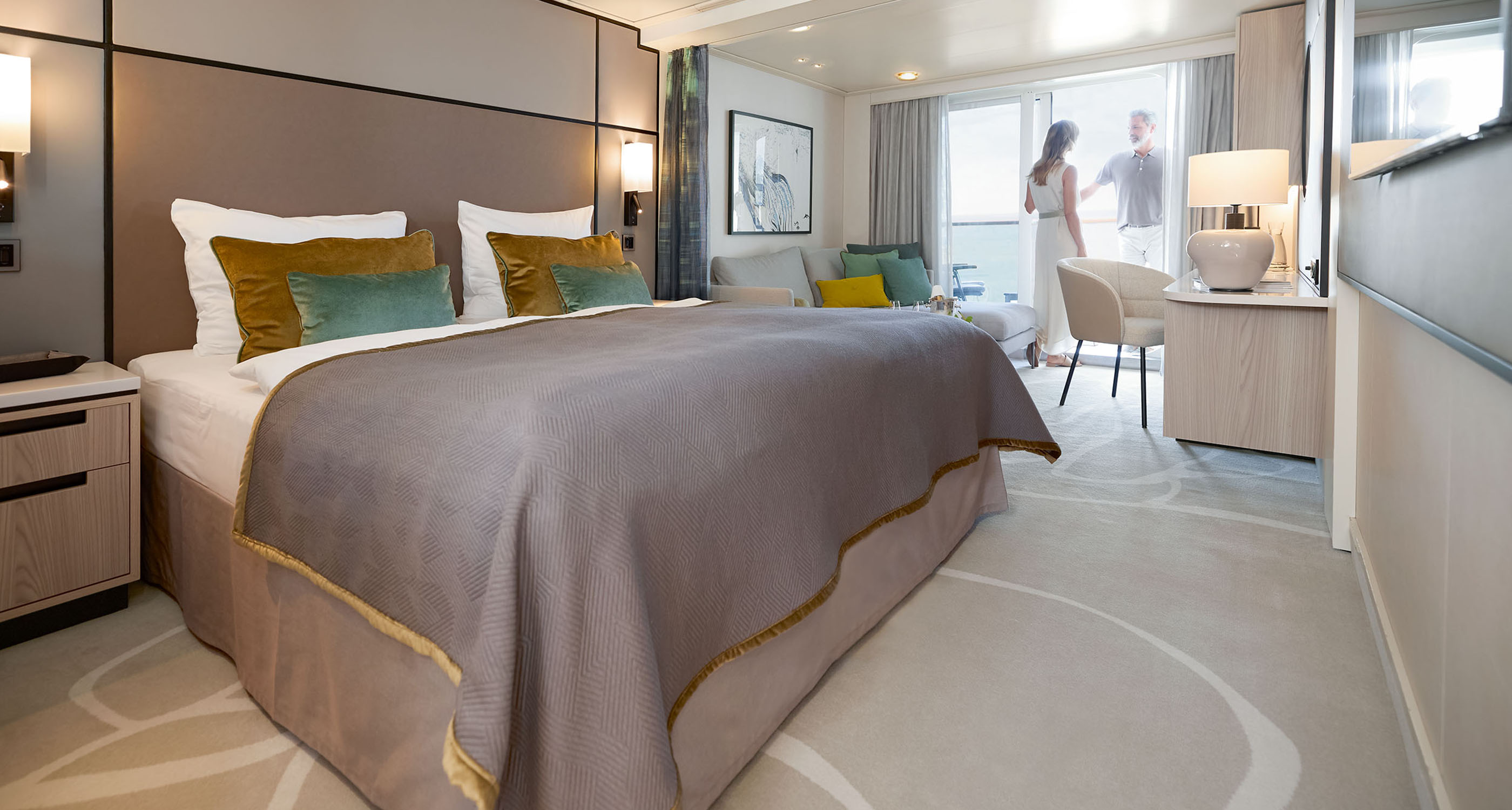
We conducted immersive research to gain a deeper understanding of the target demographicโ€”affluent, young professionalsโ€”and their evolving preferences for luxury hospitality. Todayโ€™s travelers seek not just comfort but rejuvenation and inspiration from their hotel stays.   

The unique location and its rich history provided the perfect backdrop for a distinctive brand story. Historically a vital trade hub along the Pearl River, Pazhou is now a thriving center of innovation and sustainability in the Greater Bay Area.   

Drawing on these insights, we crafted the brand story: Just like the boats along the Pearl River, bringing newfound treasures from the East and West, guests will discover new experiences to inspire, recharge their body and soul and reconnect with people. This hotel empowers guests in their own journey of rediscovery. 

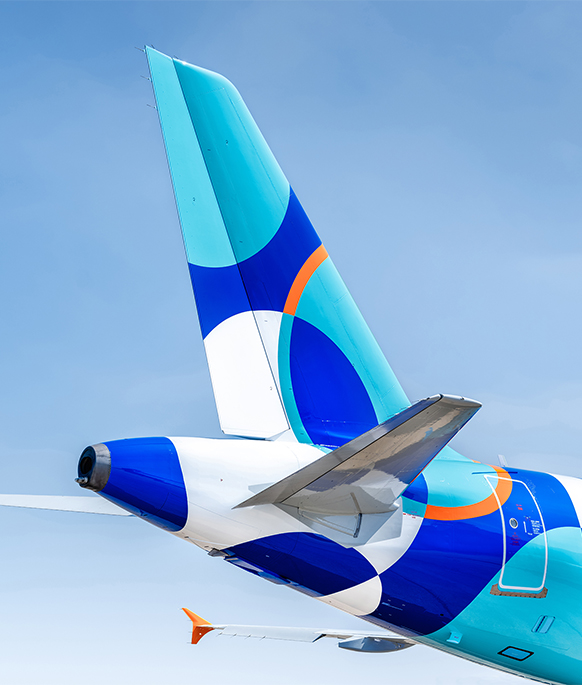
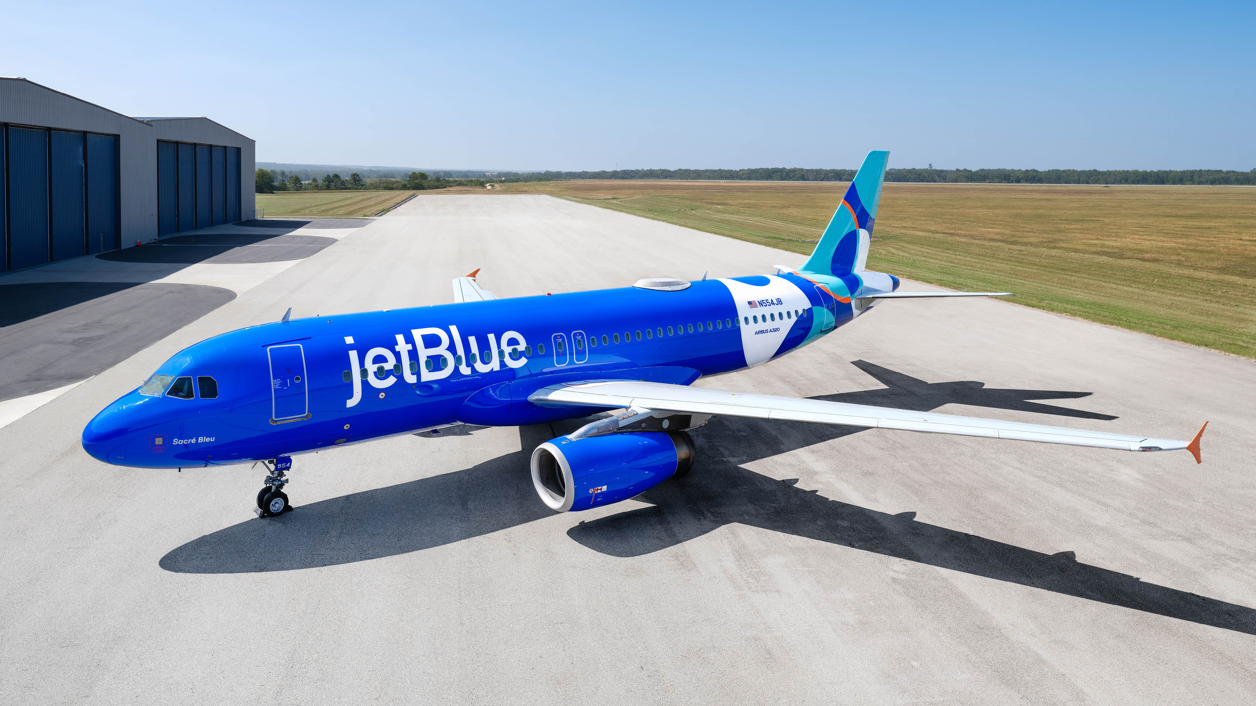
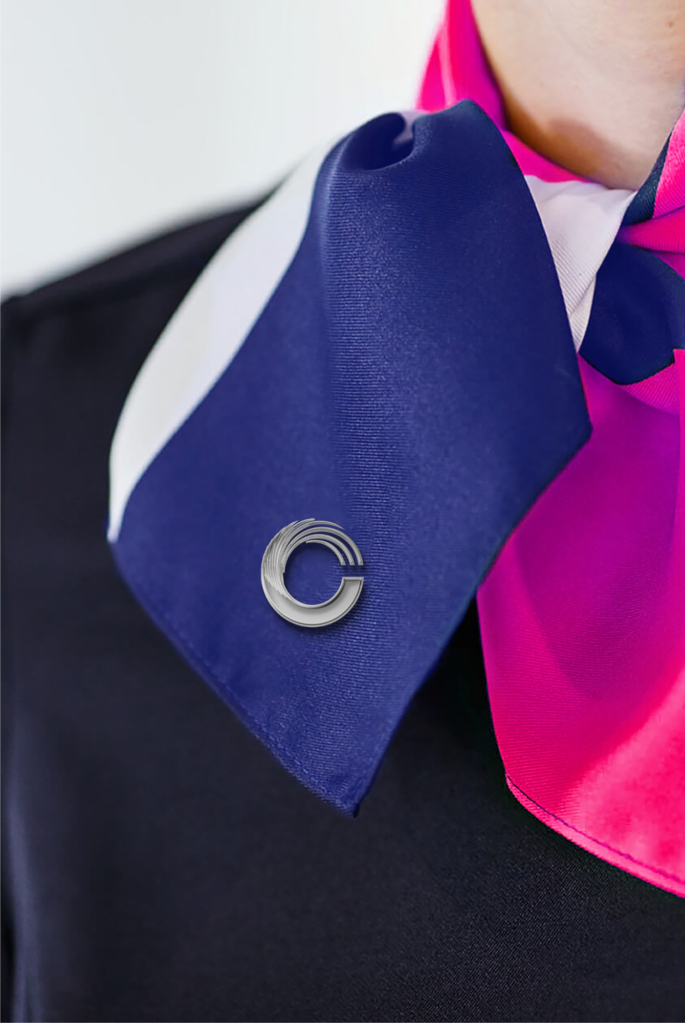
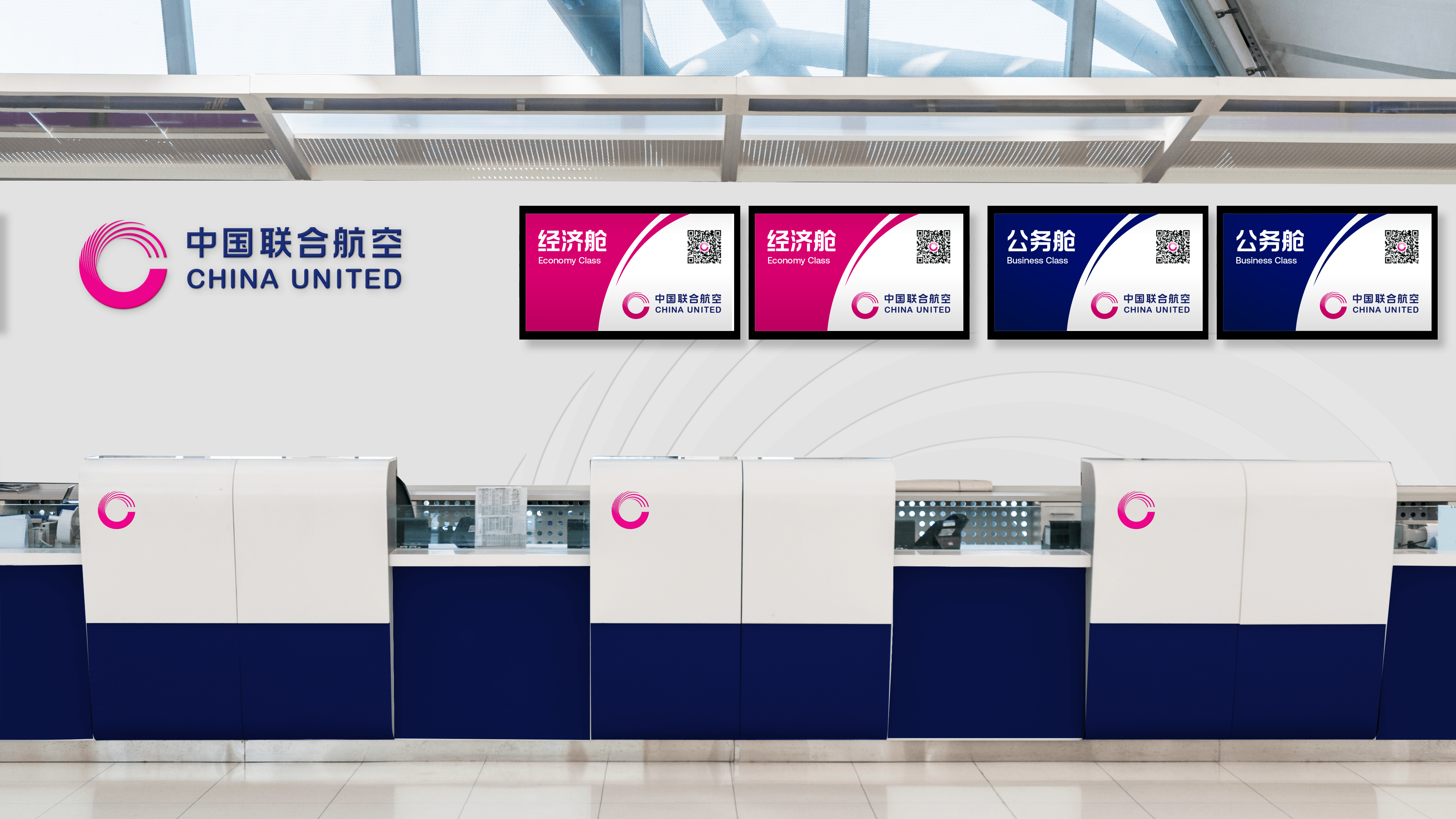
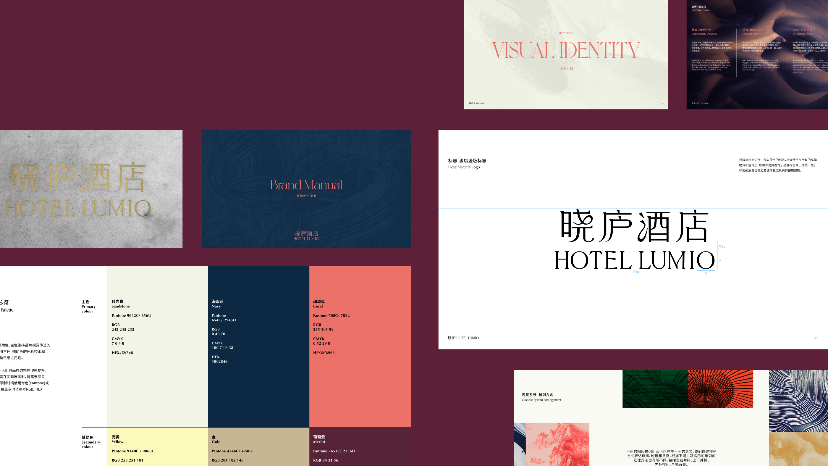
Prophet translated these unique equities into a brand-new design direction โ€œEvolving travelโ€. Building upon the design direction, we crafted a new brand logo with a kinetic logomark and its Chinese logotype. We also curated a distinctive brand palette and typographic style, developed a travel photography style fused with the warmth and romance of magic hours, and created a series of applications throughout the passenger journey. The brand’s fresh visual identity expertly uses dynamic lines to capture the vibrant energy and fluid motion of the China United brand. 
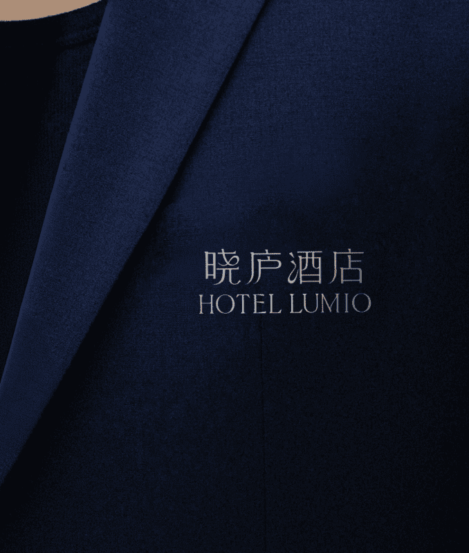
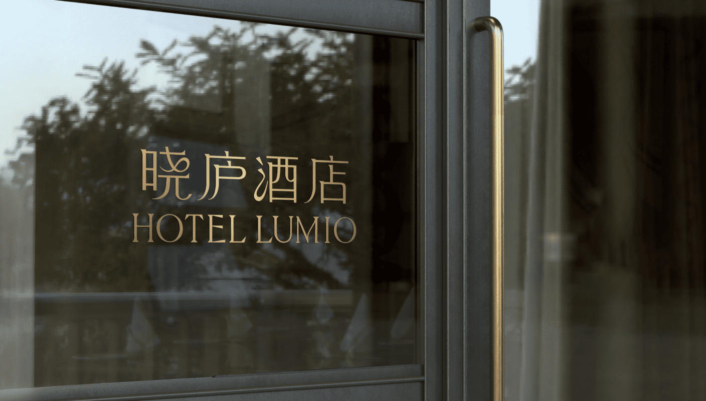
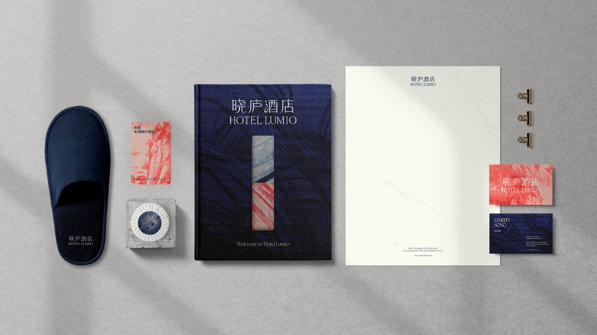
The Chinese name โ€œๆ™“ๅบโ€ (Xiao Lu) created by the client evokes the poetic imagery of โ€œilluminated retreat.โ€ Taking the brand story as foundation, we developed the English name Lumio, symbolizing โ€œlightโ€ and โ€œilluminationโ€ while creating a strong phonetic link to the Chinese name. Furthermore, we developed four experience principles and an impactful visual identity to bring the brand to life.   

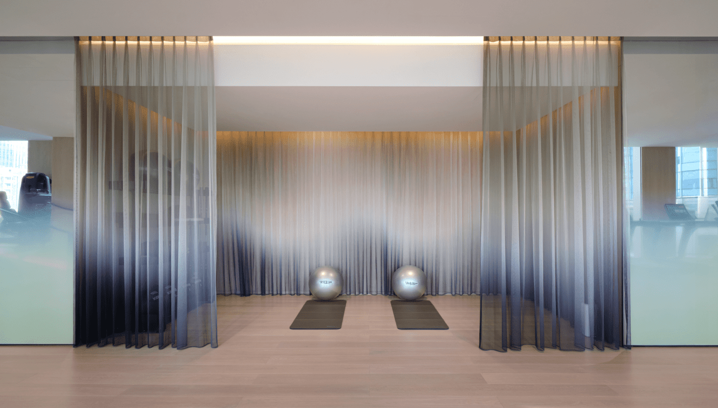
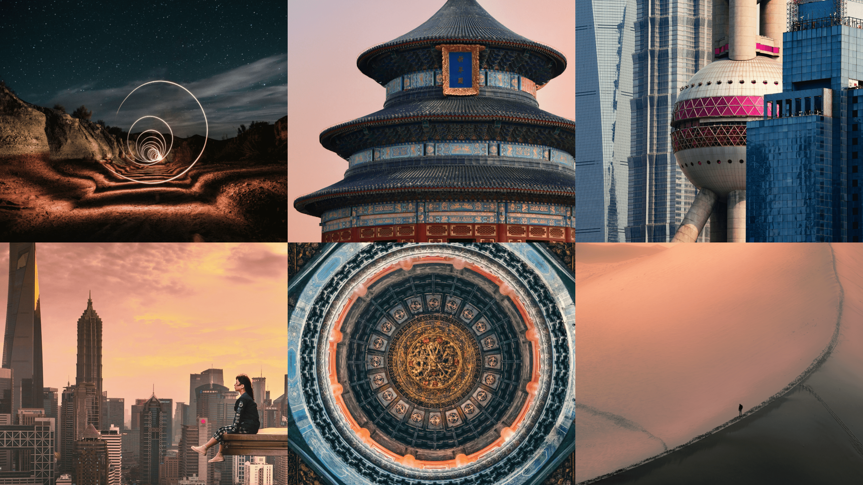
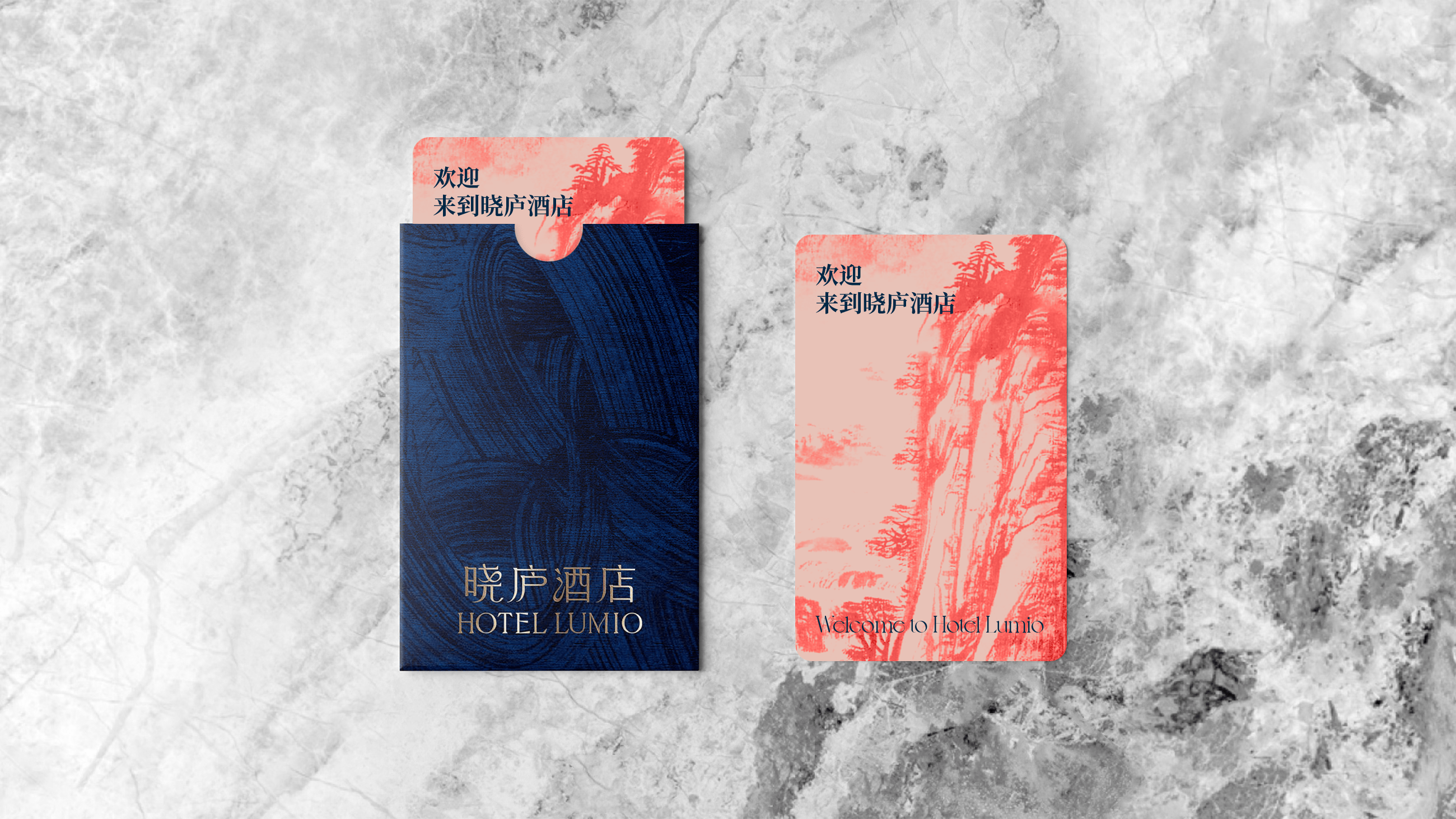
Our creative team seamlessly fused Pazhouโ€™s rich cultural heritage with Hyattโ€™s global sophistication, crafting a visual identity that harmonizes Eastern and Western aesthetics. Lumioโ€™s logo features fluid curves inspired by traditional brushstrokes, embodying a sense of artistry and movement. The carefully curated color paletteโ€”coral and navy for the hotel, and pine green, gold, and sandstone white for the propertiesโ€”evokes the warmth of nature and the depth of history. To further bring the brand to life, we established a distinctive photography style that captures the modern, dynamic energy of this East-meets-West fusion. 

Results

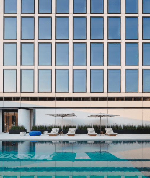
As the first Hyatt Unbound Collection hotel in the Greater Bay Area,โ€ฏHotel Lumio has entered the final stages of preparation for its grand opening. Located in Pazhou, a hub of innovation and technology, Lumio is poised to set new industry standards and lead the way forward, illuminating the path for the future of hospitality. 

Our creative concept

The root of the word Lumio refers to โ€œlightโ€ and โ€œilluminationโ€ and that moment of inspiration, creating a phonetic link with the Chinese name while evoking the imagery of dawn, energy and inspiration. It symbolizes the brandโ€™s bespoke elegance and transformative spirit.

Distinctive visual expression 

Lumioโ€™s visual identity blends rich colors, textures, and graphic elements to convey depth and sophistication. We created a bespoke logotype that has serif elements that suggest candlewicks and curves of a flame. These distinctive characteristics were brought in the letterforms across both Latin and Chinese alphabets. 

East meets West 

A circular light motif is used to create new and interesting juxtapositions of Eastern and Western elements. This visual contrast reflects the brandโ€™s core principle of exploration and connection, symbolizing the brandโ€™s invitation to โ€œrediscover the world through a new lens.โ€  

CASE STUDY

Miiro Hotels

Creating Europeโ€™s Most Talked-About Hotel Brand 

Challenge

As InterGlobe Enterprises, a leader in aviation and hospitality, ventured into a new chapter with an acquired portfolio of European properties, it sought to transform these holdings into exceptional destinations. Beyond goals of enhancing loyalty and revenue, the vision was to create a distinguished luxury lifestyle hotel brand. Entrusting Prophet with the task, InterGlobe asked us to define the brand strategy, visual expression, name and guest experience.โ€ฏ

Solutions

Starting with a detailed market review and quantitative research, we identified a unique niche for a hotel that seamlessly blended authentic luxury with a calming and mindful experience. This insight informed a distinct brand positioning centered on offering โ€œBrilliantly Considered Stays.โ€ 

We used Prophetโ€™s extensive naming process and after evaluating more than 200 name possibilities, the team aligned on Miiro, originating from the Latin for โ€œa sense of wonder.โ€ Through creative exploration, we uncovered five distinct brand territories, testing two with potential guests to refine our direction. From this, we defined a set of design principles applied across various touchpoints. We also established a compelling tone of voice and provided a comprehensive writing guide to ensure consistency in communications. This brand strategy’s visual expression then shaped the design of the guest experience, from pre- to post-stay, accentuating signature moments that encapsulated the essence of the new brand.โ€ฏ

As a final โ€“ and important โ€“ step, leveraging Prophetโ€™s Human Centered Transformation Model, we devised an effective strategy to introduce Miiro to InterGlobe colleagues, ensuring seamless integration and alignment with organizational goals

Results

Miiro launched its first properties in Paris, Barcelona and Gstaad in 2024, with London following this year. Buzz is building, and the debut has been heralded as one of the year’s most anticipated hotel brand launches.โ€ฏ

A Name for Self Reflection

Through an extensive naming process, we landed on the name Miiro. Originating from the Latin for โ€˜a sense of wonderโ€™, it serves as a reminder for guests to pause, look around andโ€ฏsavor every moment. The double vowel spelling reflects the idea of a mirror, speaking to the idea of mindful self-reflection, echoing the unique spirit of each Miiro location.

Sensory Discovery

The creative concept underpinning the new name and brand positioning โ€” Brilliant Considered Stays โ€” centers around the idea of ‘Sensory Discovery’, bringing guests closer to the soul of Miiroโ€™s neighborhoods. Through a carefully curated and crafted visual system, the identity celebrates the human senses of sight, smell, sound, taste and touch. This sensory journey is embodied with a modern rendition of classic calligraphy, curated layouts and unfiltered personal photographic moments that capture genuinely local experiences.

โ€œOur expectations of travel are filtered through the lens of social media, creating generic and uniform travel experiences, hindering meaningful connections with the places we visit and the people we meet. Miiro aims to change this with a more authentic representation of place.โ€

Clive Rohald
Executive Creative Director, Prophet

Considered. Curated. Crafted.

To ensure the Miiro brand and experience is represented consistently across all hotel locations, we developed three guiding design principles that influence every aspect of the guest experience. These principles ensure cohesive application of the brand, from the aesthetics and ambiance to the quality of customer service. By adhering to these principles, we maintain the high standards and distinctive character that defines the brand and deliver an exceptional experience across all Miiro hotel locations. 

Signature Guest Experiences

Drawing upon customer insights, we crafted bespoke guest experiences that significantly enriched travelers’ stays. This approach embodied the concept of ‘Brilliantly Considered Stays,’ effectively translating it into tangible and memorable moments for our guests. By creating a true sense of place for guests, we not only elevated the quality of their experiences but also fostered a deeper connection between the guests and their surroundings.

โ€œThe Miiro brand isnโ€™t just a new logo and minimalist design dรฉcor, itโ€™s an expression of who Miiro are as an organization and the commitment to delivering an experience for guests that provides a true sense of place, wherever they stay.โ€œ

Alex Whittaker
Partner, Prophet

CASE STUDY

Beazley

Modernizing a brand that’s redefining risk

Challenge

Beazley, a successful FTSE 100 B2B specialty insurer, has always seen risk as an opportunity to innovate. Its people, values and culture power its success, shaping its approach to creating services and solutions that deliver positive outcomes for its clients, partners and investors. With the business evolving and the ways in which it communicates with its audiences changing, Beazley sought to convey its smart thinking and new brand values through a refreshed identity and global campaign.  

Solutions

Prophet dove in. Our approach focused on modernizing Beazleyโ€™s brand expression, making it fit for todayโ€™s digital world while staying true to its original spirit. Illustration has always played a big part in Beazleyโ€™s toolkit, working with a renowned illustrator, our design team infused Beazleyโ€™s iconic pencil line with a new expressive fluidity, using motion to capture the adaptable thinking and seamlessness of Beazleyโ€™s solutions. Next, we intensified Beazleyโ€™s signature pink, supercharging it for all digital uses. And we re-energized the insurer’s verbal expression with spirited copy and playful typography.  

We then undertook Beazleyโ€™s largest project to date โ€“โ€ฏa global brand campaign to launch the new look and feel: `Insurance. Just Different’, underscoring Beazleyโ€™s unique approach to insurance and its role as a pioneer in risk management.  

Tone of voice

The insurance industry isn’t known for its boundary-pushing tonality, but Beazley is changing that narrative. Prophet crafted a tone of voice that expresses their unique personality and is integral to their overall brand expression. This refined tone brings their perspective to life, highlighting their distinctive character and outlook.

โ€œWhen we partnered Prophet with our own team, the magic started. We got creative and put our bold plans into action. Itโ€™s rewarding to see the brand making a genuine impact and engaging internal and external audiences alike.โ€ 

Georgina Peters-Venzano
CMO, Beazley

Bringing it to life

To kick off the campaign with newsworthy impact, Beazley held a high-profile, experiential brand launch event in London featuring the first-ever private drone show over the River Thames, illuminating the City of London skyline with the new logo and brand illustrations. The event generated a video that has achieved over 2.5 million YouTube views and garnered significant media attention. Additionally, tube and rail stations in London’s financial district were transformed with bold ads on screens, floors and the travelator at Bank Station, achieving nearly 50 million in-person and digital impressions.  

โ€œBeazley is the kind of client you dream of. Their palpable culture, direction and energy as a business are beautifully reflected in the spirit of their evolved identity. Itโ€™s a truly rewarding partnership.โ€ 

Gregg Finlay
Executive Creative Director, Prophet

Impact

The campaignโ€™s success extended globally, with marquee brand events in New York, Chicago, Atlanta, Singapore and Toronto. The new brand video Prophet created with Beazley garnered 1.8 million YouTube views, a remarkable feat for an insurance company that doesnโ€™t sell directly to the public.  

Most importantly, the brand and associated efforts are redefining Beazleyโ€™s positioning as a leader in innovative risk solutions, as evidenced by its record-breaking financial performance. In 2024, the Insurindex Brand Power Index ranked Beazley as the top player in the market, up from third place in 2023, based on market share and brand perception. 

By re-energizing Beazley’s look and feel, capturing its dynamic spirit and employing compelling storytelling and unique brand activations, a new standard has been set for branding in insurance and financial services.  

#1

Ranking in Insurindex
2024 Brand Power Index

50M

campaign impressions

Your network connection is offline.

caret-downcloseexternal-iconfacebook-logohamburgerinstagramlinkedinpauseplaythreads-icontwitterwechat-qrcodesina-weibowechatxing