CASE STUDY
Beazley
Modernizing a brand that’s redefining risk

Challenge
Beazley, a successful FTSE 100 B2B specialty insurer, has always seen risk as an opportunity to innovate. Its people, values and culture power its success, shaping its approach to creating services and solutions that deliver positive outcomes for its clients, partners and investors. With the business evolving and the ways in which it communicates with its audiences changing, Beazley sought to convey its smart thinking and new brand values through a refreshed identity and global campaign.
Solutions
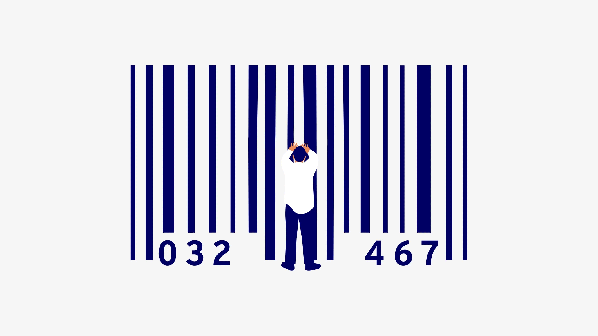
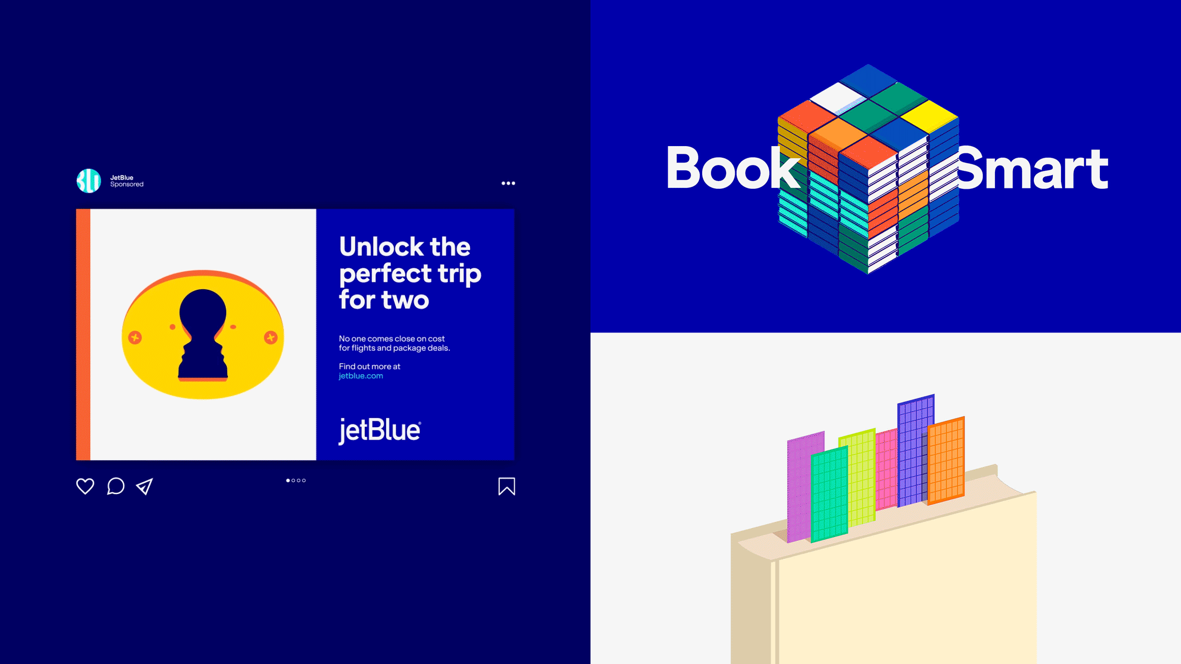
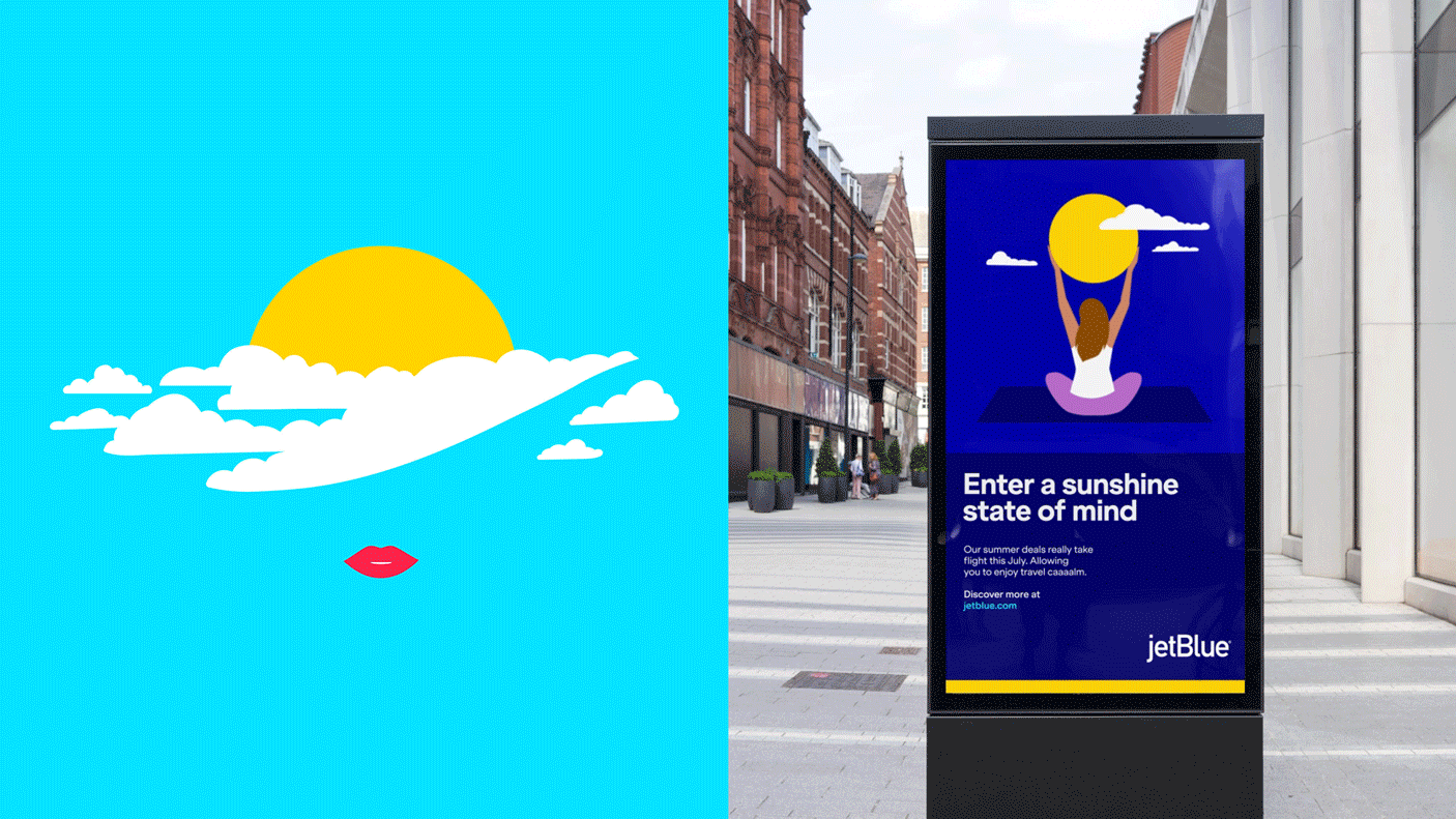
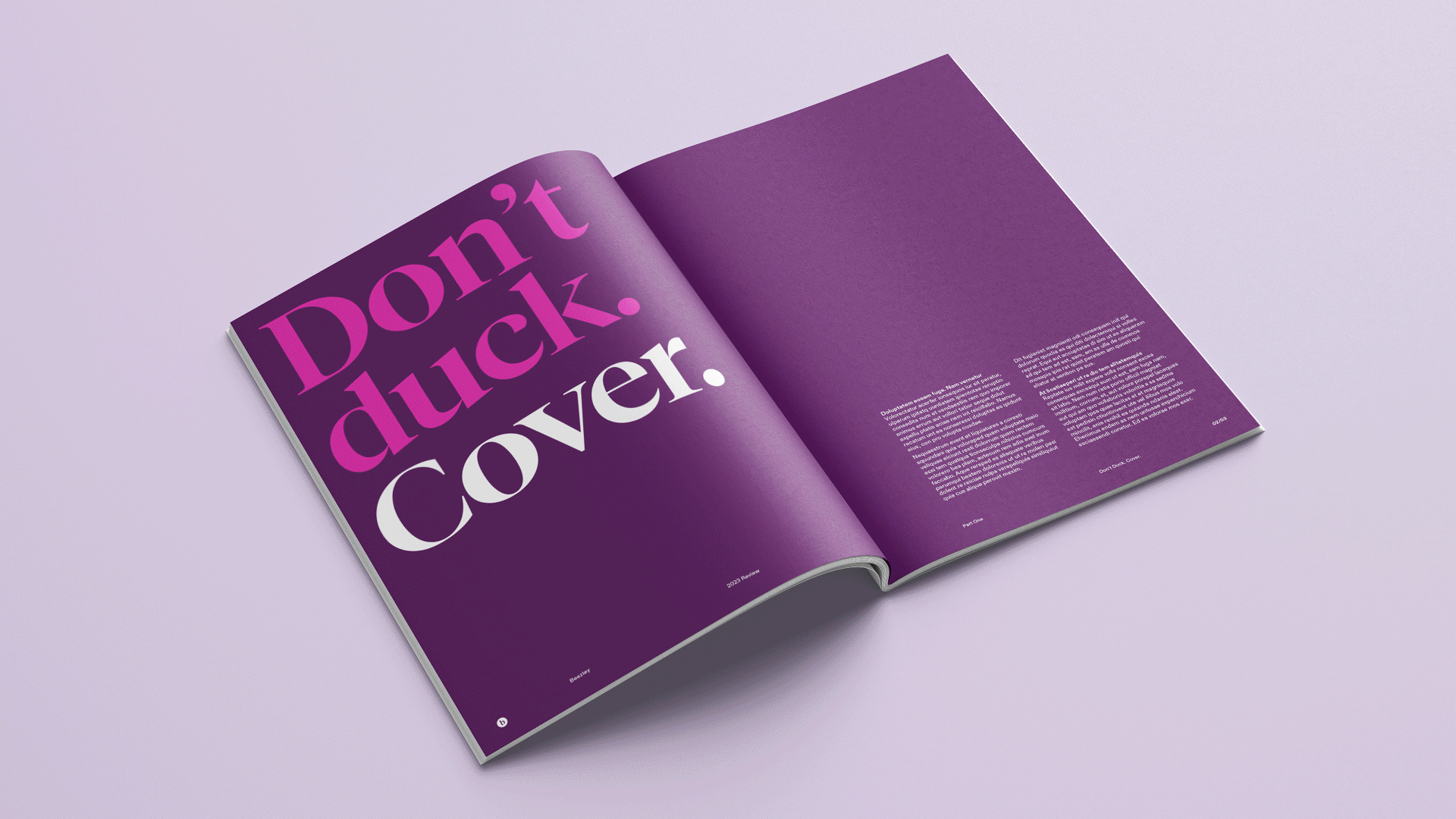
Prophet dove in. Our approach focused on modernizing Beazley’s brand expression, making it fit for today’s digital world while staying true to its original spirit. Illustration has always played a big part in Beazley’s toolkit, working with a renowned illustrator, our design team infused Beazley’s iconic pencil line with a new expressive fluidity, using motion to capture the adaptable thinking and seamlessness of Beazley’s solutions. Next, we intensified Beazley’s signature pink, supercharging it for all digital uses. And we re-energized the insurer’s verbal expression with spirited copy and playful typography.
We then undertook Beazley’s largest project to date – a global brand campaign to launch the new look and feel: `Insurance. Just Different’, underscoring Beazley’s unique approach to insurance and its role as a pioneer in risk management.


Tone of voice
The insurance industry isn’t known for its boundary-pushing tonality, but Beazley is changing that narrative. Prophet crafted a tone of voice that expresses their unique personality and is integral to their overall brand expression. This refined tone brings their perspective to life, highlighting their distinctive character and outlook.


“When we partnered Prophet with our own team, the magic started. We got creative and put our bold plans into action. It’s rewarding to see the brand making a genuine impact and engaging internal and external audiences alike.”
Georgina Peters-Venzano
CMO, Beazley


Bringing it to life
To kick off the campaign with newsworthy impact, Beazley held a high-profile, experiential brand launch event in London featuring the first-ever private drone show over the River Thames, illuminating the City of London skyline with the new logo and brand illustrations. The event generated a video that has achieved over 2.5 million YouTube views and garnered significant media attention. Additionally, tube and rail stations in London’s financial district were transformed with bold ads on screens, floors and the travelator at Bank Station, achieving nearly 50 million in-person and digital impressions.


“Beazley is the kind of client you dream of. Their palpable culture, direction and energy as a business are beautifully reflected in the spirit of their evolved identity. It’s a truly rewarding partnership.”
Gregg Finlay
Executive Creative Director, Prophet


Impact
The campaign’s success extended globally, with marquee brand events in New York, Chicago, Atlanta, Singapore and Toronto. The new brand video Prophet created with Beazley garnered 1.8 million YouTube views, a remarkable feat for an insurance company that doesn’t sell directly to the public.
Most importantly, the brand and associated efforts are redefining Beazley’s positioning as a leader in innovative risk solutions, as evidenced by its record-breaking financial performance. In 2024, the Insurindex Brand Power Index ranked Beazley as the top player in the market, up from third place in 2023, based on market share and brand perception.
By re-energizing Beazley’s look and feel, capturing its dynamic spirit and employing compelling storytelling and unique brand activations, a new standard has been set for branding in insurance and financial services.
#1
Ranking in Insurindex
2024 Brand Power Index
50M
campaign impressions