CASE STUDY
MB Bank
Customer-Centric Innovation: MB Bank’s Journey in Creating Personalized Experiences

Challenge
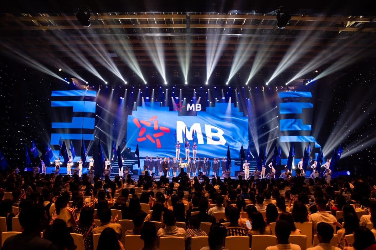
Since 2018, Prophet has partnered with MB Bank on its transformation into a digital-first, customer-centric global bank. Following a brand refresh, MB Bank has embarked on a series of growth initiatives across its brand, marketing, digital and retail experiences, helping it reach over 30 million customers and more than 300,000 corporate clients. Named Vietnam’s most valuable brand by Brand Finance, MB Bank’s digital banking experience now leads the market.
Building on the success of its digital banking app since its launch in early 2020, MB Bank strived for greater differentiation across its private and mass retail segments. To help achieve their ambition, Prophet partnered with MB Bank to collaboratively develop two personalized digital experiences for these target segments.
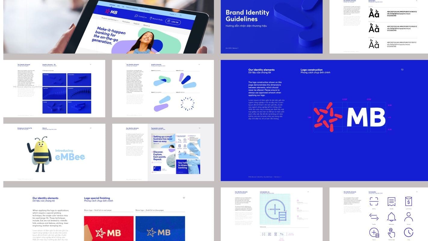
Through PlayStudio sessions with MB Bank’s key stakeholders, we developed a compelling Customer Experience (CX) vision and principles, initial transformation ideas as well as a design direction that guided the development of a new experiential retail design, signature touchpoints and experience transformation.
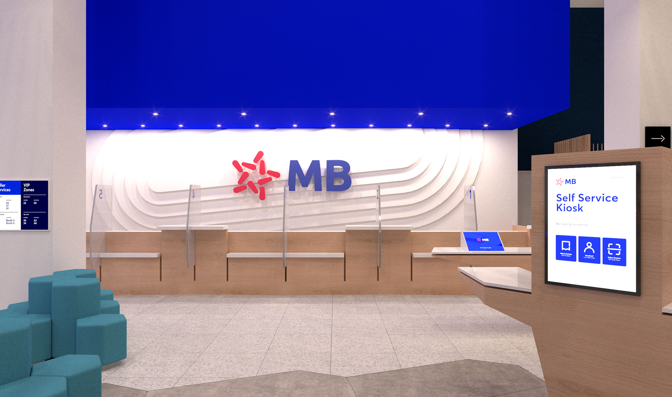
Our work culminated in the development of signature experiences and the creation of a new auto-banking concept—the MB SmartBank. With the signature CX moves and designs developed, the final step was to conduct an in-market pilot. We developed execution plans to guide the roll-out and necessary changes in the day-to-day operations. To empower change, we also developed KPIs to measure success, along with staff workflows and detailed job descriptions for the transformed roles in the retail branch and MB SmartBank.
Solutions
To develop distinctively personalized experiences, our team first conducted extensive customer research to identify two key target segments:
- MB Private: High net worth individuals who are more focused on wealth management and lifestyle needs
- MB Mass Retail: Mass customers who are largely digitally savvy Millennials and Gen Z with general banking needs
We then mapped out the current customer journeys to uncover key pain points and opportunities across both physical and digital engagements. By analyzing the current customer experiences, we diagnosed loopholes and fragmented pieces within the existing user journeys that needed to be augmented.
We explored industry trends and best practices from traditional banks and fintechs to pinpoint and define standout features tailored to each of MB Bank’s customer segments—such as wealth portfolio overviews, personalized spending insights, gold investing, and gamified loyalty programs. With these, we developed a clear UX-led information architecture (also known as the sitemap) and prioritized high-impact signature features. We then moved into an agile design process, rapidly iterating User Interface (UI) designs with continuous feedback from product owners to ensure a seamless, future-ready experience.
Impact
+10M
Android app downloads as of 2025
32M
App users as of 2025
#2
Most downloaded app in Vietnam (2024)

Two Segments, Two Design Languages
By combining strategic foresight with master-brand precision, we translated distinct customer needs into two UI design languages. For the private segment, we created a luxurious, confidence-driven interface featuring brass metallics, refined typographic-usage from the master brand, and purposeful negative space for accessibility—all embodying exclusivity and bespoke services. For the mass retail segment, we developed a vibrant, tech-forward system with fluid gradients inspired by the master brand palette.


Strategy in Every Pixel
This system uses bold sans-serif fonts and dynamic micro-interactions to enhance accessibility and loyalty engagement through educational and gamified features. Our strategic design process ensured that every UI component, from data visualization to navigation, aligns with each segment’s financial behaviors. As a result, we delivered two scalable design systems where strategic intent and brand authenticity live in every pixel.


Best-in-Class Banking Experience for All
Prophet helped MB Bank launch two distinct digital app experiences—each designed to meet the unique needs of its Private and Mass Retail segments in design, features, and user experience.
The MB Private app successfully launched in June 2023, giving the bank a first-mover advantage over competing banks for Vietnam’s private customers. The enhanced Mass Retail experience followed later that year, offering a refreshed, digital-first journey for a broader experience.
The partnership continues as Prophet supports MB Bank in elevating its digital platforms to deliver best-in-class experiences for all MB Bank customers.