CASE STUDY
Beflo
Creating an innovative connected desk brand from concept design to activation

Challenge
With the pandemic resulting in people balancing both work and life activities at home, there was a growing demand for furniture solutions that were more versatile, comfortable, and functional. Our original equipment manufacturer (OEM) client saw the opportunity to create a DTC brand that would deliver a solution to empower people to enjoy a better way of living and working from home. They partnered with Prophet to help create and launch their first consumer brand.
Solutions
With a blank slate, we worked collaboratively with the client to create a brand that would be relevant to today’s working-from-home customer.
We used an AI-powered online research tool and interviewed 135 potential U.S. customers to understand their unmet needs and expectations around their WFH set-up. Our research revealed critical insights about how consumers need to not only prioritize their physical health but also their interest in a good work-life balance – including ways to optimize all the various parts of their lives.
From this, we created a new brand purpose, “We believe happiness comes from being in the flow in all activities we do at home.” We then created brand principles, tone of voice, and the tagline “Work. Flow. Home” to bring the brand to life in a unique and distinctive way against other competitors. The name “Beflo” came out of the idea of being “in the flow” when everything you do works seamlessly and effortlessly.
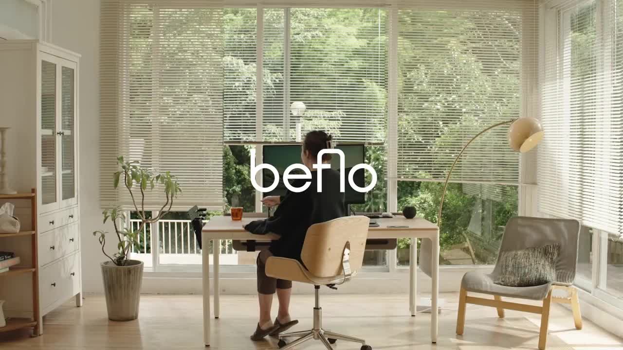
Beflo began developing a desk prototype, combining motorized height-adjustable settings with modular tech accessories around cable management, charging features and other productivity tools. As part of that, we worked with them to create brand principles based on their new purpose that would have implications for their product design.
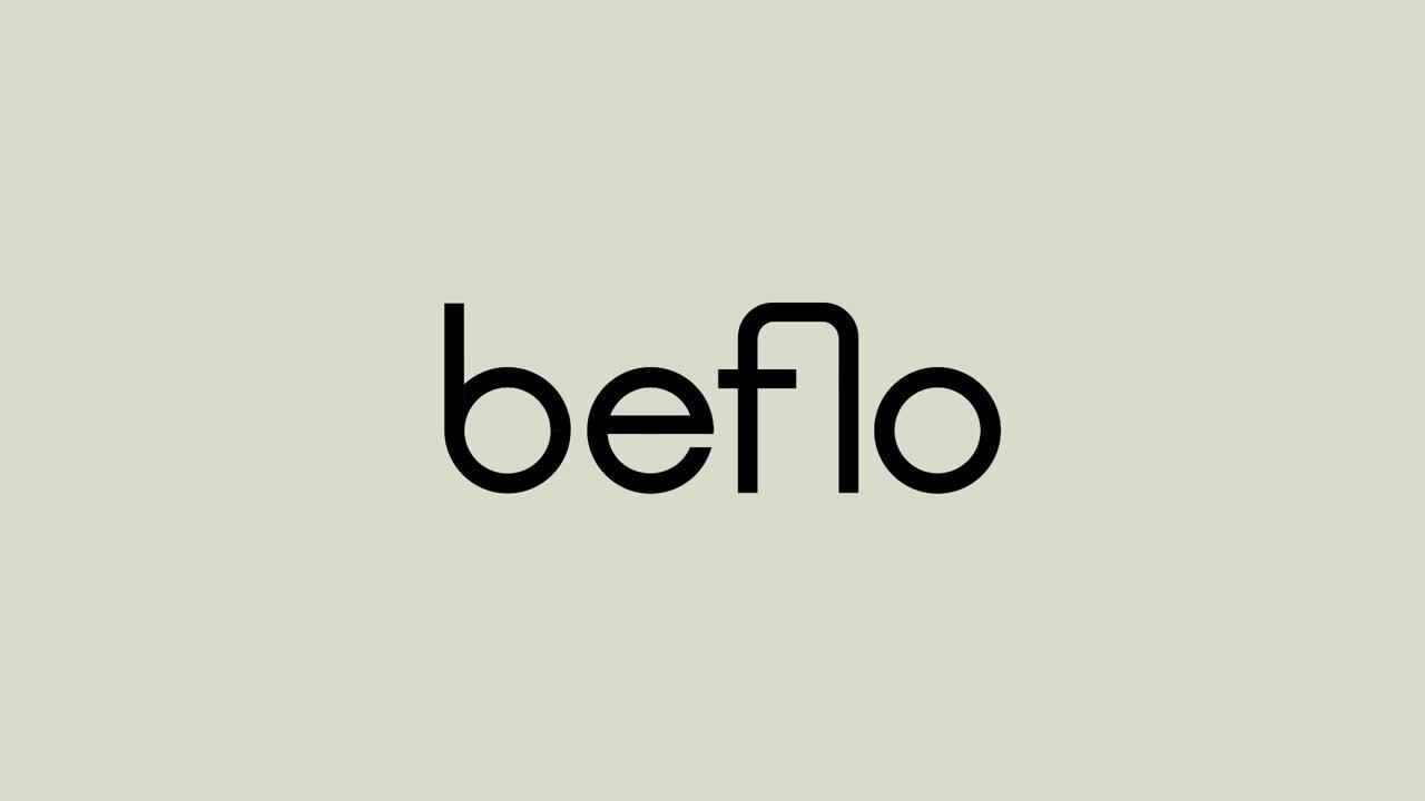
The visual identity also used the “flow” concept to create a simple and ergonomic-looking logotype with rounded letterforms and the curved ligature between the “f” and “l” that mimicked the side profile of the curve on the desk’s legs.
From this, we created a new brand purpose, “We believe happiness comes from being in the flow in all activities we do at home.” We then created brand principles, tone of voice, and the tagline “Work. Flow. Home” to bring the brand to life in a unique and distinctive way against other competitors. The name “Beflo” came out of the idea of being “in the flow” when everything you do works seamlessly and effortlessly.
Beflo began developing a desk prototype, combining motorized height-adjustable settings with modular tech accessories around cable management, charging features and other productivity tools. As part of that, we worked with them to create brand principles based on their new purpose that would have implications for their product design.
The visual identity also used the “flow” concept to create a simple and ergonomic-looking logotype with rounded letterforms and the curved ligature between the “f” and “l” that mimicked the side profile of the curve on the desk’s legs.
Results
The brand concept, name, visual identity and product design successfully came to market in 2023. The branding was recognized in the 2021 Transform Awards as the Best Visual Identity in Technology, Media and Telecommunications.
Results
The brand concept, name, visual identity and product design successfully came to market in 2023. The branding was recognized in the 2021 Transform Awards as the Best Visual Identity in Technology, Media and Telecommunications.


Positioning Around the “Flow”
Keeping the target consumer in mind, we developed different brand territories that would be relevant to their needs, and our positioning ultimately landed on the territory of Flow.
“We believe happiness comes from being in the flow in all activities that we do at home.”
The flow state was where people could fully immerse themselves in the task at hand and find enjoyment in the present moment. This resonated with the targets’ needs to balance multiple priorities and to find enjoyment in their WFH routine.
Meet Helena.
We developed a creative representation of our target customer who has a desire to improve their WFH set-up, anxiety around balancing all of life’s priorities and a strong interest in interior design resulting in a design-oriented approach to buying furniture. She prioritizes physical health, good work-life balance, success and connection with the community. This helped us imagine all our work with a certain persona in mind.

Applied Brand Principles
We created brand principles to serve as a guide for uniquely delivering on their brand promise. The four principles: Adaptive Comfort, Ultimate Ease, Holistic Wellbeing, and Lasting Innovation were then expanded into tangible guidelines and were applied in both the product design as well as the surrounding consumer experience.
The Visual Concept
The logo and visual system reflect the “flow” concept by embracing an equally weighted, san-serif to not disrupt the eye, but have a balanced and cohesive look. The crafted ligature between the “f” and “l” characters also creates a unique element that creates a visual “flow.” The system consists of the same curved elements that incorporate a soft flow across all communications and visuals, all the way down to the actual curved corners of the actual desk legs.


A Distinctive Verbal Voice
We created tone of voice principles to ensure that all communications had a cohesive tone of voice. Messaging guidelines offered guardrails around practical dos and don’ts as well as messaging examples.

Shopify Design
We created Beflo’s first Shopify design, creating both the site architecture, content hierarchy of each page, and design layout. Everything from imagery style to navigation and input fields was carefully designed to support the new brand.

A Cohesive System
We brought the brand strategy and identity to life by creating a visual system with a unique perspective on photography style, color palette, typography and graphic elements. This unique look created an unmistakable identity across all their applications from product design to digital interfaces and print communications.

Activating the Brand
We created an activation rollout plan to help Beflo navigate the different horizons of growth. We also developed a content marketing playbook to help create compelling and relevant content to attract, engage and convert consumers along the customer journey with recommendations across channels and partnerships to consider.

“Working with Prophet undoubtedly helped us build a rock-solid foundation for our brand; we wouldn’t be where we are without them. The branding groundwork they laid out has been our guiding north star, enabling us to stay focused and coherent with our work.”
Beico Chiu
Founder CEO, Beflo