Challenge
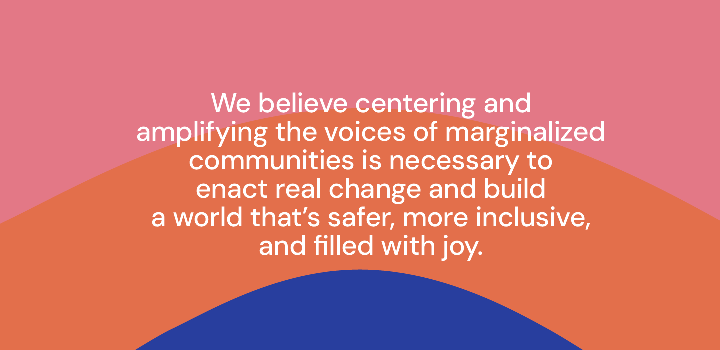
The LGBTQI+ community fights for space in this world. For a global community of queer persons, the simple act of living puts them at risk, and often causes them to flee their homelands in search of safety. SafePlace International is an organization dedicated to centering and amplifying the voices of LGBTQI+ people around the world.
The core of SafePlace International’s work centers on equipping their community members to find their purpose and thrive in their new environments. From welcoming someone who was recently displaced to supporting them as their goals change, the organization starts with a foundation of safety and stability, working side-by-side with global and local partners to protect people who need it. From there, they look to the future with The Dream Academy, a 10-week intensive virtual course focusing on leadership development, socio-emotional learning, and job skill training. Led by members of the LGBTQI+ community and available in English and French, the Dream Academy connects participants to purpose, power, and the new possibilities they need to heal from individual and collective traumas. The Dream Academy has over 1000 alumni from 19 countries to date, and as it’s virtual, it can be accessed from anywhere that web support is available.
The organization played a unique and vital role in the global LGBTQI+ community, but audiences didn’t always understand or internalize it. SafePlace needed a more comprehensive, clear, and cohesive way to express its mission to attract more supporters, and ultimately reach more people. Its new positioning had to be powerful and profound as well as easy to understand and share with a wide audience, from donors to partners to community members. Their team also needed a visual system that would bring this positioning to life.
From this, we created a new brand purpose, “We believe happiness comes from being in the flow in all activities we do at home.” We then created brand principles, tone of voice, and the tagline “Work. Flow. Home” to bring the brand to life in a unique and distinctive way against other competitors. The name “Beflo” came out of the idea of being “in the flow” when everything you do works seamlessly and effortlessly.
Beflo began developing a desk prototype, combining motorized height-adjustable settings with modular tech accessories around cable management, charging features and other productivity tools. As part of that, we worked with them to create brand principles based on their new purpose that would have implications for their product design.
The visual identity also used the “flow” concept to create a simple and ergonomic-looking logotype with rounded letterforms and the curved ligature between the “f” and “l” that mimicked the side profile of the curve on the desk’s legs.
Solution
We started by analyzing the communications and visual systems of SafePlace International as well as peer and aspirational organizations and immersing ourselves in the organization’s strategies and materials.
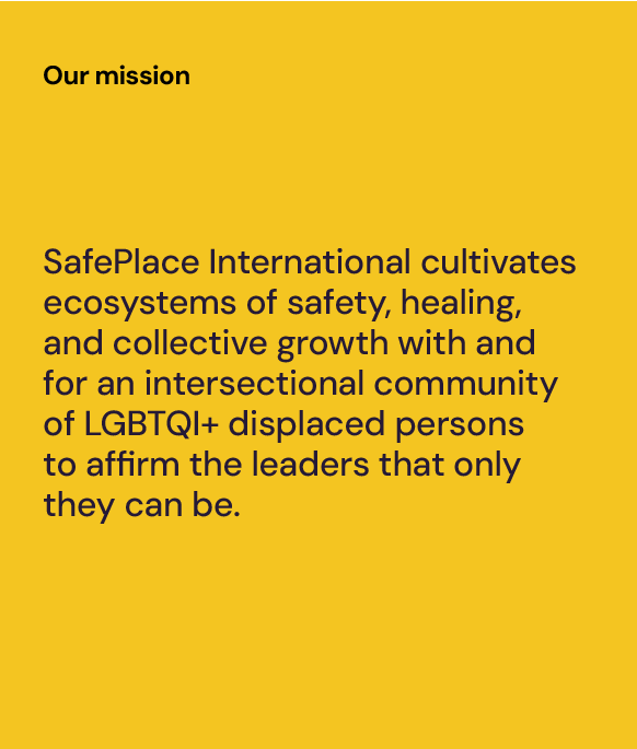
Through collaborative workshops across three continents and interviews with several stakeholders, we found there was an opportunity for their mission to express not only the work SafePlace does, but also why it is so vital: expressing the lived realities of displaced LGBTQI+ persons as well as the broader implications and transformative impact these community members can have when in positions of leadership and influence.
We also learned their original strategic pillars were only telling part of their story. So, we worked to evolve these pillars and put more context around what SafePlace International does—and what community members can expect as a result. We wanted to keep the impact and memorability of the original pillars, as well as describe the full journey: Reach, Protect, Connect, Invest.
Bringing all of these elements together, we wrote an emotive narrative that acts as the foundation of articulating the strategy to community members, donors, and partners, and can be used in fundraising materials, video scripts, and anywhere they are trying to drive understanding of who they are and what they stand for.
From there, we shifted our attention to the visual system. We began with a key question: do we modernize their existing rainbow tree logo, which was recognizable and held a lot of affinity? Or do we introduce a new symbol? We explored 20 concepts that ranged from minor modifications to their existing logo to bolder designs that could cut through the noise with simplicity and strong graphic elements.
Results
The brand concept, name, visual identity and product design successfully came to market in 2023. The branding was recognized in the 2021 Transform Awards as the Best Visual Identity in Technology, Media and Telecommunications.
Results
The SafePlace International team launched its bold new mission, story, and visual identity at a fundraiser in Prophet’s San Francisco office in October 2023 as well as on the organization’s newly re-designed website.