CASE STUDY

CUNA Mutual Group Becomes TruStage 

Introducing a single powerful brand, from strategy to execution 

Challenge

CUNA Mutual Group, a storied financial institution rooted in the credit union movement, has grown and diversified over its 80-year history. By 2021, it had become a $5 billion mutual insurance company providing services to credit unions, their members and other financial institutions. But while it delivered many products and services, it did so by using many different brands. CUNA Mutual Group wanted a unified strategy that matched its ambition, enabling it to continue its growth trajectory.

Solutions

To develop their vision for the future, CUNA Mutual Group partnered with Prophet, leveraging our interdisciplinary approach to craft a single-brand strategy, marrying the enterprise’s strong history with its growth ambitions. 

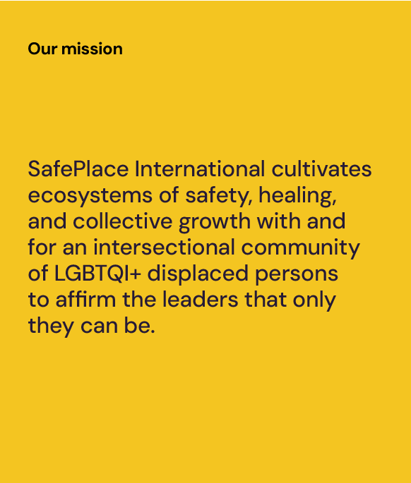
This cross-functional team started with a clarified purpose for the enterprise, including the brand’s promise and principles. Using this distilled North Star, the organization now had somewhere to turn to ensure product-level value propositions align with core values and its plans for the future. 

TruStage, CUNA Mutual Group’s successful insurance brand, emerged as the answer. TruStage illustrates how the company builds on trust, helping customers and the people they serve confidently navigate every stage of their financial journey.  

Prophet worked closely with the company as it activated the new TruStage brand, finding ways to elevate and expand this brand for all stakeholders. 

A core component of this approach involved equipping teams with the tools to pursue continued growth. That entailed bringing the new brand to life with comprehensive training to support employees. We created inspiring activations, designing immersive digital and physical employee experiences deployed during launch week, and giving them everything they need to carry the momentum forward. We also produced a comprehensive external brand campaign, including creative assets and tactical media plan, for the launch.  
 
All told, Prophet delivered:   

  • Brand architecture and nomenclature strategy that supports a single brand strategy 
  • Visual and verbal identity and core messaging for key audiences 
  • A unified web experience that streamlined multiple unique web properties under one digital front door 
  • A purposeful and holistic enterprise content strategy 
  • Social channel architecture and taxonomy that clarifies and reinforces the single brand strategy  
  • A first ever corporate brand campaign, including comprehensive creative development and media plan 
  • An ongoing brand health tracking system 

Results

The TruStage enterprise brand launched in May of 2023, generating exceptional internal and external engagement. Employees – many working remotely – returned to the office for various events during launch week, with an impressive 83% participation rate. The brand awareness campaign reached nearly 42 million targeted users, with ad engagement rates five times stronger than projected. 

“Prophet was an instrumental partner in launching our TruStage brand, working closely with our teams as collaborative partners, to help define our brand strategy and architecture, and develop an integrated internal and external launch plan that brought our brand to life for our employees and our current and prospective customers. Prophet’s expertise enabled us to achieve strong impact at launch, providing over 5x more engagement than anticipated and more efficiently than we were expecting.”

Eric Hansing
Chief Marketing Officer

CASE STUDY

JetBlue

Sending an iconic airline and true challenger brand soaring into the future  

Challenge

JetBlue, a prominent U.S. airline, was founded with the grand ambition of challenging other established carriers. Based on the promise of excellent, affordable service, JetBlue consistently offers customers a better way to travel. 

Despite being known for its distinctive wit and irreverent spirit, the company’s visual identity had grown tired, having travelled a few too many miles without a meaningful rebrand since its initial launch. JetBlue no longer reflected how its employees and travellers saw the carrier, nor did it capture what made the brand special. To address this, JetBlue engaged Prophet to refresh its brand and better reflect its competitive edge in the airline industry.   

Solutions

We evaluated each touchpoint in the JetBlue experience, assessing the airline’s existing identity and market positioning. Initially, our focus was on re-energizing JetBlue’s day-to-day marketing communications. However, through close collaboration with the JetBlue team, it became clear that a more comprehensive approach was needed.

Our scope expanded, and we embarked on crafting a holistic vision for the brand’s future. Together, we developed and launched a completely revitalized JetBlue brand identity. 

Our scope expanded, and we embarked on crafting a holistic vision for the brand’s future. Together, we developed and launched a completely revitalized JetBlue brand identity. 

Results

The ambitious rebranding initiative has positioned JetBlue for its next stage of growth and demonstrates its ongoing dedication to innovation. Entering a transitional year with an invigorated visual identity, this strategic shift has already led to increased customer interest and conversion. JetBlue continues to challenge industry norms, redefining what customers can expect from a cost-conscious airline. And this differentiating spirit is now beautifully reflected in the new brand identity and the plane liveries. 

Re-asserting JetBlue’s challenger spirit

Our idea centered on a core truth at the heart of the brand: its challenger spirit and character. Every creative decision was made to vividly bring this unique personality to life. 

“JetBlue’s brand is synonymous with irreverence and personality, yet its identity wasn’t fully embodying these traits. Our mission was to bring this back at a time when the company was preparing itself for its next stage of growth.”  

Andres Nicholls 
Global Executive Creative Director  
Prophet

Wit, positivity and plenty of carry-on character

Tone of voice has always been a key differentiator for JetBlue. We meticulously crafted every element of the visual identity system to amplify that voice. It’s designed to be flexible and seamlessly adapting to the practical requirements of each touchpoint, ensuring the effective delivery of JetBlue’s distinctive writing style. From the typeface to the color palette and copy, every aspect communicates with humor, capturing JetBlue’s youthful energy and positivity.

Illustrations tell the story 

Collaborating with Ben Wiseman, we crafted playful illustrations that narrate travel stories and provide imaginative perspectives. Ranging from the whimsical to the extraordinary, they express concepts that can’t always be captured through photography alone – providing yet another way for JetBlue to stand apart from the crowd. 

Imagery captures moments we love 

We’ve all encountered the typical, overly polished destination images. Our approach was to capture those authentic micro-moments that resonate with customers. By keeping imagery simple, subtle and uncluttered, our marketing becomes more relatable – without falling into clichés. 

Created to drive impact 

JetBlue’s new designs aim to turn heads, make a statement and elevate every moment of the experience. Setting an ambitious vision from the outset, Prophet and JetBlue have reshaped the brand expression into one that honors the past while preparing the carrier for its next phase of growth. The rollout continues across many of JetBlue’s primary marketing and communication channels.

Reimagining JetBlue’s liveries  

The project also evolved to include a redesign of JetBlue’s commercial livery. The reimagined identity and updated livery honor JetBlue’s legacy by retaining recognizable tailfin patterns, now extending beyond the tailfin to envelop the entire rear fuselage, ensuring maximum brand impact, visible both in the skies and at the gates.  

Launching JetBlue to the world  

The first of the new designs took flight in the second half of 2023, heralding the beginning of JetBlue’s fleet-wide transformation. We’re proud of how we helped make the fleet bolder. Bluer. Newer.

“Opportunities like this don’t come around very often. Guiding transformative change for an iconic brand like JetBlue, working so closely with their team, has been a privilege. The company is on an exciting journey and being part of it has been a phenomenal experience.” 

Chris Benson 
Associate Creative Director
Prophet

CASE STUDY

China United Airlines

Transforming the brand experience to new heights and journeys abound 

Challenge

Following a merger and transformation to position itself as a mass-market and low-cost airline in 2014, China United Airlines (China United) achieved rapid business growth, transporting over 10 million passengers every year. As one of the first airlines to be relocated to Beijing’s Daxing Airport, China United has maintained exceptional operations that ensure high quality and safety, reaching all four of its key objectives. China United’s successful launch at the Daxing Airport marks a new chapter of its journey as a key player in China’s aviation industry. 

Striving to provide its customers with diverse and affordable flight options, China United continued its transformation through its data strategy and product innovation. With this ambition, the airline wanted to further inject energy and momentum into its brand, propelling the company to elevate its passenger experience. 

To achieve its vision of becoming a trusted and preferred airline by all stakeholders, China United partnered with Prophet to refresh its brand identity and end-to-end customer experience. 

Solutions

Our team set out to create a distinctive and ownable brand identity for China United. We began by diving into the unique brand DNA and uncovered two distinctive equities:  

  • Diversity: China United brings people together with diverse travel destinations and experiences, giving travelers a variety of choices and options to make their journeys special. 
  • Energy: From past to future, China United is constantly evolving for the betterment of our communities, passengers, and employees, thanks to its collaborative and efficient culture. 

Prophet translated these unique equities into a brand-new design direction “Evolving travel”. Building upon the design direction, we crafted a new brand logo with a kinetic logomark and its Chinese logotype. We also curated a distinctive brand palette and typographic style, developed a travel photography style fused with the warmth and romance of magic hours, and created a series of applications throughout the passenger journey. The brand’s fresh visual identity expertly uses dynamic lines to capture the vibrant energy and fluid motion of the China United brand. 

Prophet translated these unique equities into a brand-new design direction “Evolving travel”. Building upon the design direction, we crafted a new brand logo with a kinetic logomark and its Chinese logotype. We also curated a distinctive brand palette and typographic style, developed a travel photography style fused with the warmth and romance of magic hours, and created a series of applications throughout the passenger journey. The brand’s fresh visual identity expertly uses dynamic lines to capture the vibrant energy and fluid motion of the China United brand. 

Results

Our work to transform the China United brand supercharged the airline’s ambition to offer a world-class end-to-end customer experience, breathing new life into the passenger journey. From new check-in experiences to new inflight amenities and captivating livery designs, the dynamic visual identity enables China United to create more delightful moments for its customers and employees.  

Creating the New Brand Logo

The new brand logo is designed based on the alphabet “C” for China United Airlines. The sleek contours of the letter “C” embody the excitement and thrill of takeoff, symbolizing the wings of boundless freedom in flight. The use of dynamic, circular lines not only signifies a continuous journey but also represents the spirit of exploration and innovation that drives the airline forward, capturing the essence of China United’s commitment to delivering exceptional travel experiences. 

Defining Distinctive and Impactful Brand Colors

In a departure from conventional industry norms, our selection of high contrast and saturated colors brings a fresh and distinctive allure to the brand. This unconventional palette injects life into our design, leaving a lasting impression that is both impactful and unmistakably unique.  

Transforming the End-to-End Passenger Journey

We helped to prepare for the application of the new visual identity throughout the passenger journey from online to offline (O2O), ensuring a unified brand experience, creating a cohesive and elevated visual language across the touchpoints. 

Constantly Evolving 

China United is dynamic and continually evolving. From its past to its future, transitioning from a low-cost airline to a world-class economy carrier, Prophet has helped China United in its constant evolvement for the benefit of society, passengers, and employees. 

Discover More 

In the bustling Beijing Daxing International Airport, China United proudly serves tens of millions of passengers with exceptional quality. Prophet played an important role in infusing visual experiences and thoughtful touchpoints that seamlessly guide and delight customers throughout their journey with China United. 

“The upgraded brand logo and visual identity of China United Airlines have imbued the organization with renewed energy and momentum, driving us to constantly improve our services in order to create wonderful travel experiences for our passengers.” 

China United Airlines

CASE STUDY

Personify Health

Creating a bold new healthcare brand that puts people at the center 

Challenge

How do you build and launch a first-of-its-kind health and wellbeing company?

A company that brings together two leading players, who serve different audiences with different capabilities, and compete with different competitors? 

We asked ourselves these questions when we were chosen to create the brand strategy and expression for the merger of Virgin Pulse (a leading digital-first health and wellbeing company) and HealthComp (the largest independent health-plan administrator).

The new company was formed to tackle increasing healthcare costs and complexity with an innovative, holistic approach, offering health benefits administration, engaging wellbeing programs, data-backed analytical tools, and concierge-level service—all on one platform.  

From how to go to market, to what name to use, to how to bring the brand to life, one answer emerged and guided us throughout the work: it’s all about the people. Partnering with leaders from the combined organization, we created the new brand that was publicly unveiled in February 2024. 

Solutions

We began with a rigorous assessment to answer one of the looming questions: Should the merged entity adopt an existing brand name or migrate to a new one? After careful analysis that modeled the upside value, risk, and costs of different scenarios, we decided to part from the iconic “Virgin” brand in favor of a new name that could encompass the integrated value proposition and signal a dramatic shift in the market.  

Once the decision was made to migrate to a new brand, we had to bring it to life. It was clear that a company offering a first-in-kind combination of solutions needed a first-in-kind way to describe itself. Centering on the strengths of personalization, connectivity, and engagement, we coined the term “personalized health platform,” combining these ideas with key differentiators (integrated tech and scalability) to describe the new category. The brand strategy brought forward this idea, positioning the brand around a bold purpose to engage and empower people to lead healthier lives. 

From there we explored numerous territories and styles before ultimately selecting the name Personify Health, which emphasizes the company’s commitment to bringing more humanity to a category that is too often lacking it. The name was supported with a new tagline, “Because health is personal” and a bold new verbal identity. The brand voice and messaging strategies were modular enough to flex for various audiences and content types and felt freshly disruptive to break from the informative, serious expressions of their competitive set while underscoring the company’s credibility. 

Building on the people-first approach, our team crafted the visual identity with an emotive brandmark that acts both as a monogram for the logo and the personification of the brand. With an ability to flex between a bolder, consumer approach and a more measured B2B expression, the rest of the visual identity was designed to feel empowering, highlight the uniqueness of our audiences, and stand out. We developed a color palette around a distinctive yellow to convey warmth and optimism.  

The new visual and verbal expression is being used across an array of functions, from mobile apps to tradeshow environments. Prophet also designed and developed the new website in partnership with the Personify Health team. The site was designed to reach different audiences, across markets, with varying priorities—all while telling a unified brand story to drive more leads. 

Results

In early 2024, the rebranding was publicly announced and garnered overwhelmingly positive reactions, especially from a key stakeholder audience: the employees of both legacy brands. Employees rallied around the new name, positioning and expression. Customers and prospects showed interest too, with many reaching out with questions and partnership inquiries. 

  • “I love it. [Personalization, patient- and people-centricity]—all things the industry can use more of.” – Industry analyst from Gartner reacting to the launch 
  • “Celebrating both the great name (which is hard to do these days!) and the great combination you’ve forged. Onward to continuing the bold mission to support people in their best health.” – Health economist  

6.1M+

impressions driven by 10 original media articles within the first two weeks (with an exclusive feature in Fierce Healthcare, and coverage in Digital HealthWire, Endpoints, FirstWord HealthTech, HIStalk, MobiHealthNews, Providence Business First, and more)

12k+

impressions of CEO Chris Michalak’s LinkedIn announcement after 8 hours, including 600+ reactions, comments, and shares

Prophet’s interdisciplinary teams worked together to launch the brand and website in rapid time. Our ability to deliver speed-to-impact was enabled by our collaborative partnership with Personify Health’s key decision makers, including Chief Executive Officer Chris Michalak, Chief Marketing Officer Erica Sniad Morgenstern, and private equity owners at New Mountain Capital. The full brand migration will be complete by early 2025. 

“Our company’s strengths around personalization, human centricity, and partnerships provide compelling and differentiated opportunities for the new brand. Personify Health emphasizes our commitment to creating health experiences that put people at the center of every interaction. This was an incredibly rewarding project with unbelievable talent and support from Prophet, our CEO Chris Michalak, and others.”

Erica Sniad Morgenstern
CMO

CASE STUDY

International Health Partners

Reimagining a software system to drive growth and global impact

Challenge

International Health Partners (IHP) is a global NGO committed to providing quality, long-dated medicines to disaster-hit and vulnerable communities worldwide, regardless of location or demographic.​ In pursuit of this mission, IHP developed Boaz, a cutting-edge product donations management software designed to enhance efficiency and compliance in the donations process. However, IHP encountered a significant challenge in actualizing its growth ambition for Boaz. Seeking to transform the software into a driver for expanding global access to medicines and generating a sustainable revenue stream, IHP sought assistance from Prophet.

Solutions

With a multidisciplinary team, Prophet set to work to support Boaz’s growth ambition focusing on brand enhancement, user experience refinement and operating model optimization.    

Collaborating closely with the IHP team, we conducted a strategic review of Boaz’s brand and user experience, with the aim of elevating its customer journey to a premium, scalable level while ensuring operational sustainability. This involved the development of a comprehensive Boaz customer experience map, meticulously detailing each step of the user journey. Through iterative testing and refinement with Boaz users, we ensured that every interaction with the platform was intuitive, efficient and aligned with IHP’s mission.

We then crafted four distinct brand territories, leveraging Boaz’s strengths and unique differentiators to create a compelling brand positioning statement that effectively captured its purpose and promise. This involved communicating Boaz’s impact, engaging Corporate Social Responsibility (CSR) and Environment, Sustainability and Governance (ESG) teams and maintaining visual cohesion with the overarching IHP brand.

Moreover, we equipped the IHP team with the operational organization setup necessary to bring Boaz’s vision to life. Through capability assessments, a detailed 5-year roadmap and financial modelling, we provided actionable insights to guide Boaz’s growth trajectory and ensure long-term success.  

Results

Armed with the expertise and resources provided by Prophet, the IHP team seamlessly integrated Boaz into their operations, utilizing the materials and support across various initiatives, from sales pitches to committee budget reviews. Boaz’s webpage is also now live, marking a significant milestone in their journey towards expanding global access to medicines. 

Client Testimonial

“The comprehensive support provided by Prophet, spanning from the brand guidelines to pitch formulation and customer journey mapping, has left us with a clear roadmap for our next steps. We now have a solid foundation and actionable insights to drive Boaz forward and maximize its potential.”

Colleen Harrison-Dodds
Director of Compliance and SaaS at International Health Partners

CASE STUDY

Eat. Learn. Play

Refreshing Eat. Learn. Play’s compelling brand to elevate their mission 

Challenge

Eat. Learn. Play. is an Oakland-based public charity dedicated to unleashing the amazing potential of every child. Founded in 2019 by four-time NBA champion and two-time MVP Stephen Curry and entrepreneur, host and two-time New York Times best-selling author Ayesha Curry, Eat. Learn. Play. launched with a focus on improving the lives of kids and families in Oakland, the Bay Area and across the country. Rooted in three of the most vital pillars for a healthy childhood—nutrition, education and physical activity — Eat. Learn. Play. works to ensure that every child in Oakland has access to the nutritious food they need to be healthy and thrive; resources to learn and love to read; and safe places and equitable opportunities to play. The organization has been on an amazing journey since their inception, creating meaningful impact for the community it serves. Nearing their four-year mark, they recognized the need to hone in and more effectively communicate the scope and scale of their work at the highest level—elevating their mission to tell a concise and compelling story about what makes them special, and their continued impact on the Oakland community.  

Solutions

To understand how similar organizations were talking about their work and missions, we underwent a deep immersion in the space. We also spoke with Eat. Learn. Play.’s stakeholders and staff to understand the organization’s impact to date and uncovered key themes that weren’t coming through in their current communications. To elevate these themes, we created a brand strategy that showcased the full scope of their mission to bring the uniqueness of Eat. Learn. Play.’s work to life. Then, to activate the refreshed strategy and drive content creation, we created a set of voice principles to guide their tone of voice and a set of key messages that could flex across primary audiences, such as donors and program partners. We included a range of updated content to demonstrate how this new voice and messaging could be activated across channels. We also developed a brand narrative, to tie together the strategy and verbal expression to tell the story of who Eat. Learn. Play is and highlight the meaningful work they are doing across the Oakland community.   

Using the brand strategy as a foundation, we then created a new visual system including a refreshed logo design and color palette. Eat. Learn. Play relaunched their brand and mission in 2023, as part of that, we produced a brand anthem video meant to not only inform and educate audiences, but also to build excitement about the refreshed mission and strategy. The video was produced to be used for donor presentations and eventually for their refreshed website.   

Results

The overall brand refresh and anthem video positions Eat. Learn. Play for their future growth, but also helps them deliver on their commitment to change the school experience for a generation of Oakland students. Across Eat. Learn. Play social media channels, the brand anthem video received over 4 million total impressions. Around the time of the video launch, Eat. Learn. Play announced their enhanced strategic vision and goal to raise $50 million in additional educational support and resources for students in Oakland by end of the 2026 school year.  

“We are so grateful for the work the Prophet team created for Eat. Learn. Play. They approached the overall project with an impressive level of passion, joy, care, and professionalism. Our brand narrative, voice, messaging, and visuals are much stronger now than when we started this work together. Their strategic and thoughtful approach helped to unlock so many invaluable insights for Eat. Learn. Play. I can’t recommend the Prophet team highly enough.”  

Chris Helfrich
Chief Executive Officer
Eat. Learn. Play.   

CASE STUDY

SafePlace International

Elevating the story of an organization on the ground with the global LGBTQI+ community 

Challenge

The LGBTQI+ community fights for space in this world. For a global community of queer persons, the simple act of living puts them at risk, and often causes them to flee their homelands in search of safety. SafePlace International is an organization dedicated to centering and amplifying the voices of LGBTQI+ people around the world.

The core of SafePlace International’s work centers on equipping their community members to find their purpose and thrive in their new environments. From welcoming someone who was recently displaced to supporting them as their goals change, the organization starts with a foundation of safety and stability, working side-by-side with global and local partners to protect people who need it. From there, they look to the future with The Dream Academy, a 10-week intensive virtual course focusing on leadership development, socio-emotional learning, and job skill training. Led by members of the LGBTQI+ community and available in English and French, the Dream Academy connects participants to purpose, power, and the new possibilities they need to heal from individual and collective traumas. The Dream Academy has over 1000 alumni from 19 countries to date, and as it’s virtual, it can be accessed from anywhere that web support is available.  

The organization played a unique and vital role in the global LGBTQI+ community, but audiences didn’t always understand or internalize it. SafePlace needed a more comprehensive, clear, and cohesive way to express its mission to attract more supporters, and ultimately reach more people. Its new positioning had to be powerful and profound as well as easy to understand and share with a wide audience, from donors to partners to community members. Their team also needed a visual system that would bring this positioning to life. 

From this, we created a new brand purpose, “We believe happiness comes from being in the flow in all activities we do at home.” We then created brand principles, tone of voice, and the tagline “Work. Flow. Home” to bring the brand to life in a unique and distinctive way against other competitors. The name “Beflo” came out of the idea of being “in the flow” when everything you do works seamlessly and effortlessly.  

Beflo began developing a desk prototype, combining motorized height-adjustable settings with modular tech accessories around cable management, charging features and other productivity tools. As part of that, we worked with them to create brand principles based on their new purpose that would have implications for their product design.

The visual identity also used the “flow” concept to create a simple and ergonomic-looking logotype with rounded letterforms and the curved ligature between the “f” and “l” that mimicked the side profile of the curve on the desk’s legs.

Solution

We started by analyzing the communications and visual systems of SafePlace International as well as peer and aspirational organizations and immersing ourselves in the organization’s strategies and materials.

Through collaborative workshops across three continents and interviews with several stakeholders, we found there was an opportunity for their mission to express not only the work SafePlace does, but also why it is so vital: expressing the lived realities of displaced LGBTQI+ persons as well as the broader implications and transformative impact these community members can have when in positions of leadership and influence.  

We also learned their original strategic pillars were only telling part of their story. So, we worked to evolve these pillars and put more context around what SafePlace International does—and what community members can expect as a result. We wanted to keep the impact and memorability of the original pillars, as well as describe the full journey: Reach, Protect, Connect, Invest.  

Bringing all of these elements together, we wrote an emotive narrative that acts as the foundation of articulating the strategy to community members, donors, and partners, and can be used in fundraising materials, video scripts, and anywhere they are trying to drive understanding of who they are and what they stand for.  

From there, we shifted our attention to the visual system. We began with a key question: do we modernize their existing rainbow tree logo, which was recognizable and held a lot of affinity? Or do we introduce a new symbol? We explored 20 concepts that ranged from minor modifications to their existing logo to bolder designs that could cut through the noise with simplicity and strong graphic elements.   

Results

The brand concept, name, visual identity and product design successfully came to market in 2023. The branding was recognized in the 2021 Transform Awards as the Best Visual Identity in Technology, Media and Telecommunications. 

Results

The SafePlace International team launched its bold new mission, story, and visual identity at a fundraiser in Prophet’s San Francisco office in October 2023 as well as on the organization’s newly re-designed website.  

A Story on a Mission: The Heart of the Strategy 

We worked closely with the SafePlace International team to co-create mission and belief statements that could celebrate the diversity, nuances, and humanity of their community members, balancing the urgency of the organization’s work with its inherent optimistic and inspiring view of the world.

The Rainbow Connection: A Bold, New Logo 

Ultimately, we landed on an abstracted rainbow, keeping the connection to a meaningful symbol embedded in their previous logo, while evoking a canopy, or safe place, through its shape. The design system celebrates the rainbow motif–one whose asymmetrical arcs illustrate the community’s intersectionality and SafePlace’s commitment to inclusivity. It is optimistic, simple, and flexible, while honoring the visual language of the LGBTQI+ community. 

“I’ve been fortunate to work with Prophet several times over my career as a global Chief Marketing Officer, but this was my first engagement with the pro bono practice, Prophet Impact. It’s an intense sprint, but one that always left me feeling like a valued client and partner. We have tested the new brand identity and voice with donors, influencers, community members and board members to name a few stakeholders and the feedback is positive and jubilant all around—and we are just getting started. Thank you again, Prophet! “

Maggie Lower
Board Chair
SafePlace International

“Going through this process with Prophet was an absolute delight and nothing short of transformational. They’ve not only provided us with a clean, beautiful new brand identity that reflects our warmth and professionalism, but also helped us refine the way that we communicate our layered and often complex work to the outside world. We’re so grateful and could not be happier with the results!“

Rachael LeClear
Executive Director
SafePlace International

CASE STUDY

Upward Climate

Launching a new brand in a high-growth category

Challenge

A new-to-market DTC company founded by technology and climate industry veterans was looking to launch an app that provides climate insights and daily tips, empowering people to make more climate-conscious decisions and ultimately accelerating the transition to a carbon-neutral economy. The company approached Prophet to help create a name and visual system that would deliver on its value proposition and create differentiation in a fast-growing category—all before the app’s launch. 

Solution

After immersing in the established strategy, Prophet’s verbal branding experts mobilized a sprint to explore new names for the company. We looked at numerous territories and styles, ultimately prioritizing names that felt conversational, optimistic, and unique. We landed on the name Upward Climate—which evokes encouragement with a nod to the phrase “onwards and upwards” and reflects a departure from the green or earthy category naming trends.

From this, we created a new brand purpose, “We believe happiness comes from being in the flow in all activities we do at home.” We then created brand principles, tone of voice, and the tagline “Work. Flow. Home” to bring the brand to life in a unique and distinctive way against other competitors. The name “Beflo” came out of the idea of being “in the flow” when everything you do works seamlessly and effortlessly.  

Beflo began developing a desk prototype, combining motorized height-adjustable settings with modular tech accessories around cable management, charging features and other productivity tools. As part of that, we worked with them to create brand principles based on their new purpose that would have implications for their product design.

The visual identity also used the “flow” concept to create a simple and ergonomic-looking logotype with rounded letterforms and the curved ligature between the “f” and “l” that mimicked the side profile of the curve on the desk’s legs.

We then crafted a visual expression for Upward Climate. We abstracted the “U” from the brand’s name to create a distinctive mark with repeating lines connoting data visualization. An understated, earthy color palette conveys a calming, steady grounding in the climate space, while pops of a bright hero yellow bring both positivity and urgency to the forefront of the brand’s identity. We designed the company’s new name and visuals to be integrated into its launch site and app, with iconography that extends from pictograms for branded moments to functional icons for in-product navigation. 

Results

The brand concept, name, visual identity and product design successfully came to market in 2023. The branding was recognized in the 2021 Transform Awards as the Best Visual Identity in Technology, Media and Telecommunications. 

Results

Prophet developed the name and new visual identity, complete with motion elements in just under five months. As the company just launched its launch site and app, additional impact will be defined in the coming months. 

An Expressively Optimistic, yet Functional Visual System

The app’s vision is to “facilitate the transition to a carbon neutral economy by empowering individuals to understand the climate impact of their decisions and elevating sustainable businesses.” The brand needed a relatable expression to bring that determination and optimism to life. 

“Working with Prophet was a transformative experience for our company. They were able to work on incredibly tight timelines to deliver a name and brand identity that fit with our broader strategic vision and was unique – in a space that can often feel homogenous. They were incredibly structured throughout the process, a huge asset in the ambiguous space of building a brand. Partnering with Prophet was a truly outstanding experience we’re grateful for. “

Eric Mandell 
Founder & CEO
Upward Climate

CASE STUDY

G7 Connect

Uniting Two Giants to Digitally Transform the Freight Industry in China

Challenge

The logistics industry in China is hugely complex in scale, yet highly traditional in its operations. Most freight companies operate under the same conventional labor-intensive model with low efficiency. 

G7 and E6 Technology are both leading IoT SaaS providers striving to transform the road freight industry through “smart logistics” software services based on the Internet of Things. In Q1 2022, G7 and E6 announced their merger. Despite the completion of the initial stage of integration, employees and customers were still uncertain about the direction of the new company. 

To further accelerate the integration process, NewCo urgently needed a unified brand strategy. However, as the two companies were both industry leaders, it was important to retain the legacy equities that G7 and E6 established in the market. 

Solutions

Prophet’s team started with a series of in-depth interviews with internal and external stakeholders to understand the unique DNA of both G7 and E6.  It was crucial to identify the synergies of each organization – the common DNA. 

Having gained a deep understanding of the business, we then defined a distinctive and unifying brand strategy: propel the productivity of the logistics industry with IoT SaaS technology and innovations to bring beautiful changes to all industry stakeholders. It clearly defines NewCo’s frame of reference as an IoT SaaS provider in the logistics industry, while creating broader connections with various types of audiences, from big owners of cargo and small logistic company owners to finance managers and truck drivers, by demonstrating a compelling purpose. A powerful tagline was also created to encapsulate the strategy – “Beautiful Changes Happens Now.”  

With a robust brand strategy in place, we recommended the Chinese name “G7易流” (G7 Yiliu) that fuses the two names to retain the legacy brand assets from both G7 and E6.

Inspired by the essence of connectivity of logistics networks, our design team developed a unique creative concept of “Unlocking the new pathway together.” The new visual identity adopted the core visual elements from the two companies – the purple arrow from G7 and the green dash from E6. These elements came together to symbolize flowing “turns” and harmonizing “roads”, telling a confident story of how G7 and E6 intersect to form greatness. The newly designed logo and visual system represent human-centered innovation, speed and precision. The color palette was updated, adding turquoise, to give the brand a smart and modern element.  

Through this new visual identity system, we successfully maximized both brands’ visual equity while crafting a new way forward to reflect the new company’s new purpose, frame of reference and direction. 

Results

The new brand strategy and visual system of G7 Connect, introduced a clear purpose and direction to the business, reassuring employees and customers about the future of the newly merged company. It also served as a guide for external communications across multiple touchpoints, including the CEO’s announcement speech to the theme of its annual client conference. 

“It is uncommon and more difficult for a B2B or industrial company to market its strengths in data and technology through a human-centric lens. However, with such strategic guidance, every touch of our communications feels deeply authentic, results-driven and compelling,” expressed Yayun Guo, head of brand communications and marketing at G7 Connect.  

“We’d like to thank Prophet for its strong expertise, insights and methodologies that helped accelerate our merger. It allowed us to assess G7 Connect’s strengths and equities in a more thoughtful way while being committed to human-centricity in our long-term strategy. Moreover, the precision in Prophet’s design capabilities lent to creative expressions that embody our brand perfectly.” 

“Everyone (within our organization) resonates greatly with the new brand. Our work throughout the year has been centered around how we are bringing beautiful changes to the industry and the organization – the new slogan has become an important anchor point for the whole company.”

Xuehun Zhai
Founder and CEO of G7 Connect

CASE STUDY

Seatrium

Unlocking a New Chapter of the Global Marine Industry

Challenge

Keppel Offshore & Marine (O&M) and Sembcorp Marine have played a key role in Singapore’s past, present and future. Keppel O&M is one of Singapore’s flagship multinational companies with a global footprint in more than 20 countries, whereas Sembcorp Marine has a nearly 60-year track record in the design and construction of rigs, floaters, offshore platforms and specialized vessels.   

Changing industry dynamics towards cleaner and renewable energy have led to the O&M and energy industry needing to forge a new path forward. This has created an opportunity for 2 leaders to merge and transform, giving birth to NewCo to better transition, operate and capture opportunities in renewable energy. Prophet helped to create a new brand strategy and visual system for NewCo. 

Solutions

We started by immersing ourselves in the current state of the brands, reviewing data through sustainability reports, brand strategy documents and merger materials to deeply understand existing efforts. Apart from meeting with the steering committees, we also conducted in-depth stakeholder interviews across employees and customers to understand both perspectives.  

Understanding that they bear a high level of similarity in culture and mindset, we combined strengths from both organizations to retain their unique DNA and bring the best of both worlds together. While NewCo’s vision was to be the global player to drive the energy transition and ensure energy security, NewCo also aimed to create meaningful impact for employees, Singapore, and shareholders. After running competitor audits, there was an opportunity for NewCo to differentiate with a stronger purpose in providing premium and customized solutions to the energy industry – being able to combine engineering and execution excellence with people centricity to deliver on customer needs​.   

From beginning to end, we involved employees and stakeholders in the extensive naming process to make sure the new name resonated with them and best captured NewCo’s storytelling. The name ‘Seatrium’ created by the client was selected – “We are the atrium where we gather the people of the seas, and we are a collaboration of industry leaders, bringing the best of engineering solutions to our customers and partners.” Its direct connection to sea highlights Seatrium’s expertise and creates relevance to the industry, while reinforcing visual identity at the same time by complementing the ‘seagull’ element in its logo. 

Inspired by forms in the industry, the new visual identity highlights new waves of innovation in the marine environment and elevates Seatrium to new heights. Inspired by the shape of Singapore and the bow of a ship, Seatrium showed their commitment to expand their footprint to reach new customers and markets. The three crescent shapes form their foundation; anchored in offshore marine, defining new horizons and ensuring clean skies for all, together helping to elevate above and below. The symbol reflects the key principles – flexible, fearless and resilient. Moreover, the new color palette is refreshing, minimal and outstanding. A brand book was also created to familiarize employees with their new brand strategy and visual look and feel to ensure they communicate in a cohesive way that is uniquely Seatrium. 

Results

Officially launched in April 2023, Seatrium continues to remain Singapore’s largest shipyard group with expanded work across the energy transition, including cleaner oil and gas, as well as offshore renewable opportunities.   

The enlarged post-merger company has started implementing integration initiatives. Seatrium is expected to benefit from greater synergies given its broader geographical footprint (Singapore, Indonesia, the Philippines, China, Japan, the UK, Norway, the US and Brazil), larger operational scale and enhanced capabilities. Our work with Seatrium was recognized at the Transform Awards Asia 2023, winning two silver awards for Best Corporate Rebrand Strategy and Best Visual Identity.

CASE STUDY

Beflo

Creating an innovative connected desk brand from concept design to activation 

Challenge

With the pandemic resulting in people balancing both work and life activities at home, there was a growing demand for furniture solutions that were more versatile, comfortable, and functional. Our original equipment manufacturer (OEM) client saw the opportunity to create a DTC brand that would deliver a solution to empower people to enjoy a better way of living and working from home. They partnered with Prophet to help create and launch their first consumer brand.

Solutions

With a blank slate, we worked collaboratively with the client to create a brand that would be relevant to today’s working-from-home customer. 

We used an AI-powered online research tool and interviewed 135 potential U.S. customers to understand their unmet needs and expectations around their WFH set-up. Our research revealed critical insights about how consumers need to not only prioritize their physical health but also their interest in a good work-life balance – including ways to optimize all the various parts of their lives.

From this, we created a new brand purpose, “We believe happiness comes from being in the flow in all activities we do at home.” We then created brand principles, tone of voice, and the tagline “Work. Flow. Home” to bring the brand to life in a unique and distinctive way against other competitors. The name “Beflo” came out of the idea of being “in the flow” when everything you do works seamlessly and effortlessly.  

Beflo began developing a desk prototype, combining motorized height-adjustable settings with modular tech accessories around cable management, charging features and other productivity tools. As part of that, we worked with them to create brand principles based on their new purpose that would have implications for their product design.

The visual identity also used the “flow” concept to create a simple and ergonomic-looking logotype with rounded letterforms and the curved ligature between the “f” and “l” that mimicked the side profile of the curve on the desk’s legs.

From this, we created a new brand purpose, “We believe happiness comes from being in the flow in all activities we do at home.” We then created brand principles, tone of voice, and the tagline “Work. Flow. Home” to bring the brand to life in a unique and distinctive way against other competitors. The name “Beflo” came out of the idea of being “in the flow” when everything you do works seamlessly and effortlessly.  

Beflo began developing a desk prototype, combining motorized height-adjustable settings with modular tech accessories around cable management, charging features and other productivity tools. As part of that, we worked with them to create brand principles based on their new purpose that would have implications for their product design. 

The visual identity also used the “flow” concept to create a simple and ergonomic-looking logotype with rounded letterforms and the curved ligature between the “f” and “l” that mimicked the side profile of the curve on the desk’s legs.

Results

The brand concept, name, visual identity and product design successfully came to market in 2023. The branding was recognized in the 2021 Transform Awards as the Best Visual Identity in Technology, Media and Telecommunications. 

Results

The brand concept, name, visual identity and product design successfully came to market in 2023. The branding was recognized in the 2021 Transform Awards as the Best Visual Identity in Technology, Media and Telecommunications. 

Positioning Around the “Flow”

Keeping the target consumer in mind, we developed different brand territories that would be relevant to their needs, and our positioning ultimately landed on the territory of Flow.   

“We believe happiness comes from being in the flow in all activities that we do at home.” 

The flow state was where people could fully immerse themselves in the task at hand and find enjoyment in the present moment. This resonated with the targets’ needs to balance multiple priorities and to find enjoyment in their WFH routine.

Meet Helena.

We developed a creative representation of our target customer who has a desire to improve their WFH set-up, anxiety around balancing all of life’s priorities and a strong interest in interior design resulting in a design-oriented approach to buying furniture. She prioritizes physical health, good work-life balance, success and connection with the community. This helped us imagine all our work with a certain persona in mind.

Applied Brand Principles

We created brand principles to serve as a guide for uniquely delivering on their brand promise. The four principles: Adaptive Comfort, Ultimate Ease, Holistic Wellbeing, and Lasting Innovation were then expanded into tangible guidelines and were applied in both the product design as well as the surrounding consumer experience.

The Visual Concept

The logo and visual system reflect the “flow” concept by embracing an equally weighted, san-serif to not disrupt the eye, but have a balanced and cohesive look. The crafted ligature between the “f” and “l” characters also creates a unique element that creates a visual “flow.” The system consists of the same curved elements that incorporate a soft flow across all communications and visuals, all the way down to the actual curved corners of the actual desk legs.

A Distinctive Verbal Voice

We created tone of voice principles to ensure that all communications had a cohesive tone of voice. Messaging guidelines offered guardrails around practical dos and don’ts as well as messaging examples.

Shopify Design

We created Beflo’s first Shopify design, creating both the site architecture, content hierarchy of each page, and design layout. Everything from imagery style to navigation and input fields was carefully designed to support the new brand.

A Cohesive System

We brought the brand strategy and identity to life by creating a visual system with a unique perspective on photography style, color palette, typography and graphic elements. This unique look created an unmistakable identity across all their applications from product design to digital interfaces and print communications.

Activating the Brand

We created an activation rollout plan to help Beflo navigate the different horizons of growth. We also developed a content marketing playbook to help create compelling and relevant content to attract, engage and convert consumers along the customer journey with recommendations across channels and partnerships to consider.

“Working with Prophet undoubtedly helped us build a rock-solid foundation for our brand; we wouldn’t be where we are without them. The branding groundwork they laid out has been our guiding north star, enabling us to stay focused and coherent with our work.” 

Beico Chiu
Founder CEO, Beflo

CASE STUDY

Josun Hotels & Resorts

Creating a winning brand portfolio strategy

Background

Established in 1914, Josun Hotel has become an exemplary hospitality brand, transforming into the current Josun Hotels & Resorts while maintaining its original “First & Best” mentality. 

In a market where new entrants have raised the bar on hospitality, Josun Hotels & Resorts wanted to position its brands at the forefront of hospitality experiences in South Korea. Prophet worked closely with Josun to create an independent portfolio of brands, each targeting different consumer groups.

Approach

Prophet helped Josun Hotels & Resorts define a winning brand portfolio that captures distinct opportunities in the Korean travel market, with clearly defined roles and relationships for each of their hospitality brands. Understanding that each hospitality brand needs to meet the unique needs of Josun’s varied audiences, fresh insights were uncovered to define distinctive concepts for each brand. Through extensive research, expert interviews and in-depth audits, we created a hybrid brand architecture with a series of flagship brands with reimagined concepts appealing to different target audiences in Korea. 

Each hotel brand is tied to its unique idea, name and story that delivers a hospitality experience like no other. L’Escape was born for those who wish to get away from reality and create their own dreams and fantasies, a true Parisian escape in the heart of Seoul. Gravity was created to become a thriving social hub for Millennials, a center of gravity in the community to foster creativity, collaboration and inspiration that blends work and play together. Combining Josun’s legacy with fresh modernity, Grand Josun reflects a refined sensibility for premium customer experiences while catering to families. Lastly, Josun Palace represents the group’s highest-grade luxury offering, encapsulating the key essence of the hotel’s heritage and appealing to “The Cultured Connoisseur.”

We brought the different brand strategies to life by carefully crafting distinctive visual identities for each hotel. We also developed complete branding concepts for some of the food and beverage offerings within the hotels. 

Impact

The four new hotel offerings by Josun Hotels & Resorts – L’Escape, Gravity, Grand Josun and Josun Palace – were subsequently launched between 2018 and 2021 to great success. The optimized portfolio and architecture strategy maximized revenues across the brands and serves as a growth engine for the group, unlocking new possibilities in its journey to become a global hospitality brand.  

Our work with Josun Hotels & Resorts received critical acclaim including multiple awards from Transform Magazine’s Transform Awards Asia [1][2][3].


L’ESCAPE

Creating a Parisian escape in the heart of Seoul

GRAVITY

From hotel to Millennial experience hub

GRAND JOSUN

Extending the Josun heritage to create a premium hotel brand for families

JOSUN PALACE

Creating a luxurious hotel brand under a winning portfolio

Let’s grow together

Have questions about your next growth move? Prophet has answers.

Group 18

Your network connection is offline.

caret-downcloseexternal-iconfacebook-logohamburgerinstagramlinkedinpauseplaythreads-icontwitterwechat-qrcodesina-weibowechatxing