CASE STUDY
Swiss Re
Future-proofing the brand in a rapidly changing world

Challenge
The world – and what needs to be insured and reinsured – is fundamentally changing. Swiss Re, a world-leading provider of reinsurance and insurance, had seen the needs of its clients and partners reshaped by the likes of global warming, the expanding role of digital and data in consumers’ lives, new types of risk and an increasingly disruptive competitor set.
Swiss Re had already evolved its business strategy to better address these new, emerging realities and the changing risk landscape. But, with a new customer-centric business strategy in place, it was vital that the Swiss Re brand better connected with its audiences in a more compelling way.
Solutions
Prophet partnered with Swiss Re to redefine their brand strategy, including a refreshed brand positioning, an evolved visual identity and a first-in-kind audio brand. Collaborating with all corners of the global Swiss Re team – and with a deep understanding of the challenges that the brand needed to address – we set about developing a more relevant and differentiated position in the market.
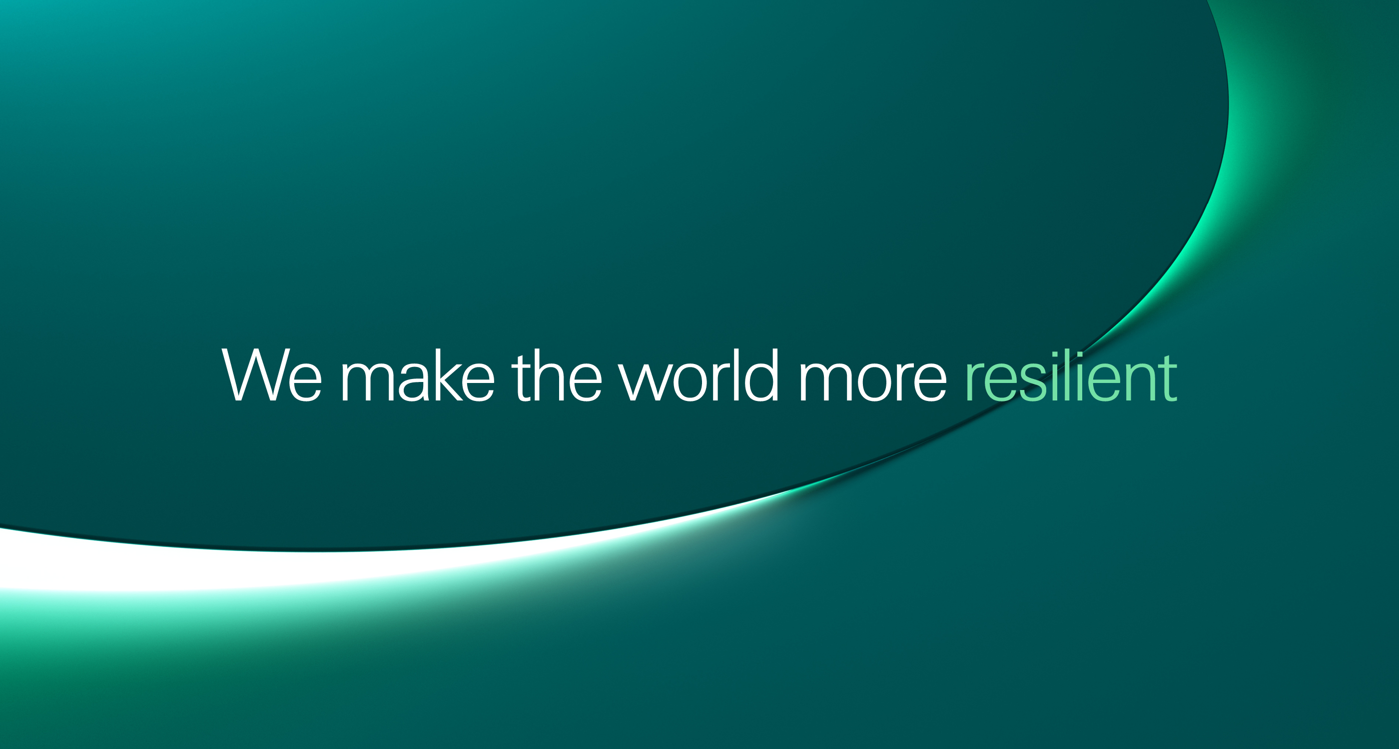
The refreshed brand positioning now reflects the dynamic, digital-first Swiss Re has become and demonstrates the firm’s growth ambition. This distinctive positioning brings its tech and innovation, data and insights and societal leadership strengths to the fore to better reflect new types of risk that clients face, as well as attract new talent and partners.
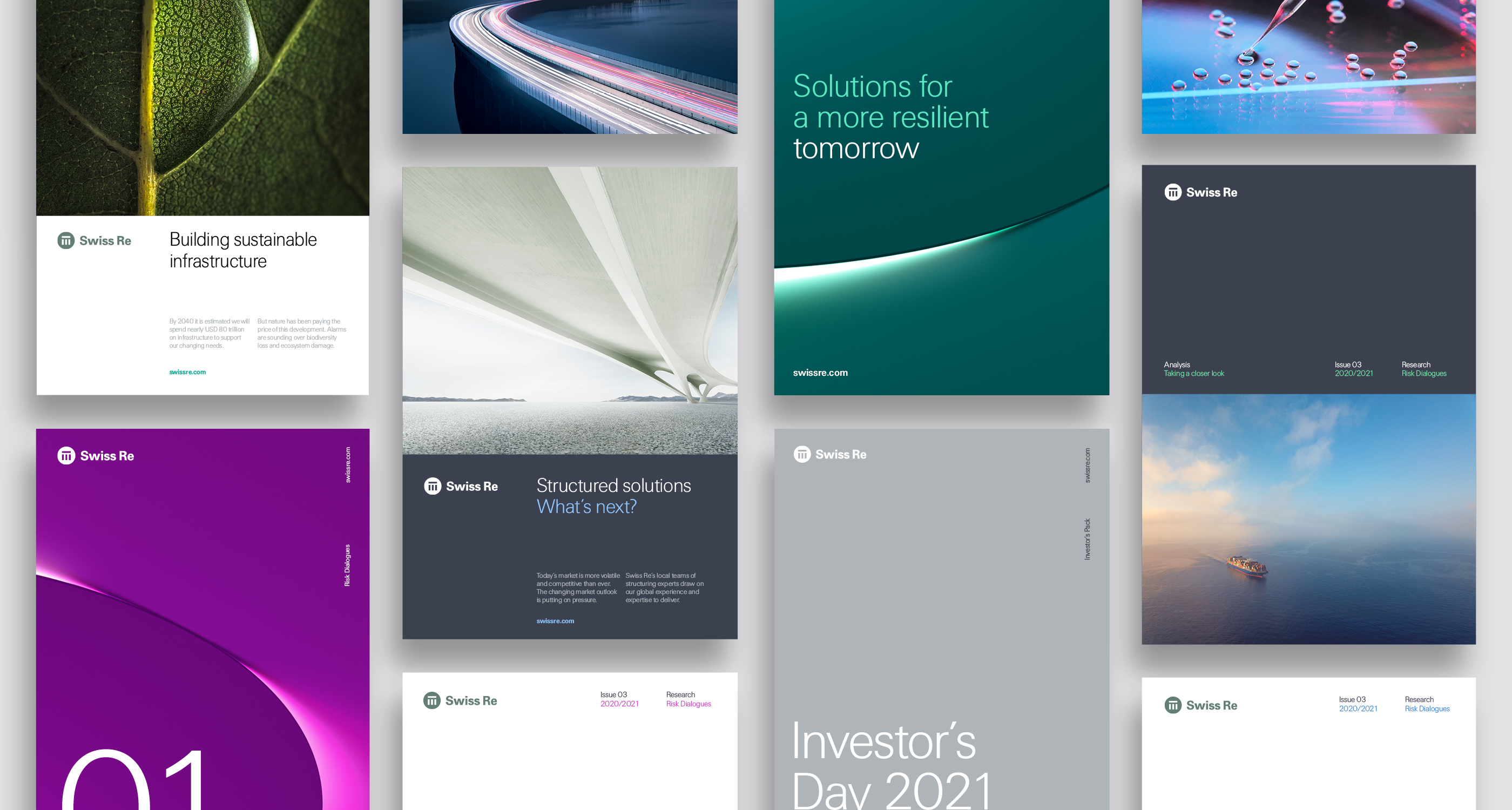
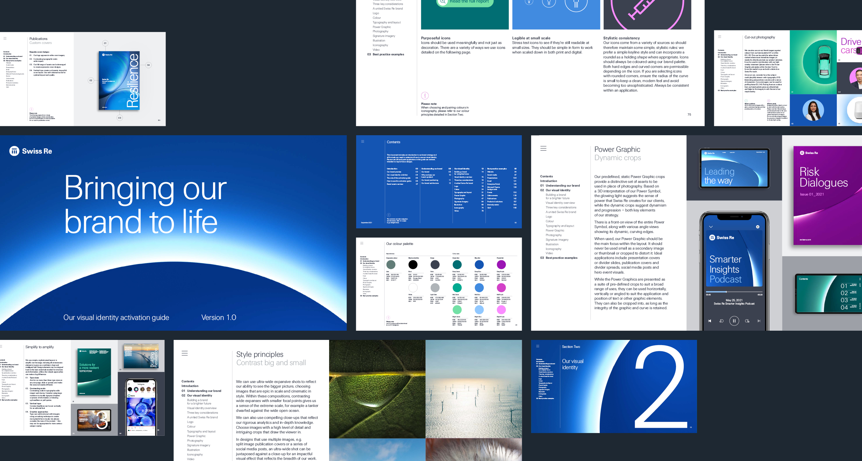
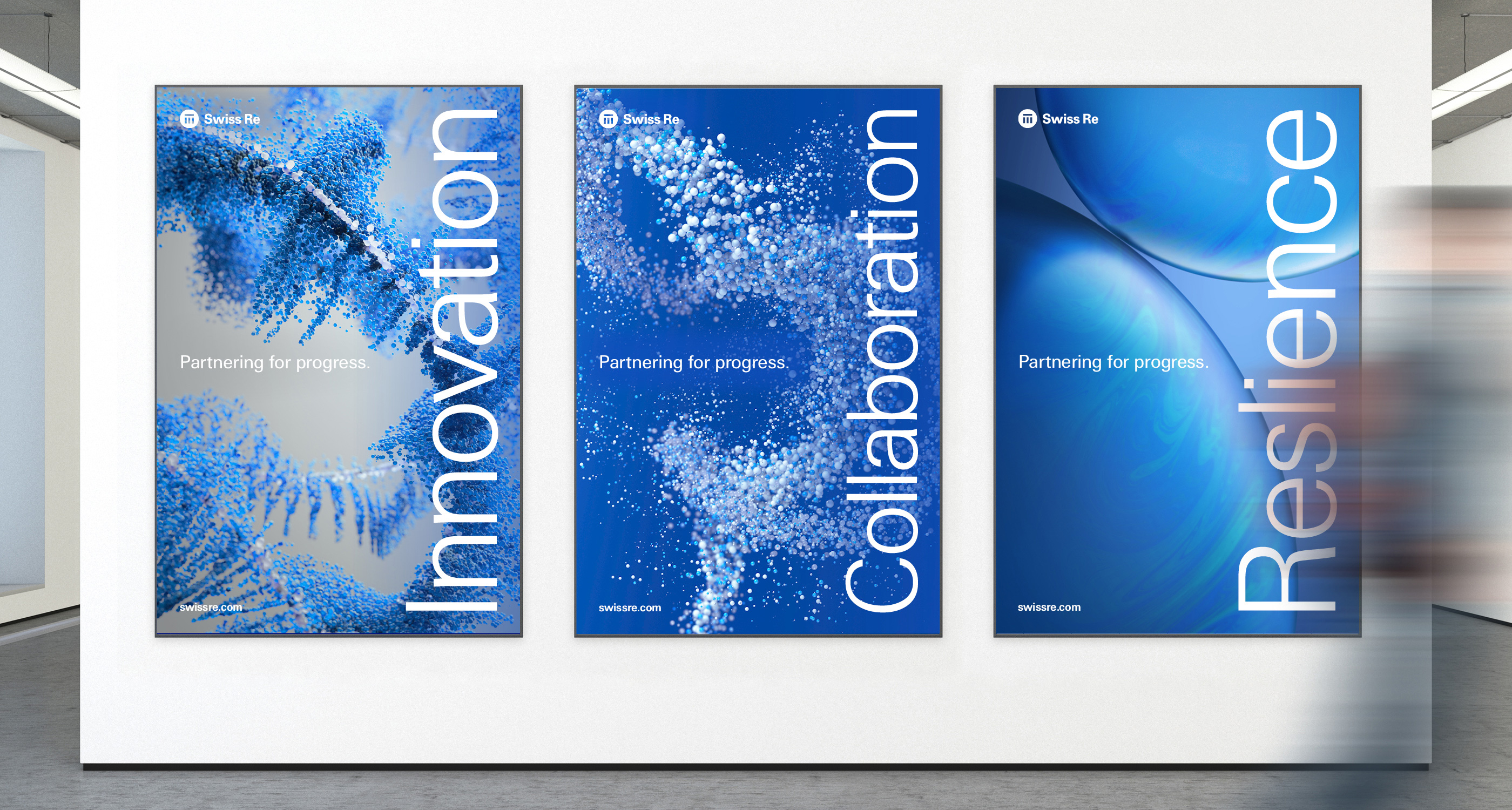
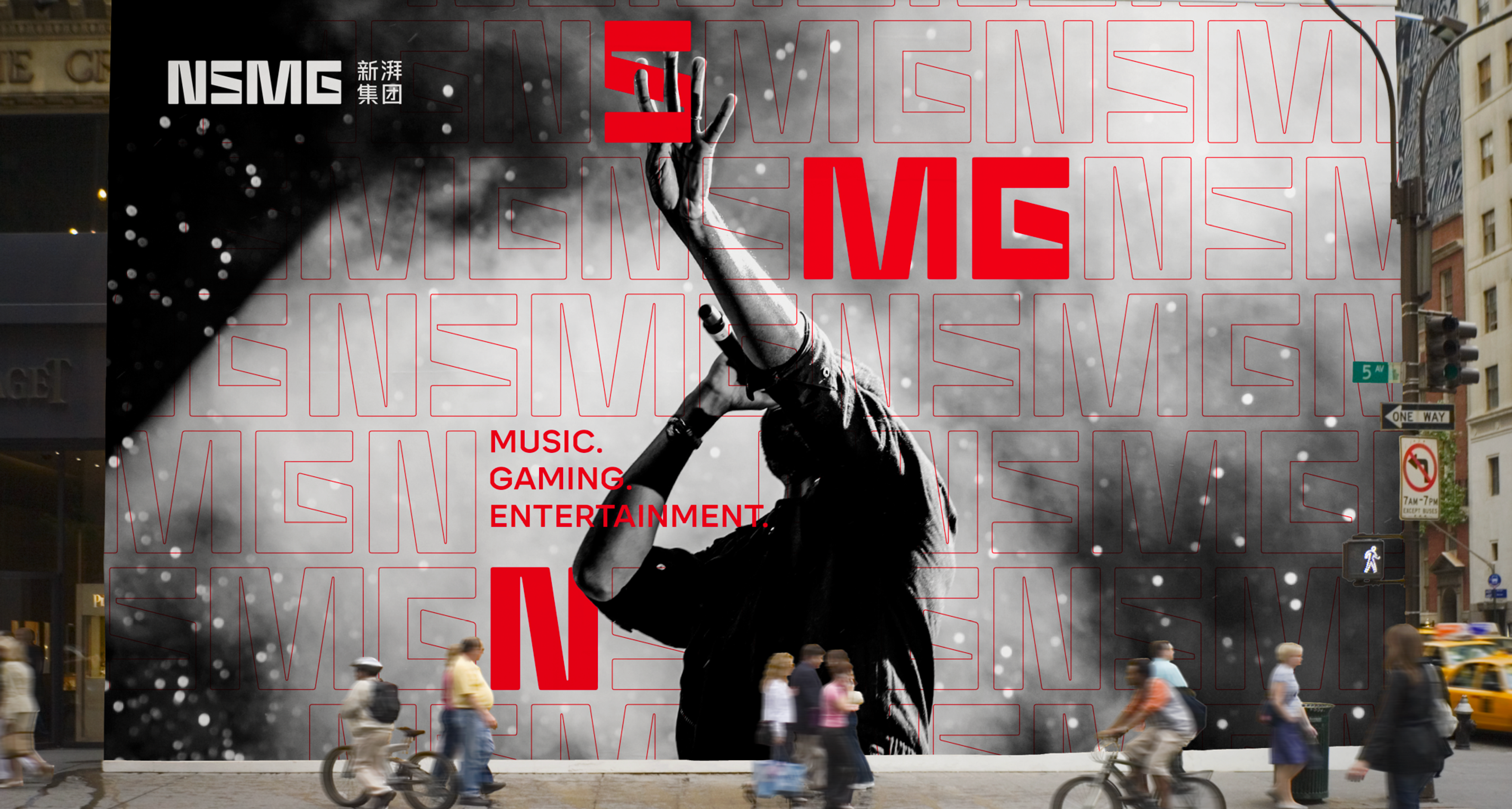
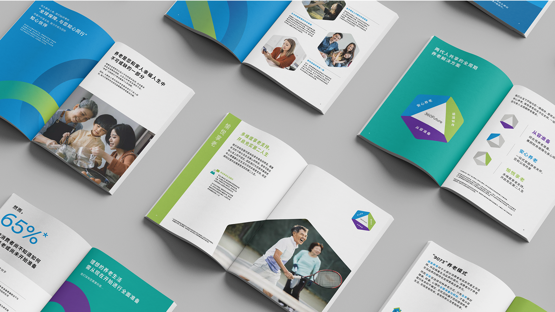
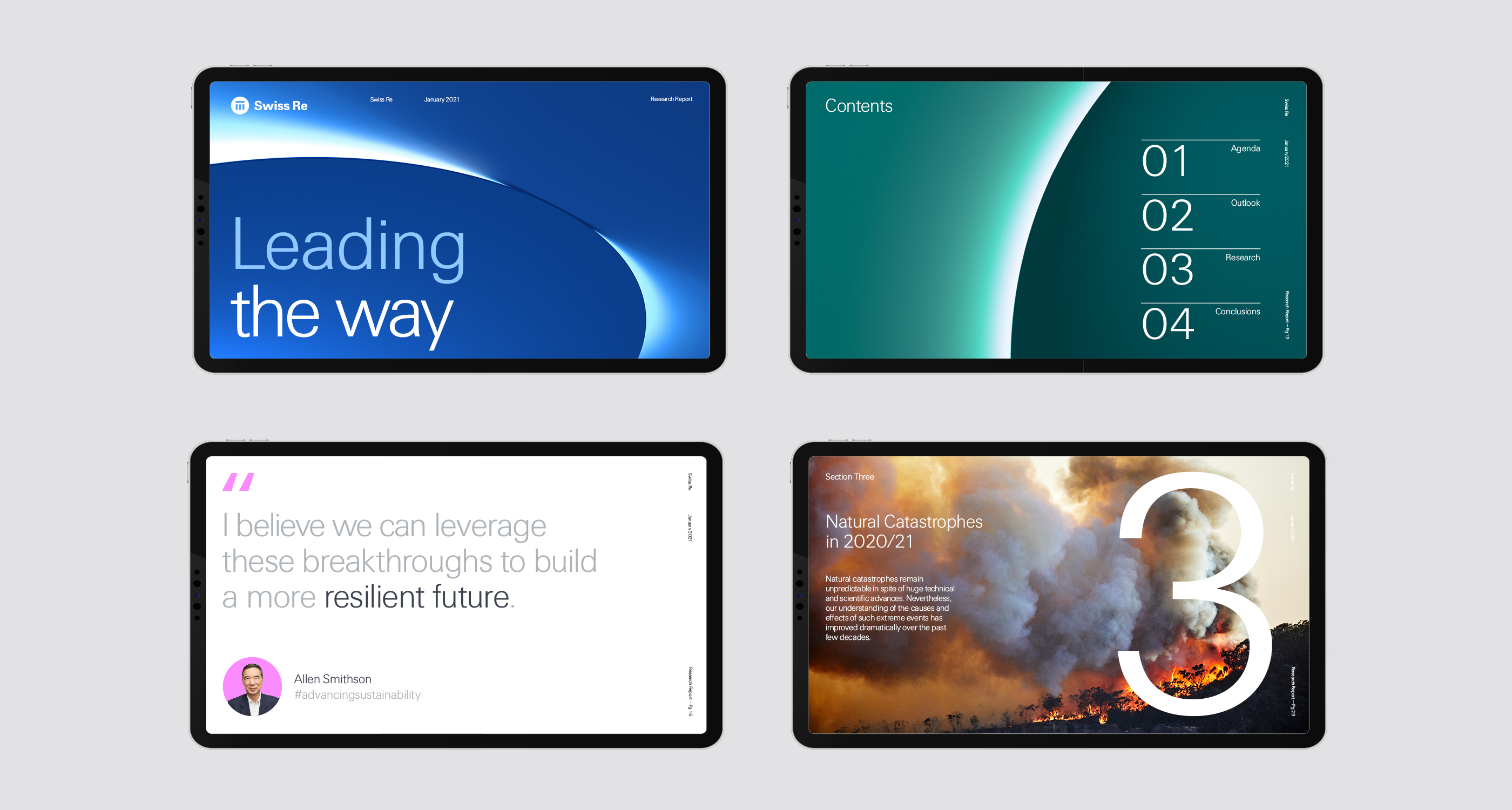
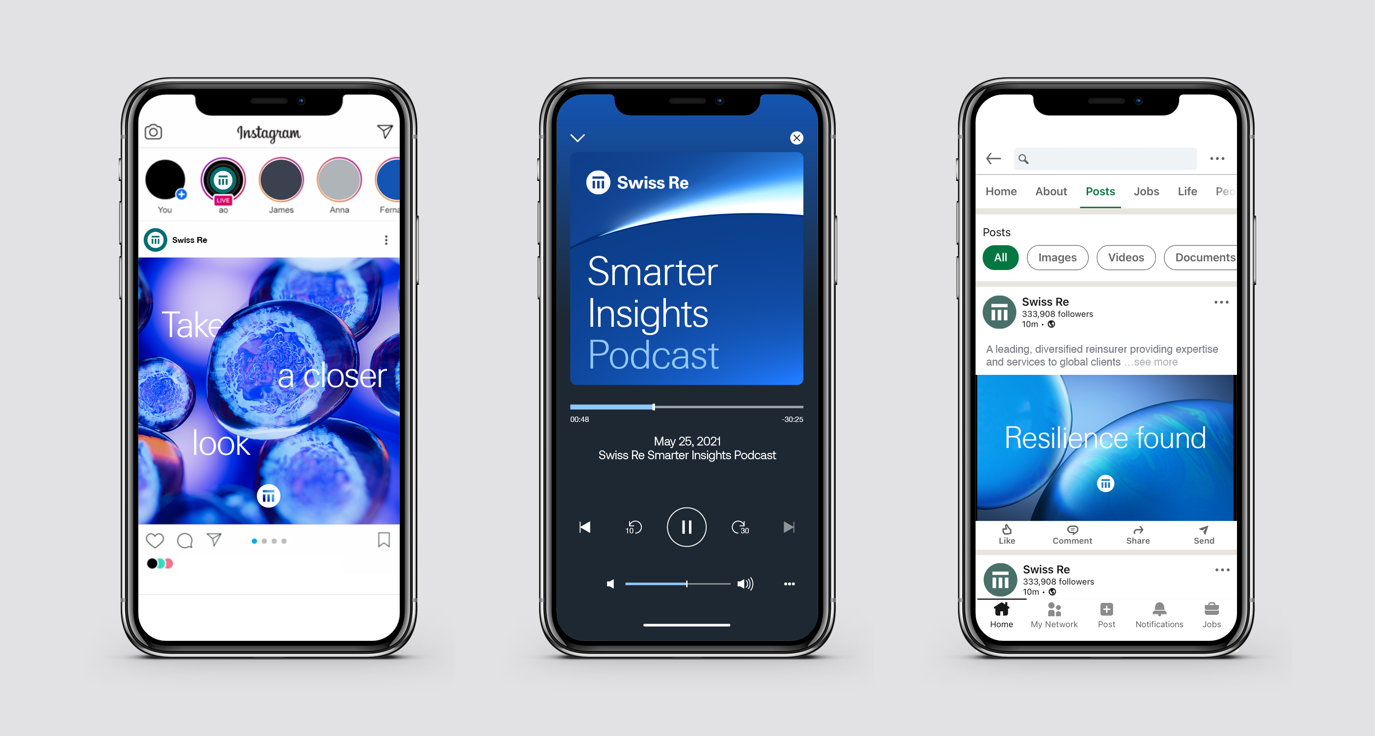
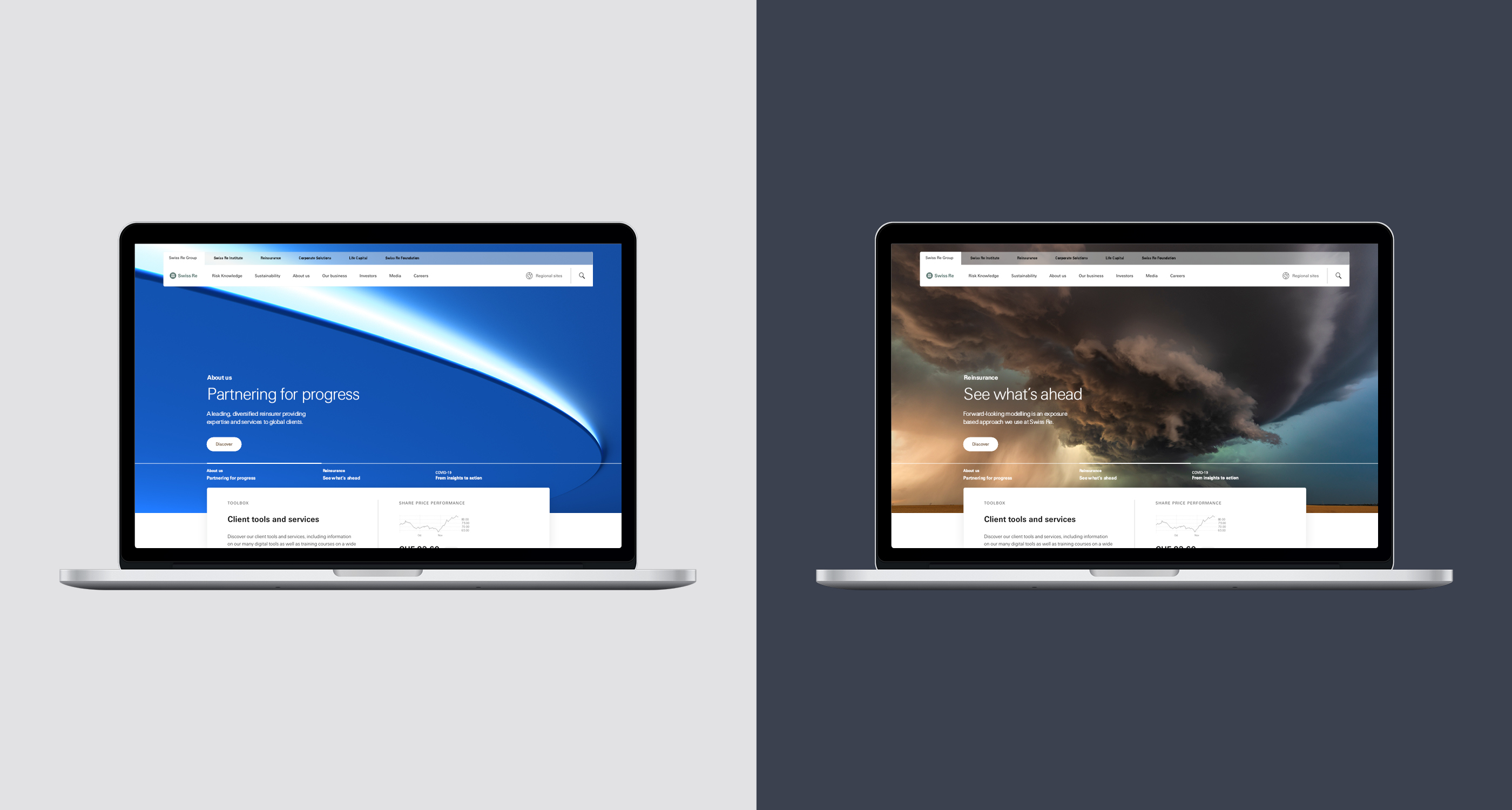
To support the new brand strategy, there was a need to advance the visual identity to embrace all facets of the business and build a sense of ‘oneness’ in today’s digital world. Prophet partnered with the team to activate the identity with a suite of design assets including bespoke imagery, to act as a metaphor for how Swiss Re powers progress and their unique perspectives on the world. And – rather atypical for a business-to-business brand – an audio brand was introduced to strike the right tone and deliver a more contemporary expression of the brand.
Results
Awarded a prestigious Red Dot Design Award in 2022 and a German Brand Award in 2023, the sophisticated refreshed brand reaffirms Swiss Re’s leading position in the industry as a future-ready business, working to attract new talent, stand out against the competition and unlock new opportunities for the company. Well received internally, it is also resonating with employees, enforcing the unifying notion of ‘oneness.’

“Prophet’s unique approach to strategic design has delivered a far more contemporary and sophisticated expression of the brand. We couldn’t be more proud of the outcome.”
Dr. Jan Dietrich Müller
Head Group Communications, Managing Director