CASE STUDY

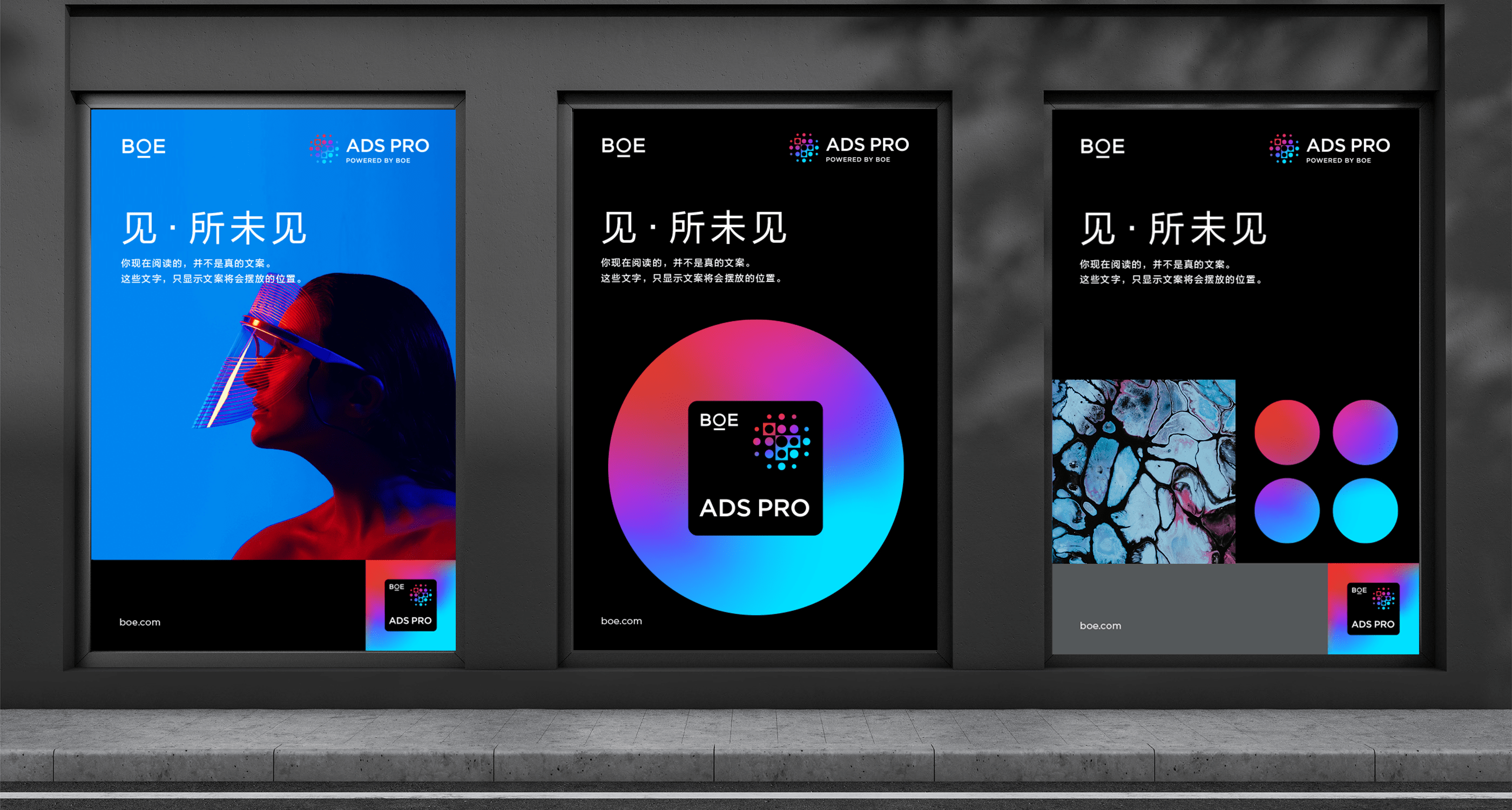
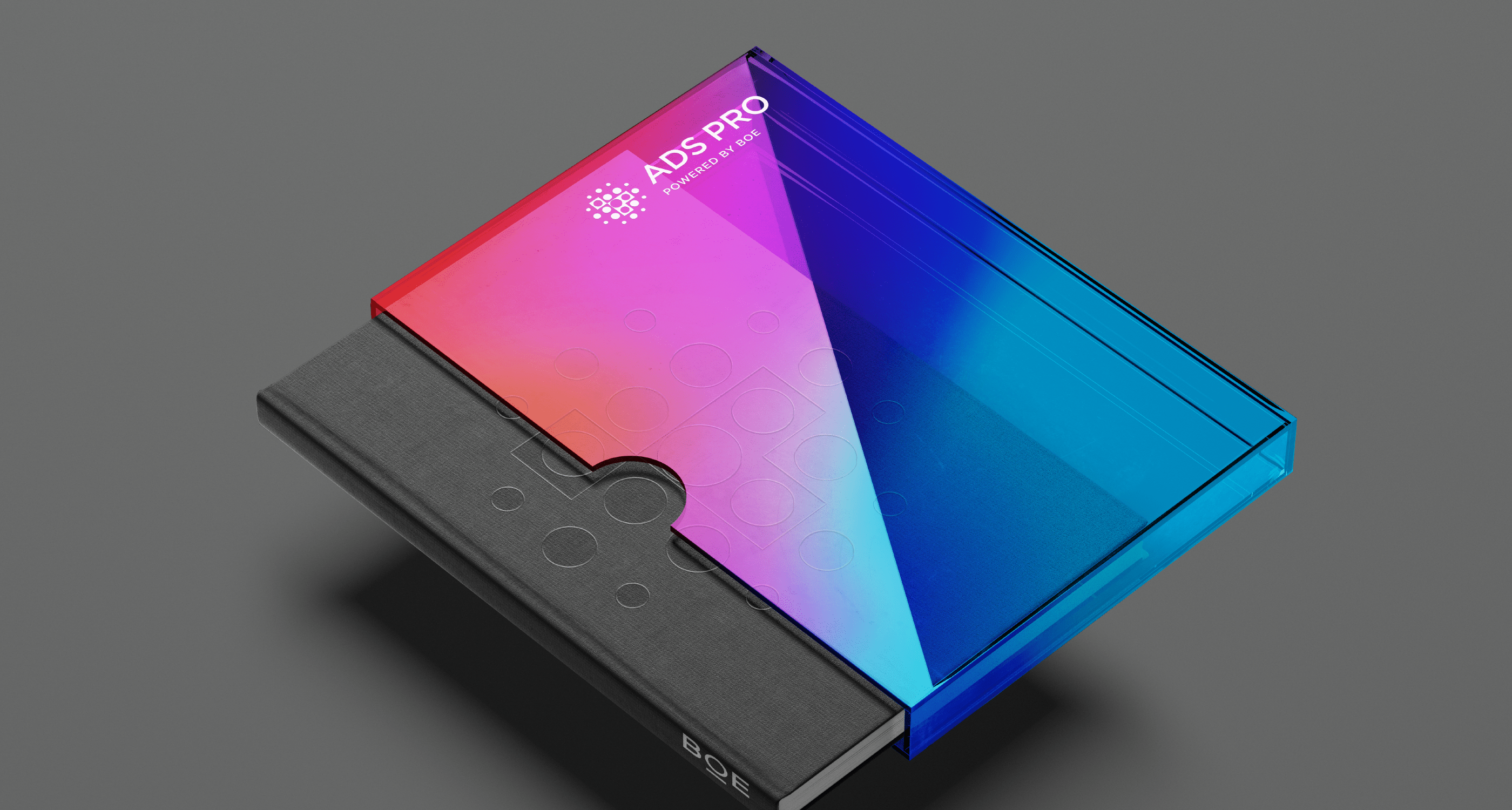
BOE

Defining a purpose-driven technology brand with a revigorated identity 

Challenge

With nearly three decades of rapid development, leading IoT technology company BOE has become one of the world’s largest semiconductor display providers, producing more than a quarter of the world’s digital screens.  

Though BOE has built a strong brand reputation over the years, its new corporate strategy prompted the organization’s imminent need to upgrade its master brand strategy. BOE came to Prophet with two key objectives: First, to extend its brand perception from a “business-oriented” company to a “consumer-oriented” one by creating a clear and consistent image as an IoT technology leader; and second, to define a new brand architecture that fuels the growth of its diversified business portfolio. 

Solutions

Since 2017, Prophet has been BOE’s long-term strategic partner, supporting the business’s and brand’s continuous growth. Through this relationship, BOE entrusted Prophet with elevating BOE group’s master brand. 

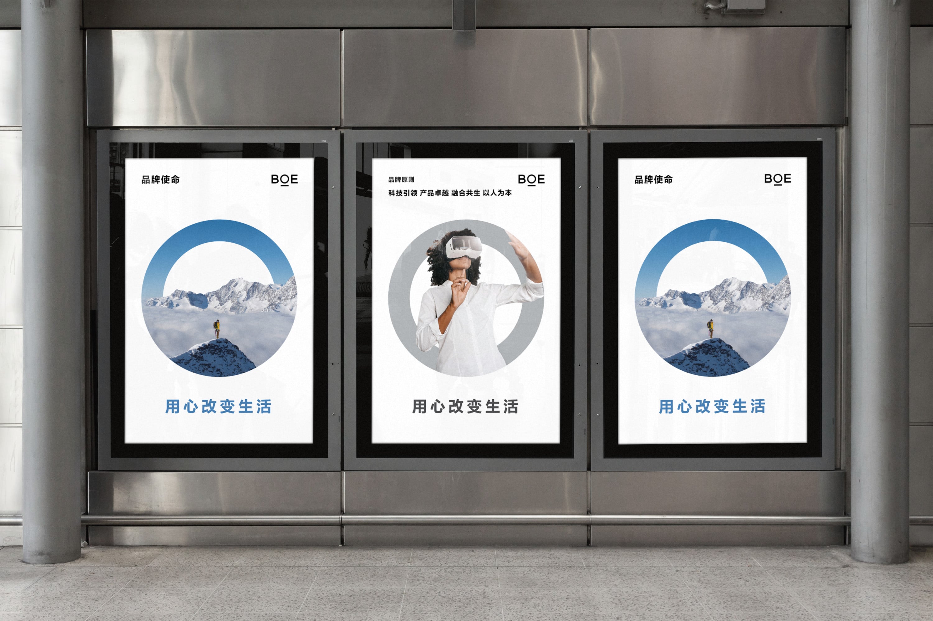
Our team first carried out in-depth interviews with both internal and external stakeholders  – from executives and employees to customers and ecosystem partners. Combining insights with learnings from the benchmark study of leading global technology brands, we identified the core elements that BOE brand needed to retain and build. We then held multiple co-creation workshops with BOE’s core teams and executives to hone in on its brand mission for future growth. As a result, we defined the brand mission to “Change life with heart”, presenting people with a technology brand that’s warm, human and aspirational. 

Anchoring on this core mission, we also clarified BOE’s brand promise and principles. This allowed the client to ensure that its mission was brought to life both in terms of external communication and engagement and internal behavioral codes and actions. 

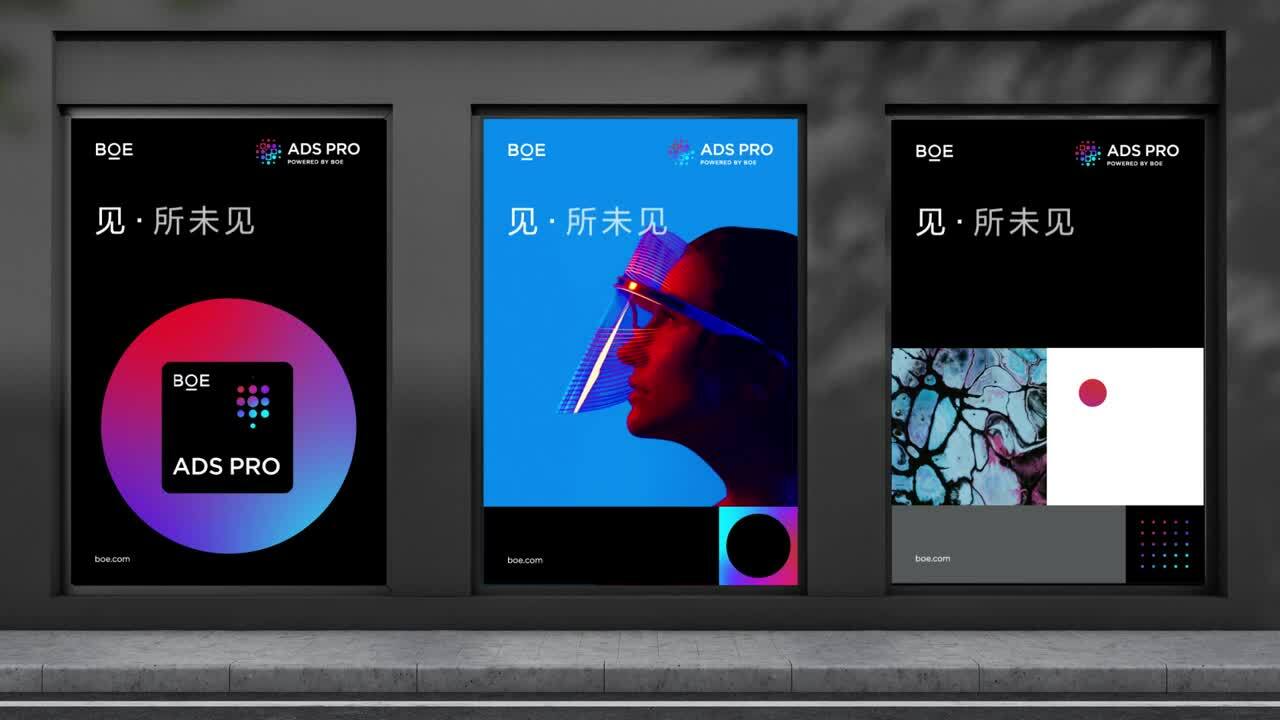
Our work didn’t end there. We teamed closely with the BOE team to define its brand architecture, a crucial component of a successful brand strategy. The refined brand architecture set the foundation for BOE’s transformation from a single, master brand-led approach to a hybrid architecture powered by master brand and key sub-brands. The new brand architecture better supports the organization’s growth vision across business areas. We then created a comprehensive decision framework to help evaluate where BOE needs to build sub-brands across business, technology and product levels. 

Results

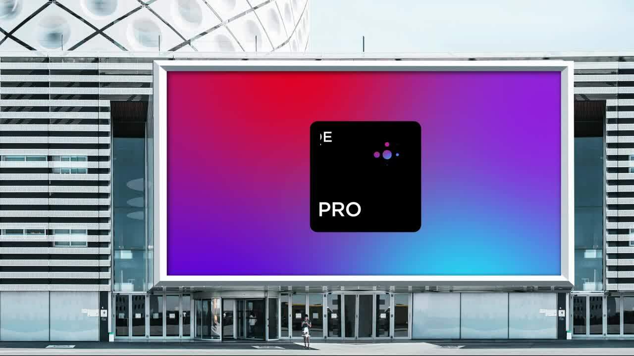
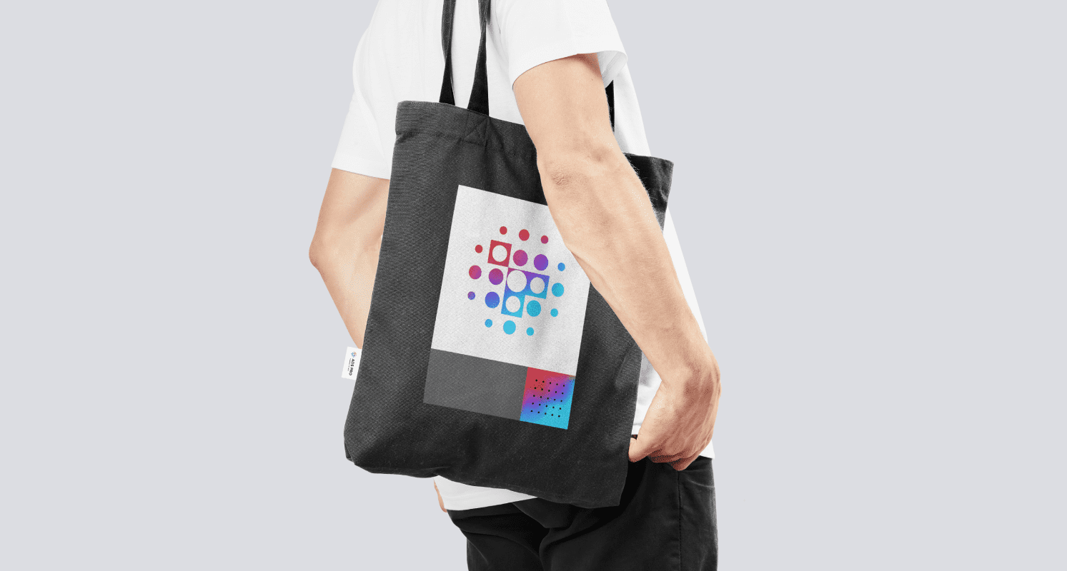
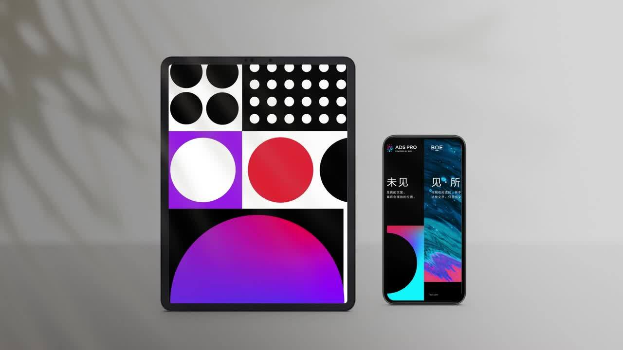
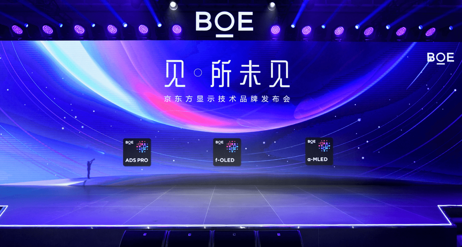
In late 2021, BOE officially unveiled its new brand positioning. Soon after BOE launched its first sub-brand – display technology ingredient brand. With the elevated brand positioning and architecture, BOE continues to accelerate building a connected and symbiotic IoT innovation ecosystem to empower the growth of upstream suppliers as well as the digital transformation of lower-stream partners. Working closely with a network of global partners, BOE strives to push forward a new round of technological disruption to unlock uncommon growth. 

“We partnered closely with Prophet to drive the upgrade of BOE group’s master brand. With strong diligence and dedication, Prophet demonstrated deep insights into the technology industry and a true understanding of our business. It helped us successfully overcome the roadblocks of rebranding amid a business transformation, elevating our existing brand strategy in a clear and concise manner. All these endeavors were highly effective in repositioning BOE as an IoT company with a refreshed identity system.”

Da Si
Vice President and Chief Brand Officer, BOE

CASE STUDY

Vantage

Reinvigorating a Fintech brand to drive growth

Challenge

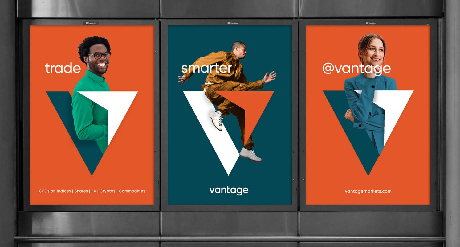
Founded in 2009, Vantage is a global multi-asset broker offering clients access to services for trading contracts-for-difference (CFDs) on forex, commodities, indices and shares. As competition in online CFD trading intensifies and customer expectations evolve, Vantage’s brand had become less relevant and harder to differentiate. In addition, its visual identity, which served the broker well in the past decade, lacked a clear proposition and emotional appeal.

A business with the scale and ambition of Vantage needs to make sure that its brand expression is not only consistent and coherent globally, but also relevant to both institutional broker (IB) partners and individual retail investors across different markets. Thus, Prophet was engaged to reinvigorate Vantage’s brand with a clear, insights-driven brand positioning and modern, compelling visual identity.

Solutions

Prophet took a hypothesis-led yet rigorous approach to activate Vantage’s internal expertise and explore new external opportunities. By immersing in stakeholder interviews, 360-degree competitor audit, as well as AI-driven customer research, we obtained a comprehensive and nuanced understanding of Vantage, including its ambition to its capabilities, competitors and target customers.

Our strategy team then used these insights to define Vantage’s new brand positioning – to “provide a trusted trading ecosystem that enables customers to achieve their own success, faster and simpler”. Based on the brand positioning, we crafted a messaging framework and the brand voice to guide what the brand says and how the brand speaks. We also simplified its brand name from “Vantage FX” to “Vantage” to better reflect the company’s ambition to be a multi-asset trading platform beyond FX trading.

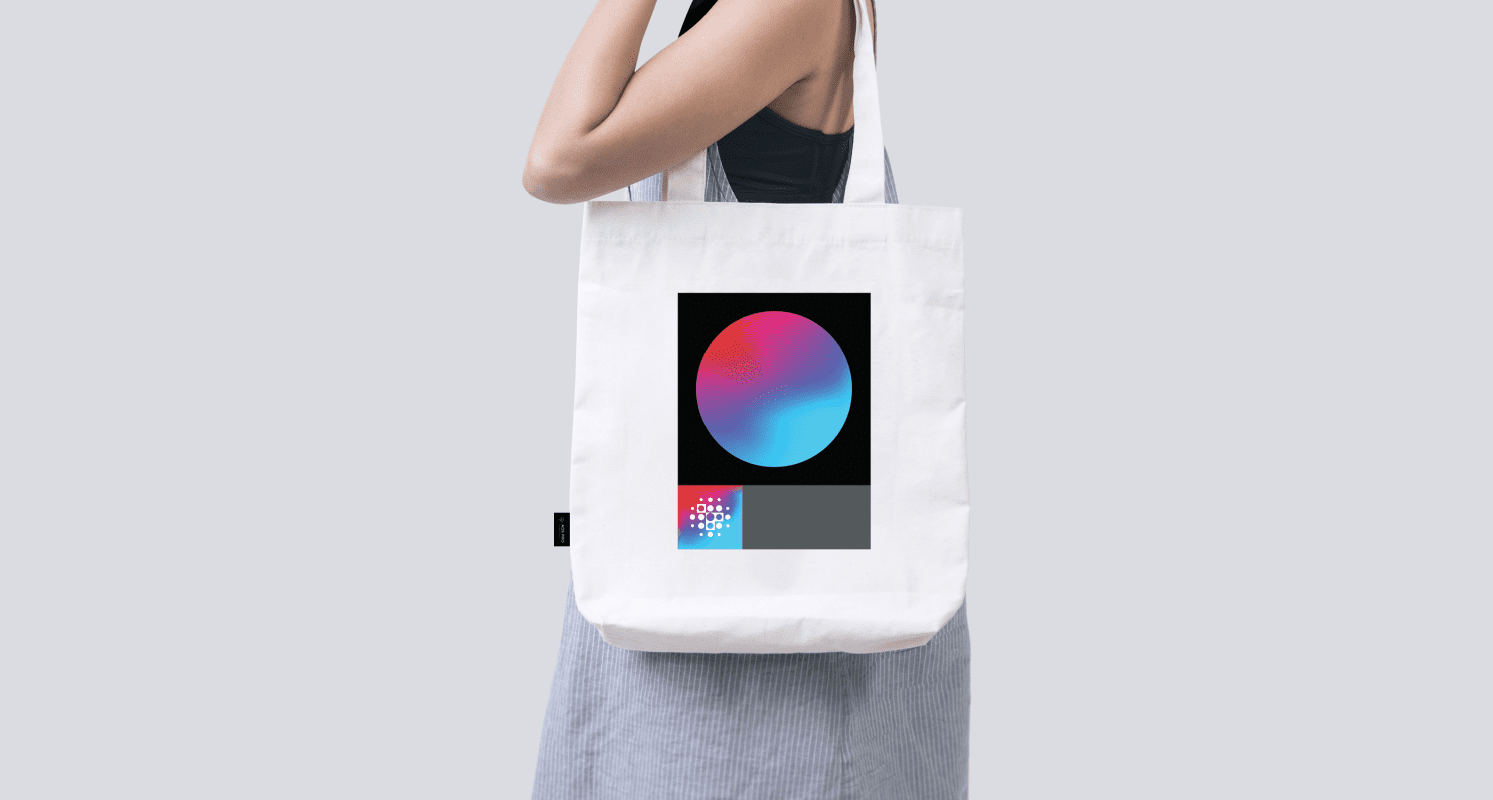
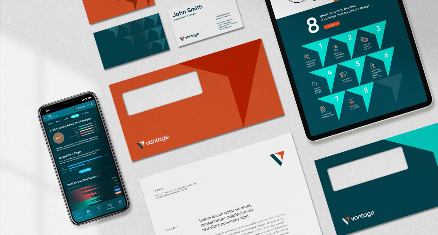
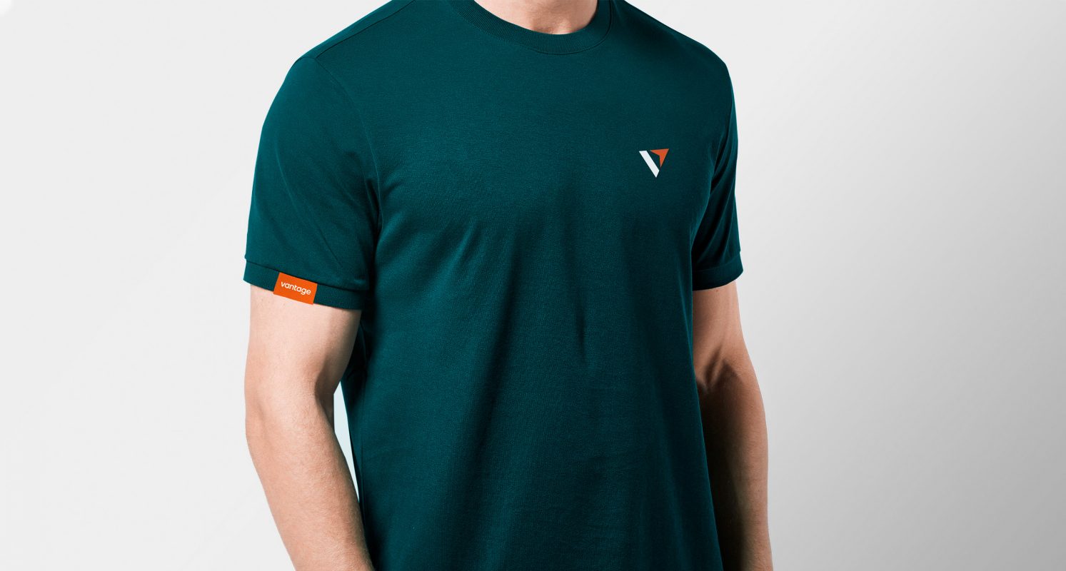
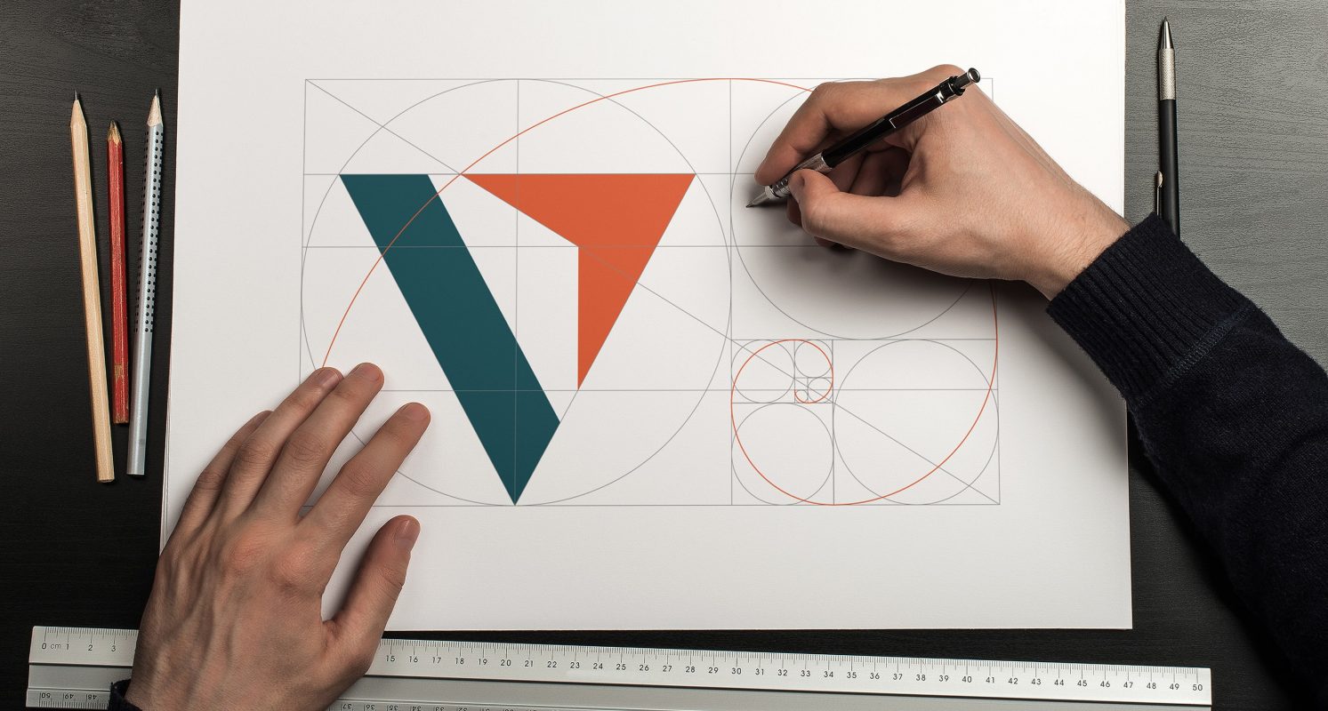
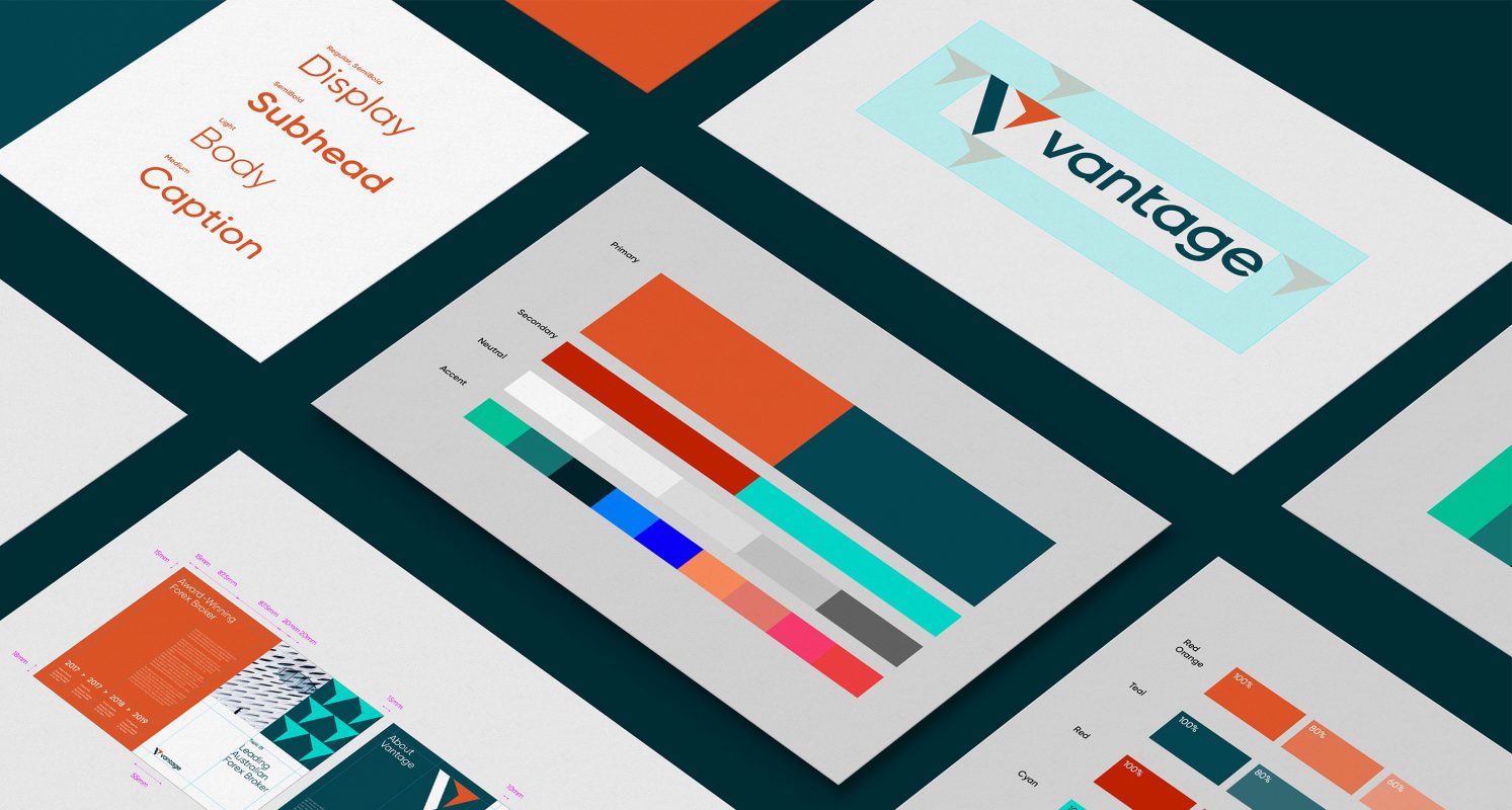
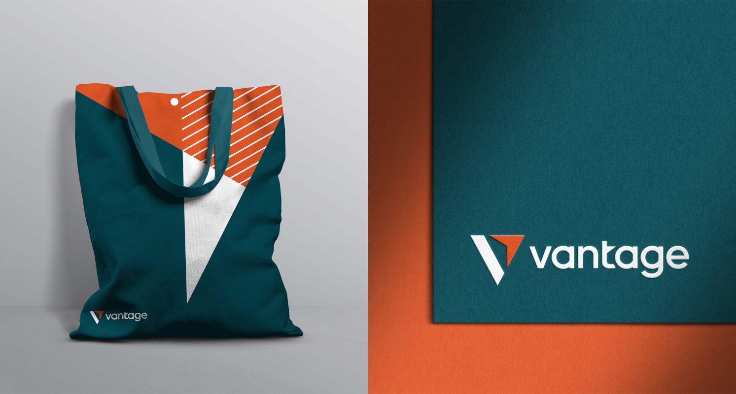
To bring the strategy to life, our design team built upon the big idea of “Shared Success” and applied the Fibonacci Golden Ratio in creating Vantage’s new visual identity system. The Fibonacci Golden Ratio is not only permeated in nature and art but also prevalent in financial markets – Fibonacci retracement levels are often key indicators to predict market movements. The idea resonates with the brand category and strategy to resemble precision, growth patterns, perfect harmony and concise prediction of patterns in an ecosystem.

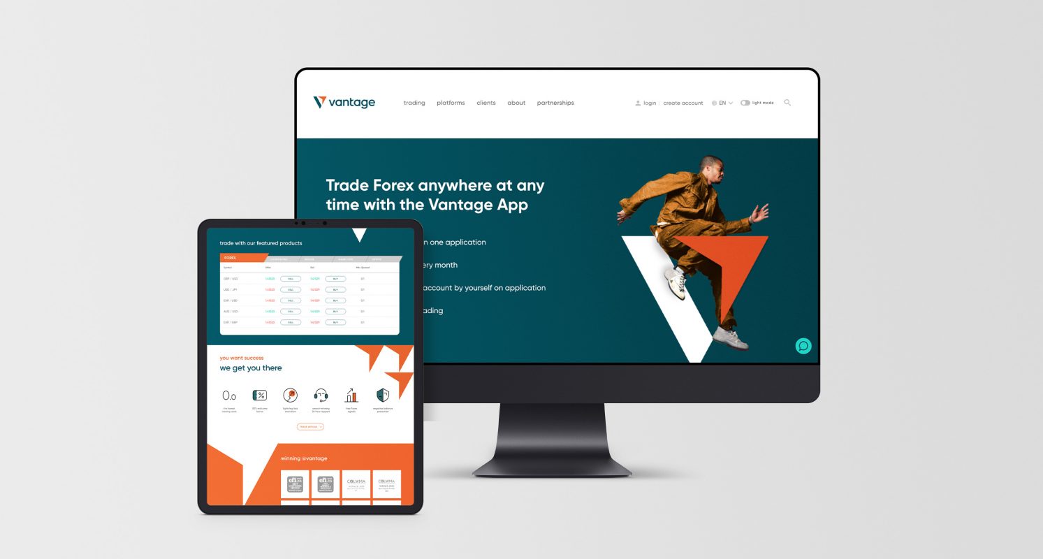
To help Vantage envision its new visual identity, we created customized iconography, brand and photography guidelines, as well as a wide range of applications including website and mobile app re-skin.

Results

Vantage launched its new brand globally with a resounding impact.  It was well-received by industry peers at its unveiling in November 2021. The group achieved a significant increase of nearly 30% in new users in three months, compared to the same period before the rebrand.

Vantage was also recognized at the 2021 Transform Awards Asia, for the categories of ‘Best brand development project to reflect the changed mission, values or positioning’ and the ‘Best visual identity from the financial services sector’.

“Our rebranding exercise was the long-awaited change that our business needed, and Prophet was the ideal partner to assist us through the entire process. From the initial interviews to the final reveal of our new brand identity, the Prophet team has been more than instrumental in its assessment and recommendations,” says David Shayer, CEO of Vantage UK.

“The results of the rebrand speak for itself. Removing FX from our name has allowed us to speak more closely to our multi-asset offering, and our new brand puts us closer to our clients who share the same values. With a refocused business direction, we are empowered to continue the work of enhancing our tools and platforms to bring about an unparallel trading experience for our clients.

“The rebrand has also opened doors to some prominent partnerships, including our recent sponsorship of the McLaren Extreme E, which highlights our push for greater sustainability, diversity, and inclusion within the financial services industry in the coming years.”

“From the initial interviews to the final reveal of our new brand identity, the Prophet team has been more than instrumental in their assessment and recommendations.”

David Shayer
UK CEO

CASE STUDY

McAfee

Repositioning McAfee for accelerated growth

Challenge

With innovations like streaming and teleconferencing as well as external trends like COVID-19, people found themselves living more of their lives online—and in turn, looking to find better online protection.

At the same time, McAfee, the global cybersecurity leader, announced it was spinning off its enterprise business to focus exclusively on consumers.

These two realities provided McAfee with a moment-in-time opportunity to redefine what its consumer business stands for and become even more relevant for the people it serves and position itself for accelerated growth.

Solutions

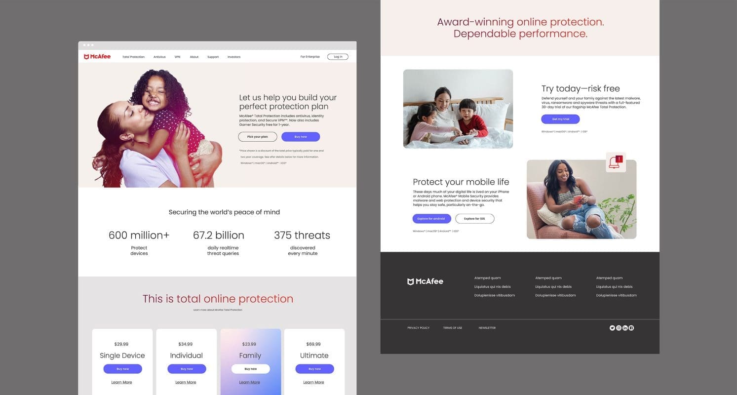
McAfee partnered with Prophet to uncover how it could best become more relevant with consumers. After auditing the competitive landscape and immersing in what made McAfee unique, Prophet conducted research with over 5,000 customers internationally to understand the needs and opportunities where McAfee could play. In our research, we uncovered a white space that customers care about and where McAfee could credibly deliver.

Working closely with McAfee executives, we crafted a new brand strategy, including a more human-centered brand positioning that pushes beyond the category’s conventions. We looked at untapped drivers of purchase to build a brand that focuses on how McAfee’s protection—not just cybersecurity, but identity, privacy and family protections too—frees and empowers people to confidently enjoy their lives online.

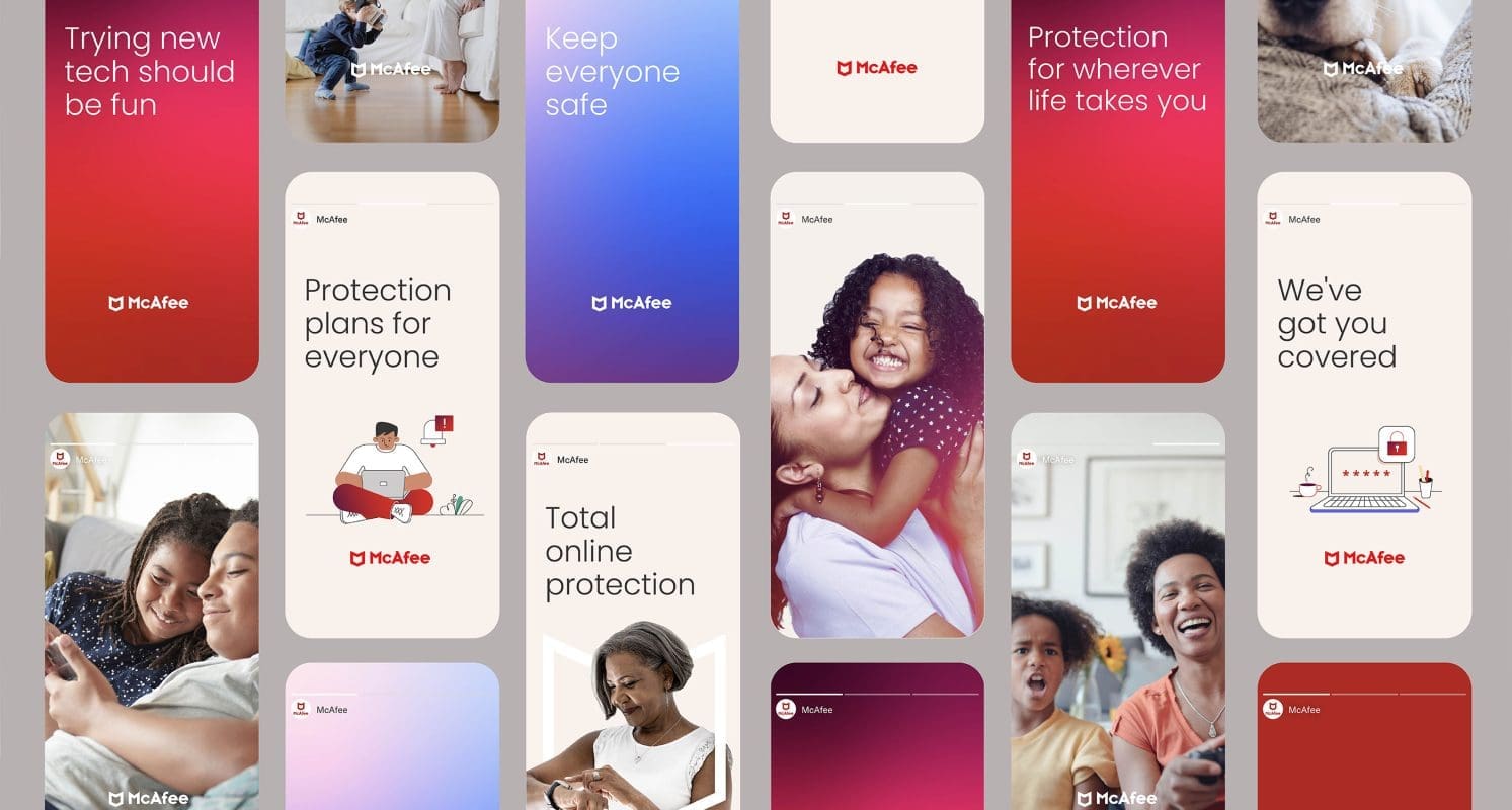
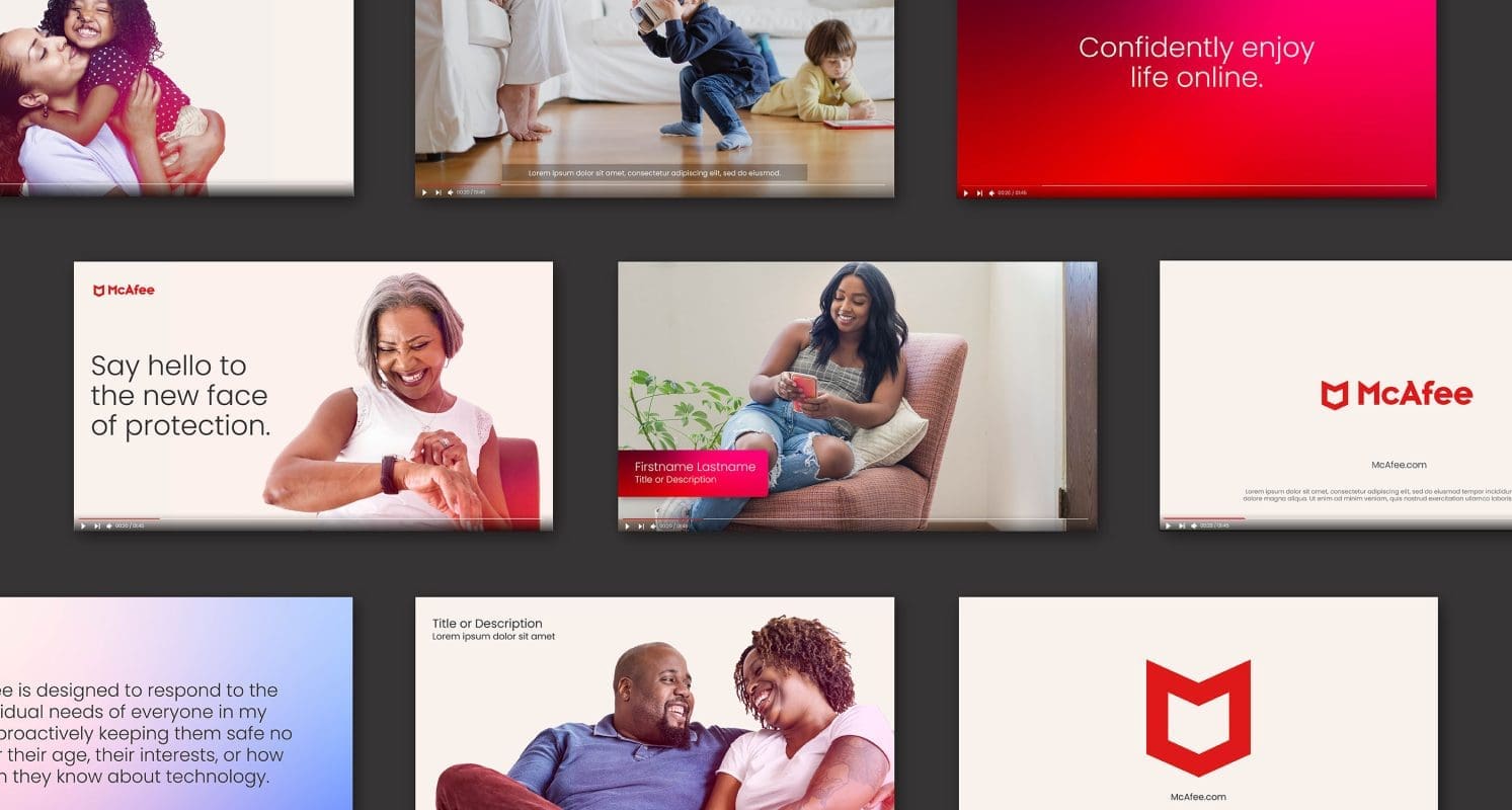
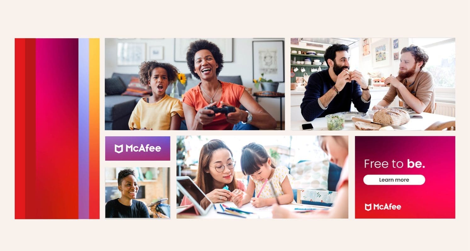
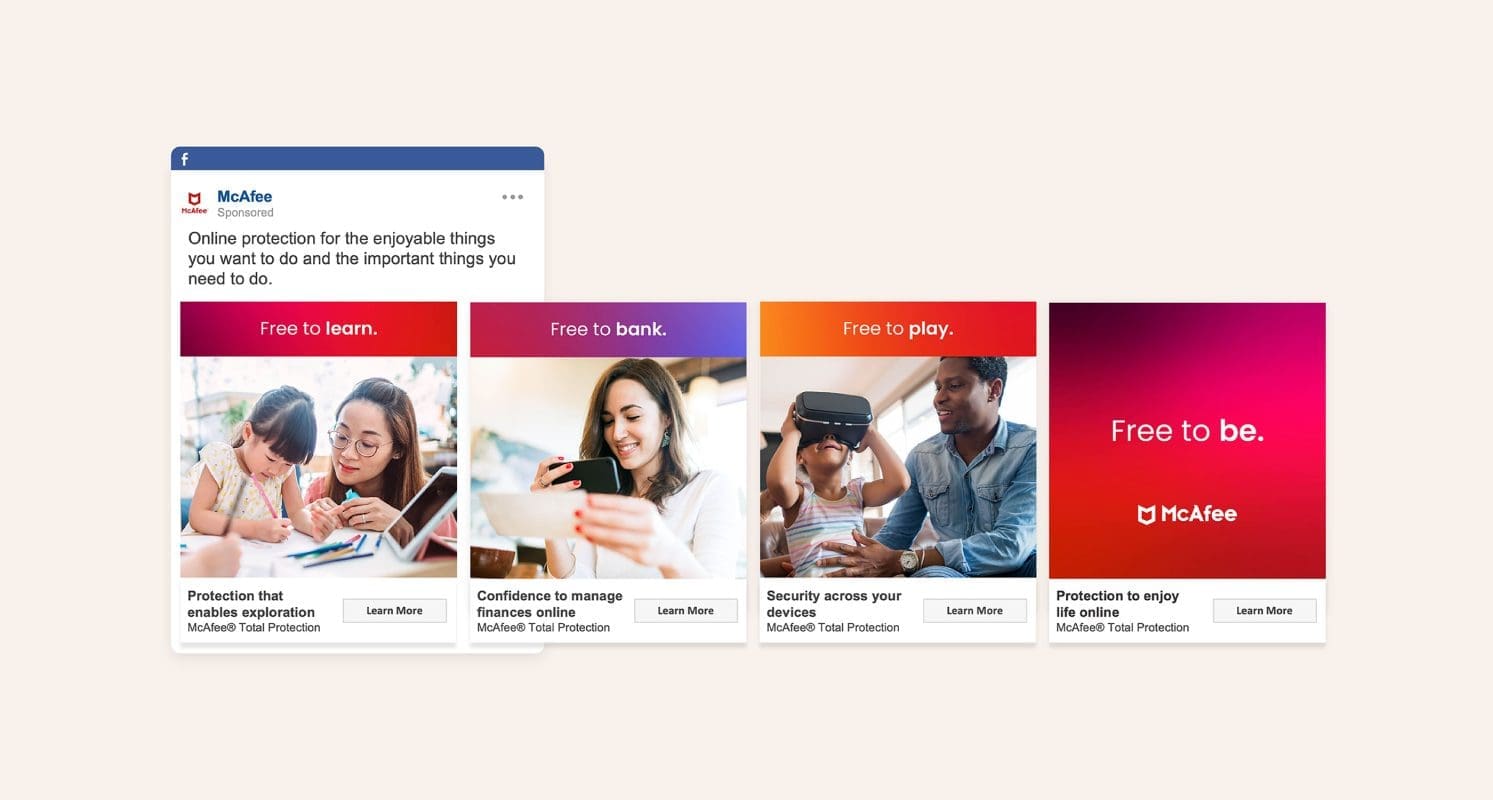
We developed a new verbal and visual brand identity to match—crafting a brand voice that is approachable and optimistic, messaging that highlights McAfee’s research-backed strengths and a look-and-feel that is modern and dynamic that can be applied across marketing and product.

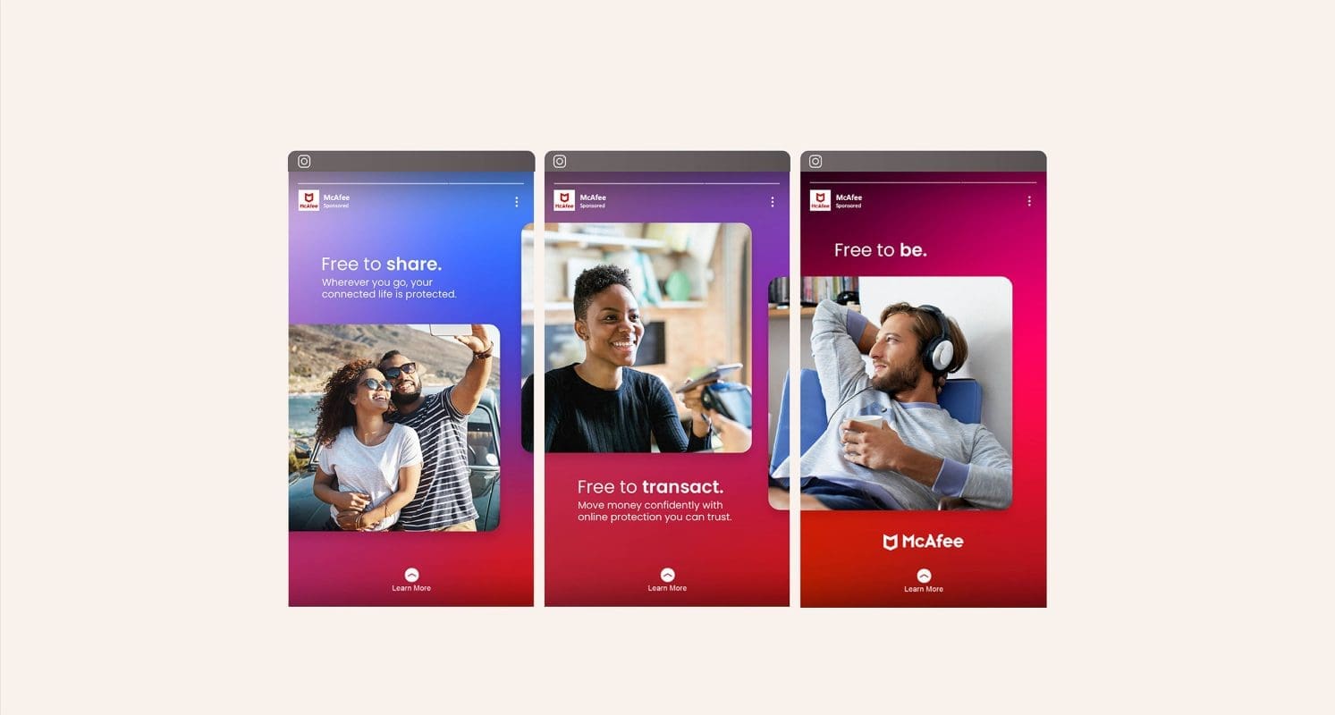
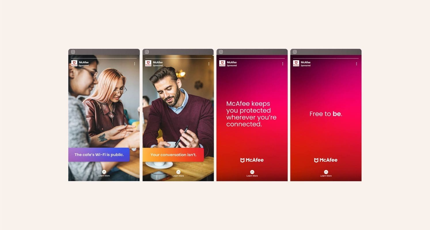
Prophet translated the new strategy and identity into a compelling digital launch campaign. The “Free to Be” campaign highlights how everyone deserves to be able to do what they want to do online—that people should be free to learn, free to shop, free to bank, free to connect—confidently and without fear of online threats.

Results

The new strategy, brand identity and corresponding campaign herald the future of online protection—not just for McAfee, but for what consumers should demand from the online protection industry. McAfee will continue to roll out major updates and industry firsts that help consumers stay protected and enjoy life online.

“Prophet became our indispensable ally. They expertly bridged strategy and execution and helped us effectively align our organization around our new brand strategy, which is helping us continue to deliver on the future of online protection.”

Judy Bitterli
SVP of Marketing

CASE STUDY

Trellix

Building one modern cybersecurity brand from two storied players

Challenge

When Symphony Technology Group merged McAfee Enterprise and FireEye, it wanted to create a new brand, one modern enough to address the rapidly evolving needs of cybersecurity experts. It needed to demonstrate that in an age of cloud computing and machine learning, it could fend off the increasingly malicious actors that make headlines nearly every day. And it knew this new brand had to convey the strength and history of both companies.

Solutions

Prophet’s multidisciplinary teams dove into customer research with security buyers, quickly learning that these experts operate in a near-constant state of digital transformation. They wanted smart, responsive products that evolve to deal with ever-changing security threats. They wanted a partner that instills confidence in their ability to maintain and grow operations and organizations.

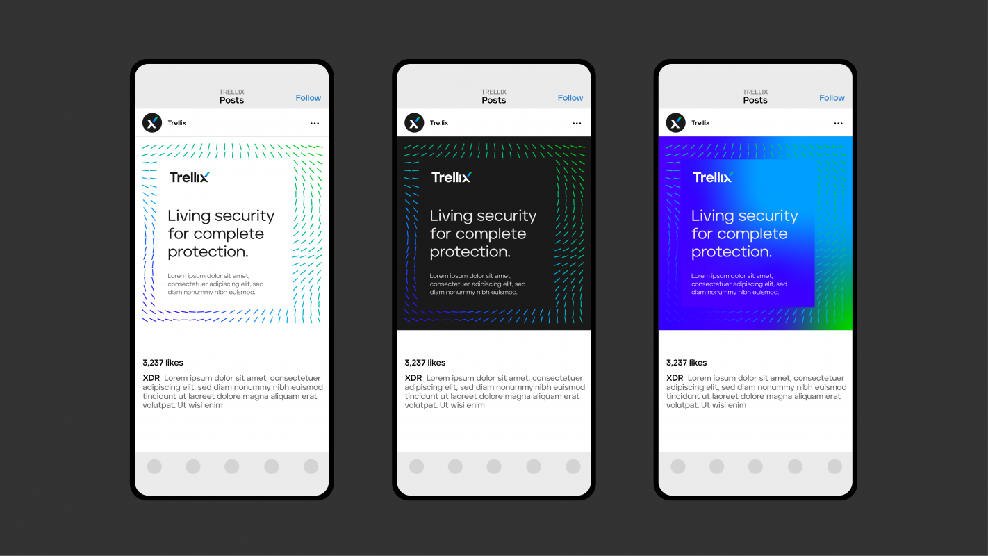
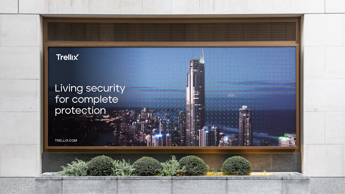
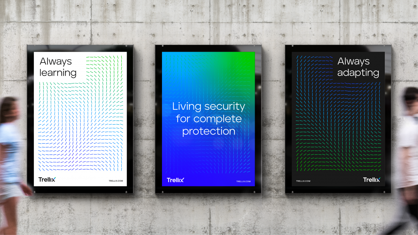
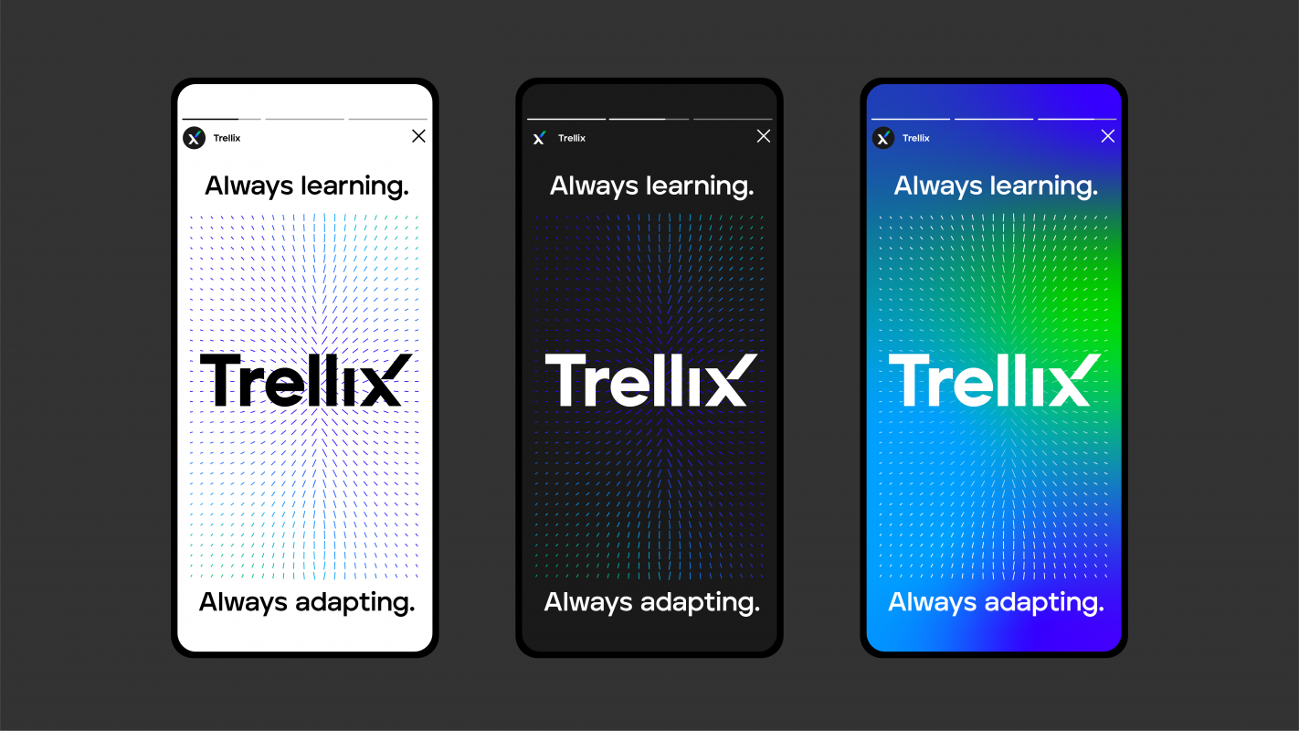
Prophet developed the core idea of NewCo’s brand strategy: living security – a system that learns and adapts. From this strategy, the Prophet verbal team created Trellix, a name that evokes a natural system that grows with customers.  It also reflects the powerful combined capabilities of the new company.

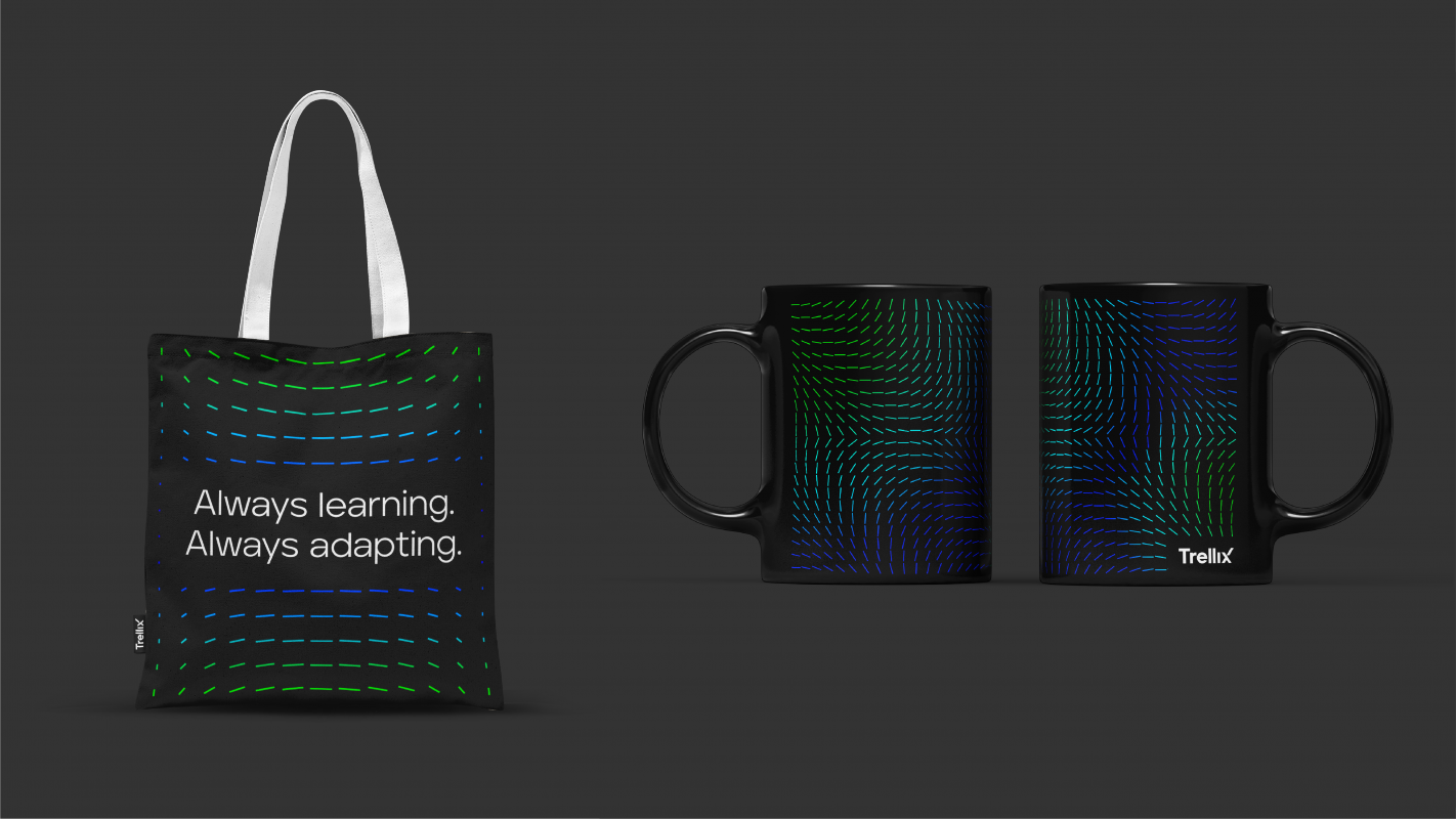
We then mapped out a brand expression for Trellix that telegraphs the new company’s purpose and promise. A distinctive graphic element invokes a pool of data lines, representing the artificial intelligence and machine-learning algorithms that are the backbone of the robust Trellix living security ecosystem.

Using a vibrant, modern color palette, the company’s new name and look convey an optimistic and positive approach to cybersecurity — a departure from the industry’s warlike and militaristic tropes. And our experience team developed a comprehensive content strategy for the new Trellix website.

Results

Prophet developed this new identity and digital experience in just under five months, leading up to the launch and included an internal celebration event and external marketing and PR campaign. Early analyst feedback on the brand has been positive, reflecting Trellix’s strong positioning for market leadership.

Brett Hannath, Chief Marketing Officer, explained that “Prophet helped us create a differentiated brand that conveys our fresh approach to cybersecurity. In a sea of same, Trellix stands out as we create a resilient digital world enabling trust and success.”

CASE STUDY

Azenta Life Sciences

Transforming a brand to advance its pursuit of scientific progress

Challenge

Brooks Automation, a leader in semiconductor automation, embarked on a journey nearly a decade ago into the life sciences space. The strategy was to leverage its unique expertise in cryogenic automation to address the growing need for biosample storage and management. The result was a resounding success as the company grew both organically and inorganically to become a niche life sciences powerhouse providing unrivaled sample exploration and management solutions to help customers bring impactful breakthroughs and therapies to market faster.

The life science business was strong, capable and ready to stand on its own. In order to separate the two businesses, the company announced the sale of the semiconductor operations with the intention to use the proceeds to funnel significant investment into the life sciences arm of the company. The semiconductor business retained the Brooks name and Brooks Life Sciences was now ready to transform into a pure life sciences brand.

Solutions

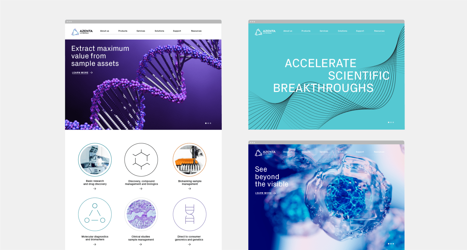
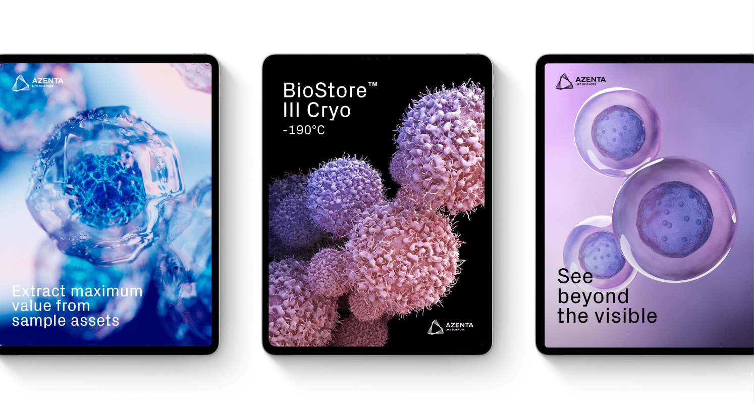
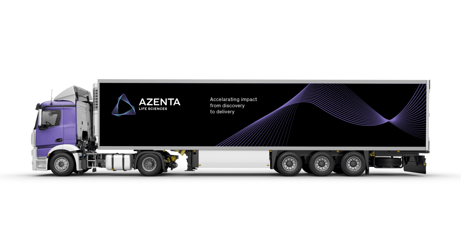
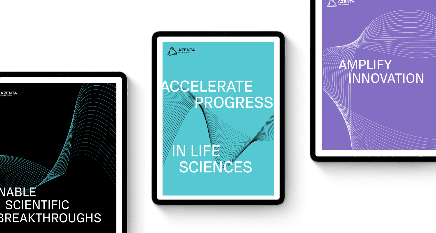
Brooks Life Sciences partnered with Prophet to develop into a strong brand that has an integrated strategy, strong positioning, a story that inspires and a look and feel that is modern, authentic and unique. The company wanted to convey to the market that it is ready to meet customer needs today and, in the future, to accelerate discovery, development, and delivery of healthcare solutions to improve and save lives.

To this end, a strategy was defined to position the company as a life sciences organization with the purpose of helping customers rise above challenges and reach new heights in their pursuit of scientific progress.

On top of that, all of this needed to be done within a few months while the company continued to grow and pursue new acquisitions.

Results

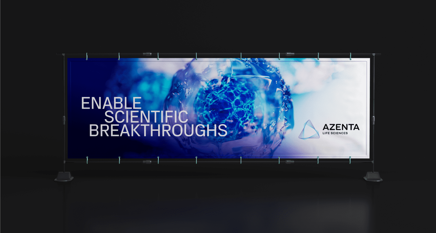
The team quickly turned around the internal brand launch to employees. A few months into the project, Azenta Life Sciences was brought to market, followed by a celebration of the debut of its new name and ticker sign by ringing the Nasdaq closing bell.

There is now one consolidated Azenta brand, which has been rolled out across North America, Europe and Asia. The new strategic focus has been embraced by the market and positioned Azenta Life Sciences to drive innovation and growth with greater speed and precision—and continue its journey to help customers move faster and smarter—making a healthier world for people everywhere.

Additionally, our work earned recognition in the 2022 North America Transform Awards, earning Bronze in the Best Visual Identity From the Healthcare and Pharmaceutical Sector category.

We knew from the start that this initiative was going to be a challenge because we had to work fast—build a brand within a few months while we were growing, acquiring, and transforming. Prophet has been a great partner for us and played an integral role in the transformation of Brooks into Azenta Life Sciences, a brand that resonates with our customers and inspires our employees.”

-Linda De Jesus, Chief Commercial Officer & Senior Vice President, Azenta Life Sciences
“Prophet has been a great partner for us and played an integral role in the transformation of Brooks into Azenta Life Sciences, a brand that resonates with our customers and inspires our employees.”

Linda De Jesus
Chief Commercial Officer & Senior Vice President
CASE STUDY

Teladoc Health

Leading a multinational healthcare company to break away from the telemedicine pack

Challenge

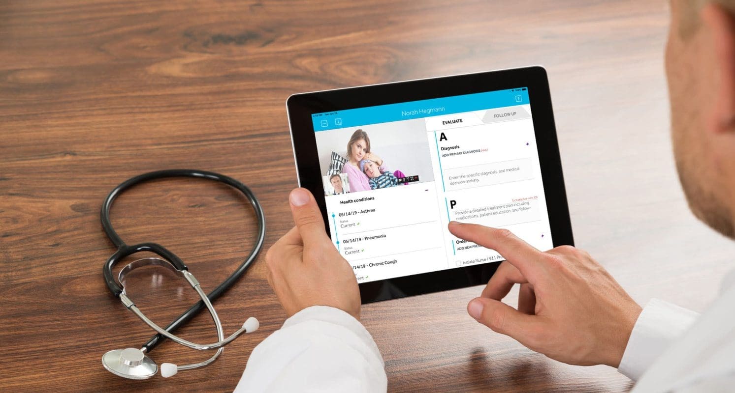
Teladoc Health, a multinational telemedicine and virtual care healthcare company, sought to transform the healthcare system by creating a new category of whole-person virtual care, connecting individuals to their healthcare with a strategy far more comprehensive than the approach of their traditional competitors.

Teladoc Health expanded its capabilities and geographic reach through organic growth and a series of acquisitions. As a result of this growth, it was necessary to elevate the brand to build cohesion across the business and to communicate its value as an integrated system.

Teladoc Health partnered with Prophet to realize and activate its brand potential as an integrated company serving clients and consumers around the world.

Solutions

Prophet helped Teladoc Health evolve its brand narrative through both corporate and consumer-facing growth moves. We worked with the Teladoc Health team to develop a revised corporate brand and portfolio architecture, complete with an action plan to engage employees around the new approach to the corporate, commercial and product brands.

Results

Teladoc Health launched its new corporate brand and has continued to experience exponential growth. With Prophet’s help, the organization has a brand that aligns with a rapidly growing and highly acquisitive business. Grounded by an effective brand portfolio strategy – that both resonates with employees and attracts new customers – Teladoc Health continues to redefine and lead the telehealth industry as a comprehensive, integrated virtual care organization.

CASE STUDY

Sodexo Healthcare France

Prescribing a new value proposition amidst a global pandemic

Challenge

Healthcare is fundamentally changing around the world. Sodexo, an international leader that provides services that improve quality of life for patients, visitors and healthcare professionals, recognized that it needed to make some changes to better compete in the market and to be relevant to its customers’ evolving needs. Sodexo needed to clearly articulate its value proposition for the future, building on what the business could deliver today.

After creating a new value proposition in the U.S., Prophet partnered with Sodexo’s healthcare business in France to create a locally relevant proposition, one that elevates its healthcare credentials and translates it in a customer-centric way – allowing the organization to better connect on an emotional and functional level with clients in the region.

Solutions

Recognizing the differences that exist between countries, cultures and their public and private healthcare systems, the Prophet team started by immersing themselves in the context of the French market. The team interpreted customer insights and conducted a series of interviews with members of Sodexo’s leadership and sales teams to understand the needs and objectives of the firm locally. Prophet also did research into Sodexo’s brand perception outside of the healthcare sector in order to provide objective recommendations.

The first phase of the project was to define the pillars that truly stand at the core of Sodexo Healthcare’s value proposition in France – to which strategy and communications would be anchored. As the project was completed against the backdrop of the COVID-19 pandemic, this was developed through collaborative working sessions, all conducted virtually by the Prophet team who leveraged digital platforms to create a truly engaging experience. This included one session with the full Executive Committee where the team assessed different options and aligned on the way forward – reflecting the centrality of the value proposition for all functions in the Healthcare organization.

With the strategic foundation in place, an associated slogan and messaging platform were also developed so the Sodexo team could speak with one united and consistent voice internally and to their customers externally around the slogan: ‘Vers l’avenir du soin’/’Towards the Future of Care’. Ambitious and forward-looking, the slogan reflects the aspiration of Sodexo to continuously improve the healthcare conditions in France through a human-centric focus on care, doubling down on their leadership position in the industry and the strength of their expertise.

Results

Delivered within a compressed timeframe, Sodexo began rolling out the new value proposition in France in a matter of weeks. With the pandemic still surging, it was a unique opportunity for Sodexo to show its commitment to its new value proposition. The associated messages that were pushed via key communications channels, including social media, addressed the current environment, delivering compassion and connecting on an emotional level with audiences. Armed with this new value proposition, Sodexo is prepared to thrive in the changing healthcare environment.

“The Prophet team convinced us with their vision and did not fail to keep their promise during our work together. The final result is very satisfactory.”

Nataliane Thoulon
Director of Strategy, Sodexo Healthcare France

CASE STUDY

Gravity

From hotel to Millennial experience hub

Challenge

As part of their hotel growth plans, Josun Hotels and Resorts wanted to create a hotel that appealed to the Millennial generation whose needs and expectations for a hotel were shifting to meet their evolving lifestyles in Korea.

Solutions

Prophet worked closely with Josun to first define their target audience—who they were and what their wants and needs are in a hotel experience. We uncovered fresh insights about this target, who we called ”The Experience Maximizers.” They cross the three spheres of work, life and play seamlessly. They are highly tech-savvy, social seekers, community nomads who crave new and exciting experiences. Understanding this, we set out to create a hospitality destination that harnessed the growing desire to foster creative, collaborative and inspiring communities that blend work and play together.

The concept was to become a thriving social hub—a center of gravity in the community that provides open and flexible space for socializing, working, eating and shopping. The hotel would deliver this through flexible, multi-purpose spaces that evolve throughout the day, with curated programming that draws people in from the local community. The space would truly energize the community—whether it’s showcasing the works of local artists, holding a regular farmer’s market on the rooftop or hosting performances from favorite local bands.

Both the name “Gravity” and the logo we created with the directional “V” symbolize the concept of a modern hub and acts as a center for attraction and interest. The floating concept seen in the “V” is also brought through the black and white conceptual imagery of things that are floating in midair defying gravity. We brought the modern hub concept through thinking about their space, F&B, service, local content, curated programming of activities and unique partnerships.

Results

SJosun has recently opened the first Gravity hotel in Seoul, Dec 2020, and started to roll out some signature experiences including Gravity Time which features unique activities and premium dining as well as Gravity Tribe, that brings cultural and wellness programs, as well as opportunities for exchange among community members. The hotel is part of the Autograph Collection by Marriott.

CASE STUDY

Nam Nghi

Defining the brand story and experience for a Vietnamese luxury resort

Challenge

Nam Nghi, a boutique resort on the Vietnamese island of Phu Quoc, is a beautifully designed hotel that is built on a secluded peninsula and with a private island. Despite its unique geographic assets, the property had difficulties standing out in the increasingly competitive hotel market on Phu Quoc island due to its inconsistent customer experience across touchpoints.

Nam Nghi engaged Prophet to closely examine its brand portfolio, develop a refreshed brand positioning and narrative, and ultimately completely redesign its identity system to fit the reimagined approach for the brand.

Solutions

Prophet’s experience in developing luxury hotel brands in Asia and around the globe has led to an understanding of key experience trends that are shaping the travel and hospitality category: hyper-local, eco-consciousness and bespoke experiences.

Prophet identified Nam Nghi’s unique geographic placement as the resort’s clear advantage in the market. The unspoiled Phu Quoc island is a hidden paradise; it boasts of colorful coral reefs, lush jungles, turquoise waters, white beaches and true Vietnamese hospitality.

As a result, we defined a unique and strong brand story for Nam Nghi – “Nurtured by Nature.” We positioned the property as a destination for eco-luxury travelers who crave world-class quality hospitality and authentic, one-of-a-kind experiences with minimal environmental impact.

Centered around the positioning, we further explored how we could bring the story to life across existing touchpoints, including gastronomy experience, hospitality services, range of activities and its signature private island. Moreover, we helped the client to create signature moments that enhance the brand positioning. For example, using reusable bottles filled with filtered water and electric cars for pick-up.

We then designed an identity that conveys the idea of “immersion in nature” using patterns and hand-drawn illustrations. The lush foliage and vibrant corals that surround Nam Nghi served as inspiration for a rhythmic pattern design that is artistic and hand made. Using icons that represent the local flora and corals, we designed bespoke illustrations that are used in the framing device design, pattern design and on-site offerings. Aside from comprehensive guidelines, we delivered designs and ideas for touchpoints ranging from in-room amenities to wellness outlets, as well as digital apps.

Results

Phu Quoc Island has become one of Asia’s most talked-about destinations and an international hub for luxury and eco-friendly tourism. We brought Nam Nghi to life through an immersive visual identity that conveys premium options, while telling a story about local culture and its commitment to nature. The brand rejuvenation appeals to the young affluent customers – fashionable, luxurious and eco-conscious, through a distinctive brand positioning and visual identity that is true to the hotel’s strengths.

Our work with Nam Nghi was awarded Silver for best visual identity at Transform Awards Asia-Pacific 2019.

CASE STUDY

Colgate

Rejuvenating Colgate’s brand positioning to drive growth in China

Challenge

Colgate is a global leader in oral care with more than 40% share of the global toothpaste market. Having entered China in 1992, Colgate has become a household name with its slogan “No Cavities” widely known by Chinese consumers.

With the rise of China’s new middle class, the premiumisation trend has been growing in prominence in the personal care category. At the same time, the post-90s and 2000s generations have become the driving force of the category’s growth. Niche brands are increasingly sought after, while leading domestic brands are also gaining momentum. The Colgate brand was losing its vitality and appeal with young consumers in China.

Despite having a clear global brand mission “Everyone Deserves a Future They Can Smile About,” Colgate needed a better way to connect with China’s young consumers. To achieve this ambition, Colgate worked closely with Prophet to rejuvenate the brand with a distinct and vibrant positioning, anchored deep in China’s cultural and consumer insights.

Solutions

In just two months, we conducted comprehensive consumer research to gain an in-depth understanding of China’s new middle-class and the evolving needs of young consumers. Our insights showed that the new generation of Chinese consumers care more about the present and focus on near-term goals that move their life forward. However, for reasons such as lack of confidence, they often don’t take action against those goals.

Based on this key insight, Prophet worked with the Colgate team to dive deeper and define the positive role that Colgate can play in consumers’ lives. We developed the positioning, “Smile and Go for It” (放开笑放手做) – a proposition rooted in consumers’ desire to define a more passionate life, while anchoring on Colgate’s brand essence of smiling. It encourages consumers to smile with confidence and take action to pursue their dreams and goals, no matter how big or small, and to live out the life they want.

With the positioning identified, Prophet then facilitated workshops with Colgate’s marketing, innovation, e-commerce and design teams to develop the brand activation roadmap. Moreover, Prophet helped Colgate leverage the micro-segmentation work conducted by Tmall. By providing strategic analysis of the segmentation and identifying high-value customer groups, we were able to help the client determine the most relevant product innovations to bring to market. In addition, in order to strengthen the understanding of Colgate’s new brand positioning across internal and external stakeholders, we developed brand guidelines and provided guidance for Colgate’s communication with ad and media agencies.

Results

In July 2019, Colgate launched the “Smile and Go for It” campaign to activate its new brand positioning. Through a series of targeted marketing initiatives, Colgate built aspirational connections with diverse consumer groups who share different passions using film, TV, music, talk shows, workplace, beauty and ACGN (Animation, Comic, Game, Novel), encouraging them to tell their own “Smile and Go for It” stories. In only two months, Colgate’s campaign discussion on Weibo (a Chinese social media platform) had exceeded 420 million views.

Colgate has continued to draw inspiration from the brand positioning developed by Prophet, as well as the reset portfolio strategy, to carry out product innovations. In 2020, Colgate launched a new anti-aging toothpaste, an industry-leading move that created a new premium subcategory. At the same time, Colgate continued to reinforce its effort in building emotional resonance with young consumers. A recent initiative was its partnership with the top reality TV show “CHUANG 2020” as well as Chinese pop icon Wang Yibo.

Colgate’s brand rejuvenation has seen monumental success, with its top-of-mind awareness among 18- to 29- year-olds increasing from 13% in 2019 to 17% in Q2 2020. Once again, Colgate is a key player and driving significant business growth in China.

“With a thorough understanding of the challenges we faced, Prophet unpacked the tension and passions of Chinese consumers. Through a meticulous validation process, they crafted a positioning that’s true to both the Colgate brand and Chinese consumers. In addition, they were very good at navigating multinational companies, and bridged that understanding to drive maximum impact.”  -Vicky Hu, Marketing Director, China Brand Marketing – Core Brands

“Through a meticulous validation process, Prophet crafted a positioning that’s true to both the Colgate brand and Chinese consumers to drive maximum impact.”

Vicky Hu
Marketing Director, China Brand Marketing – Core Brands

Impact

4%

percent increase in brand awareness amongst targets

CASE STUDY

U.S. Women’s National Team (USWNT): OOSA

Creating a brand that pushes for progress on and off the field

Challenge

For decades, the U.S. Women’s National Team (USWNT) has been leading the charge for equality, both on and off the soccer field. They’ve elevated the level of the women’s game on the global stage and fought for causes like gender equality, parity to the US men’s team in terms of pay, coaching and medical treatment, frequency of games, field quality, and even how they train and travel to matches.
Knowing that their performance at the highly anticipated 2019 FIFA World Cup tournament meant more than demonstrating athletic prowess, the USWNT needed a brand to bolster their equal pay and equality agenda on the global stage.
Solution

As part of our Prophet Impact initiative (formerly P4NP – Prophet for Nonprofit), a team of strategists, designers, copywriters and developers from Prophet partnered with USWNT players to create a new brand and digital experience that captured the essence of the team—both as world-class athletes and as passionate activists. All the spirit, hard work and positive energy were channeled into a new brand: OOSA.

The name OOSA is a nod to the team’s 20-year-long tradition of players chanting “OOSA, OOSA, OOSA-AHHHH,” as a rallying cry before they take the pitch. The OOSA brand capitalizes on the collective value of the players while providing an avenue for supporters to get involved in their efforts to push for meaningful progress. The brand provides something tangible to rally behind, while also helping to defray the cost each player incurs to lead the cause for change.

Results

The new OOSA website and brand video launched just before the 2019 Women’s World Cup, where the team became four-time FIFA World Cup Champions with their win over the Netherlands. Twenty-two percent more U.S. viewers tuned into the final match than the 2018 men’s final, with a total of 263.62 million unique viewers globally.

In Nov. 2019, the Prophet team won two SILVER awards for “Best strategic and creative development of a new brand” and “Best use of audio branding” at the North America Transform Awards. And in 2022, the U.S. Women’s Soccer Team won equal pay, eliminating a long-time pay gap.

Learn more about how we build brands and transform society through Prophet Impact.

CASE STUDY

Ava

Elevating a FemTech start-up to become a bold brand

Challenge

Ava, a fast-growing FemTech start-up, is known for helping users accurately plan conception. The brand is expanding its services and is preparing to launch a contraception product. With so much momentum, and changes happening in their leadership team, the time was right to partner with Prophet to revamp the brand.

Solutions

The key was identifying their target customers and what the brand should stand for in a way that was sensitive, non-judgemental and empowering. Prophet conducted online focus groups in multiple markets to identify Ava’s target customers and better understand their needs. We then determined what space the brand should play in analysing conception and contraception competitors. Our research uncovered that Ava should be in the scientific, research-backed space (vs. lifestyle brands), highlighting its purpose to improve women’s health (vs. brands like Apple).

Our research also provided insights for Ava’s brand architecture, showing that we had permission to establish the Ava brand as one that went across conception and contraception – speaking to different product-level needs with tailored messaging.

Based on these insights we defined a bold new brand promise, ”Driving the progress women deserve. One cycle at a time.” It was brought to life with a new, more passionate tone of voice, messaging and visuals that demonstrate how the new brand shows up in a more inspiring way.

Results

Six months later, Ava has effectively rolled out the new tone of voice and messaging on key channels. Marketing budgets are better aligned to successfully reach the target audience.

“It was key for us that our partner would fully ‘get us’ and stand 100% behind our mission. We found that with Prophet and are super happy with the results.”

Lea Von Bidder
CEO and Co-founder of Ava

Your network connection is offline.

caret-downcloseexternal-iconfacebook-logohamburgerinstagramlinkedinpauseplaythreads-icontwitterwechat-qrcodesina-weibowechatxing