CASE STUDY

Gourmet Burger Kitchen

Creating a new visual and verbal identity
Challenge

Founded in 2001, Gourmet Burger Kitchen (GBK) helped move the burger from grease to gourmet indulgence in the UK. But, after a period of rapid growth as customers’ expectations changed and the market began bustling with new competitors, GBK was beginning to lose its personality and direction. Already tackling some of the issues head on, the senior team brought us on board to help define a clear purpose that could drive real change across a large, multi-lingual service organization.

Solutions

Through a series of workshops, we helped GBK rediscover what brought them together, what mattered most to them and what would help them stand out in the market – their burger obsession. This key insight led to five core beliefs and a brand strategy that would be applied across every aspect of the company’s operations from menu creation, retail environment design and hiring practices.
Results

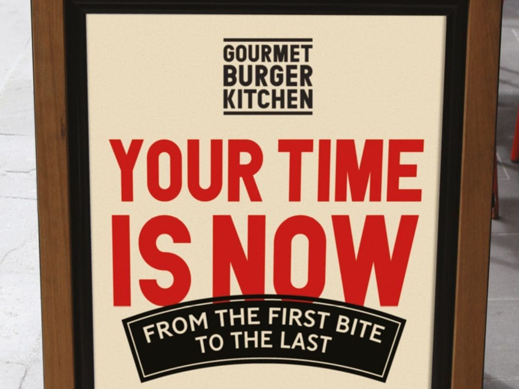
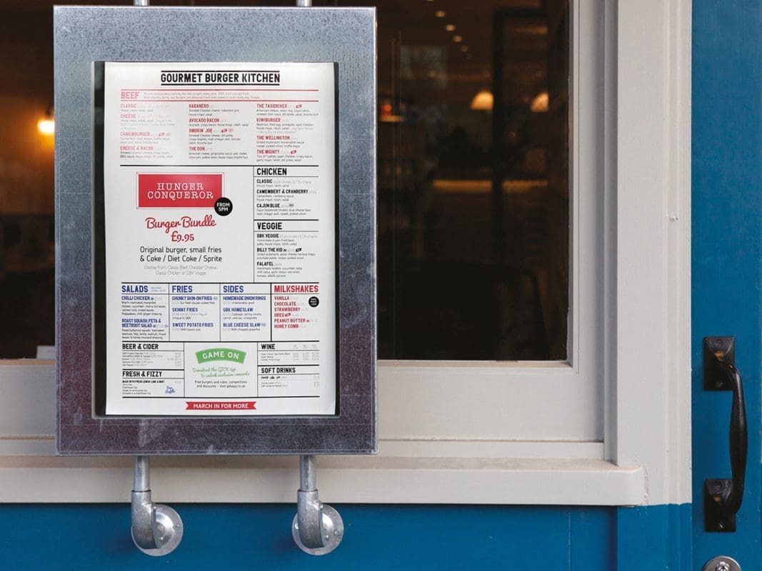
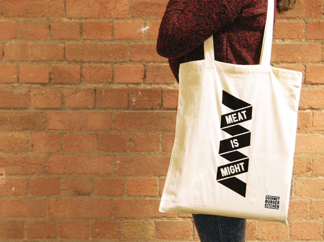
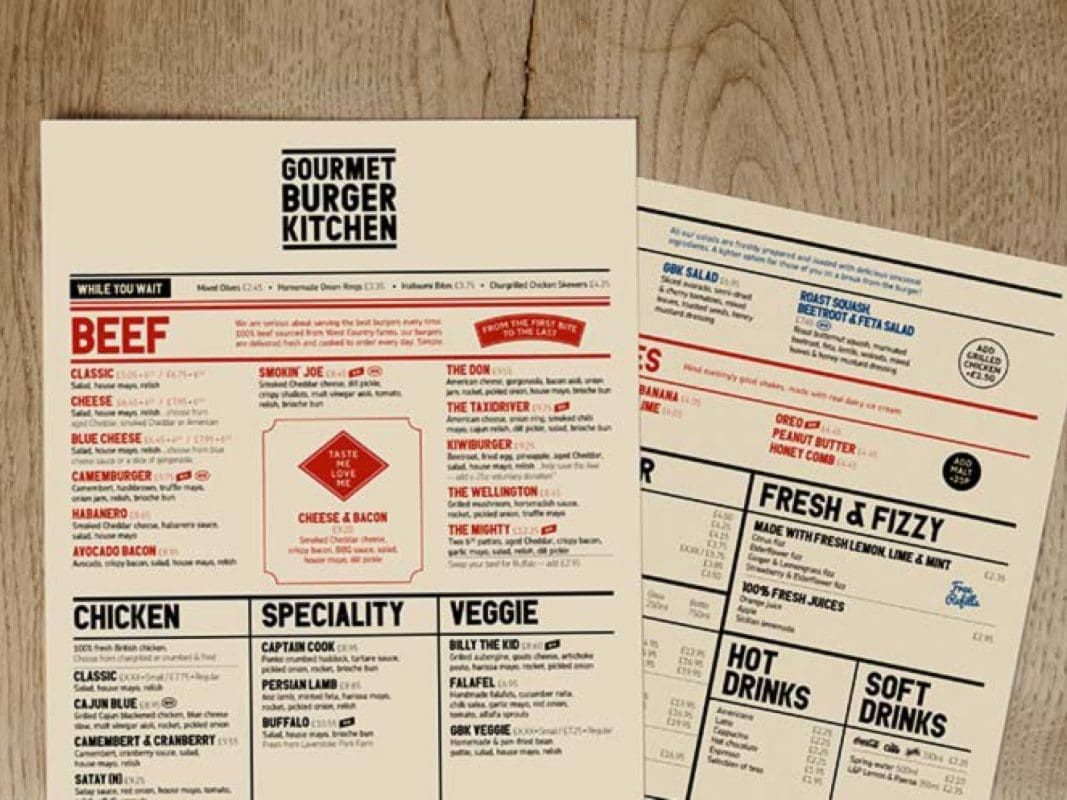
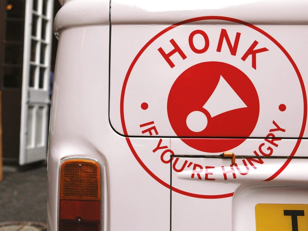
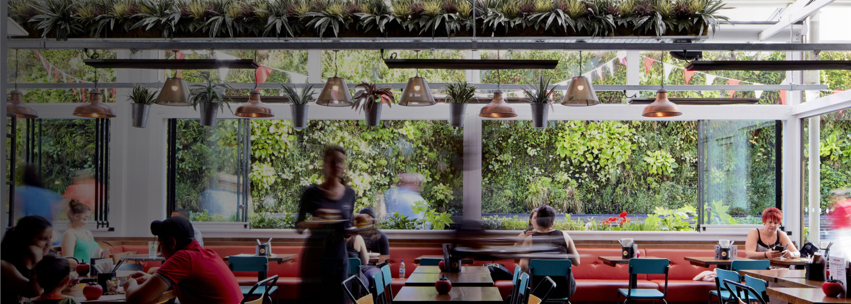
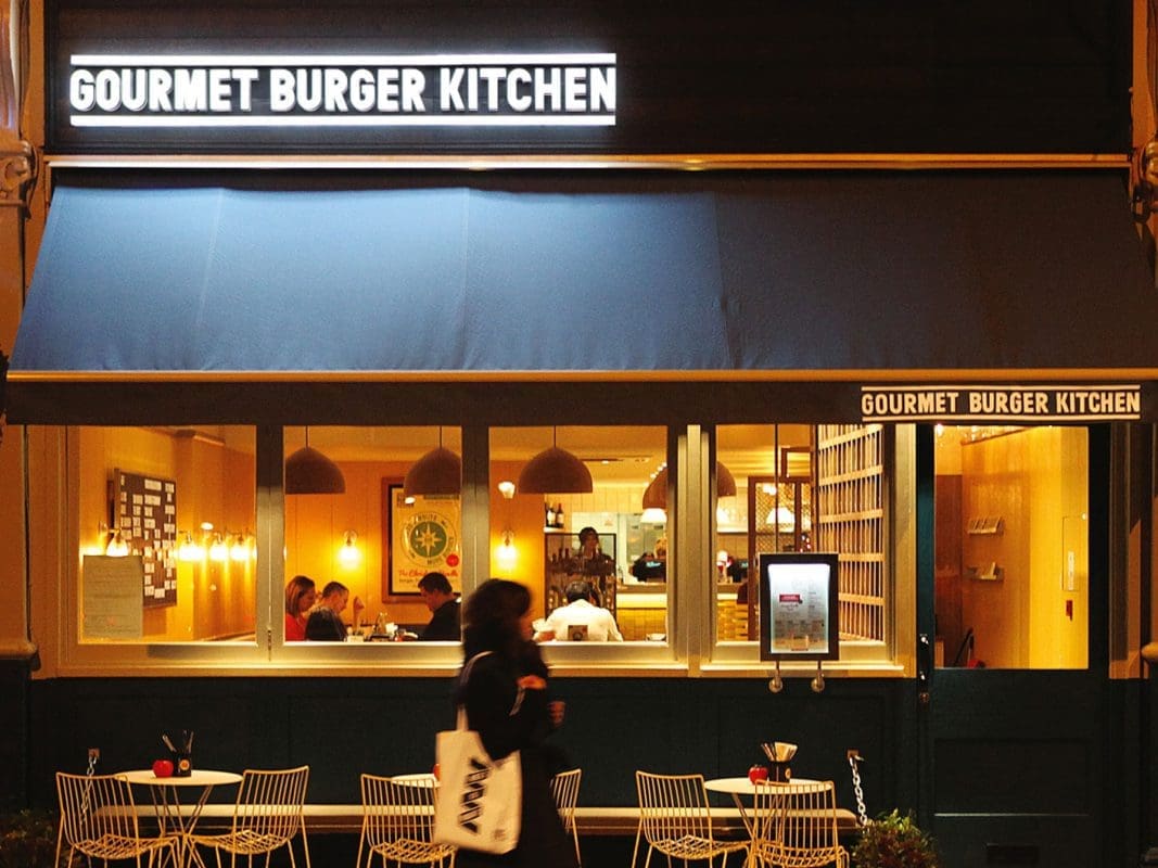
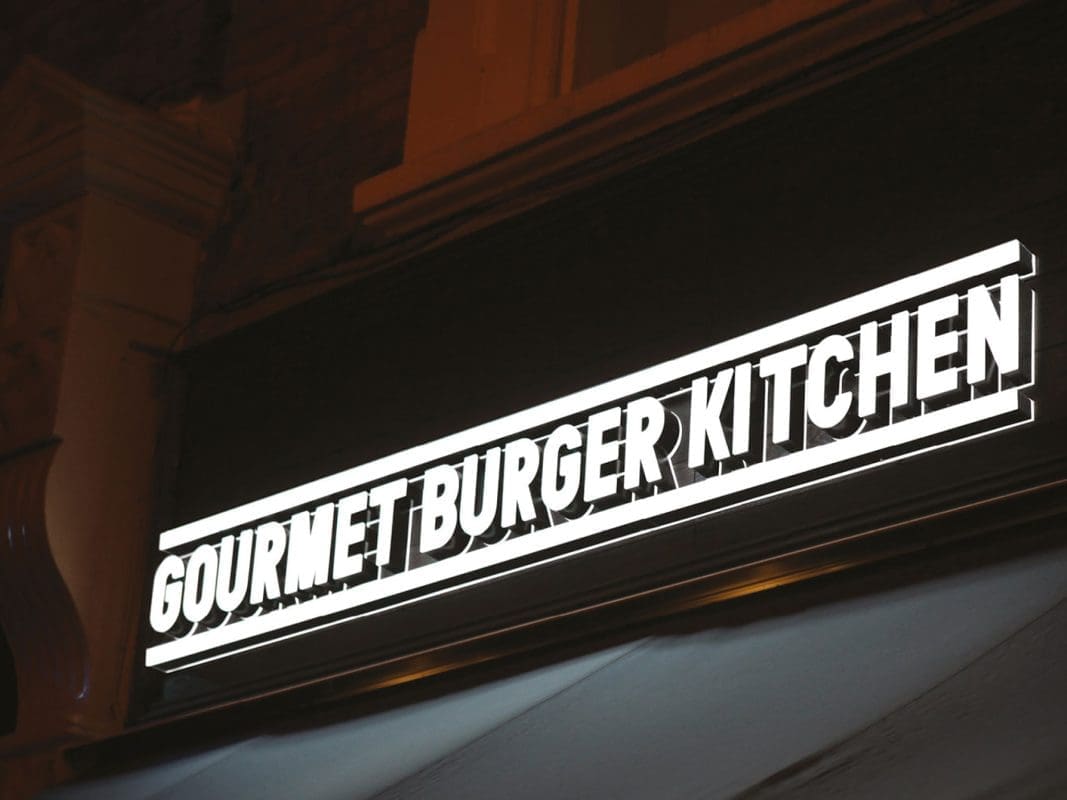
The result is a brand platform that the GBK leadership has personally invested in and has been passionate about advocating across the company. We created a new visual and verbal identity to reinforce the idea of this gang of obsessives coming together to spread burger joy. With inspiration from existing clubs — from Hell’s Angels to the Boy Scouts — the new identity never takes itself too seriously but venerates the gourmet burgers at the heart of everything they do.

CASE STUDY

BMC

Repositioning to support business transformation

Challenge

After being taken private by a group of investors, BMC was restructured into five distinct business units representing key product lines. Management was given the mandate to drive growth with core IT audiences and emerging business buyers.

But BMC was poorly positioned to win, due to low awareness and consideration in several key product areas. There was a lack of clarity in the market about what BMC stood for and even a lack of conviction that the brand could become relevant in a digital-first economy.

Prophet was hired to develop a “Golden Thread” brand strategy that would unite BMC’s product system under a common umbrella, differentiate the company against existing and emerging competitors, and ultimately, position BMC as a relevant brand across all lines of IT and digital service management.

Solutions

We started by mapping the IT and digital service management categories, laying out buying center dynamics, customer needs and competitive solutions in a holistic view of the current state. This mapping enabled us to identify entirely new possibilities for the brand – ones that could be credible for BMC to deliver based on its production system and capabilities.

We identified and explored four territories that could drive relevance, credibility differentiation, and ultimately devised a new positioning for BMC as the “DNA of the Digital Enterprise” that significantly modernized the brand, re-ignited relevance and consideration, and established a platform for differentiated growth. The positioning squarely established BMC as a key player in helping businesses become more digital.

Working in partnership with Moving Brands in San Francisco, we used the strategy to help guide the development of BMC’s updated logo and identity system. Prophet then worked with the GMs across the company to develop BU-specific narratives and product messaging aligned to the new brand strategy.

Results

The strategy has helped drive incredible business impact for BMC and its investors. The company has achieved:

  • $1B in new revenues and a number of new global customer accounts
  • An emerging reputation in digital
  • Share gains vs. large-cap competitors
  • Worldwide acclaim from industry analysts
  • Significant ROI on private equity investment

CASE STUDY

Keurig Green Mountain

Energizing an iconic brand portfolio

Challenge

Green Mountain Coffee Roasters (GMCR), a small Vermont coffee company, acquired Keurig, a manufacturer of single-serve coffee brewers. A few years later, GMCR realized that in order to unlock growth, they needed a strategy that would successfully bring the two businesses together. The company engaged Prophet to support the large-scale transformation required to manage and accelerate business growth.

Solutions

We began our journey by setting the strategic foundation — designing a best practice marketing organization and clarifying the brand architecture required to drive growth. Once the internal structure was established, Prophet re-energized the flagship product brands, Keurig and Green Mountain Coffee Roasters, with a strategy grounded in their heritage but positioned for their future. We set out to transform Keurig into a brewing system that could stand for much more than just coffee and aspired to expand Green Mountain from its New England roots to a globally recognized brand.

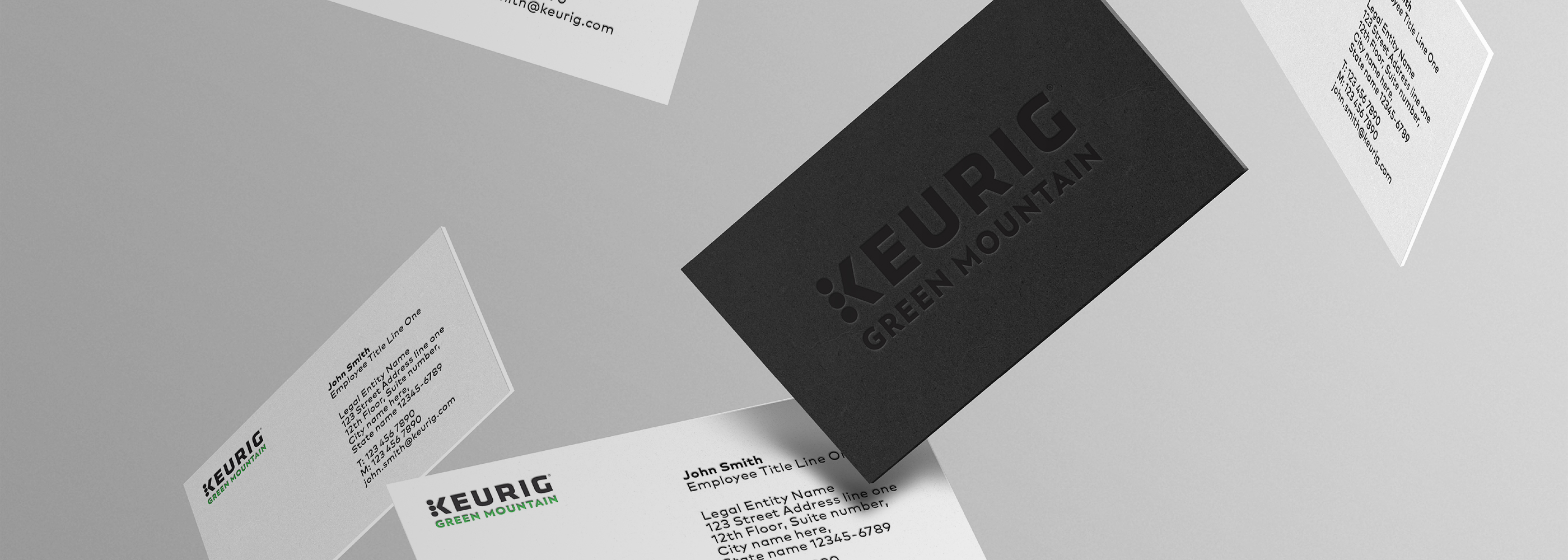
By spending time with Keurig advocates, we uncovered how valuable the product has been for reinventing consumers’ ordinary routines. Building off of the characteristics of simplicity, consistency, convenience and personalization, we developed a positioning centered on how Keurig makes it easy to make the things that make your day. We designed a new brand identity inspired by the ease of the push of a button and the choice of pods offered by the Keurig system.

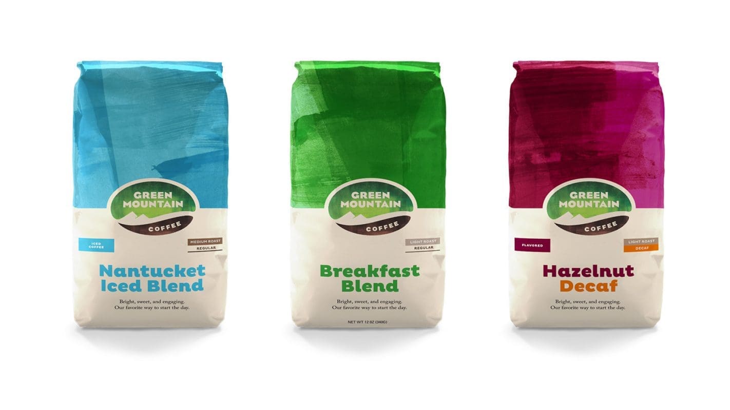
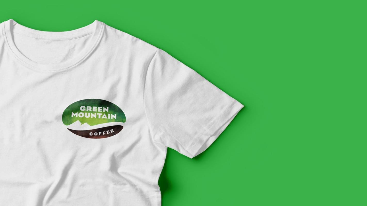
Green Mountain Coffee, with its strong roots in Vermont, has a rich history in fair trade, social responsibility and carefully selected and roasted coffee. The new branding, inspired by its birthplace, honors its legacy but with a more contemporary look and feel. The new symbol embodies the company’s roots featuring the region’s signature geography and the core of its business — the coffee bean.

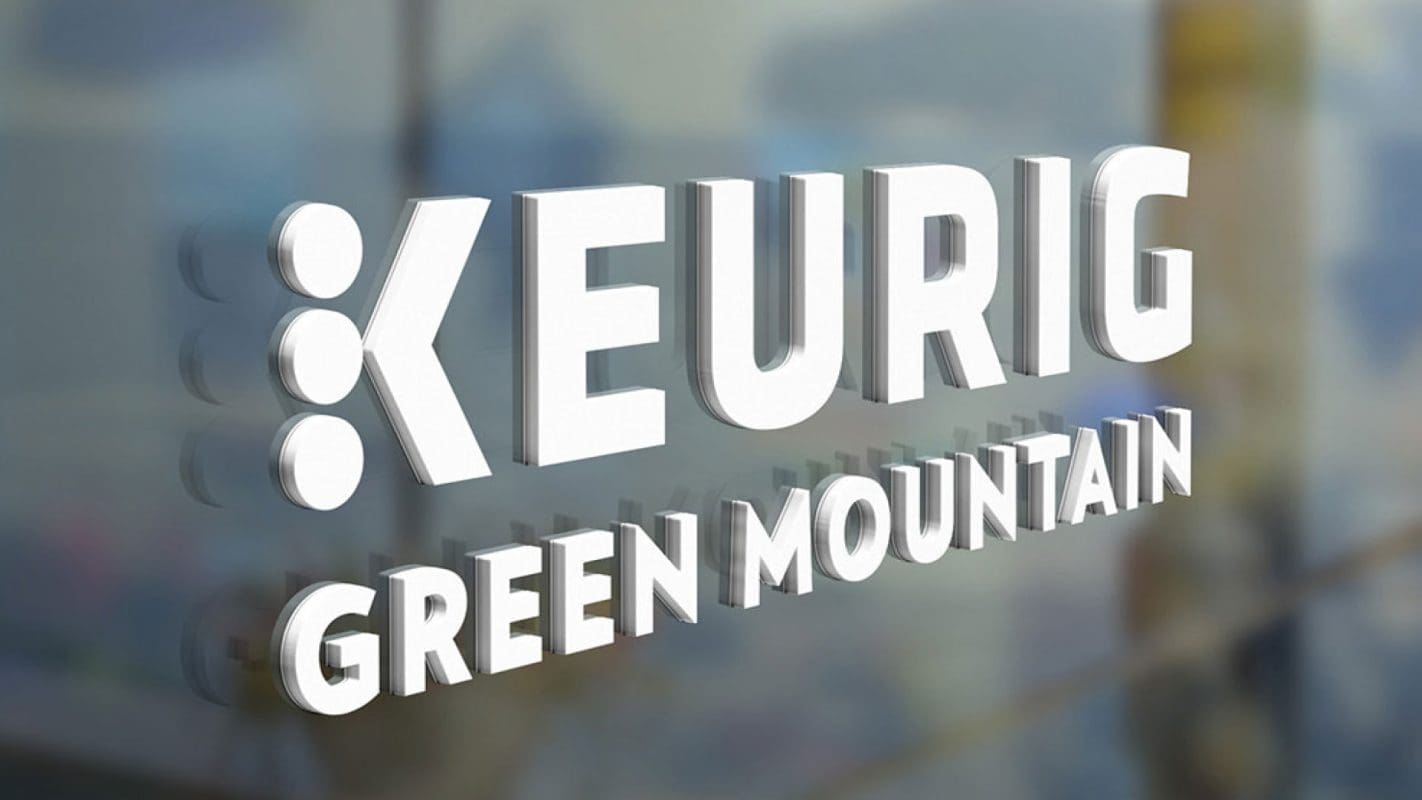
We helped Keurig Green Mountain come to life through two unique visual systems, united by a new corporate identity and logo that combines elements of their two main brands.

Results

Keurig Green Mountain has launched its new branding and is leveraging this new identity to expand its offerings into new products, and take Green Mountain Coffee into a new line of Organics.

“Prophet has been critical in the growth of our marketing capabilities, especially in a part of our business where we were trying to go from one brand to another very quickly. The company is filled with great strategists who happen to operate in a marketing realm. But the thinking transcends marketing and has a much greater impact.”

TJ Whalen
Former Chief Strategy Officer at Keurig Green Mountain

CASE STUDY

Electrolux

Refreshing a global icon and modernizing the brand

Challenge

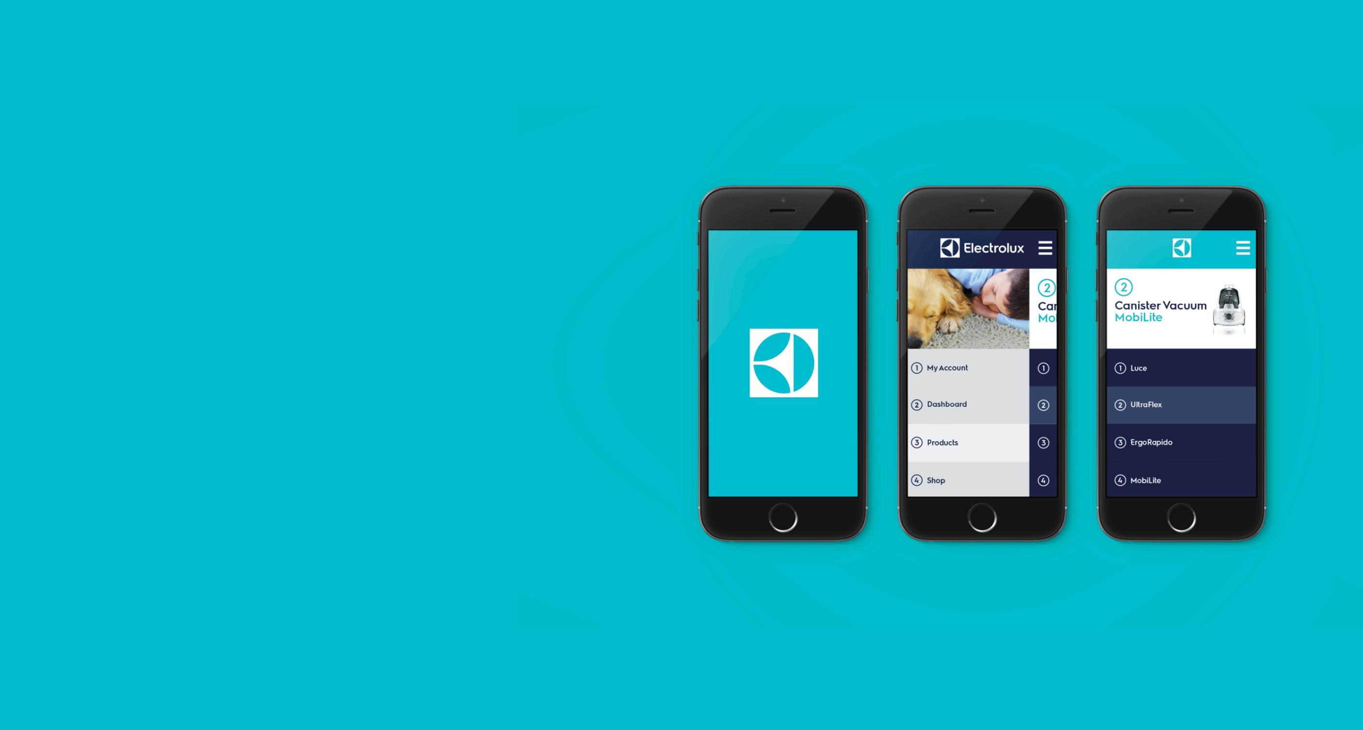
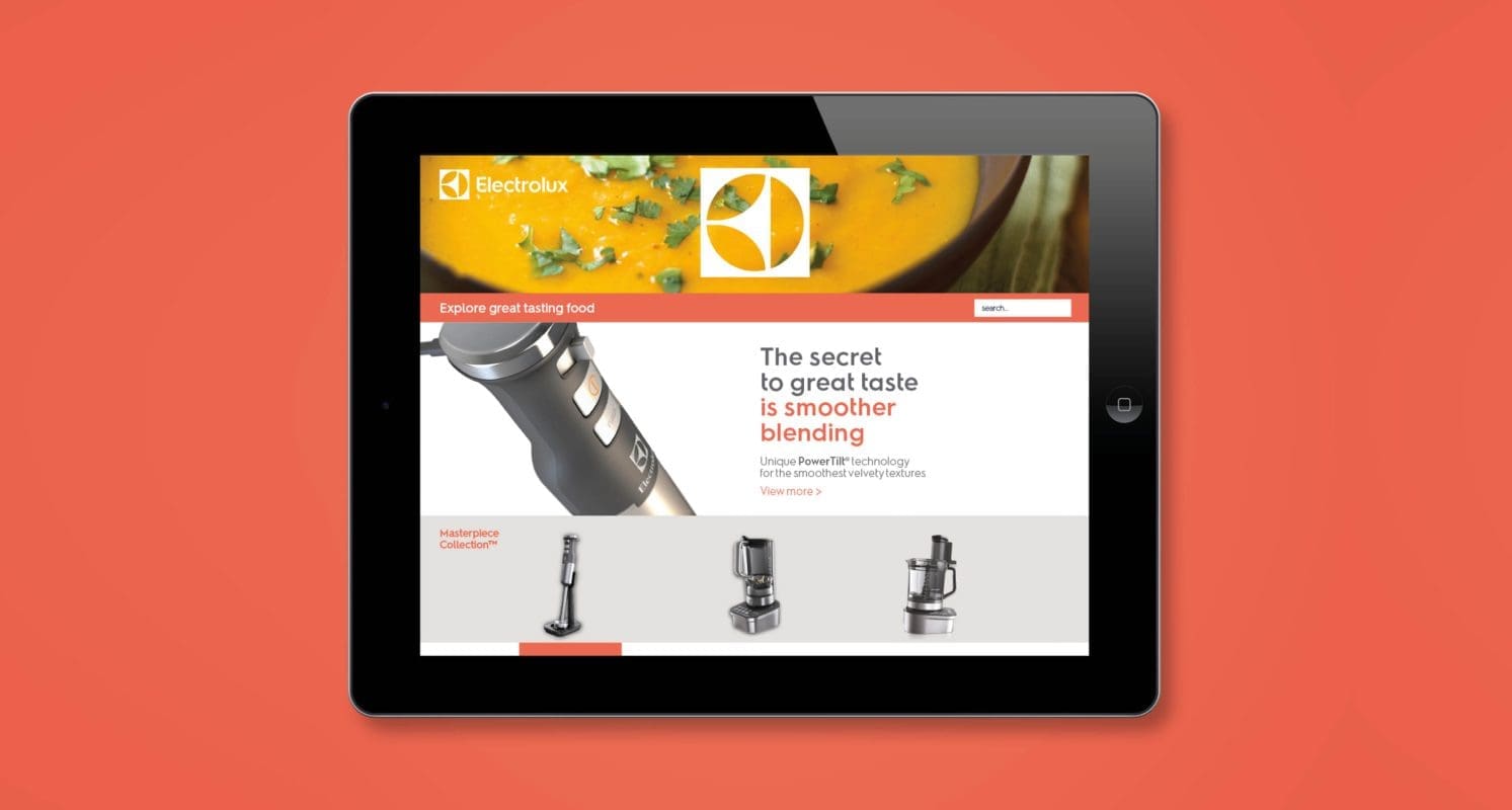
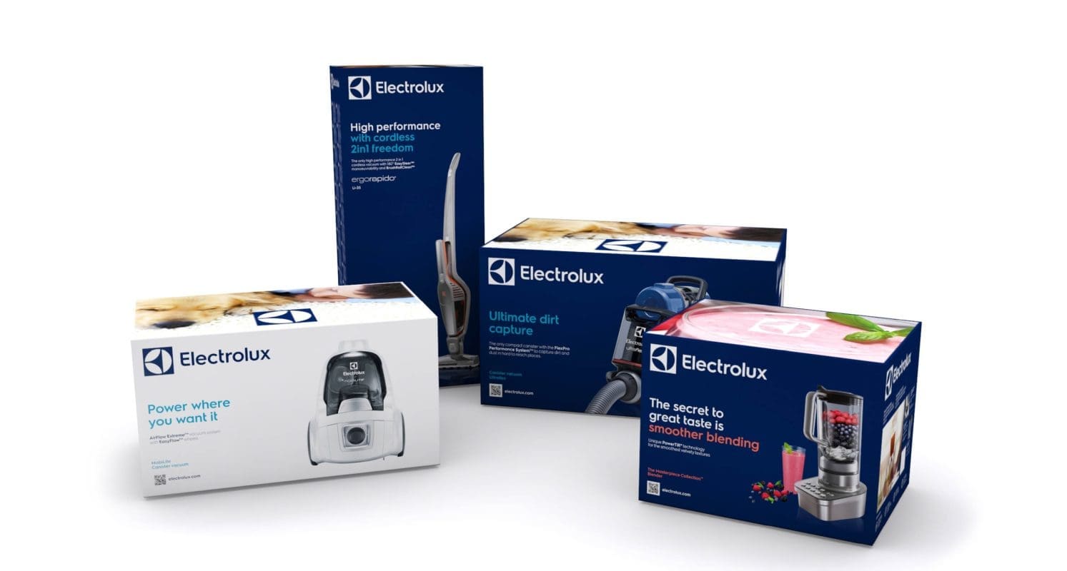
Electrolux is on a journey to become a world-class consumer marketing company – but the brand’s visual identity felt out of date and undifferentiated. Electrolux worked with Prophet to create a visual platform that modernizes the brand and stands out in the market.

Solutions

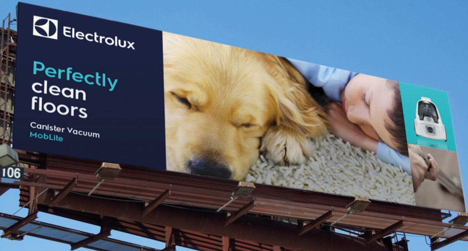
Equipped with a deep understanding of Electrolux’s consumers, resulting from a long-standing partnership, Prophet worked with Electrolux’s team to build a brand identity that would appeal to consumers on an emotional level. A key insight led to the idea; consumers want to see the benefit of a product not just the features – a beautifully poached egg, a pile of soft, fluffy towels or a perfectly crisp white shirt.

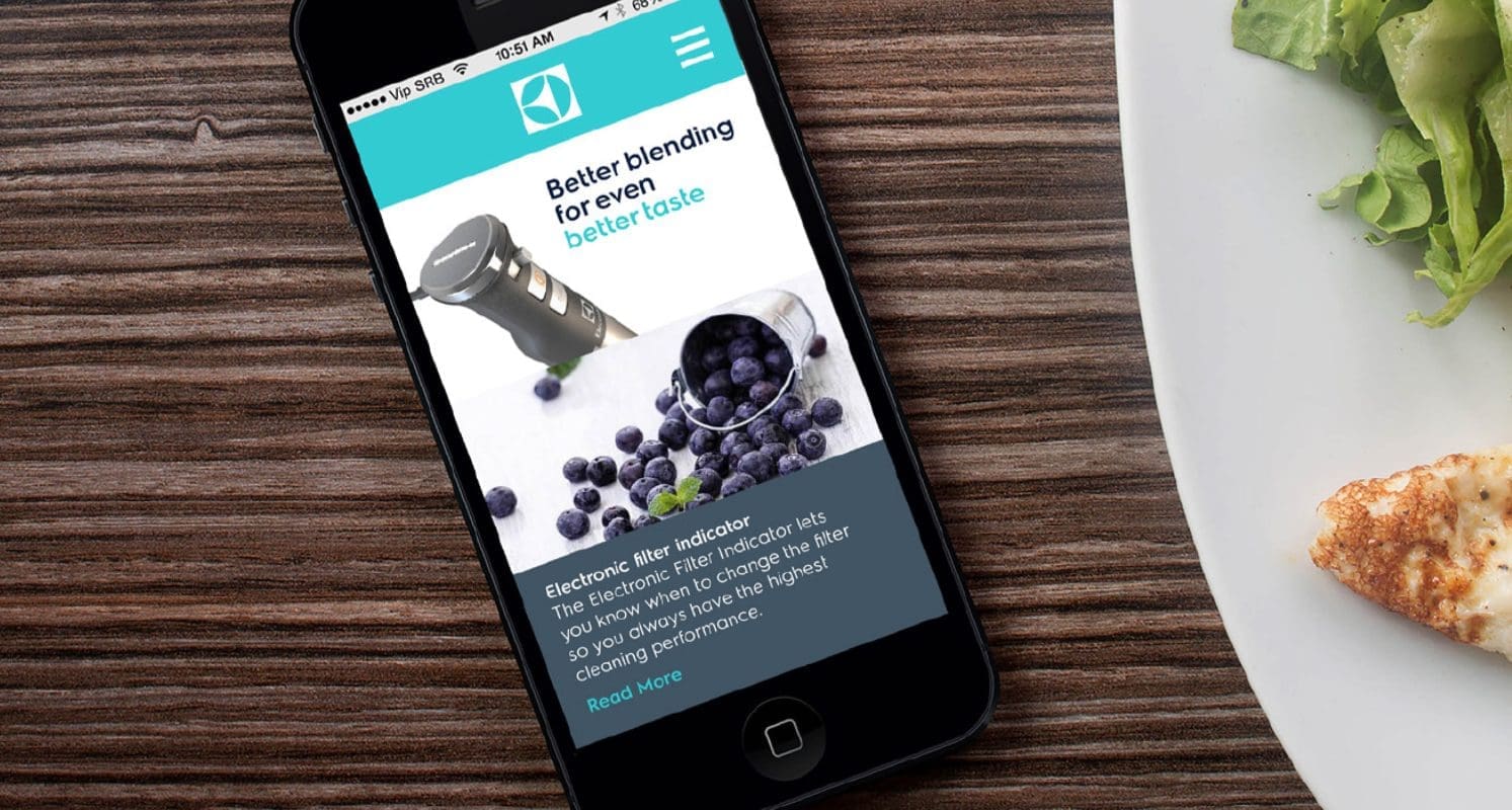
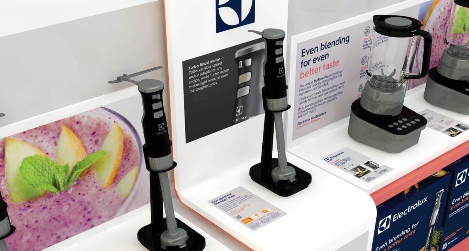
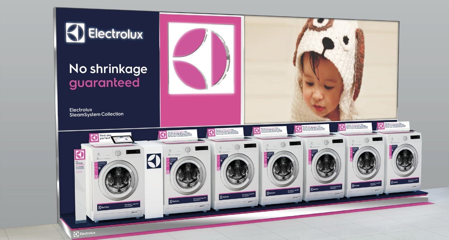
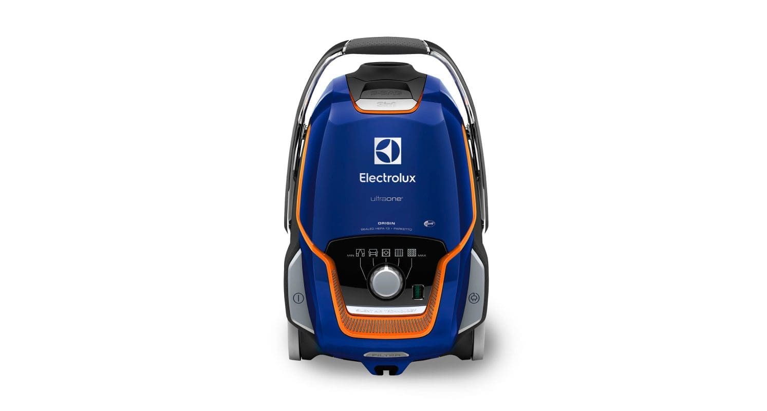
Each aspect of the identity was modernized. The logo was stripped of superfluous shapes and the tagline, maximizing its visibility and impact. The font was updated to a custom, modern sans serif, echoing the shapes in their iconic brand symbol. The symbol was given a new lease on life, creating stopping power wherever it is encountered. The letters in the logo were extended into a custom brand typeface, creating a look that is distinctive in appearance on anything from billboards to product stickers. Their core color blue was darkened to have a more premium and modern appeal supported by a palette of bold, vivid colors that will stand out in busy retail environments.

Results

The new visual identity has been embraced by all corners of the organization and will change the way customers interact with Electrolux – in-store, online, on packaging and through mobile devices.

Read more about Electrolux’s redesign in Design Week, Creative Blog and Little Black Book. In the period after activation, Electrolux saw sales in North America grow by 2.2%, and margins increase by 3.9%.

CASE STUDY

Bank of East Asia

Creating a bold statement in retail banking

Challenge

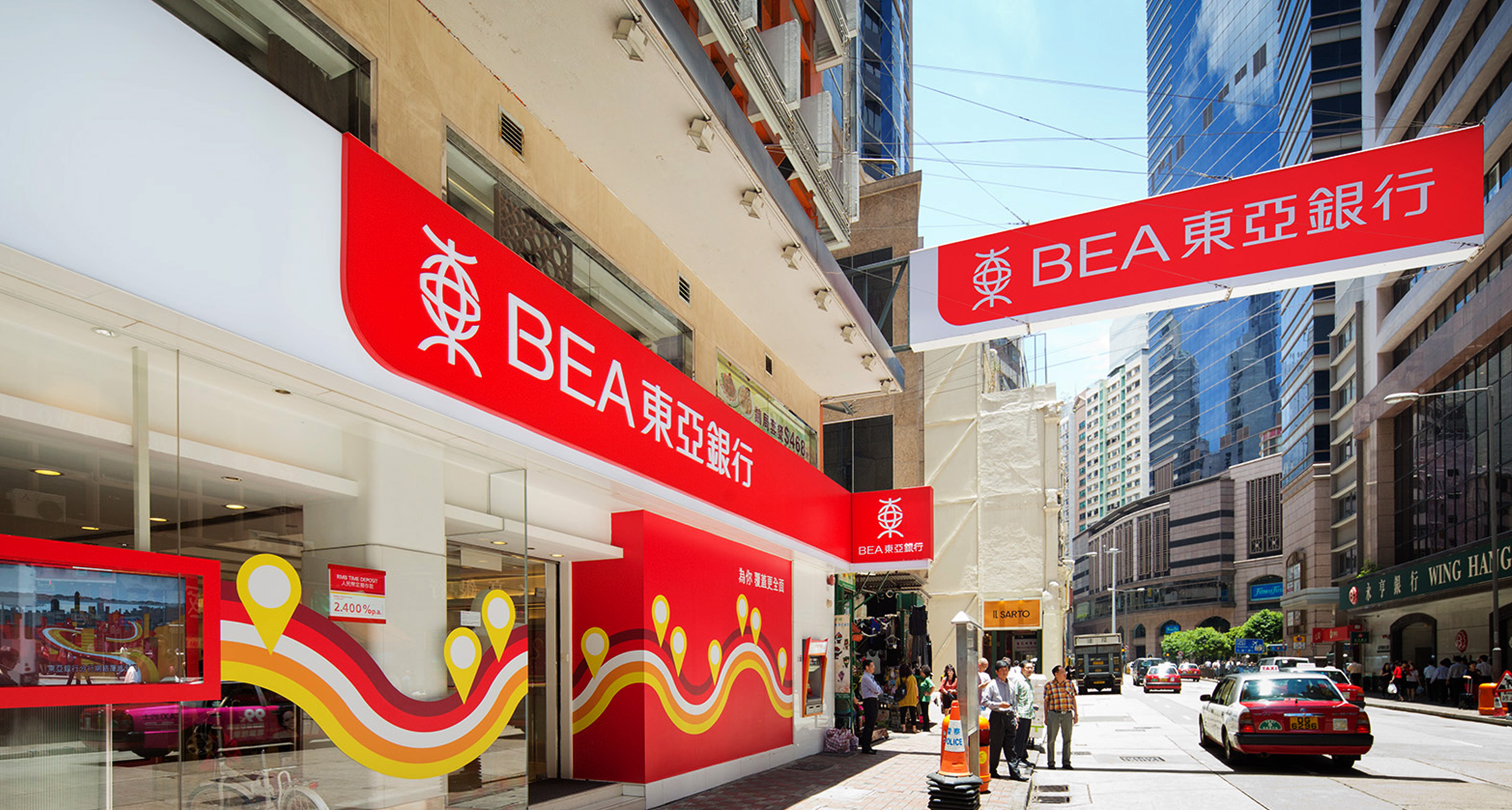
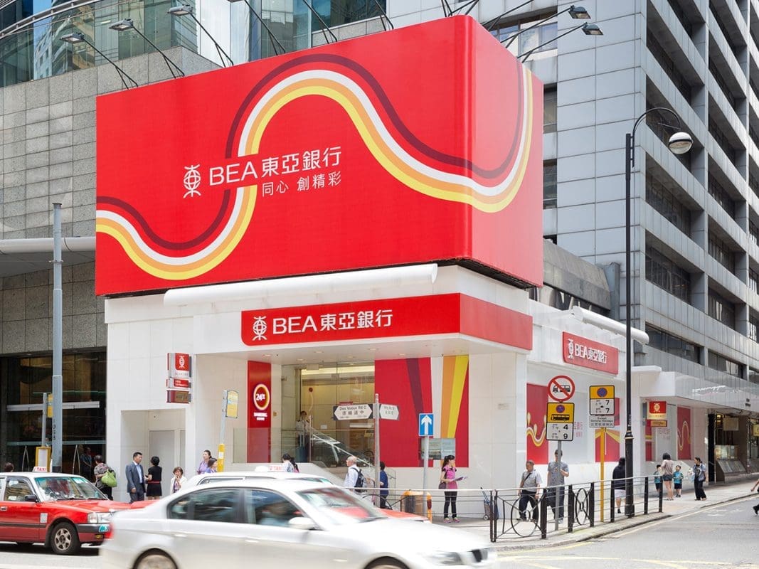
Bank of East Asia (BEA) is the largest independent local bank in Hong Kong with a large retail branch network. In light of new competition, BEA hoped to extend its reach to customers and enhance its retail visibility. Prophet worked with BEA to create a coherent and impactful brand communication system to help the bank stand out across all channels.

Solutions

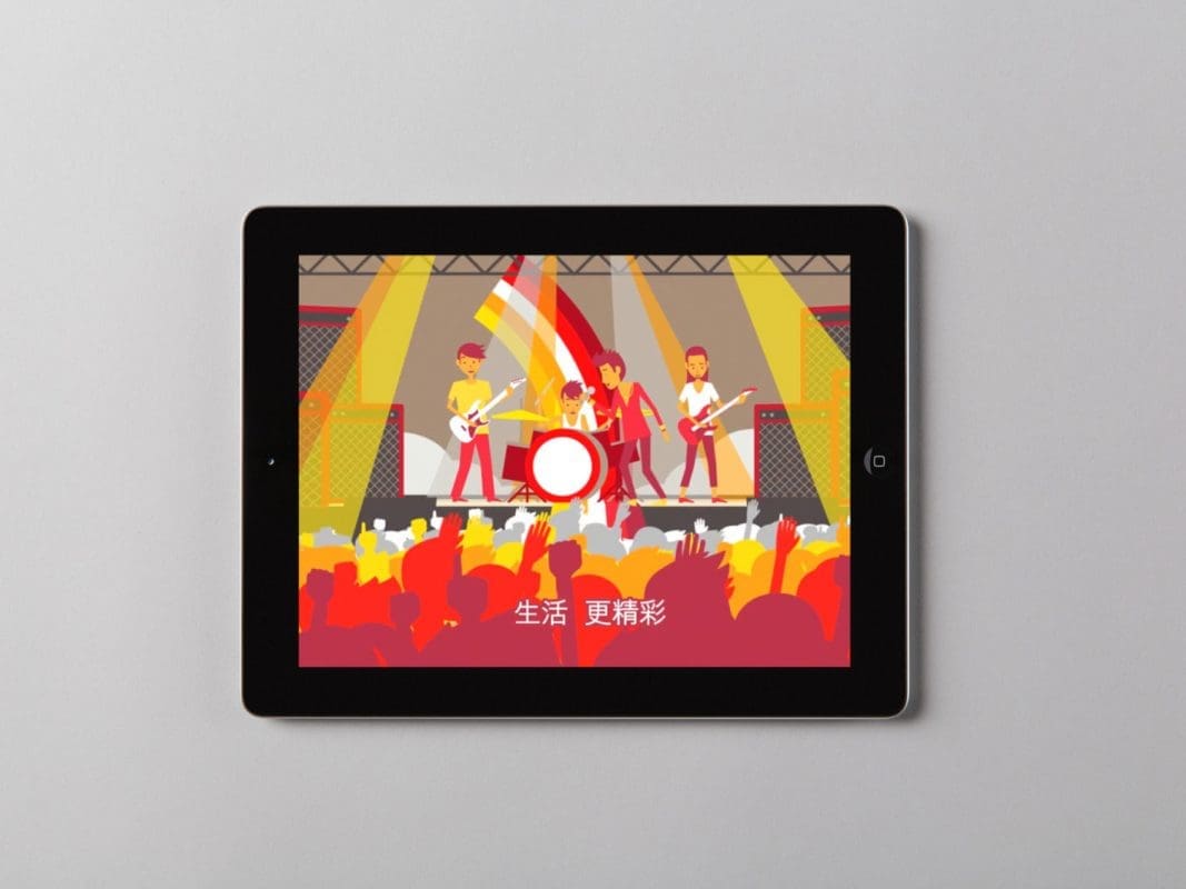
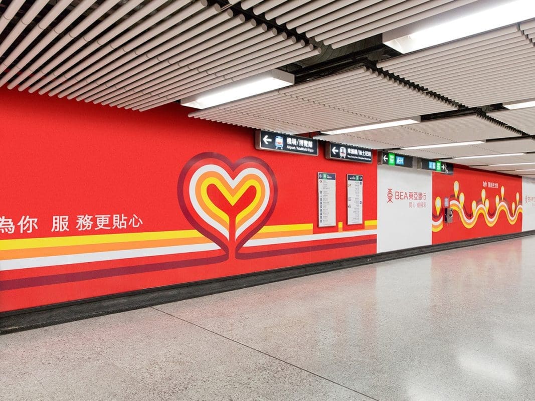
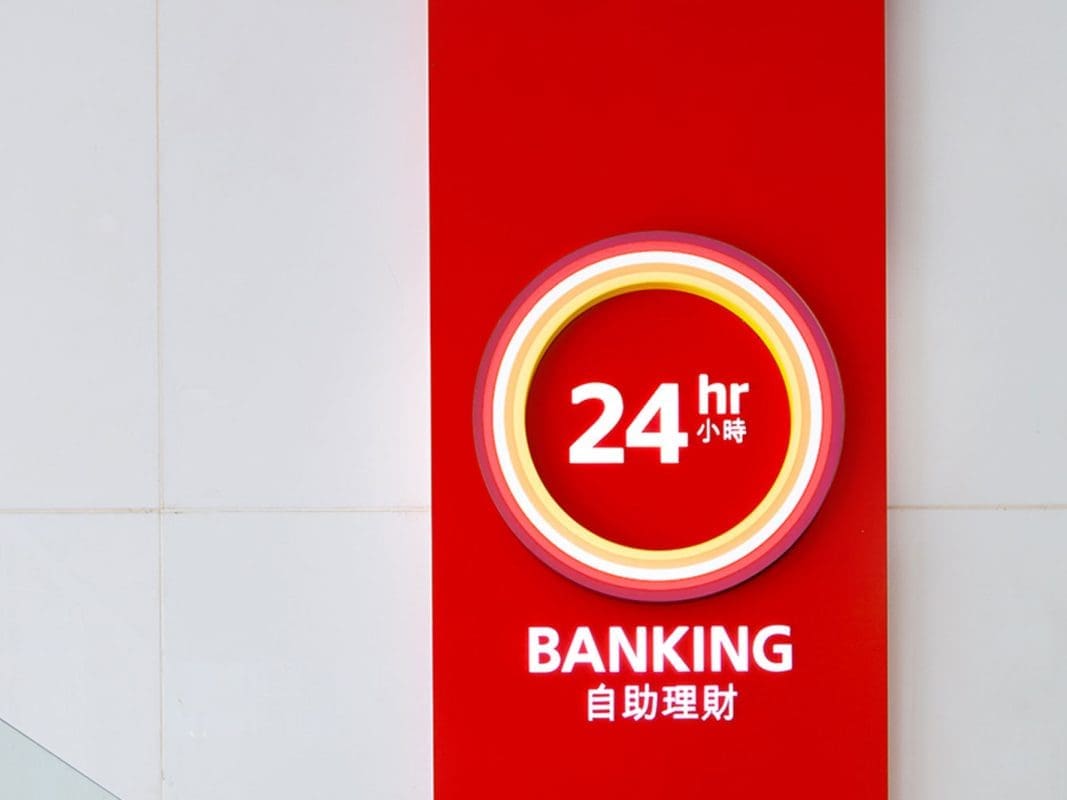
The new look is based on a band of five colored “light rays” symbolizing the five core values of the bank. It is designed to project a forward-looking image, making a bolder statement on a street level. As part of the branding campaign, a new tagline “Enriching your world” and four secondary messages have been developed.

Together, they communicate BEA’s commitment to helping customers improve their lives and achieve their goals through the provision of quality banking and financial services. BEA launched its new image through a high-profile advertising campaign including print, bus advertisements, outdoor billboards in the Central, TST, Hong Kong MTR Station, TST Piers and online advertisements.

Prophet ensured consistent delivery throughout the process, from concept to execution, as a long-term partner dedicated to elevating the brand to the next level.

Results

The end result is a dynamic visual and verbal communication approach that brings the brand to life, and significantly differentiates BEA from its competitors in retail environment, enhances the brand visibility and favorability.

Overall, the customers feel very positive about the change, more than 80% of customers reckon that the new look has enhanced the BEA brand image, and the majority of current customers are willing to recommend BEA to others.

Interested in learning more about how Prophet helps companies develop unique brand strategies, create engaging customer experiences and drive business growth? Explore our collection of case studies.

Your network connection is offline.

caret-downcloseexternal-iconfacebook-logohamburgerinstagramlinkedinpauseplaythreads-icontwitterwechat-qrcodesina-weibowechatxing